Cardiologist Education Website Template
Pulse is a hub-and-spoke cardiac patient education landing page built for cardiologist practices. It turns complex diagnoses, procedures, and medications into clear, visual explanations for patients and their families. Anchored by a stats-first layout, a sticky navigation bar, a symptom selector, and a guide download form, the page earns trust before it ever asks for anything.
by Rocket studio
Quick summary
Pulse is a single-page cardiac patient education hub designed for cardiologist practices. It decodes conditions, procedures, medications, and recovery milestones into plain language patients can act on. Every spoke section opens with an arresting statistic, then unfolds into clear explanations. The primary goal is a heart health guide download, captured with just a first name and email.
Who this template is for
This template is built for cardiologists and cardiac care practices that want to educate patients between appointments. It serves teams who understand that a confused patient is an anxious patient, and that clear information builds the trust that keeps people engaged in their own care.
- Cardiologists and cardiology group practices seeking a patient-facing education resource
- Healthcare content teams building a library of condition, procedure, and medication explainers
- Practices looking to grow an email list through a high-value guide download offer
What problem this template solves
Cardiac patients often leave appointments with a diagnosis they cannot fully explain to a family member. Discharge paperwork is dense, medical terminology is intimidating, and reliable plain-language resources are scattered across the web. This template addresses all of that in one focused place.
- Patients who just heard "ejection fraction" or "aortic valve replacement" for the first time need immediate, trustworthy context
- Family members researching a loved one's condition remotely have no organized starting point
- Post-procedure patients tracking recovery milestones need to know which symptoms are normal and which are urgent
What you get with this template
You get a fully structured, single-page hub with a sticky anchor navigation bar that connects six content spokes. Every section is ready for your content, your statistics, and your practice's voice.
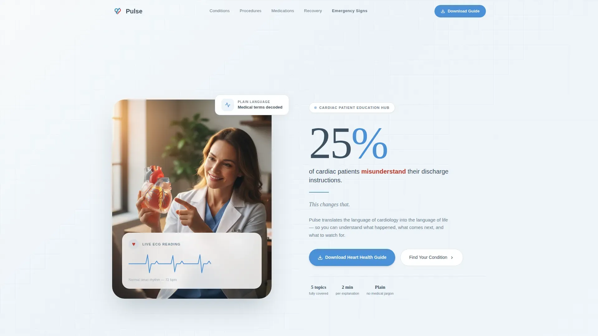
- A hero section with a half-page photo and text layout, an oversized impact statistic, and anchor navigation
- Five spoke sections covering Conditions, Procedures, Medications and Recovery, Emergency Signs, and a guide download call to action
- A single-question symptom selector, a guide download form, and a footer in a horizontal flow pattern
Feature list
Stats-First Spoke Sections
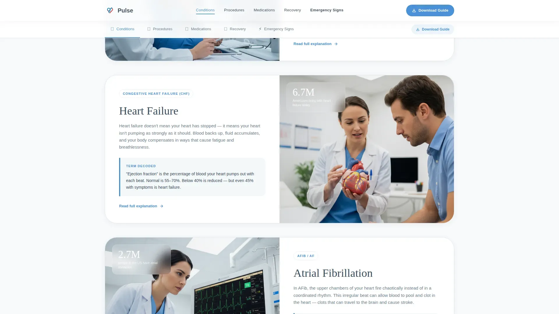
Each spoke opens with a single arresting number before any explanation begins. The statistic creates immediate relevance. The content that follows dissolves urgency into understanding, giving patients a reason to read every word.
Sticky Anchor Navigation Bar
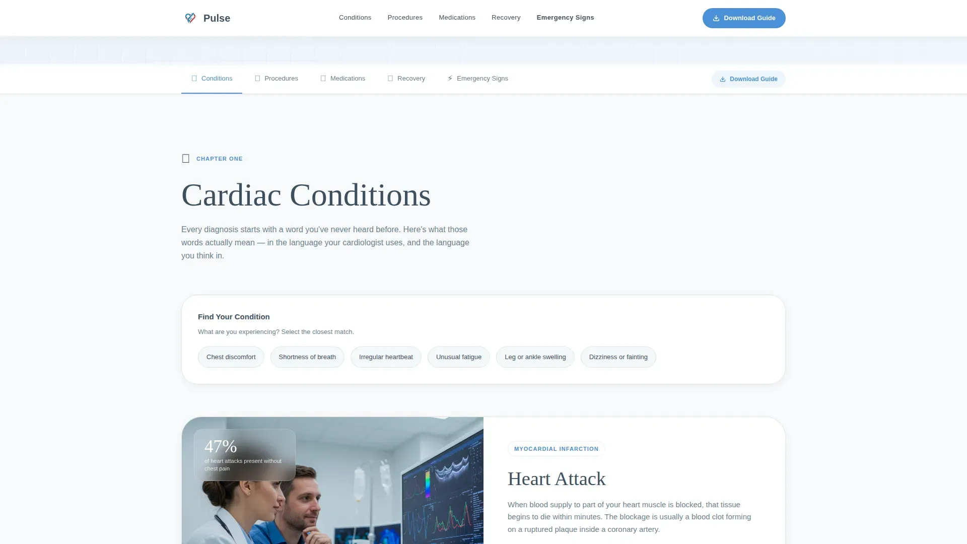
A persistent navigation bar links to every spoke section on the page. Visitors jump directly to what matters most to them. Smooth scrolling keeps the experience calm and oriented.
Single-Question Symptom Selector
A symptom selector asks one question and routes the visitor directly to the relevant spoke. It removes friction for patients who arrive with a specific concern and do not know where to start.
Guide Download Form
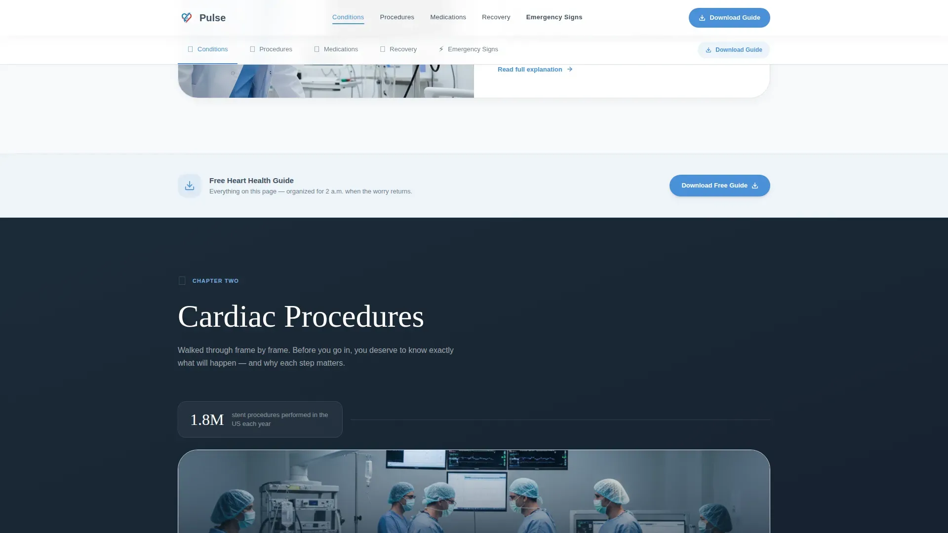
The primary conversion point asks only for a first name and email address. The form appears at the anchor navigation resting state and repeats after each spoke section. Visitors earn the download by experiencing the page's depth first.
Emergency Signs Section
A dedicated spoke uses arterial red accents to flag critical warning signs clearly. It is visually distinct from every other section, ensuring urgent information is never missed or confused with general education content.
Frame-by-Frame Procedure Walkthroughs
The Procedures spoke presents cardiac procedures as step-by-step visual sequences. Stent placements and similar interventions are broken into discrete frames. Patients and families follow the process at their own pace without needing prior medical knowledge.
Page sections overview
| Section | Purpose |
|---|---|
| Hero with stat | Opens with half-page photo, oversized impact statistic, and anchor nav |
| Conditions Spoke | Stats-first cardiac condition explainers with symptom selector |
| Procedures Spoke | Frame-by-frame procedure walkthroughs with visual depth |
| Medications and Recovery | Interaction maps and recovery milestone tracker |
| Emergency Signs | Critical alert section with arterial red visual accents |
| Guide Download | Heart health guide form and secondary symptom finder |
| Footer | Horizontal flow pattern footer |
Design & branding system
The visual identity follows a Healing Space theme. The palette feels clinical without being cold, sterile without being impersonal. Warm grain-visible photography and precise typography balance the medical context with genuine human warmth.
- Arctic White (#F8FAFB) for open backgrounds, Capillary Blue (#4A90D9) for navigation anchors and linked pathways, Arterial Red (#C0392B) reserved for critical alerts and heart-rate iconography, and calm graphite (#3D4F5F) for all body text
- Fraunces display typeface for headings, DM Sans for body text, creating a contrast between editorial depth and clean readability
- Warm, grain-visible photography of a cardiologist's hands with a heart model, natural window light, and soft-focused patient details anchor the hero section
Mobile & speed optimization
The template is designed desktop-first to suit the research-heavy context of cardiac patient education. Long-form content, data visualizations, and multi-spoke layouts perform best on larger screens. A strong mobile fallback ensures the page remains fully usable on phones and tablets.
- Static-first build approach with optimized images keeps the page responsive across devices
- Client-side interactive components such as the symptom selector and download form are kept minimal to support reliable loading
- Scroll-reveal animations, staggered entrance effects, stat count-up sequences, and smooth anchor scrolling are set to a medium intensity to avoid overwhelming the reading experience
How this template helps you convert
Every design decision on this page works toward one outcome: a visitor who trusts the practice enough to share their name and email for the heart health guide. The page earns that trust before it asks for anything.
- The hero statistic lands before the visitor has scrolled an inch, creating immediate emotional relevance and a reason to stay on the page
- Each spoke section repeats the guide download call to action after demonstrating value, so conversion opportunities appear naturally throughout the reading journey rather than only at the end
Other information about this template
This template is purpose-built for the cardiologist patient education niche within the broader health and medical category. It reflects a content and resource landing page direction, meaning it prioritizes delivering genuine educational value as the path to conversion rather than leading with a sales message.
- The intersection match score for this template against its niche is 13, indicating strong alignment between the design system and the use case
- The header concept is a half-page photo and text composition, a layout suited to high-trust healthcare contexts where visual warmth counterbalances clinical content
- The creative direction is Stats-First Impact, meaning statistics drive engagement before explanations begin, a deliberate choice for an audience that is often anxious and needs to feel informed quickly
- Animation intensity is set to medium, with scroll reveals, stagger effects, and stat count-up sequences that add polish without distracting from the educational content
Theme
Healing Space
Creative direction
Stats-First Impact
Color system
Arctic White
Style
Hub & Spoke (Anchor Nav)
Direction
Content/Resource
Page Sections
Stats-first Spoke Layout
Sticky Anchor Navigation
Symptom Selector Tool
Repeating Guide Download Form
Frame-by-frame Procedure Walkthroughs
Critical Alert Emergency Section
Related questions
Who is this landing page template designed for?
What sections are included in this template?
How does the guide download conversion work?
Can this template serve both patients and family members?
What makes the Emergency Signs section visually distinct?



