Healthcare Social Media Agency Landing Page Template
Pulse is a masonry-style landing page template built for healthcare social media agencies. It combines a collage header, an interactive portfolio grid, and a multi-step lead capture form into one cohesive pitch. The Monochrome Steel palette and Lens and Frame visual identity make every section feel precise and considered, turning clinical credibility into a scroll-stopping first impression.
by Rocket studio
Quick summary
Pulse is a single-page template designed for healthcare social media agencies that need to pitch, impress, and convert hospital marketers in one scroll. The masonry grid acts as both portfolio and proof, the collage header sets an immediate visual tone, and a three-step form guides serious buyers toward booking an audit.
Who this template is for
This template is built for agencies that market directly to healthcare organizations. If your clients are hospital marketing leaders, private practice owners, or health system executives, Pulse speaks their language while showing creative range.
- Healthcare social media agencies pitching hospital CMOs and health system marketing teams
- Digital agencies with a healthcare content specialty looking for a stronger new-business page
- Boutique creative studios targeting private practice owners and specialist clinics
What problem this template solves
Most agency portfolio pages either look too clinical or too generic. Healthcare marketing decision-makers need to see relevant proof fast, and a wall of static case study links does not deliver that. Pulse solves the credibility-plus-creativity gap that most healthcare agency pages leave wide open.
- Hospital marketing buyers can't quickly find proof that an agency understands their vertical
- Generic portfolio layouts don't communicate the scale or specificity of healthcare content work
- Standard contact forms fail to qualify leads or communicate the agency's strategic approach
What you get with this template
Pulse delivers a fully structured single-page layout with every major section pre-built. The interactive logic, visual hierarchy, and conversion flow are all defined in the template so you spend time customizing, not building from scratch.
- A collage-style hero header with hover-reveal engagement metrics on each content tile
- A masonry portfolio grid that reorganizes by healthcare specialty as the visitor scrolls
- A three-step progressive lead capture form and a secondary gated content download path
Feature list
This section covers the core interactive and structural features delivered inside the Pulse template.
Collage Hero Header
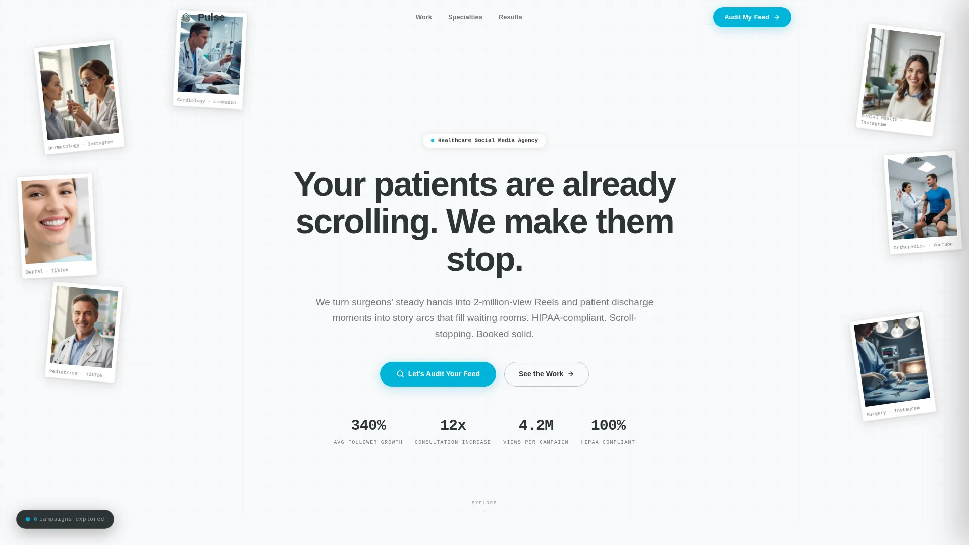
The header is designed as a living wall of healthcare social content. Sample posts from different specialties overlap at slight angles, framed with thin steel-gray borders that evoke contact sheets. On hover, each piece lifts, enlarges, and reveals a mock engagement metric beneath the frame, making the agency's results feel tangible before a word is read.
Interactive Masonry Portfolio Grid
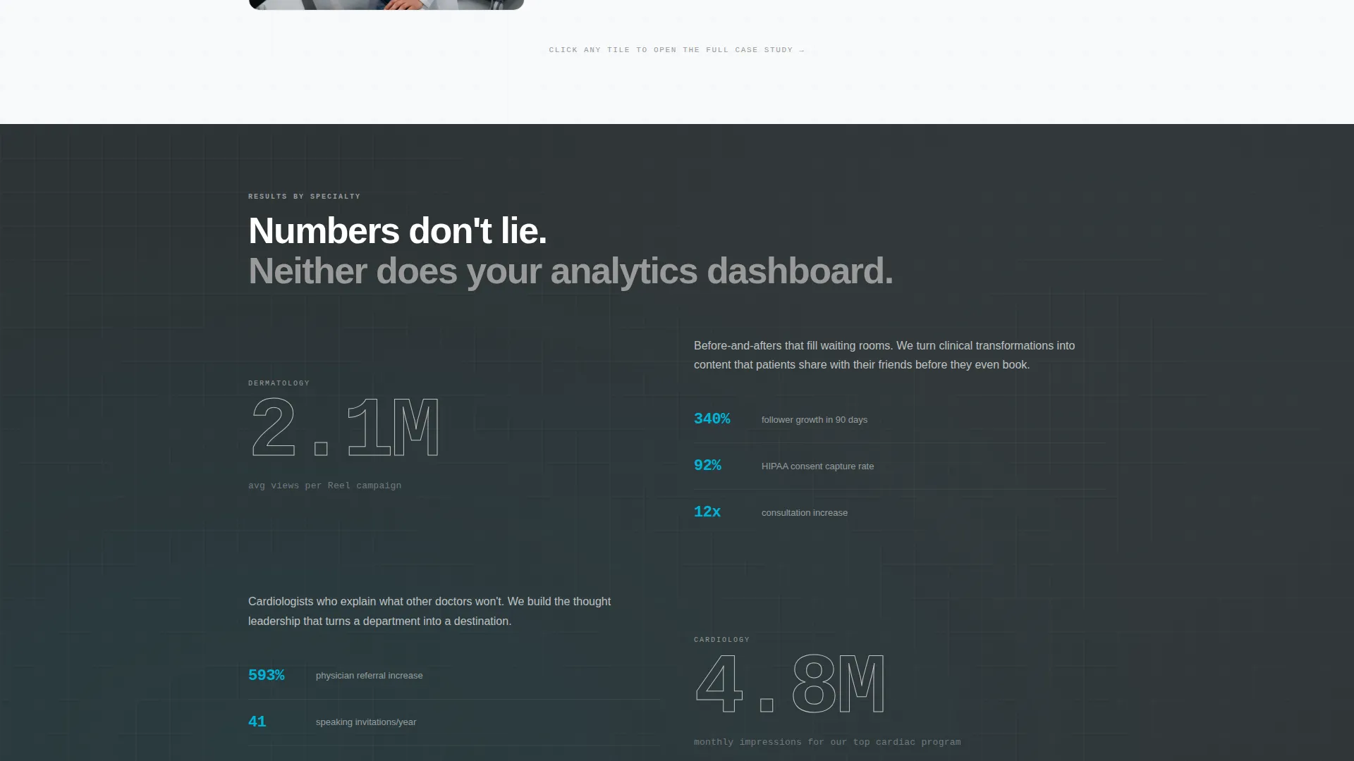
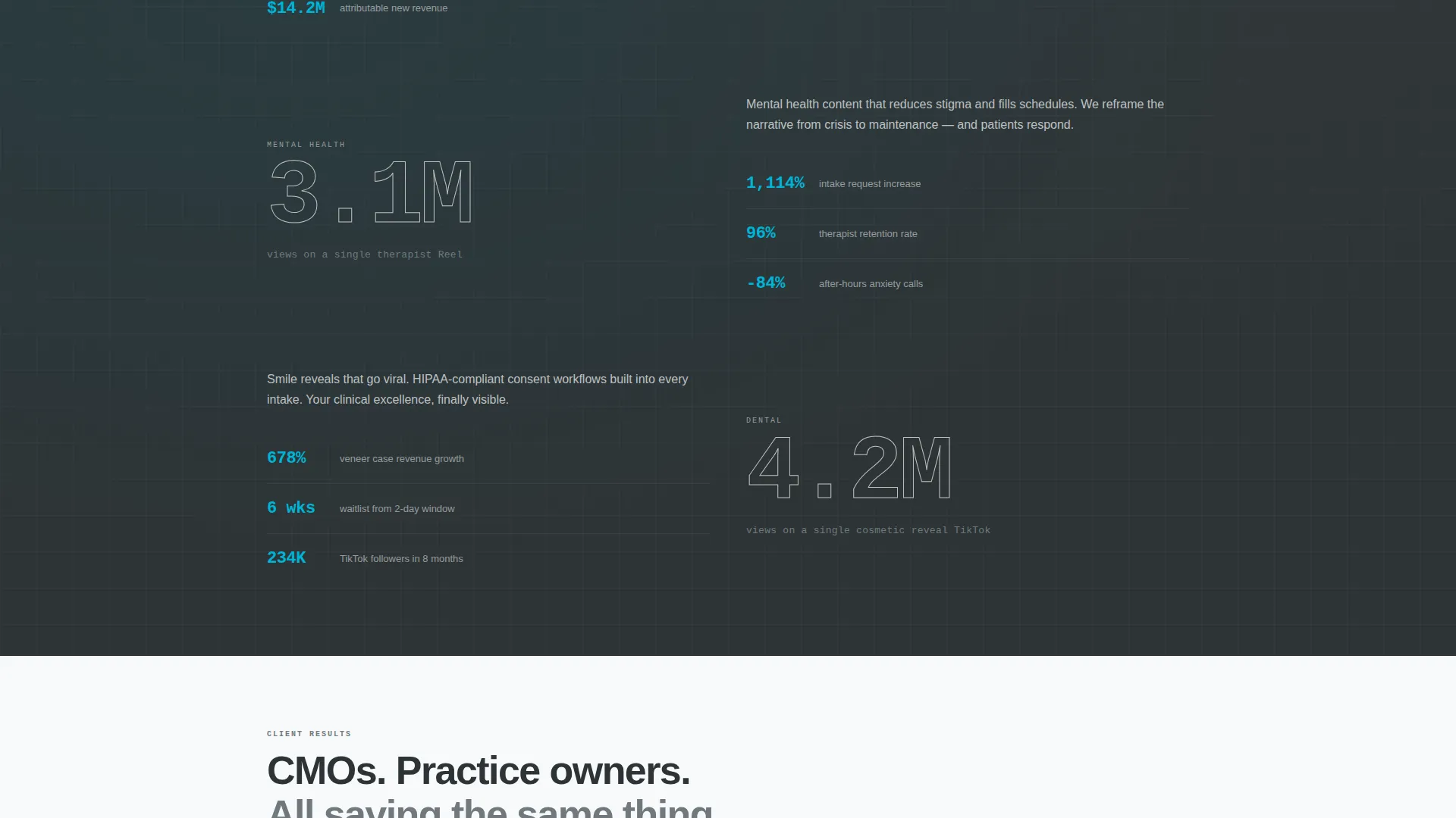
The masonry grid is the central feature of the page. Each tile represents a content campaign, and clicking any tile opens a mini case study drawer that slides in from the right. The drawer shows a client challenge, the content strategy used, three sample posts, and outcome metrics. The grid reorganizes by specialty cluster as the visitor scrolls, with each cluster introduced by an oversized monospaced statistic.
Specialty Cluster Navigation
As visitors scroll, the grid subtly regroups into specialty sections such as dermatology, cardiology, dental, and mental health. Each cluster is introduced by a single large statistic in monospaced type. This structure lets visitors self-select into the content most relevant to their vertical without any manual filtering.
Gamified Exploration Counter
A persistent floating counter sits in the corner of the page and tallies the number of campaigns a visitor has explored. This shot-counter mechanic rewards curiosity and signals the agency's depth of work. The more a visitor engages, the more the page reveals.
Three-Step Progressive Lead Form
The primary call to action is a teal pill button labeled "Let's Audit Your Feed." It becomes visible after a visitor explores at least two case study tiles, earning the click through demonstrated proof. The form runs three steps: selecting a healthcare vertical from a visual icon grid, pasting a social handle for a live preview, and then entering name and work email.
Gated Benchmark Report Download
A secondary conversion path offers a downloadable healthcare social benchmark report gated behind email only. This path captures leads who are not ready to book a call but are ready to compare their own performance numbers against the industry.
Page sections overview
| Section | Purpose |
|---|---|
| Collage Hero Header | Sets tone and surfaces proof through hover-reveal engagement metrics |
| Headline Typewriter | Stamps the core message across the hero with a self-typing animation |
| Masonry Portfolio Grid | Serves as portfolio and pitch through clickable campaign tiles |
| Case Study Drawer | Slides in per tile to show challenge, strategy, posts, and outcomes |
| Specialty Cluster Blocks | Groups tiles by vertical with oversized monospaced stats |
| Exploration Counter | Gamifies scrolling with a persistent campaigns-explored tally |
| Audit call to action Button | Appears after two tile interactions as a teal pill call to action |
| Three-Step Lead Form | Qualifies leads through vertical selection, handle input, and contact info |
| Benchmark Report Gate | Captures early-stage leads with a gated downloadable report |
Design & branding system
The visual identity follows a Lens and Frame theme built around a Monochrome Steel color system. The palette references the brushed metal surfaces of an operating theater, clinical without feeling cold, with a single accent color reserved for interactive moments.
- Colors: surgical steel (#71797E), instrument chrome (#C0C0C0), sterile field white (#F8F9FA), scrub-cap charcoal (#2D3436), and defibrillator-shock teal (#00B4D8) used only for calls to action and interactive states
- Typography: monospaced fonts for statistics and data, clean sans-serif for headlines, creating a contrast between precision and warmth
- Backgrounds alternate between sterile white and deep charcoal to produce a lightbox-slide effect as visitors scroll
Mobile & speed optimization
The template layout is structured to translate cleanly from a wide masonry grid to a stacked single-column view on smaller screens. The floating counter and drawer interaction are both designed to remain functional on touch devices.
- The masonry grid collapses gracefully so case study tiles remain tappable and readable on mobile
- The three-step form is broken into discrete screens, making it easy to complete on a phone without scrolling through a long single form
How this template helps you convert
Pulse is built around the idea that proof should come before the ask. The page earns the conversion by letting buyers experience the agency's range before a single form field appears.
- The collage header and masonry grid deliver immediate visual credibility, so hospital marketing buyers feel the agency's quality before reading a pitch
- The exploration counter and tile-gated call to action mean the "Let's Audit Your Feed" button only appears after a visitor has already engaged, making the ask feel well-timed rather than premature
- The dual conversion paths capture both ready buyers through the audit form and early-stage researchers through the gated benchmark report, widening the lead funnel without diluting the primary offer
Other information about this template
Pulse is categorized under Portfolio and Agency templates with a specific focus on the Healthcare Marketing and Agency subcategory. It is suited for agencies operating in the healthcare social media niche who need a page that closes the gap between creative credibility and clinical relevance.
- Template style: Masonry and Pinterest layout for a grid-driven browsing experience
- Theme: Lens and Frame, referencing the viewfinder and contact-sheet aesthetics of editorial photography
- Header concept: Collage and Scrapbook, built to feel like a lightboard covered in active campaign content
- Creative direction: Interactive Explorer, rewarding each click with deeper context and new proof
- Landing page direction: Partnership and B2B, structured to convert hospital CMOs and health system marketing executives into booked consultations

Theme
Lens & Frame
Creative direction
Interactive Explorer
Color system
Monochrome Steel
Style
Masonry/Pinterest
Direction
Partnership/B2B
Page Sections
Collage Hero Header with Hover Metrics
Interactive Masonry Portfolio Grid
Gamified Exploration Counter
Tile-gated Primary Call to Action
Three-step Progressive Lead Form
Gated Benchmark Report Download
Related questions
Who is this template built for?
Can I replace the portfolio tiles with my own client work?
How does the tile-gated call to action work?
What does the three-step lead form include?
What is the secondary conversion path for?



