Heart Disease Digital Therapy App Landing Page
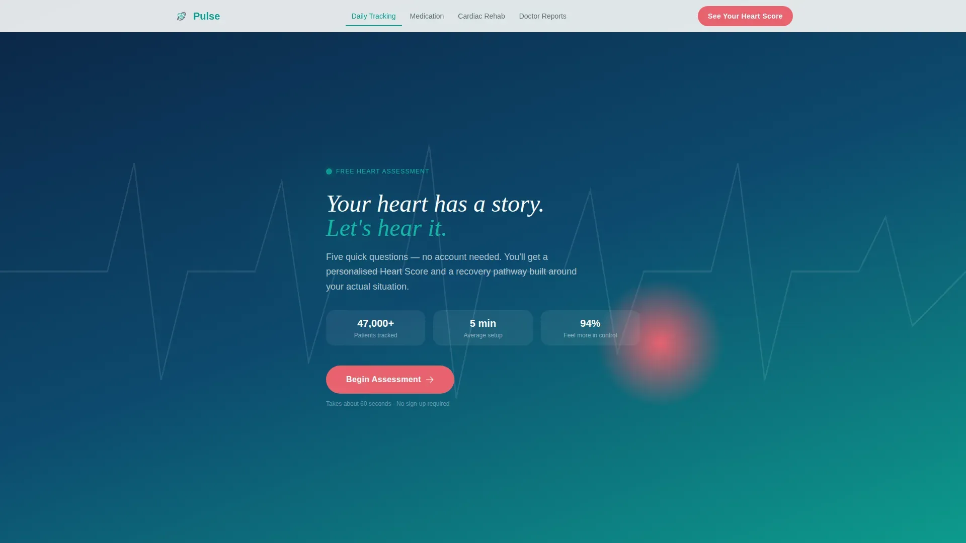
Pulse is a heart disease digital therapy landing page built for post-diagnosis patients who need more than a waiting room pamphlet. It opens with a five-step heart health assessment, guides visitors through daily tracking, medication reminders, cardiac rehab, and doctor report features, and delivers a personalized Heart Score before asking anyone to create an account.
by Rocket studio
Quick summary
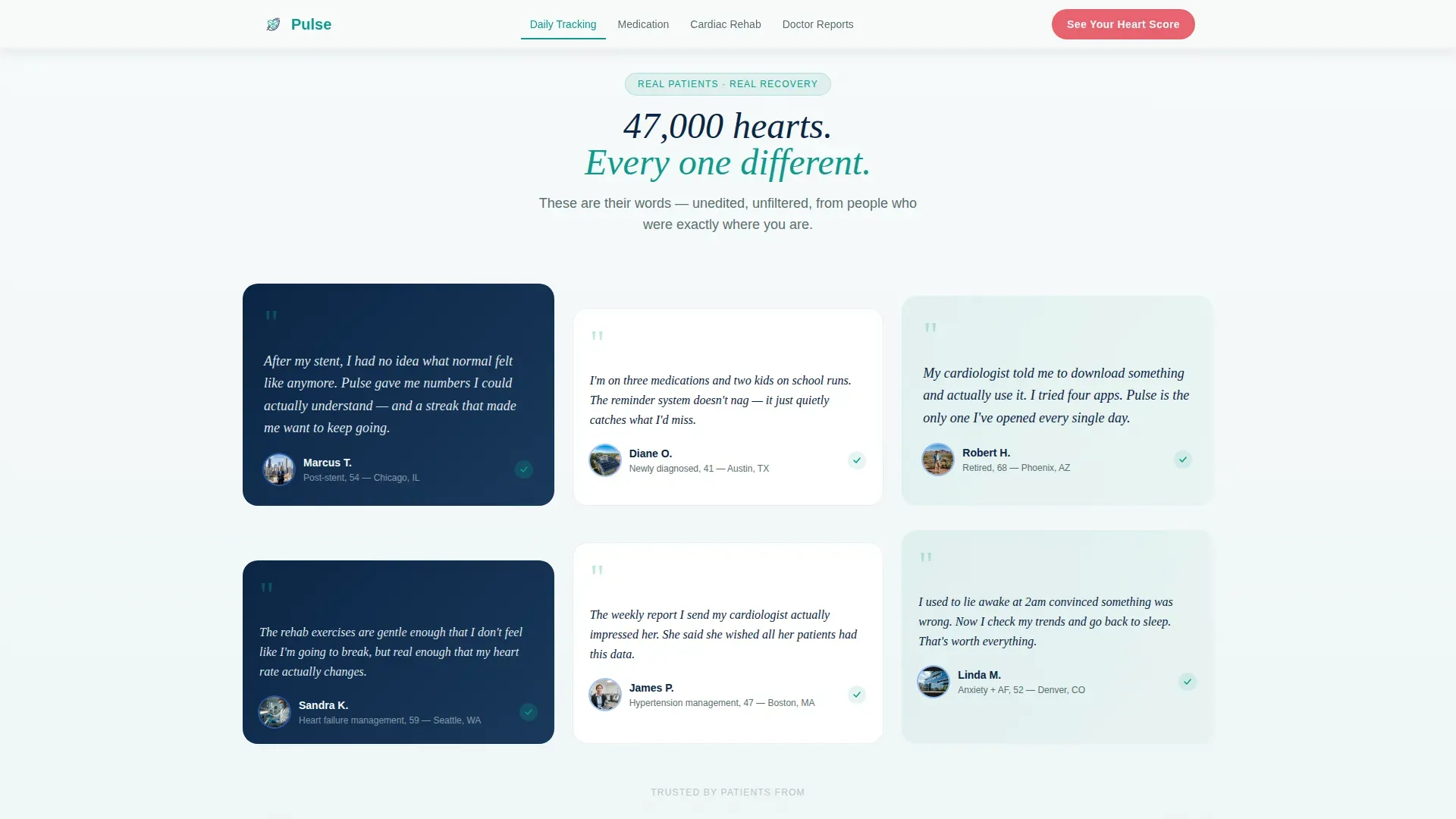
Pulse is a hub and spoke landing page for a heart disease digital therapy app. It opens mid-conversation with a five-step assessment form, builds trust through a patient testimonial mosaic, and organizes core features into four anchor-nav spokes. The page is built for real cardiac patients who need clinical credibility and low-friction onboarding in equal measure.
Who this template is for
This template is built for digital health teams launching a cardiac companion app to post-diagnosis patients. It speaks directly to people who are already in recovery, not people who are simply curious about heart health.
- Post-stent patients and newly diagnosed adults who manage beta-blockers, blood pressure logs, and rehab routines between appointments
- Cardiologists and care coordinators who recommend digital tools to patients and need a page that feels clinically trustworthy
- Health app founders who want a conversion-focused landing page that reduces signup friction by leading with personalized value
What problem this template solves
Most cardiac patients leave their cardiologist's office with instructions and no real daily support system. The gap between appointments is where habits break down, medications get missed, and anxiety fills the silence.
- Patients need a structured daily routine for blood pressure logging, medication adherence, and rehab exercises, but generic wellness apps feel too casual to trust
- The signup barrier stops high-intent users before they see any value, leaving them with nothing to act on
- Landing pages that lead with features instead of patient experience fail to connect with a trust-driven, non-technical audience managing real health conditions
What you get with this template
This template delivers a complete, fully designed landing page for a heart disease digital therapy app. Every section is built around the patient journey from first visit to first login.
- A five-step heart health assessment form that opens on page load, collects resting heart rate range, current medications, weekly activity level, last cardiology visit date, and biggest daily challenge
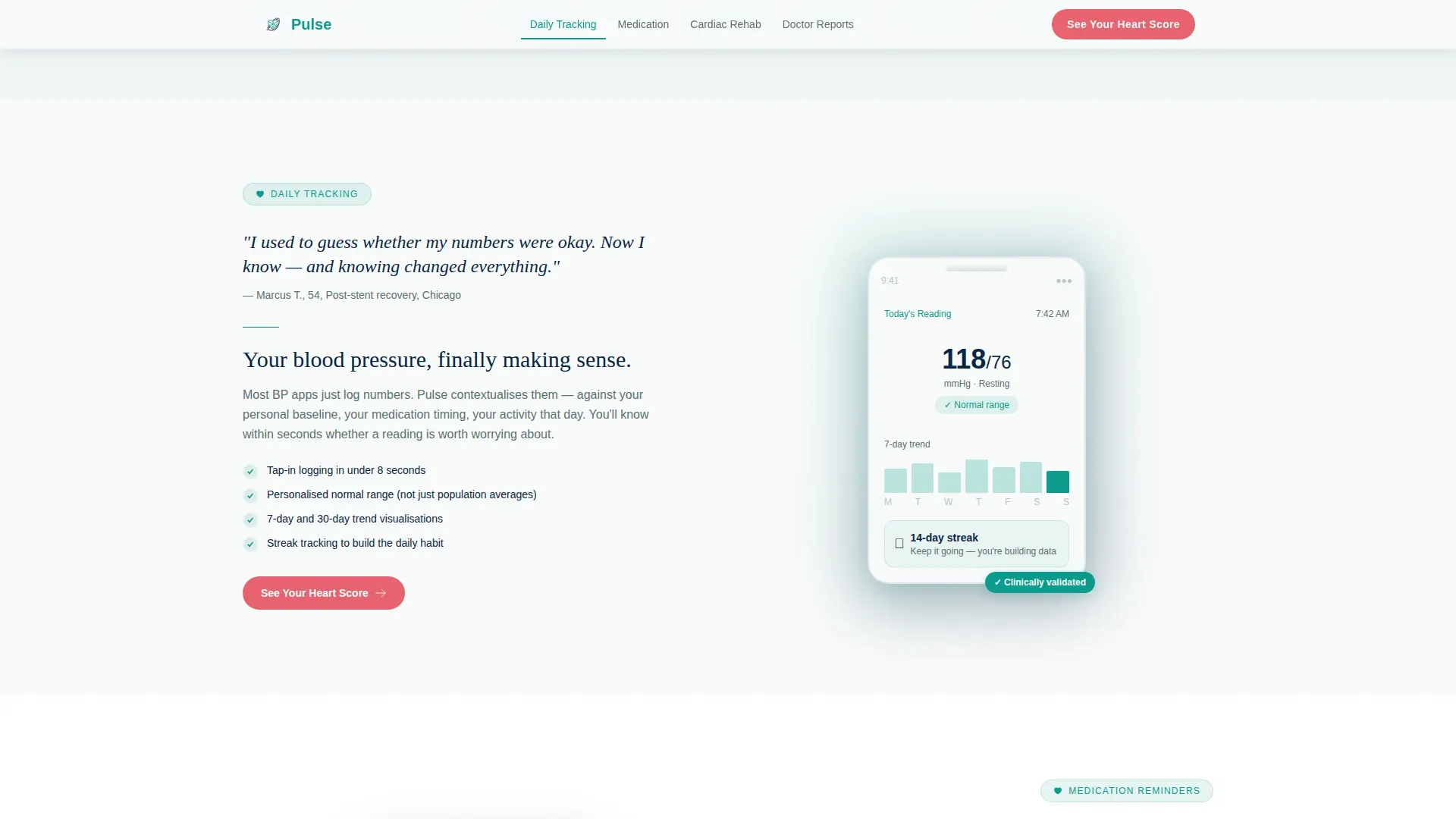
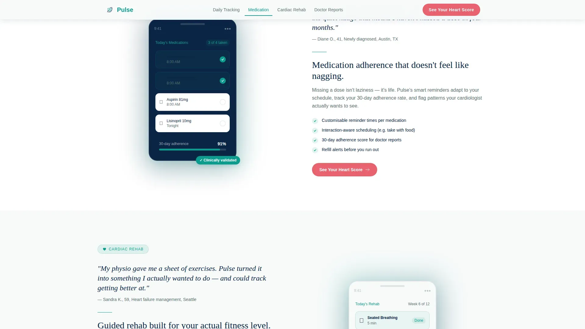
- Four anchor-nav feature spokes covering Daily Tracking, Medication Reminders, Cardiac Rehab, and Doctor Reports, each introduced by a patient quote in large italic serif
- A personalized Heart Score reveal screen with a recommended app pathway delivered before any account creation is required
Feature list
This landing page is built around a tightly connected set of components. Each one serves a specific role in the patient conversion journey.
Five-Step Heart Health Assessment Form
The header opens directly inside step one of the assessment. Oversized tap-friendly answer cards replace dropdowns, and a slim teal progress bar guides visitors through five questions. The form collects resting heart rate range, current medications via checkbox, weekly activity level, last cardiology visit date, and biggest daily challenge.
Personalized Heart Score Reveal
After completing the five-step form, visitors receive a personalized risk-awareness summary and a recommended app pathway. No account creation is required at this stage. The coral "See Your Heart Score" button appears on the form completion screen and as a persistent element in the anchor navigation bar.
Testimonial Mosaic with Patient Voices
Each feature spoke is introduced by a real patient quote displayed in large Fraunces italic serif. Quote cards alternate in size and overlap slightly, creating a wall-of-voices effect. Named testimonials include specific conditions and photo avatars, building social proof and clinical credibility at the same time.
Anchor Navigation with Four Feature Spokes
A persistent anchor navigation bar links directly to Daily Tracking, Medication Reminders, Cardiac Rehab, and Doctor Reports. Active states update as users scroll, keeping orientation clear on mobile. Each spoke section pairs a patient quote with a short educational explainer and a user interface screenshot of the feature in action.
Accordion FAQ Section
A clinical concerns accordion at the bottom of the page handles trust objections before they become exit reasons. It is designed for a non-technical audience managing real health questions and sits above a split footer with logo, tagline, and navigation links.
Page sections overview
| Section | Purpose |
|---|---|
| Assessment Form Header | Opens mid-conversation with five-step heart health quiz |
| Teal Progress Bar | Shows form completion across five steps |
| Testimonial Mosaic | Builds social proof with alternating patient quote cards |
| Daily Tracking Spoke | Explains blood pressure log feature with patient quote and screenshot |
| Medication Reminders Spoke | Shows medication adherence streak feature with patient context |
| Cardiac Rehab Spoke | Covers guided rehab exercise feature with patient voice and user interface |
| Doctor Reports Spoke | Highlights shareable report feature for clinical credibility |
| Heart Score Call to Action | Delivers personalized risk summary and recommended pathway |
| FAQ Accordion | Addresses clinical concerns and trust objections |
| Arc Split Footer | Logo and tagline left, navigation links right |
Design & branding system
The visual identity follows an Educational Guide theme with a Teal Catalyst color system. The palette feels like a modern cardiology suite, cool enough to inspire trust, warm enough to feel human.
- Clinical teal (#0D9B8C) dominates section backgrounds and progress indicators; deep cardiac navy (#0B2545) anchors all body text; oxygenated white (#F7FAFA) provides breathing room between content blocks
- Alert coral (#E8636F) appears exclusively on call-to-action buttons and risk-score highlights, so the eye moves only when the page needs it to
- Typography pairs DM Sans for body text and user interface elements with Fraunces italic serif reserved for patient quotes, reinforcing the distinction between clinical information and personal voice
Mobile & speed optimization
This template is built mobile-first, recognizing that post-stent office workers and retired patients are most likely arriving on a phone. Every interactive element is sized and spaced for thumb navigation.
- Oversized tap-friendly answer cards replace dropdowns throughout the assessment form, reducing input friction on small screens
- Scroll-activated reveals, step transition animations with blur and vertical movement, and SVG beam effects are implemented using client components only where interactivity is needed, keeping static sections lean
- The anchor navigation bar maintains active states as users scroll, so mobile visitors never lose their place across the four feature spokes
How this template helps you convert
The entire page is structured as a quiz and assessment funnel. Conversion happens in stages, not all at once.
- Visitors enter the page already inside the assessment form, which lowers resistance immediately. There is no hero image to scroll past and no manifesto to read. The first question, "How many days this week did you check your blood pressure?", feels like a conversation, not a form.
- The Heart Score reveal delivers personalized value before asking for anything in return. Seeing a risk-awareness summary and a recommended app pathway gives visitors a concrete reason to create an account, transforming a cold signup into a motivated next step.
- The testimonial mosaic and patient-voice spoke introductions build cumulative trust as users scroll. Each named quote with a specific condition makes the product feel real and vetted, which is the trust signal a cardiac patient needs before downloading a health app.
Other information about this template
This template is part of a Health and Medical category build, specifically designed for the heart disease digital therapy app niche. It uses the Hub and Spoke with anchor navigation template style and a Quiz and Assessment landing page direction.
- The template is localized for English-speaking audiences in the United States, using imperial measurements and 12-hour time format throughout
- Animation intensity is high, including step transitions with blur and vertical movement, scroll-activated reveals, SVG beam effects, and a marquee element for social proof continuity
- The footer follows an Arc Browser Split pattern with the logo and tagline on the left and navigation links on the right
- Interactivity includes a five-step form with full state management, an accordion FAQ, and an anchor navigation bar with active scroll states
Theme
Educational Guide
Creative direction
Testimonial Mosaic
Color system
Teal Catalyst
Style
Hub & Spoke (Anchor Nav)
Direction
Quiz/Assessment
Page Sections
Five-step Heart Health Assessment
Personalized Heart Score Reveal
Testimonial Mosaic Layout
Hub and Spoke Anchor Navigation
Accordion FAQ for Clinical Concerns
Related questions
Does the landing page require visitors to create an account upfront?
Who is the primary audience this landing page is designed to reach?
Can I customize the five assessment questions for my app?
What makes this landing page feel different from a standard health app page?
Is the template suitable for older or less technical users on mobile?



