Pulse — Trendy Açaí Bar Landing Page Template
Pulse is a full-width immersive landing page template built for açaí and tropical smoothie bars. It follows a Neo-Retro visual theme, a Citrus Burst color system, and an Origin Story scroll flow that takes visitors from the Amazon to the counter. An interactive bowl builder, close-up food photography, and a pickup order flow turn browsers into paying customers.
by Rocket studio
Quick summary
Pulse is a cinematic, single-page landing page template designed for açaí bars, smoothie counters, and tropical food businesses. It opens with a golden-hour lifestyle hero, unrolls an Amazon-to-bowl origin story as the visitor scrolls, then drops them into a close-up menu grid and a three-step interactive bowl builder. Every design decision, color, type, animation, and copy layout, is made to make the visitor hungry before they ever tap "Build Your Bowl."
Who this template is for
Pulse is built for food and beverage businesses that want their landing page to do the selling before the visitor even reaches the menu. It is the right fit when your product has a story worth telling and a visual identity strong enough to carry a full-viewport scroll experience.
- Açaí bar owners and tropical smoothie counter operators who want a high-impact online presence without hiring a full design team
- Food and beverage entrepreneurs launching a new concept and needing to attract post-surf locals, gym-goers, and remote workers from day one
- Established bar operators ready to move clients from Instagram curiosity to confirmed pickup orders through a structured, story-led page
What problem this template solves
Most food business landing pages look the same. A logo, a photo, a menu link, and a "Contact Us" form. That sameness makes it hard to build trust or excitement. Visitors check the page for thirty seconds, find nothing that earns their attention, and leave. Pulse addresses that issue directly by making the page itself an experience.
- It replaces a flat, static presence with a scroll-driven origin story that builds desire section by section, so by the time the menu appears, the visitor already wants the bowl
- It removes friction from ordering by combining a visual bowl builder, a pickup time selector, and a single phone number field into one seamless conversion flow
- It gives the bar a retro-cool visual personality that stands out from standard cafe designs, making the page shareable and the brand instantly recognizable
What you get with this template
Pulse delivers a complete, ready-to-customize landing page structure. Every section is pre-designed with placeholder photography slots, live color tokens, and animated scroll states. You are not starting from a blank canvas, you are starting from a finished composition that needs your content.
- A full-viewport hero section with a lifestyle photograph slot, a center-frame hand-lettered logotype layout, and a scroll-reveal navigation bar that stays hidden until the visitor moves down the page
- A five-stage Origin Story scroll sequence (Amazon, freeze, ship, blend, build) paired with botanical illustration placeholders and a typeface transition from serif to rounded sans as the story moves forward through time
- An interactive three-step bowl builder (base, toppings, drizzle) with a stacking bowl illustration that animates with each selection, a pickup time selector, and a single-field phone number form for text confirmation
Feature list
Pulse is not a generic food template with a coat of paint. Every feature listed here is directly grounded in the brief and present in the template structure.
Full-Viewport Cinematic Hero
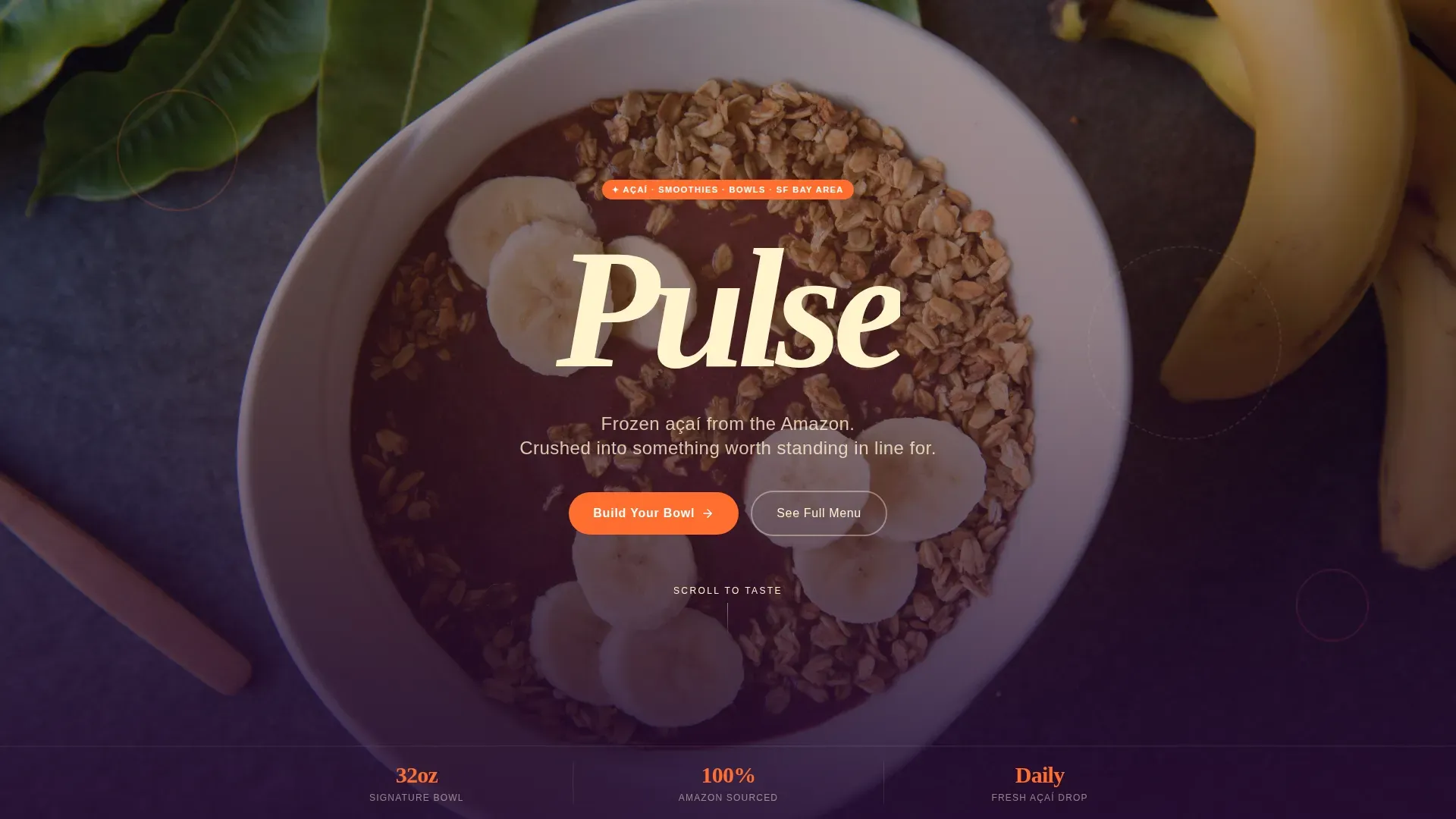
The hero section fills the entire screen with a warm, golden-hour lifestyle photograph of a loaded açaí bowl on a terrazzo countertop. The logotype sits center-frame. No navigation is visible until the visitor scrolls, which means the first thing they notice is the image and the mood, not a menu bar. This approach is common in high-converting food and beverage landing pages because it commands full attention before asking anything of the visitor.
Scroll-Linked Origin Story
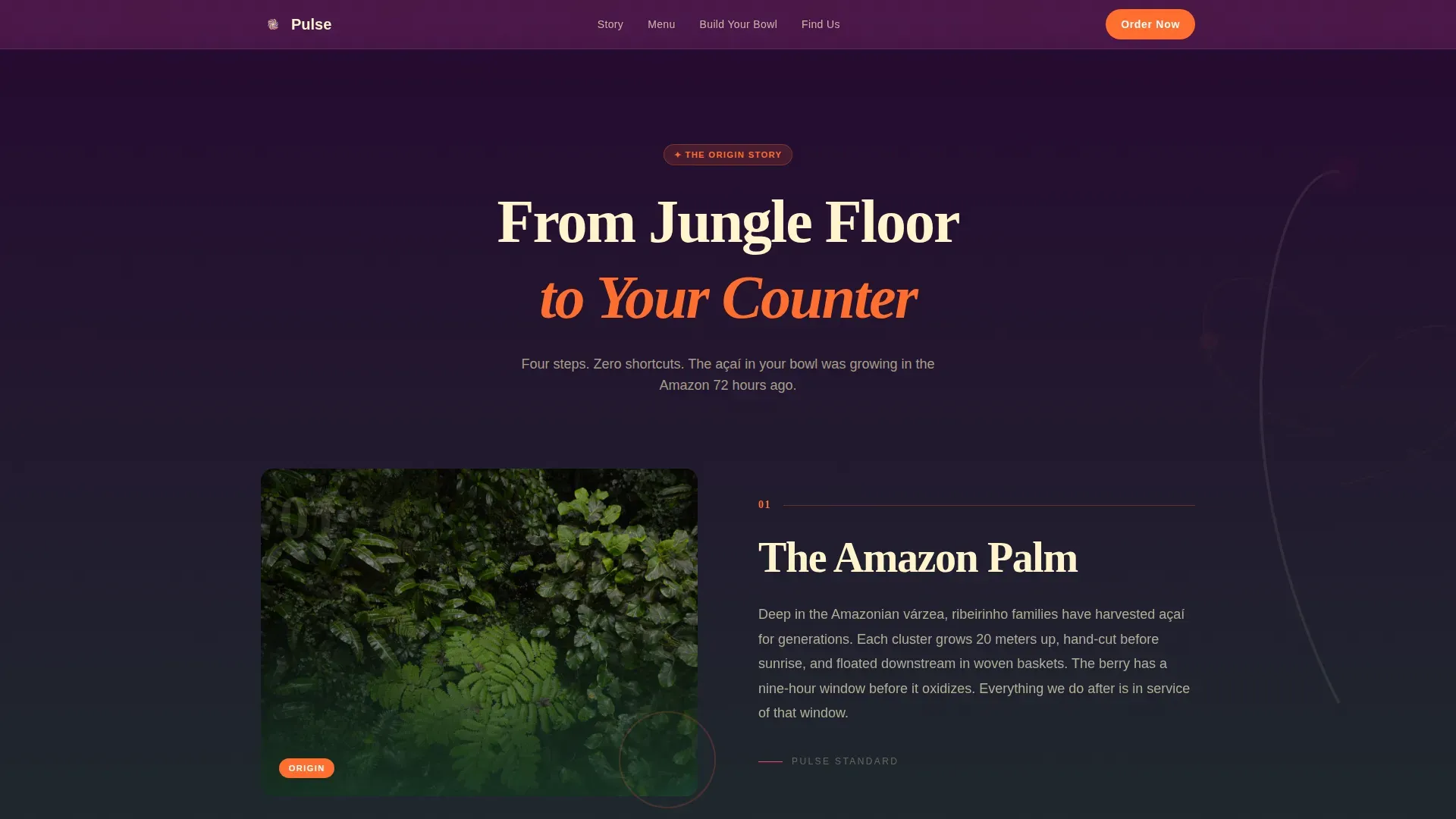
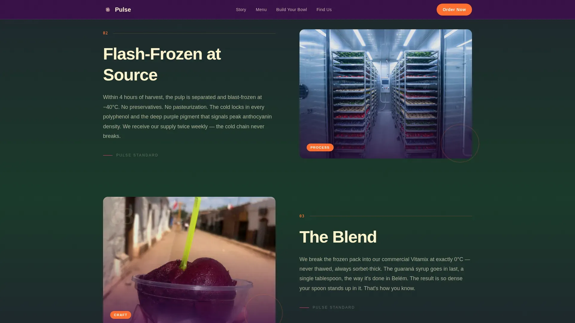
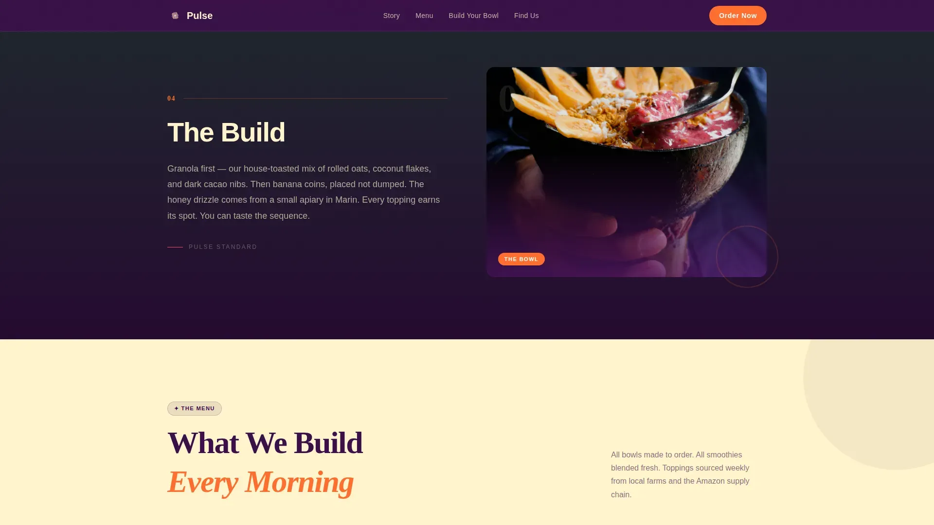
The template structures the scroll journey in five clear stages: the açaí palm in the Amazon, the freeze, the ship, the blend, and the build. Each stage has its own section layout, botanical illustration slot, and text panel. Typography shifts from a Fraunces serif for the jungle sections to a DM Sans rounded sans as the story reaches the bar counter. This development of visual language across the scroll makes the sourcing story feel earned rather than decorative, and it gives clients a way to express their values without writing a wall of text on the home section.
Close-Up Menu Grid with Photography
Once the visitor arrives at the bar inside the page, a full-bleed menu grid drops in. Photography slots are sized and composed for close-range bowl and smoothie shots, the kind of image where individual chia seeds are visible and granola texture reads on a phone screen. Each card carries a price callout in electric tangerine and supports a secondary label for discounts or limited-time items. The grid covers bowls, smoothies, juices, and snack bites in a clearly categorized layout.
Interactive Three-Step Bowl Builder
The bowl builder is the primary conversion engine of this landing page. Visitors tap through base, toppings, and drizzle in three steps. Each selection animates into a stacking bowl illustration that builds in real time. The builder uses a state machine interaction model, meaning each tap registers a visible change rather than a static form submission. Below the builder, a "See the Full Menu" anchor link provides a secondary path for visitors who want to browse before committing.
Pickup Order Flow with Phone Confirmation
After building their bowl, visitors choose a pickup time using a visual selector and enter a single phone number field for text confirmation. This low-friction checkout approach is designed for the mobile-first crowd, post-surf regulars and gym-goers who are placing an order from a parking lot or a beach path. The form is short by design. One field, one tap, one confirmation.
Social Proof Section with Testimonials
A dedicated section holds customer testimonials with names, star ratings, and specific bowl callouts. This kind of social proof is an important trust signal for first-time visitors who do not yet have a relationship with the bar. Studies show that reviews with specific product mentions outperform generic praise in terms of conversion influence. The section is positioned just above the order flow so that positive word of mouth is the last thing a visitor reads before they commit.
Page sections overview
| Section | Purpose |
|---|---|
| Hero Lifestyle Shot | Full-viewport cinematic photo, center logotype, scroll-reveal nav |
| Amazon Origin Stage | Açaí palm story, botanical illustration, serif typography |
| Freeze and Ship Stage | Cold chain sourcing narrative, transitional type style |
| Blend and Build Stage | Bar arrival narrative, typography shifts to rounded sans |
| Close-Up Menu Grid | Bowl, smoothie, juice, and snack photography with pricing |
| Bowl Builder | Three-step interactive selector with stacking animation |
| Social Proof Block | Customer testimonials, star ratings, named bowl reviews |
| Pickup Order Flow | Time selector, phone field, text confirmation call to action |
| Minimal Footer | Horizontal layout, essential links, location address |
Design & branding system
The visual identity of Pulse is built on the Citrus Burst color system, a palette that feels like a faded 1970s surf poster reprinted on holographic stock. The colors are pushed to the point where they almost vibrate, and that tension between nostalgia and intensity is the whole point. The Neo-Retro theme means nothing here is neutral, every surface has personality.
- Color tokens: deep açaí purple (#3B0F4A) as the primary background, electric tangerine (#FF6D2E) for call-to-action buttons and price callouts, sunbleached banana cream (#FFF4CC) for text panels and negative space, and bright guava pink (#FF3F6C) for hover states and accent badges
- Typography pairing: Fraunces serif for origin story headlines and display text, transitioning to DM Sans rounded sans for menu cards, builder interface labels, and body copy, a deliberate typographic development that mirrors the journey from jungle to counter
- Photographic art direction: warm, golden-hour, slightly overexposed imagery with intentional film grain; color grading that reads like a scan from a shoebox of old surf photographs; the visual language is consistent across every photography slot in the template
Mobile & speed optimization
The template is built mobile-first, which directly reflects the target audience. Post-surf locals and gym-goers place orders from phones. Remote workers checking the menu between tasks are usually on a tablet or laptop. The design adapts across all screen sizes without losing the immersive visual weight that makes the page work.
- The bowl builder, pickup selector, and phone confirmation form are all touch-optimized, with tap targets sized for comfortable one-handed use on standard smartphone screens
- Animations use GPU-accelerated transforms and Intersection Observer reveals, which means scroll-linked effects fire based on what is visible in the viewport rather than loading everything at once
- The full-width hero, menu grid, and origin story sections reflow cleanly for narrow screens, preserving the photography composition and color blocking at every breakpoint
How this template helps you convert
Pulse is designed around one clear idea: the origin story does the selling, so by the time the visitor reaches the call to action, they are already bought in. Every section is sequenced to move the visitor one step closer to placing an order without ever feeling like a sales page.
- The hero section captures full attention at load, eliminating distractions and setting the mood before the visitor processes a single word of copy, the photograph and logotype do the first round of persuasion while the navigation is still hidden
- The origin story builds trust through transparency, showing where the açaí comes from and how it gets to the bowl, which is a meaningful differentiator in a market where most bars say nothing about sourcing
- The bowl builder turns ordering into an experience rather than a transaction, visitors tap, watch the illustration build, choose their pickup time, and submit one phone number, completing the full conversion path in under two minutes
Other information about this template
Pulse is a practical starting point for food businesses that want to launch fast without starting from zero. Using a pre-built template like this one can significantly reduce the time it takes to get a page live. Templates save the cost of hiring a dedicated web designer or developer for the initial build, while still giving the business a professional result. The structure is fully customizable, you can update colors, swap photography, rewrite the origin story, and adjust prices without touching the underlying layout.
- No-code tools allow users to create and launch landing pages without needing to write code, and this template is built to be used inside that kind of environment, low-code platforms provide a way to build and publish with minimal hand-coding, making the whole process accessible to non-developers and solo operators alike
- The template includes a built-in location address block and a contact form area in the footer, which supports basic discoverability for local searches and gives walk-in clients a way to find the bar; the footer also supports a www link and social handles in a clean horizontal layout
- Retro design elements create a strong emotional connection with visitors and help the business stand out in a field where most competitors default to generic clean-white layouts; the retro-modern twist gives the bar an Instagram-worthy personality that encourages social sharing, which functions as free marketing for the business
- Targeted promotional features in the menu grid, including discount badges and limited-time callouts in electric tangerine, can generate urgency and encourage same-day in-store visits; these elements are easy to update week to week or season to season as offerings change
- The page structure supports seasonal updates, allowing the bar to highlight limited-time toppings, rotating smoothie specials from september through october, or event announcements without rebuilding the layout; this flexibility means the page stays relevant and fresh throughout the year, from the busy summer heat season through the slower autumn weeks
- The social proof section is positioned to address a common concern for new visitors: whether the bar is worth the detour; real customer reviews with specific bowl names and star ratings are more persuasive than any marketing write-up, and the template gives those reviews a prominent, well-designed home above the order flow
- The template is specifically built for the food and beverage sector, which means the section composition, image ratios, and call-to-action placement all reflect the way real food customers browse and book; it is not a generic business page with a food-themed color scheme applied on top
Theme
Neo-Retro
Creative direction
Origin Story
Color system
Citrus Burst
Style
Full-Width Immersive
Direction
Marketplace/Multi
Page Sections
Full-viewport Cinematic Hero Section
Scroll-linked Origin Story Flow
Interactive Three-step Bowl Builder
Close-up Menu Grid with Pricing Labels
Pickup Order Flow with Phone Confirmation
Social Proof Testimonial Section
Related questions
Can I customize the colors and fonts in Pulse?
Does the bowl builder work on mobile devices?
What sections can I remove or rearrange?
Is Pulse suitable for a new açaí bar with no existing photography?
Can I use Pulse to promote seasonal specials and limited-time offers?



