Telehealth Home Monitoring Landing Page Template
Pulse is a single-page telehealth home monitoring landing page built for caregivers, care coordinators, and rural physicians. It pairs a warm, kitchen-table visual identity with a seven-row comparison table and a scrolling testimonial mosaic. Every section earns the visitor's trust before delivering a clear, low-friction amber call to action that routes to an eligibility quiz.
by Rocket studio
Quick summary
Pulse is a click-through landing page template for telehealth home monitoring services. It opens with a warm half-page photo and text hero, leads into a seven-row comparison table with scroll-triggered testimonial quotes, and closes with a repeated amber call to action. The design is grounded, unhurried, and built specifically for emotionally driven caregiving decisions.
Who this template is for
This template is built for health tech brands and telehealth services that need to convert worried family members and medical professionals into qualified leads. It speaks directly to people who carry real responsibility for someone else's recovery.
- Adult children managing a parent's discharge after cardiac surgery
- Chronic care coordinators overseeing large patient panels
- Rural family physicians seeking specialist-level remote oversight
What problem this template solves
Post-discharge care is one of the most stressful moments in a family's life. Caregivers search online for reassurance, not brochures. This template addresses the emotional gap between clinical data and human trust, helping a telehealth service prove its value before asking for a commitment.
- Visitors leave without acting because nothing connects data to real human experience
- Traditional care comparison information is scattered and hard to evaluate quickly
- Decision-makers need both rational evidence and emotional proof before they click
What you get with this template
You get a fully structured, single-page layout ready to represent a telehealth home monitoring service. Every section is mapped to a specific conversion role, from awareness through to action.
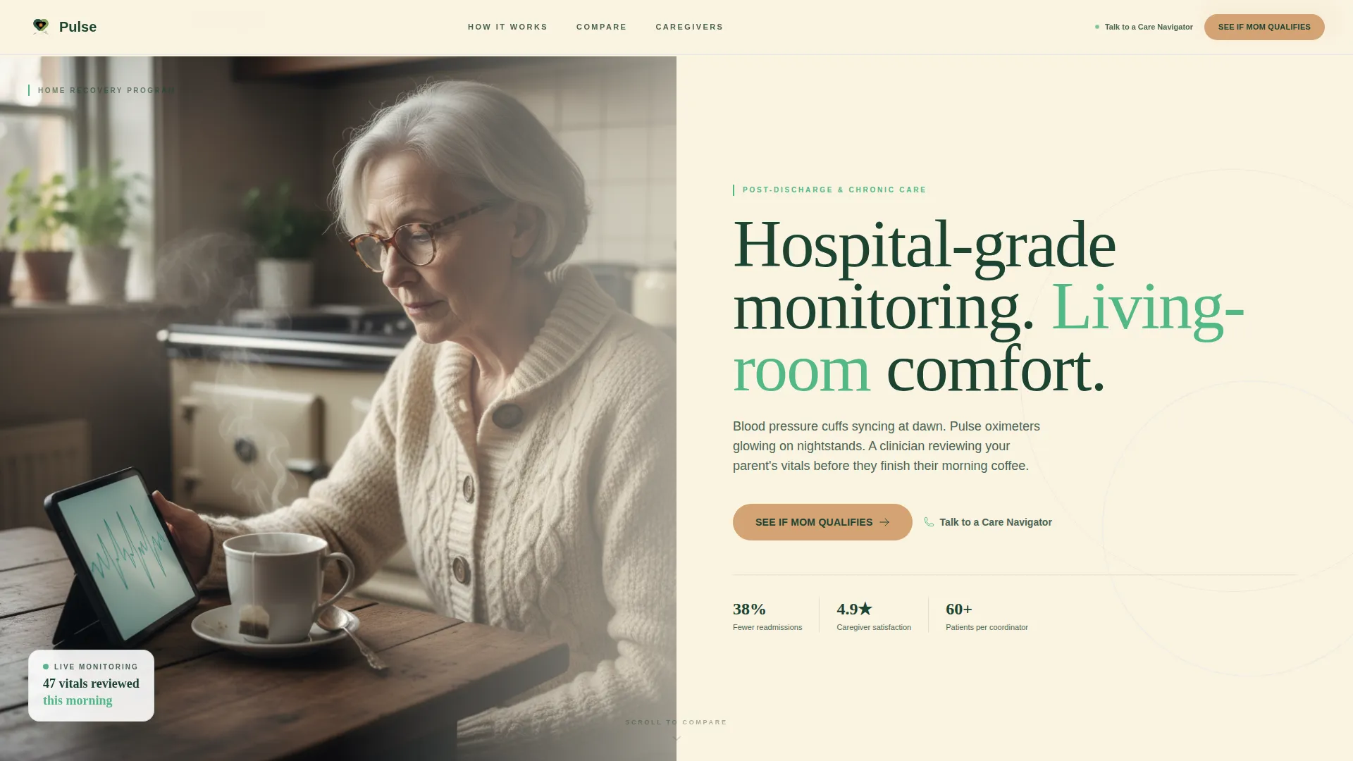
- A half-page hero section with a headline, subhead, and primary call to action button
- A seven-row comparison table with per-row sliding testimonial quotes
- A sticky call to action bar, a closing section, and a linear single-row footer
Feature list
This template ships with purpose-built components that serve the specific emotional and rational needs of caregiver-led health decisions.
Seven-Row Comparison Table
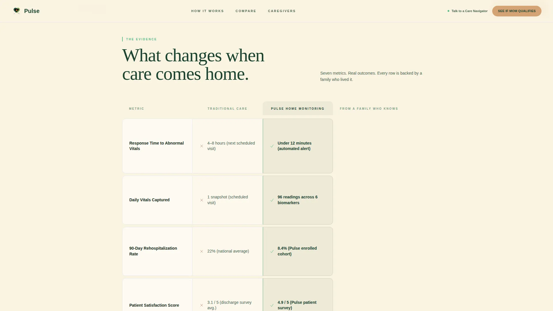
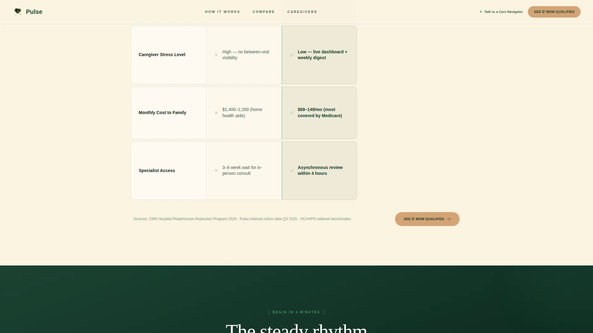
The table contrasts traditional post-discharge care against home monitoring across seven rows. Rows cover response time, daily vitals captured, rehospitalization rate, patient satisfaction, caregiver stress, monthly cost, and specialist access. Each row is a standalone trust unit.
Scroll-Triggered Testimonial Mosaic
As each comparison row enters the viewport, a caregiver or clinician quote slides in from the margin. The mosaic builds row by row, layering statistical proof on the left with personal, named human proof on the right.
Half-Page Photo and Text Hero
The hero splits the screen at kitchen-table level. A photograph of a patient in a cardigan with a monitoring tablet sits beside a headline in deep evergreen on birch cream, a fern-colored subhead, and a warm amber call to action button.
Sticky Call to Action Bar
After the visitor scrolls past the comparison table, a persistent amber bar appears at the top of the viewport. It keeps the primary action visible without interrupting the reading experience below.
Repeating Amber Call to Action Pattern
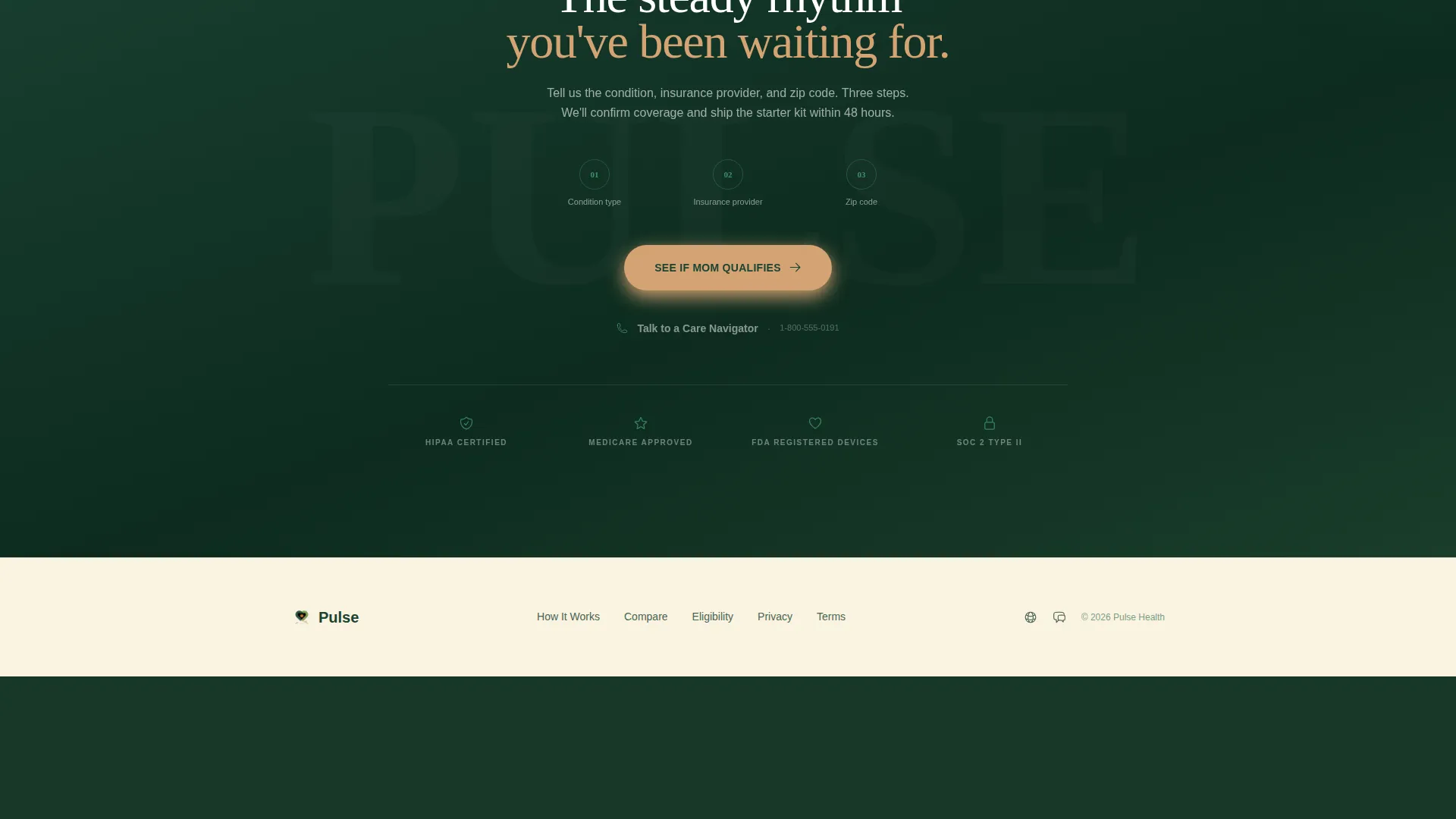
The primary call to action, "See If Mom Qualifies," appears in the hero, the sticky bar, and the closing section. The repetition removes friction by keeping the next step visible at every stage of the page.
Secondary Care Navigator Link
A text link reading "Talk to a Care Navigator" sits alongside the closing call to action. It offers a direct phone path for visitors who need a human conversation before they are ready to click through to the eligibility quiz.
Page sections overview
| Section | Purpose |
|---|---|
| Hero Split | Introduce the service with warmth and a clear primary call to action |
| Comparison Table | Show seven-row side-by-side evidence against traditional care |
| Testimonial Mosaic | Deliver named caregiver and clinician quotes per comparison row |
| Sticky call to action Bar | Keep primary action visible after the comparison table scrolls past |
| Closing call to action Section | Reinforce the decision with a final amber button and navigator link |
| Linear Footer | Provide a clean single-row footer with minimal distraction |
Design & branding system
The visual identity follows a Healing Space theme built on a Forest Trust color palette. The overall feeling is warm, grounded, and unhurried, with zero clinical sterility in sight.
- Deep evergreen (#1B4332) anchors headers and navigation; soft fern (#52B788) marks active states and progress indicators; birch cream (#FAF3E0) washes across all backgrounds
- Warm amber (#D4A373) is reserved exclusively for calls to action and interactive highlights, drawing the eye only when a decision is needed
- Typography pairs Fraunces, a serif with emotional weight, for headlines with DM Sans for clean, readable body text
Mobile & speed optimization
The template is built desktop-first to match how caregivers research on a laptop during evening hours. It is fully responsive so the experience holds on a phone or tablet without losing clarity.
- Scroll-triggered row reveals and quote slide-ins are handled by client-side components, keeping static sections lightweight
- The sticky call to action bar uses a smooth transition so it appears naturally without jarring the mobile reading flow
- The comparison table reflows cleanly on smaller screens so no data row is cut off or hidden
How this template helps you convert
This template is designed so that by the time a visitor reaches the closing call to action, the question has shifted from "should I?" to "how soon?" The layout earns the click before asking for it.
- The comparison table does the rational work, giving visitors seven clear, side-by-side reasons why home monitoring outperforms traditional post-discharge care.
- The testimonial mosaic does the emotional work, matching each data row with a named caregiver or clinician story that makes the evidence feel real and personal.
- The primary call to action routes to a three-step eligibility quiz asking condition type, insurance provider, and zip code, so the next step feels light and low-commitment.
Other information about this template
This template is suited to any telehealth home monitoring service targeting United States caregivers. It references English-language copy, USD pricing context, and United States geography including locations like Tulsa, Oklahoma and rural Texas.
- The eligibility quiz linked from the call to action covers condition type, insurance provider, and zip code in three progressive steps
- Animation complexity is set to medium: scroll-triggered row reveals, quote slide-ins from the page margin, and a sticky bar transition are all included in the template
- The template is scoped as a single landing page and does not include a multi-page site structure or any backend form processing on the page itself
Theme
Healing Space
Creative direction
Testimonial Mosaic
Color system
Forest Trust
Style
Comparison Table
Direction
Click-Through
Page Sections
Seven-row Comparison Table
Scroll-triggered Testimonial Mosaic
Half-page Photo and Text Hero
Sticky Call to Action Bar
Repeating Call to Action with Eligibility Quiz Link
Care Navigator Secondary Link
Related questions
Who is this landing page template designed for?
Does this template include a contact form?
What does the comparison table cover?
Can the colors and fonts be customized?
Is the template responsive for mobile visitors?



