Pulse - Wholesome Mealkit Landing Page Template
Pulse is a Neo-Retro heart-healthy meal kit landing page built on a masonry Gallery Walk layout. It uses a 12-tile photo mosaic header, flip-card meal galleries, a vintage postcard science wall, and a sticky call-to-action bar to move cardiac-conscious visitors toward a meal-picker checkout. The Desert Rose color system and Fraunces serif type give every section warm, trustworthy character.
by Rocket studio
Quick summary
Pulse is a single-page, click-through landing page template for a heart-healthy meal kit subscription. It opens with a 12-tile staggered photo mosaic, then guides visitors through curated "rooms", a flip-card meal gallery, a clinical science pinboard, and a member photo grid, before routing them to a separate meal-picker checkout flow via a prominent, repeated call-to-action button.
Who this template is for
This template is built for founders and marketers launching a cardiac-wellness meal kit or any heart-healthy food subscription brand. It suits teams who need emotional storytelling and clinical credibility on one page, without a long sign-up form.
- Cardiac wellness brands targeting post-stent patients and caregivers cooking for sodium-restricted loved ones
- Health-focused meal kit businesses serving home cooks in their forties who are making serious dietary changes
- Direct-to-consumer food subscription teams who want a warm, gallery-style page that routes visitors to a separate checkout flow
What problem this template solves
Selling a heart-healthy subscription box is not like selling a generic meal kit. Visitors carry real medical histories and real anxiety about food choices. A plain product page cannot hold that weight. This template solves the trust gap between a health claim and an actual purchase.
- Most food landing pages lead with price; this one leads with the food itself, letting sodium counts and omega-3 badges do the convincing before a button ever appears
- Cardiac-adjacent audiences need cardiologist credibility and peer proof, not just lifestyle photography; the Science Wall and Member Kitchens sections deliver both
- A single sticky call-to-action bar keeps the path to checkout visible without interrupting the editorial browsing experience
What you get with this template
You get a fully structured, single-page landing page template with every section laid out and ready to customize. The design direction, color tokens, and typography choices are already set to reflect the Neo-Retro aesthetic described in the brief.
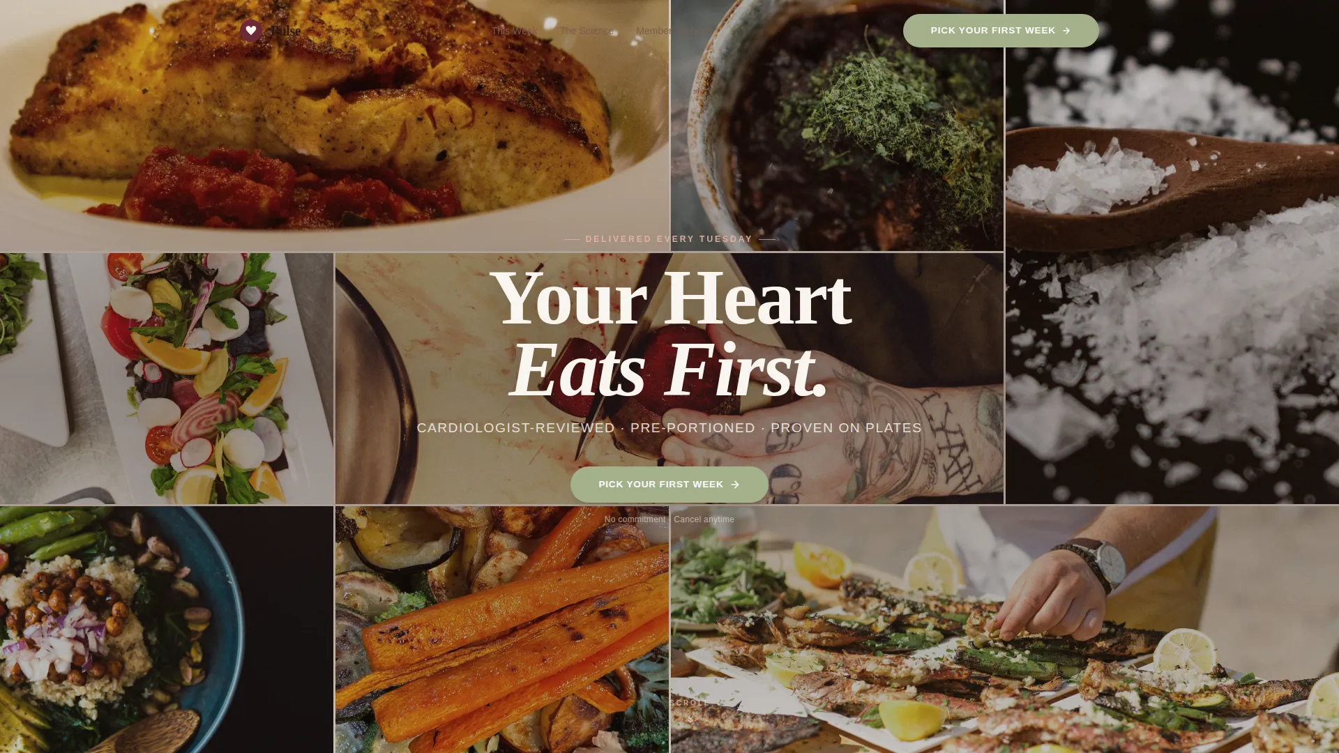
- A 12-tile Photo Grid Mosaic hero with staggered fade animation and a centered headline overlay
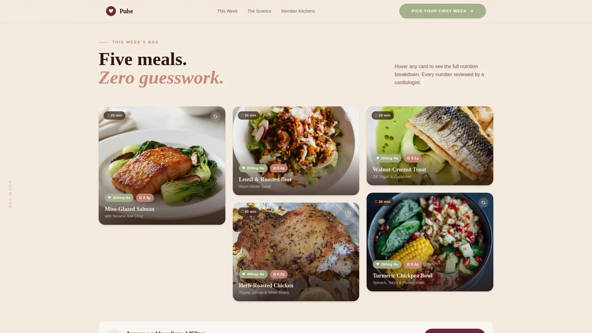
- Five masonry flip-cards for meal display, each revealing macros, sodium milligrams, and omega-3 content on the reverse
- A sticky bottom call-to-action bar that activates after the second scroll room, plus a "How It Works" asymmetric three-step layout and a warm linen footer
Feature list
A brief description of each built-in capability follows below.
12-Tile Staggered Mosaic Header
The hero fills the full viewport with twelve unevenly sized, tightly cropped ingredient and plated-meal photographs. Tiles load with a staggered fade sequence, building a living tapestry of color and texture. The headline "Your Heart Eats First" appears centered over the mosaic in a warm cream knockout once the animation completes.
Masonry Flip-Card Meal Gallery
The "This Week's Box" section presents five meals as masonry-grid cards. Each card flips on interaction to reveal the meal's macro breakdown, sodium count in milligrams, omega-3 content, and a small heart-rate icon badge. This lets the food itself make the nutritional case before the visitor reaches any call-to-action button.
Vintage Postcard Science Wall
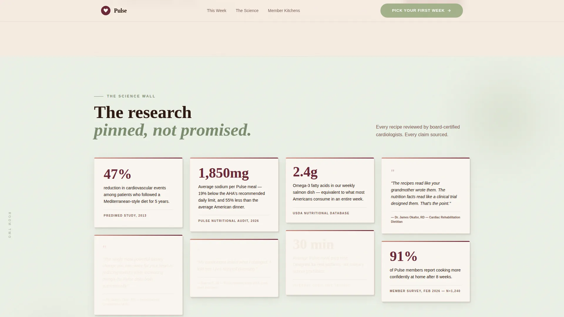
The Science Wall section styles clinical statistics and cardiologist quotes as pinned vintage postcards on a soft background. This format gives medical credibility a warm, readable format rather than a clinical chart, making the data feel approachable for an anxious cardiac audience.
Member Kitchens Photo Grid
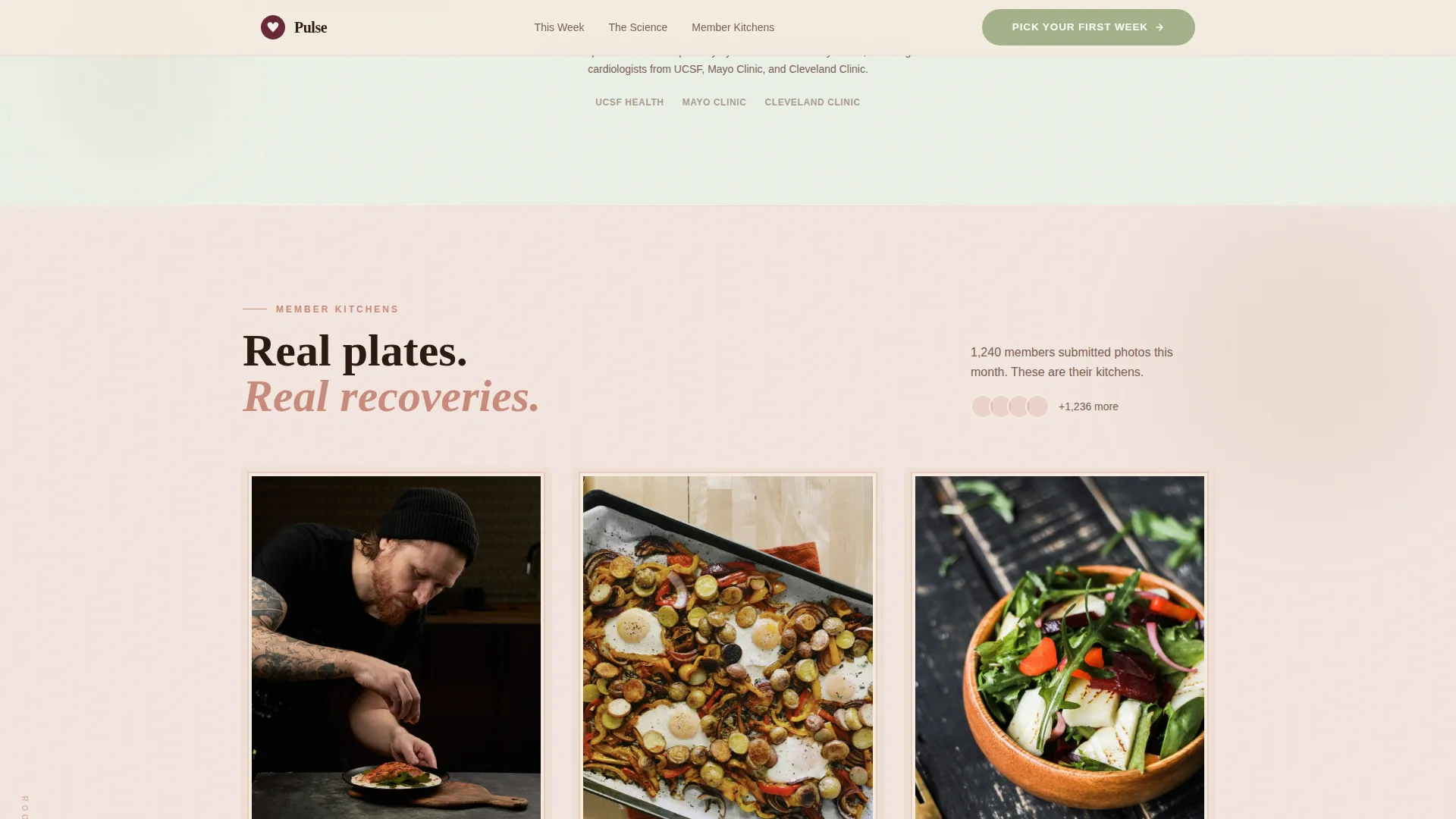
User-submitted meal photos appear in a mismatched-frame grid that feels like a curated community bulletin board. Each frame carries a short member testimonial alongside the image, providing peer social proof in a visually distinctive, editorial format.
Scroll Room Background Transitions
Each major section shifts background tone as the visitor scrolls: linen transitions to sage, then sage transitions to terracotta. These room-to-room color shifts create a Gallery Walk feeling, making each stop feel intentional and the overall page feel like a curated exhibition rather than a standard scroll.
Sticky Call-to-Action Bar
After the visitor passes the second scroll room, a sticky bottom bar appears carrying the primary call-to-action button "Pick Your First Week." It remains visible through the rest of the page without blocking content, keeping the path to the meal-picker interface accessible at any point.
Page sections overview
| Section | Purpose |
|---|---|
| Hero Mosaic Header | Introduces brand with a 12-tile staggered photo grid and headline overlay |
| This Week's Box | Displays five meals as masonry flip-cards with nutritional data on reverse |
| The Science Wall | Presents clinical stats and cardiologist quotes styled as vintage postcards |
| Member Kitchens Grid | Shows user-submitted photos in mismatched frames with short testimonials |
| How It Works | Walks visitors through the subscription process in an asymmetric three-step layout |
| Page Footer | Closes the page with a warm linen single-row linear footer |
Design & branding system
The visual identity follows a Neo-Retro direction. Every color, typeface, and animation choice draws from a 1970s cookbook aesthetic, but the underlying structure is built for modern screens and a health-literate audience.
- Desert Rose color system: sun-faded terracotta (#C98A7A) for hero warmth, warm linen (#F5EBE0) as the primary background tone, deep pomegranate seed (#6B2737) for bold typographic moments, and dusty sage (#A3B18A) reserved exclusively for buttons and nutritional callouts
- Typography pairing: Fraunces serif for all headlines and section titles, DM Sans for body text, labels, and interface elements, creating an analog-feeling headline voice with a clean, readable body rhythm
- Micro-interactions and animations run at a high intensity level, including staggered tile loads, card flip transitions, hover reveals on meal cards, and scroll-triggered background room shifts
Mobile & speed optimization
This template is built desktop-first, with a strong mobile adaptation layer suited to the primary audience. Adults in their forties and older regularly switch between desktop research and mobile browsing, so the layout accounts for both contexts.
- The masonry grid and flip-card gallery adapt to narrower viewports, preserving the Gallery Walk feel without losing nutritional label readability on smaller screens
- Static content sections use server-side rendering patterns, while animation-heavy client components handle the staggered loads, card flips, and sticky bar behavior separately to keep initial page load lean
How this template helps you convert
The page is designed as a click-through warming funnel. There is no form on this page. Every design decision is oriented toward earning trust through content before asking for any commitment.
- The mosaic header and flip-card meals present the food visually and nutritionally first, so visitors feel informed rather than sold to, lowering the emotional barrier to clicking through
- The Science Wall and Member Kitchens sections stack cardiologist credibility and peer social proof in sequence, addressing the two most common trust objections for a cardiac-audience subscription before the sticky call-to-action bar becomes prominent
Other information about this template
This template is suitable for teams building in modern front-end environments. The animation architecture separates static and interactive components for maintainability.
- Template style: Masonry/Pinterest layout with Gallery Walk creative direction
- Header concept: Photo Grid Mosaic with staggered tile fade animation
- Landing page direction: Click-through, routing visitors to an external meal-picker interface rather than capturing a form submission on-page
- Color system label: Desert Rose
- Localization context in the brief: United States market, USD pricing, imperial measurements, and American food culture references
- The brief specifies a desktop-first build priority with meaningful mobile adaptation for a 40-plus demographic that uses both device types actively
Theme
Neo-Retro
Creative direction
Gallery Walk
Color system
Desert Rose
Style
Masonry/Pinterest
Direction
Click-Through
Page Sections
Tile Staggered Mosaic Hero
Masonry Flip-card Meal Gallery
Vintage Postcard Science Wall
Member Kitchens Community Grid
Scroll Room Background Transitions
Sticky Call-to-action Bottom Bar
Related questions
Does this template include a sign-up form or checkout flow?
Can I update the meal cards with my own recipes and nutritional data?
How many call-to-action placements does this template include?
What fonts does this template use?
Is this template suited for a general meal kit brand, not focused on cardiac health?