Manufacturing Processes Professional Website Template
Pultrude is a dark, technical landing page template built for pultrusion equipment manufacturers. It opens with a count-up stats wall, moves through a zigzag pain-point audit, and closes with a side-by-side comparison table and a lead capture form. The design uses a Carbon Fiber color system to match the precision and weight of the industry it serves.
by Rocket studio
Quick summary
Pultrude is a single-page landing page template designed for pultrusion equipment manufacturers selling into the composite materials industry. It leads with four massive performance figures, walks visitors through a structured plant-floor audit, and converts them with a comparison table and a dual-path call to action. The design is dark, layered, and technically precise.
Who this template is for
This template is built for industrial B2B companies that manufacture pultrusion equipment and need to generate qualified leads from highly technical buyers. It speaks directly to engineers and operations leaders who evaluate purchases with data, not marketing language.
- Composite engineers at aerospace tier-two suppliers comparing line upgrades
- Plant managers at electrical insulator factories reviewing current throughput
- Process directors at wind-blade manufacturers losing margin on slow pull speeds
What problem this template solves
Most equipment landing pages bury the specs and lead with generic claims. Technical buyers stop reading immediately. This template flips that approach by putting the numbers front and center and letting the audit structure do the persuasion work.
- Visitors leave before they see a comparison because the value case takes too long to build
- Engineers cannot champion a purchase internally without a spec sheet or clear data to reference
- Generic layouts fail to reflect the precision and rigor that composite industry buyers expect
What you get with this template
You get a complete, conversion-focused landing page layout built around the actual buying logic of composite engineers and plant managers. Every section has a defined job, and the layout moves visitors efficiently from curiosity to qualified inquiry.
- A full-page zigzag audit structure covering resin bath, die heating, pulling mechanism, and cut-off accuracy
- A side-by-side versus table with competitor specs in graphite gray and your specs in signal yellow
- A dual-path conversion section with a detailed lead capture form and a gated spec sheet download
Feature list
Count-Up Stats Wall Header
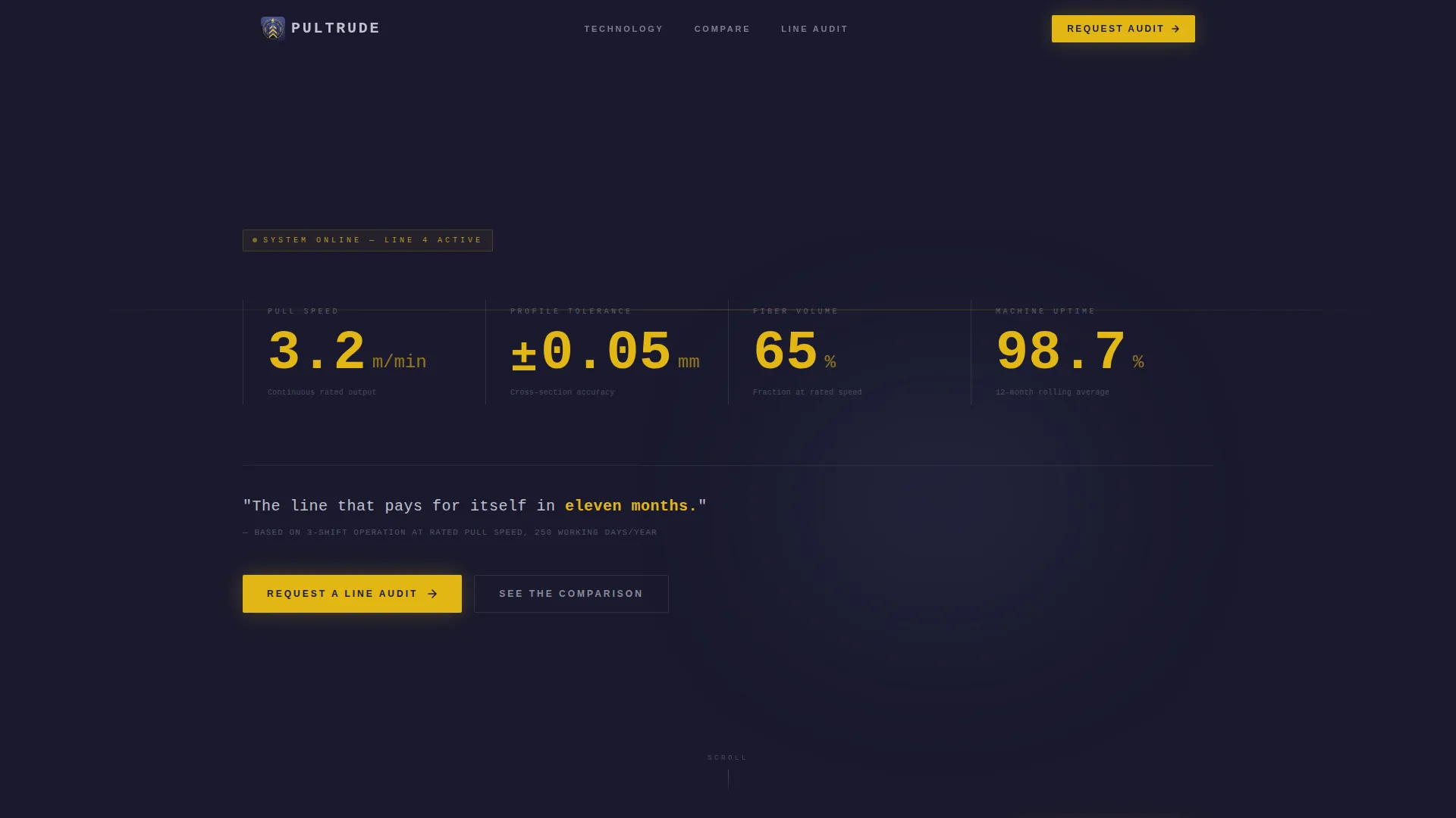
The page opens with four massive performance figures displayed against filament black: pull speed, profile tolerance, fiber volume fraction, and machine uptime. Each number counts up on load like a CNC readout zeroing in on its target value. A single tagline in machined-aluminum type runs below them.
Zigzag Pain-Point Audit Sections
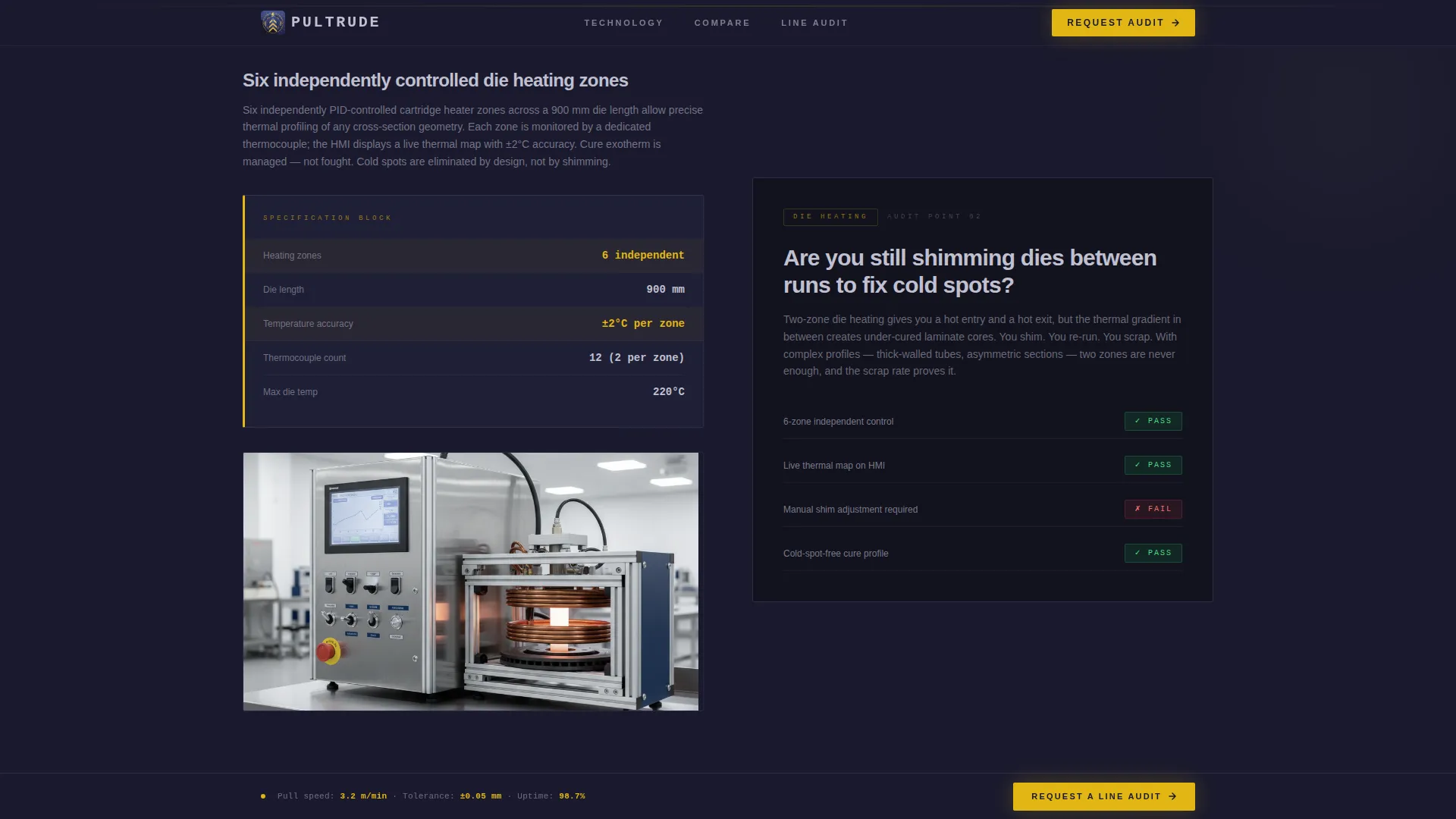
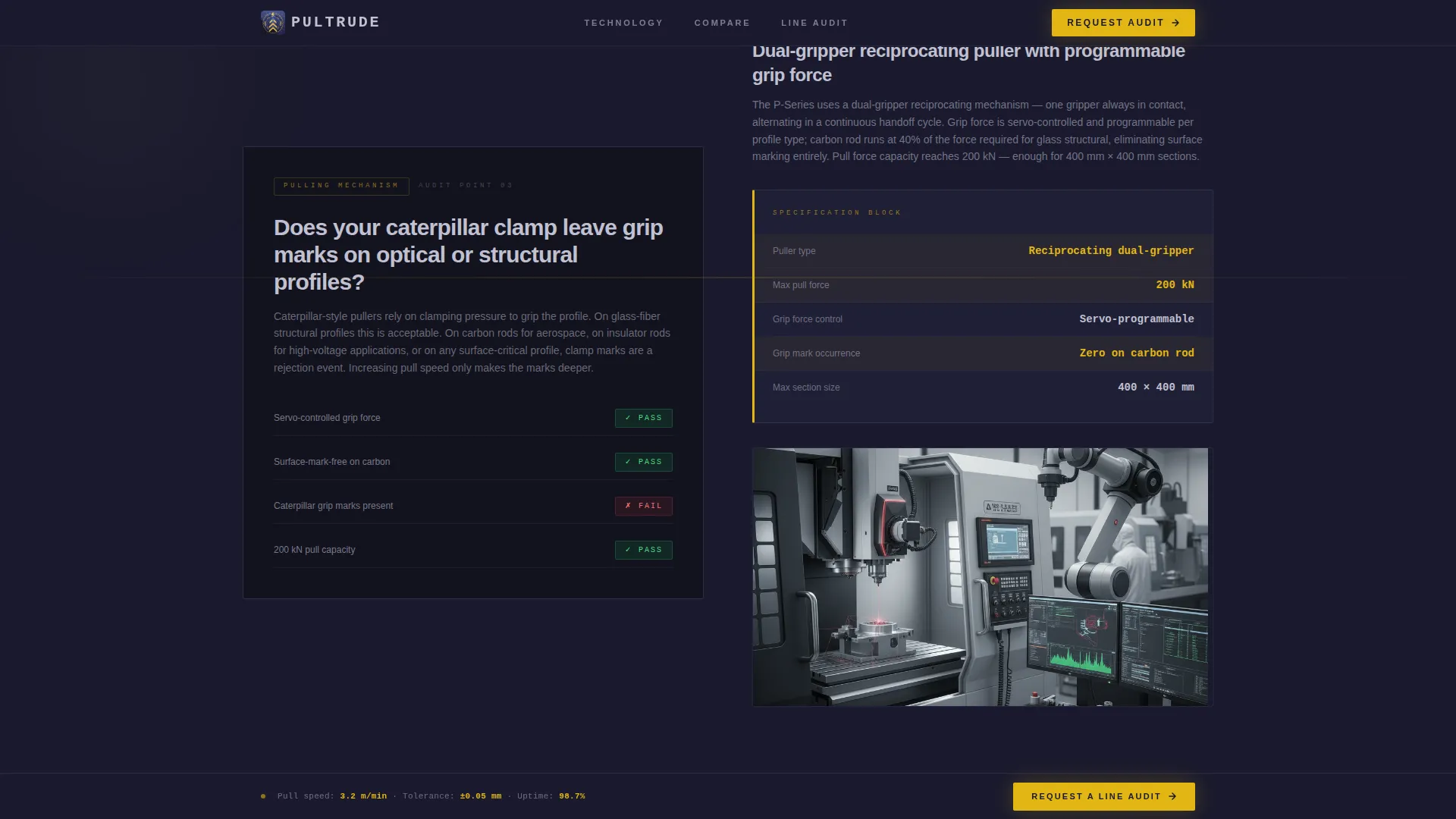
Four alternating sections each pose a real plant-floor pain point on one side and answer it on the other with a specification block, comparison table, or pass/fail audit graphic. The scroll rhythm feels like a pre-purchase technical walkthrough rather than a sales pitch.
Side-by-Side Versus Table
A dedicated comparison table drops in at the midpoint of the page. Competitor line specs appear in graphite gray. Pultrude specs appear in signal yellow. The gap between them becomes impossible to ignore without any explanatory copy required.
Dual-Path Lead Capture Section
The primary call to action is a detailed form requesting company name, current profile type, monthly output volume, and biggest bottleneck via multi-select. A secondary path offers a spec sheet PDF download gated behind email only, giving engineers a low-commitment entry point.
Sticky Bottom Call-to-Action Bar
A persistent bar at the bottom of the viewport repeats the primary call to action throughout the scroll. Visitors can trigger the lead form at any point without scrolling back to the conversion section.
Social Proof Block
A client logo row and a testimonial from a process director with a measurable outcome appear between the versus table and the conversion form. This section builds trust at the exact moment a buyer is deciding whether to request a line audit.
Page sections overview
| Section | Purpose |
|---|---|
| Stats Metrics Wall | Opens with four count-up performance figures and a single tagline |
| Resin Bath Audit | Zigzag section addressing resin bath design pain points |
| Die Heating Zones | Zigzag section covering die heating accuracy and consistency |
| Pulling Mechanism Review | Zigzag section comparing pulling mechanism types and performance |
| Cut-Off Accuracy Check | Zigzag section detailing profile cut-off precision specs |
| Versus Comparison Table | Side-by-side spec comparison in graphite gray and signal yellow |
| Social Proof Block | Client logos and a measurable process director testimonial |
| Line Audit Form | Primary lead capture with bottleneck multi-select and dropdown |
| Spec Sheet Gate | Secondary email-gated download path for engineering review |
| Minimal Footer | GitHub Developer Minimal pattern with essential navigation links |
Design & branding system
The visual identity follows a Corporate Precision theme built on a Carbon Fiber color system. The palette feels like peeling back the peel ply on a cured laminate: dark, technical, and layered, with one sharp accent reserved for the data that matters most.
- Deep filament black (#1A1A2E) as the primary background, woven graphite (#3D3D5C) for mid-tones, and machined aluminum (#C0C0D0) for body type
- Signal yellow (#E2B714) used exclusively for calls to action, specification callouts, and the interactive comparison toggle
- Plus Jakarta Sans for interface text and JetBrains Mono for all specification numbers, reinforcing the CNC-readout aesthetic
Mobile & speed optimization
The template is designed desktop-first to match how composite engineers and process directors evaluate equipment purchases, typically on workstations during plant-floor reviews. Full mobile support is included for decision-makers reviewing on the go.
- GSAP scroll-reveal animations and count-up number sequences are built for desktop performance first
- Interactive elements including the comparison toggle, multi-select form, and spec sheet gate are client-side components
- Static content sections use server component architecture to keep the initial load clean and fast
How this template helps you convert
The page is structured as a Comparison/Versus conversion funnel. Every section builds the case incrementally so that by the time a visitor reaches the call to action, the decision feels like a logical conclusion rather than a sales ask.
- The stats wall qualifies interest immediately by leading with real performance numbers before any paragraph copy, filtering out unqualified visitors in the first three seconds.
- The zigzag audit format turns familiar plant-floor pain points into a structured case for upgrade, making the visitor feel understood before they see the comparison table.
- The dual-path conversion section serves both buyer stages: decision-makers ready to request a line audit and engineers who need a spec sheet before they can champion the purchase internally.
Other information about this template
This template is part of a Manufacturing and Industrial category focused on the Manufacturing Processes subcategory, with a niche match to pultrusion equipment manufacturing. It is built for English-language markets using dual Imperial and Metric unit display, which is standard in the composite materials industry.
- The template supports both USD pricing context and technical specification display in composite industry standard units
- Animation intensity is high, with GSAP powering the count-up header, scroll reveals, and sticky call-to-action bar behavior
- The intersection match score for this template's niche, theme, and conversion direction combination is 13 out of a possible range, reflecting a highly specific and well-aligned use case
- The footer follows a minimal developer-style pattern suited to technical B2B audiences who do not need decorative footer sections

Theme
Corporate Precision
Creative direction
Checklist & Audit
Color system
Carbon Fiber
Style
Zigzag/Alternating
Direction
Comparison/Versus
Page Sections
Count-up Stats Wall Header
Zigzag Pain-point Audit Layout
Side-by-side Versus Table
Dual-path Lead Capture Form
Sticky Call-to-action Bar
Social Proof Block
Related questions
Who is this landing page template designed for?
Can I customize the stats wall numbers and specification blocks?
What does the dual-path conversion section include?
Is this template suitable for desktop-heavy audiences?
How does the versus table work visually?