Hobby & Passion Supplies Professional Website Template
Punchline is a bold masonry-grid landing page built for a stand-up comedy supply store. It targets working comics, improv troupes, and road performers who are ready to upgrade their gear. The before-and-after card layout, price-anchored header, and upsell drawer work together to turn browsing into confident buying decisions.
by Rocket studio
Quick summary
Punchline is a single-page storefront template designed for comedy gear retailers. It uses a masonry card grid with hover-reveal animations to guide visitors from entry-level equipment toward curated pro bundles. The price-anchored header and sticky build bar make the upgrade path feel clear, affordable, and earned.
Who this template is for
This template is built for retailers who sell to performers at a specific turning point: the move from hobby to professional. It speaks directly to buyers who already own basic gear and are ready to spend on something better.
- Stand-up comedy supply stores and specialty gear shops serving working comics
- Retailers targeting improv troupes, touring headliners, and festival performers
- E-commerce brands that sell equipment bundles and want to encourage higher-order values
What problem this template solves
Most gear pages treat every visitor the same. They show a flat product grid with no story, no upgrade logic, and no emotional payoff. Comics who are ready to invest in better equipment land on those pages and leave without buying.
- No clear upgrade path from starter gear to pro-grade bundles
- Price tags feel arbitrary without context showing what the gear unlocks
- Generic layouts fail to build the trust a first-time big-purchase buyer needs
What you get with this template
You get a fully structured, single-page layout that doubles as a storytelling engine and a shopping tool. Every visual and interaction element works toward one goal: helping the visitor see the gap between where they are and where they want to perform.
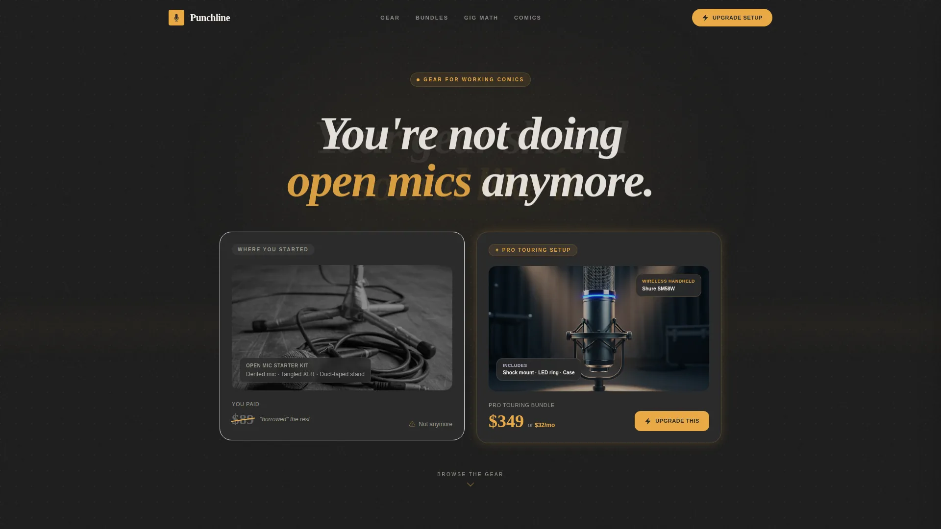
- A price-anchored split header showing a crossed-out starter kit beside a pro touring bundle
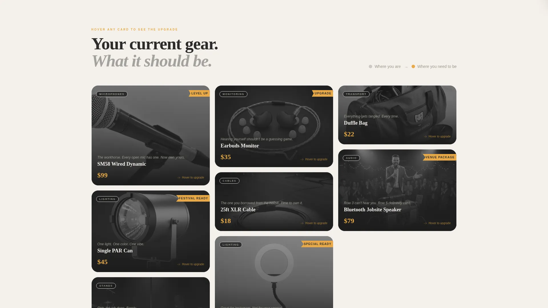
- A masonry grid with hover-reveal before-and-after card flips and a "Level Up" ribbon system
- A sticky bottom bar that tracks selections and displays a running total with a "Build Your Rider" call to action
Feature list
A paragraph introducing the feature set: each feature below reflects a specific design or layout decision baked into the Punchline template, grounded in the prompt brief and built to serve comedy gear retail.
Price-Anchored Split Header
The header uses a two-panel composition. The left side shows a dented starter kit with a crossed-out price. The right side shows a gleaming pro touring bundle at a clear price with a per-month financing callout. A single animated headline fades in between them.
Masonry Grid with Hover-Reveal Cards
The grid follows a Pinterest-style masonry layout. Each card flips or slides on hover to reveal the upgrade version of that product, paired with a "Level Up" ribbon. Cards grow physically larger as the visitor scrolls deeper into bundle and venue-package territory.
Upsell Drawer with "Add the Difference"
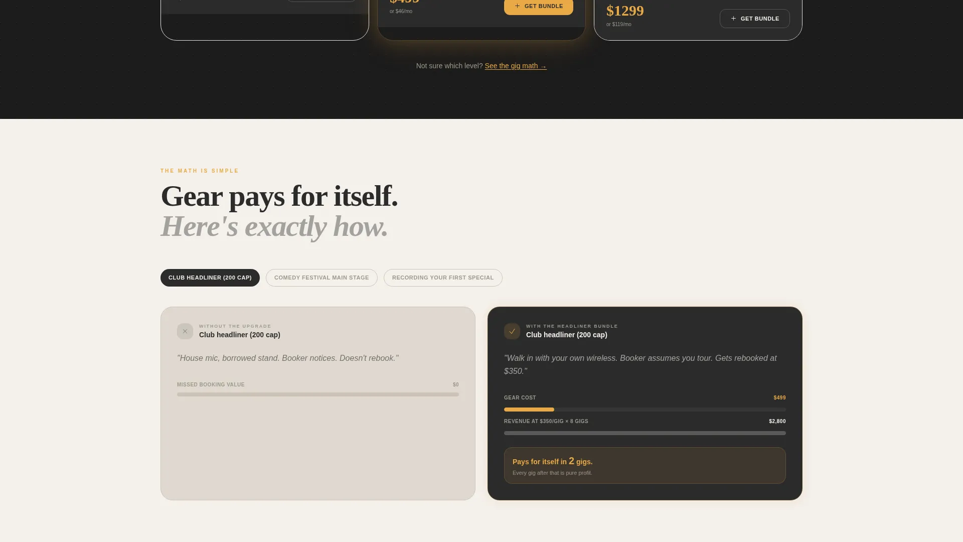
Every bundle card carries an "Upgrade This Setup" button. Clicking it opens a sliding drawer that compares what is included in the bundle against what the visitor likely already owns. A one-click "Add the Difference" option reduces friction at the moment of decision.
Sticky Build Bar with Running Total
A persistent bottom bar tracks every item the visitor selects. It displays a live running total and a secondary call to action labeled "Build Your Rider." This keeps the purchase intent visible throughout the entire scroll journey.
Narrative Scroll Progression
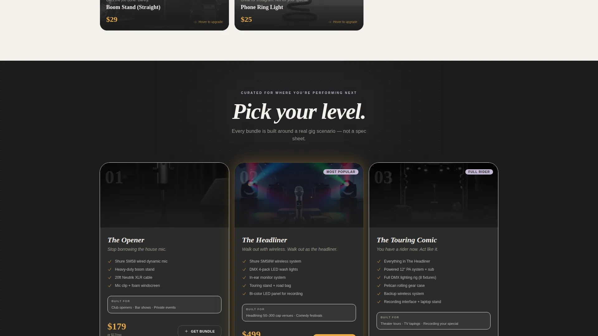
The page is structured so entry-level singles appear first, curated bundles appear mid-scroll, and full venue packages anchor the bottom. The layout physically grows larger with each tier, reinforcing the aspirational arc without a single word of explanation.
Stage-Lit Card Design System
Every card uses the charcoal background, amber price tags, and lavender bundle badges from the Cloud Canvas color system. The result feels like a product display inside a working comedy club, not a generic retail grid.
Page sections overview
| Section | Purpose |
|---|---|
| Price-Anchored Header | Shows the before-and-after contrast between starter and pro gear instantly |
| Aspirational Headline Block | Delivers the single fade-in message that frames the visitor's mindset |
| Entry-Level Grid Row | Introduces affordable singles and hooks visitors who are comparison shopping |
| Mid-Tier Bundle Row | Presents curated packages with hover-reveal upgrade cards and Level Up ribbons |
| Upsell Drawer Panel | Opens on card click to compare current gear against bundle contents |
| Venue Package Row | Anchors the page with full-room setups for headliners and festival buyers |
| Sticky Bottom Bar | Tracks selections and shows a running total throughout the scroll |
Design & branding system
The visual identity follows the Cloud Canvas color system, which pairs soft neutrals with warm amber and chalky lavender accents. The overall feel is a comedy club captured at 6 PM before the crowd arrives: house lights half-up, curtains still, everything charged with quiet potential.
- Soft stage-smoke white (#F4F0EB) for gutters and page margins, matte curtain charcoal (#2B2B2B) for card backgrounds
- Dusty spotlight amber (#E8A946) for price tags and primary call-to-action buttons, chalky lavender (#C4B7D4) for bundle badges and upgrade category pills
- Flat stage lighting on product photography with no hero image blur and no gradients, keeping product detail sharp and honest
Mobile & speed optimization
The masonry grid and hover interactions are designed to translate clearly to smaller screens. The sticky bottom bar remains functional on mobile, so visitors can track their build without losing their place in the grid.
- Cards reflow into a single-column or two-column masonry stack on narrower viewports
- The sliding upsell drawer opens as a full-screen panel on mobile for easier reading and tapping
- The sticky "Build Your Rider" bar stays anchored at the bottom of the viewport throughout the scroll on all screen sizes
How this template helps you convert
Every layout decision in Punchline is pointed at one outcome: turning a browsing comic into a buyer who feels confident about spending more than they planned to.
- The price-anchored header establishes the before-and-after value gap in the first three seconds, so visitors immediately understand the stakes of upgrading.
- The hover-reveal card system makes the upgrade path feel personal and earned rather than pushed, reducing the resistance that typically kills upsell attempts.
- The sticky build bar and "Add the Difference" drawer remove the friction of calculating costs manually, keeping the visitor in a decision-making mindset rather than a math-checking one.
Other information about this template
This template is categorized under Retail and E-Commerce, with a specific fit for hobby and passion supply stores where the buyer has deep product knowledge and strong brand preferences. The Marketplace Grid theme and Card Grid modular template style make it straightforward to add or remove product rows as your inventory grows.
- The template style is Card Grid (Modular), making individual rows easy to reorder or expand
- The creative direction is Before/After Reveal, which is well-suited to any category where customers upgrade from a familiar product to a better version
- This layout can support gear categories beyond microphones, including stage lighting, prop comedy accessories, and touring road cases
Theme
Neo-Retro
Creative direction
Curated Collection
Color system
Ink & Paper
Style
Card Grid (Modular)
Direction
Quiz/Assessment
Page Sections
Price-anchored Split Header
Masonry Grid with Hover-reveal Cards
Upsell Drawer with Add the Difference
Sticky Build Bar with Running Total
Narrative Scroll Progression Layout
Related questions
Can I use this template for other types of gear stores?
How does the upsell drawer work?
What makes the masonry layout different from a standard product grid?
Is the sticky bottom bar visible throughout the whole page?
Does the hover-reveal animation work on touch screens?



