New Construction Home Inspection Landing Page
Punchlist is a dark, executive-styled landing page for new construction inspection firms. It features an asymmetric 60/40 grid, a live deficiency estimator, an interactive house section explorer, and a lead capture form anchored by a sticky call-to-action bar. The design uses deep emerald, black walnut, and gold to communicate precision and authority from the first scroll.
by Rocket studio
Quick summary
Punchlist is a single-page landing page template built for white-glove new construction inspection firms. It pairs a bold deficiency estimator in the header with an interactive section-by-section house explorer below the fold. The result is a page that makes invisible risk visible and moves qualified buyers toward booking an inspection before they close.
Who this template is for
This template is designed for inspection professionals who serve buyers of new production builds and semi-custom homes. It speaks directly to clients who need certainty, not reassurance, and it positions the inspector as the most prepared person in the room.
- New construction home inspection firms targeting first-time homeowners and relocating buyers
- Real estate attorneys who need a credible inspection partner for clients closing on production builds
- Independent inspectors who want to attract high-value leads before and during the warranty period
What problem this template solves
Most inspection firm pages look like service brochures. They list credentials and hope the visitor calls. This template takes the opposite approach: it shows buyers exactly what is at stake before they ever fill out a form.
- Buyers don't know what they don't know, so the estimator makes the deficiency count tangible and urgent
- Visitors who aren't ready to book still have a clear secondary path to stay connected and return when the time is right
- The page builds trust progressively, so by the time the call-to-action appears, the decision feels obvious rather than pressured
What you get with this template
You get a complete single-page layout structured around two high-impact interactive sections and a conversion-focused lead capture flow. Every design decision supports the firm's authority and the buyer's urgency.
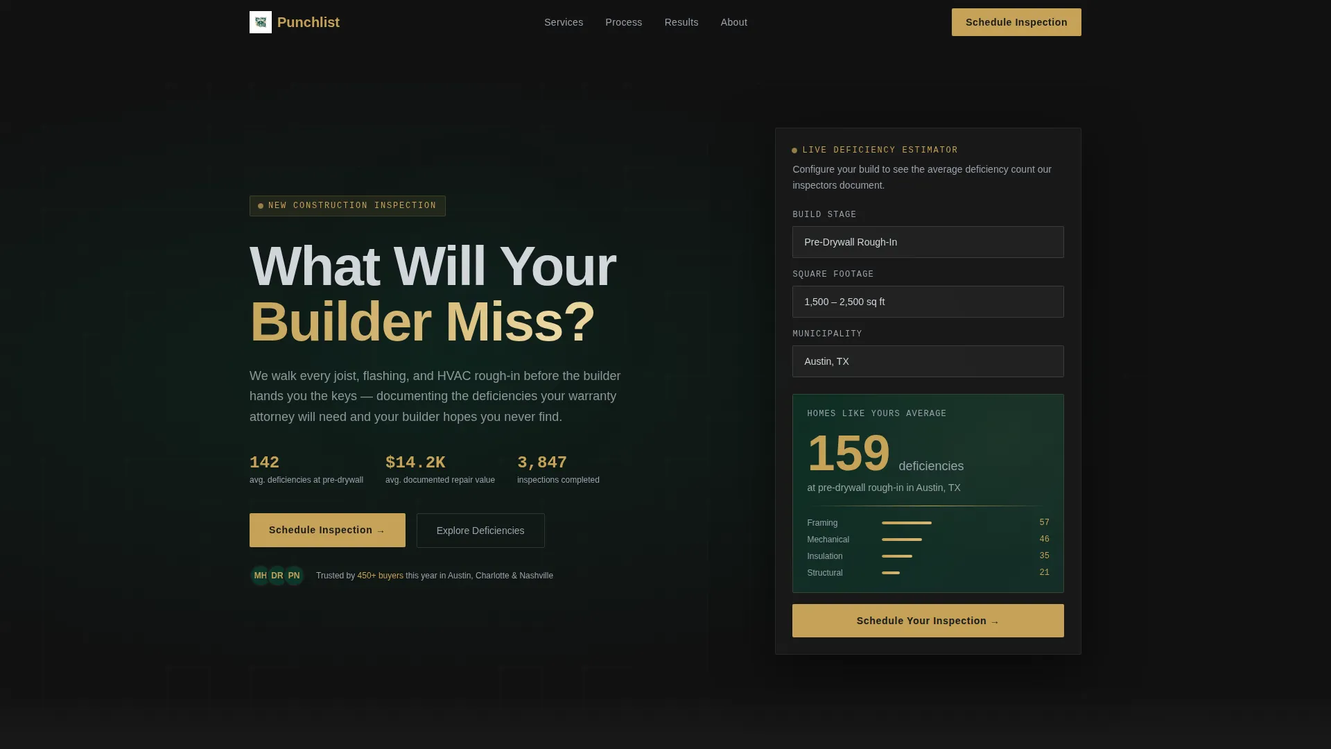
- An asymmetric 60/40 grid header with a live deficiency estimator that reacts to build stage, square footage, and municipality
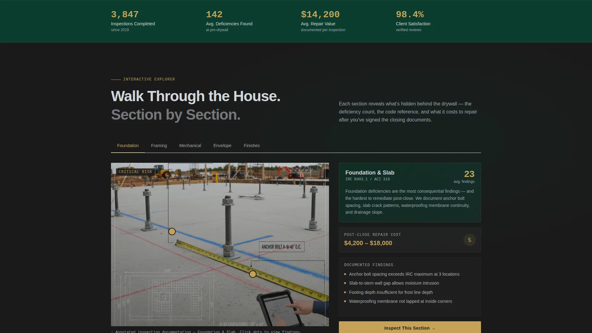
- An interactive house explorer that walks visitors through foundation, framing, mechanical, envelope, and finishes with annotated inspection visuals and cost data
- A sticky lead generation bar with a closing-date-first form, plus a secondary checklist download path for early-stage buyers
Feature list
This template is built around purposeful, prompt-driven components. Each one is designed to move a skeptical buyer closer to action.
Live Deficiency Estimator
Visitors select their build stage, square footage range, and municipality. The estimator surfaces the average number of deficiencies found at that stage, with the count displayed in gold type that ticks upward like a live figure. It makes an abstract risk feel specific and measurable.
Interactive House Section Explorer
Below the fold, the template breaks the home into five explorable areas: foundation, framing, mechanical, envelope, and finishes. Each section pairs an annotated inspection photograph on the 60-side with deficiency count, code reference, and post-close repair cost on the 40-side. Scrolling deepens the stakes section by section.
Sticky Lead Capture Bar
After the second section, a sticky bar appears anchored to the viewport. It carries the primary call-to-action and remains visible as the visitor continues scrolling. The form asks for closing date first, then address, build stage, and builder name.
Secondary Email Capture Path
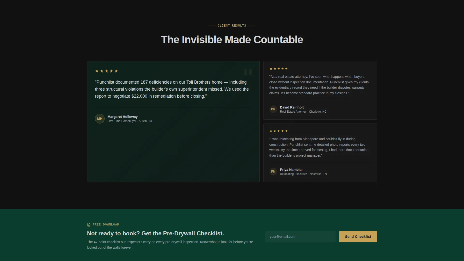
A "Download Our Pre-Drywall Checklist" option gives early-stage buyers a lower-commitment entry point. This captures emails from visitors who aren't ready to book, creating a nurture path for when their inspection window opens.
Executive Suite Visual Identity
The template ships with a fully realized color and layout system built around deep boardroom green, black walnut, brushed platinum, and decisive gold. Gold is reserved for calls-to-action and key data points, so every accent carries visual weight and intent.
Asymmetric 60/40 Grid Layout
The entire page is structured on a 60/40 asymmetric grid. The dominant column carries bold visual content and headlines. The narrower column holds interactive controls, data reveals, and form inputs. The split creates natural visual hierarchy without a rigid or boxy feel.
Page sections overview
| Section | Purpose |
|---|---|
| Estimator Header | Reveals deficiency risk via interactive build-stage calculator |
| House Section Explorer | Walks visitors through each part of the home with annotated evidence |
| Sticky call to action Bar | Keeps the primary booking action visible after the second section |
| Lead Capture Form | Collects closing date, address, build stage, and builder name |
| Checklist Download | Captures early-stage buyer emails through a secondary conversion path |
Design & branding system
The visual identity is built around an Executive Suite theme. Every color and spacing decision reinforces the message that someone meticulous is handling this. Nothing feels casual, and nothing feels generic.
- Color palette: deep boardroom green (#0B3D2E), black walnut (#1A1A1A), brushed platinum (#D1D5DB), and decisive gold (#C5A258) used sparingly for calls-to-action and key numbers
- Backgrounds alternate between walnut-black and emerald sections, with platinum typography creating legibility against the dark fields
- Gold is a deliberate accent, not a default, so data points and action buttons immediately draw the eye without competing with each other
Mobile & speed optimization
The template is structured for responsive display across device sizes. The asymmetric grid reflows cleanly so interactive elements remain usable on smaller screens.
- The 60/40 grid collapses to a stacked single-column layout on mobile without losing the visual hierarchy
- The sticky call to action bar is designed to remain accessible on mobile viewports throughout the scroll
- Interactive estimator controls and form inputs are sized and spaced for touch use on smaller screens
How this template helps you convert
The page is built around earned urgency. Every section compounds the buyer's awareness of risk before a single call-to-action appears.
- The estimator in the header makes the deficiency count feel real and personal, so the visitor arrives at the next section already emotionally invested in the outcome.
- The house explorer deepens that investment section by section, attaching specific costs and code references to every risk, until inaction feels more expensive than booking.
- The sticky bar and closing-date-first form apply time pressure at the exact moment the visitor is most motivated, and the secondary checklist path ensures early-stage buyers don't leave without a reason to return.
Other information about this template
This template is categorized under Real Estate and Property, specifically within the Home Inspection and Survey subcategory. It is purpose-built for firms operating in the new construction inspection space, including inspectors who focus on commercial building contexts and production-build residential projects.
- The template style follows a modular card-grid approach, making individual sections easy to update or reorder during customization
- The creative direction is immersive and visual, using annotated photography and live data interaction rather than static text blocks to communicate expertise
- The header concept centers on an estimator input rather than a traditional hero image, which aligns with buyers who arrive with a specific question they want answered immediately
- The lead generation direction is built into every layer of the page, from the sticky bar to the secondary checklist offer, ensuring the page serves visitors at different stages of readiness
Theme
Atelier Studio
Creative direction
Immersive Visual
Color system
Charcoal & Amber
Style
Card Grid (Modular)
Direction
Lead Generation
Page Sections
Live Deficiency Estimator
Interactive House Section Explorer
Sticky Lead Capture Bar
Secondary Checklist Download Path
Asymmetric 60/40 Grid Layout
Executive Suite Color System
Related questions
Who is this landing page template designed for?
What makes the deficiency estimator section effective?
Can this template capture leads from buyers who are not ready to book yet?
What does the interactive house explorer section show?
Is this template suitable for inspectors who also work on commercial new construction?



