Subscription Box Landing Page Template
Puzzlebox is a scroll-reveal landing page template built for subscription box brands in the puzzles and brain teasers space. It pairs a Playful Geometric visual identity with a Comparison Journey layout, tiered pricing cards, and a Gift or For Me toggle. The design moves visitors from curiosity to checkout through progressive storytelling and a warm sunset color palette.
by Rocket studio
Quick summary
Puzzlebox is a single-page, scroll-driven landing page template for a mechanical puzzle and brain teaser subscription box. It uses side-by-side comparison panels, animated geometric shapes, and tiered pricing cards to build a compelling case for subscribing. The sunset gradient palette and tactile full-bleed header make the offer feel tangible before a visitor even reads a line of copy.
Who this template is for
This template is built for subscription box founders and e-commerce entrepreneurs who sell puzzles, brain teasers, or curated hobby boxes. It suits both first-time builders and experienced operators who want a polished, conversion-ready page without starting from scratch.
- Subscription box operators selling mechanical puzzles, logic mazes, or brain teasers
- Gift-focused retailers who want a page that serves both personal buyers and gift-givers
- Solo founders or small teams who need a complete, ready-to-launch landing page
What problem this template solves
Most subscription box pages either look too generic or bury the value proposition under heavy copy. Visitors leave before they understand what they are getting or why it is worth the price. This template fixes that by structuring the entire scroll as a visual argument, not just a product description.
- Scattered, unpersuasive layouts that fail to communicate the box's unique value
- No clear path for gift buyers alongside personal subscribers
- Pricing sections that feel cold and transactional rather than exciting
What you get with this template
You get a fully structured, scroll-reveal landing page with every section a puzzle subscription box needs to convert visitors into subscribers. The layout is deliberate: each scroll step builds on the last, so the pricing reveal at the bottom feels earned.
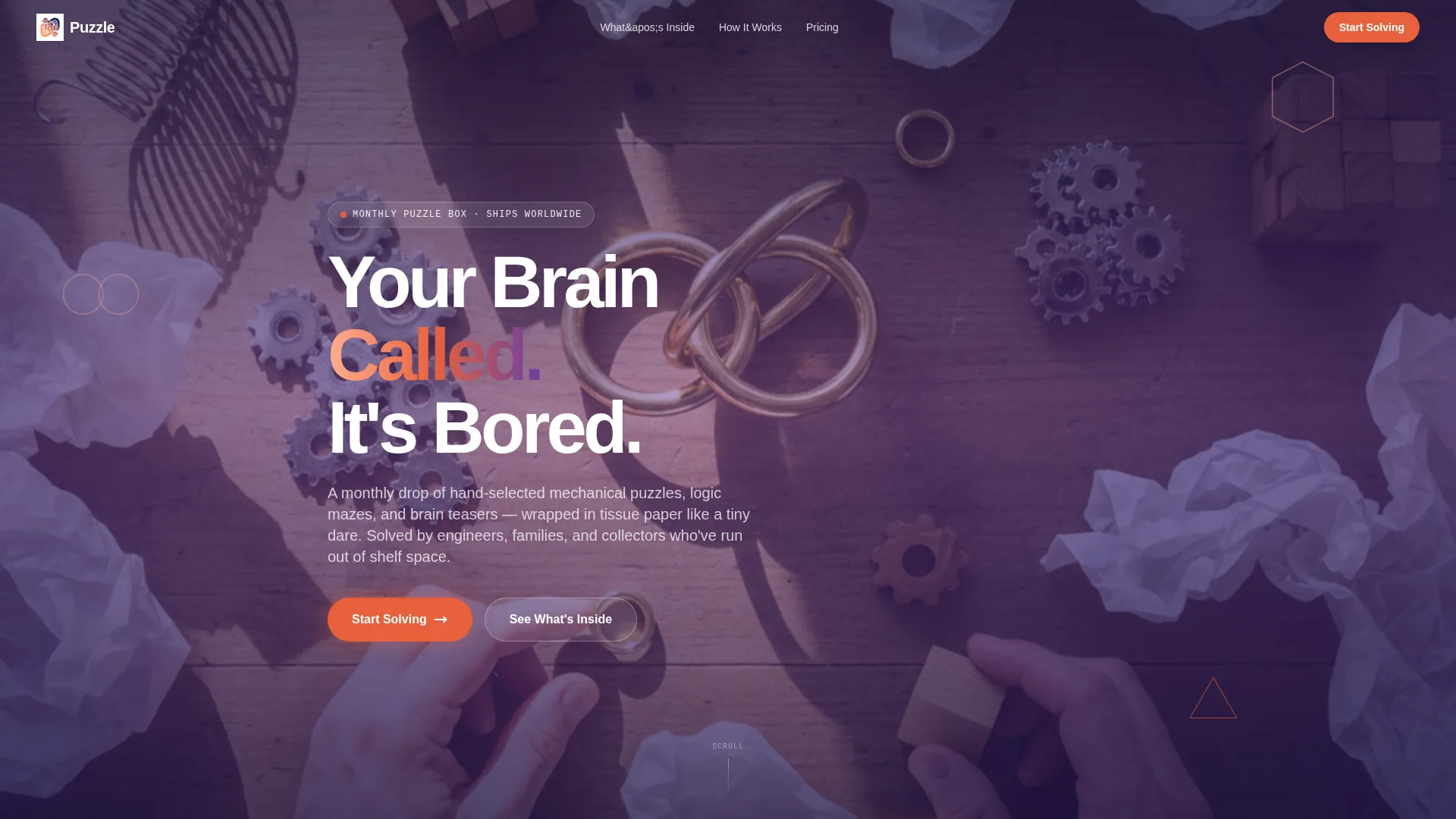
- A full-bleed hero section with an overhead lifestyle photo composition and an animated headline fade-in
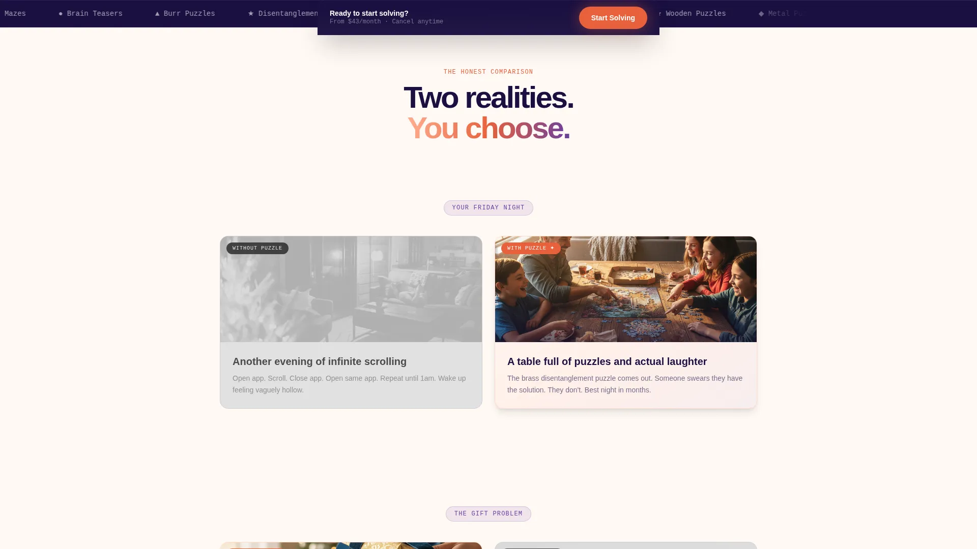
- Three side-by-side Comparison Journey panels that slide in from opposite sides on scroll
- Tiered pricing cards with hover tilt effects, a Gift or For Me toggle, and a secondary impulse-buy path
Feature list
This section covers the core built-in capabilities that make Puzzlebox ready to use out of the box.
Scroll-Reveal Comparison Panels
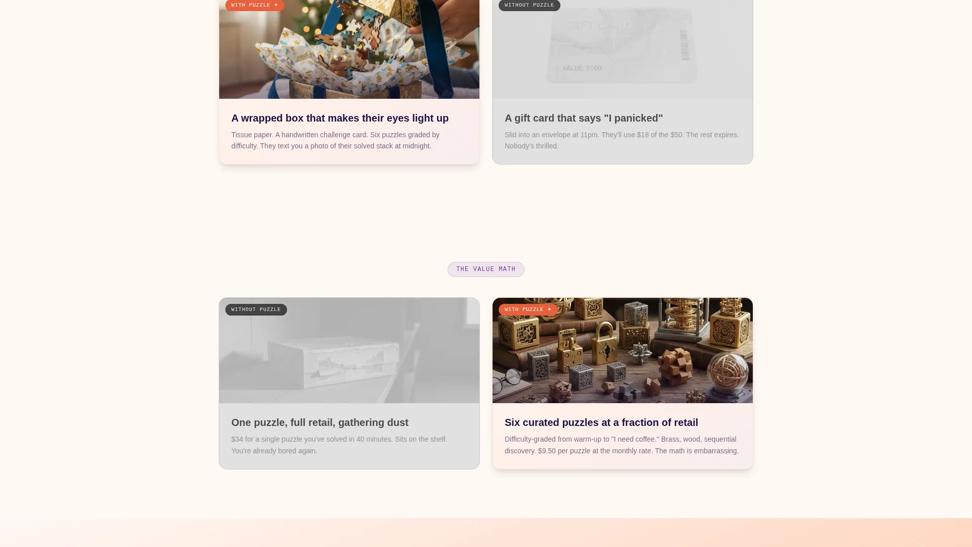
Three progressive comparison panels contrast dull evenings against puzzle-filled ones, generic gifts against the real box, and single retail purchases against the monthly subscription value. Each panel slides in from opposite sides as the visitor scrolls, with the left side rendered in flat desaturated tones and the right side in the full sunset palette.
Tiered Pricing Cards with Hover Tilt
The pricing section reveals one-month, three-month, and six-month subscription plans on geometric cards. Each card tilts on hover and shows exactly what is included: the number of puzzles, difficulty range, and any bonus items. The layout makes comparing plans effortless and visually engaging.
Gift or For Me Toggle
A single toggle in the pricing section switches the entire microcopy between a personal subscription mode and a gift mode. In gift mode, a gift message field appears automatically. This removes the need for a separate gift landing page and keeps both audiences on one focused path.
Progressive Difficulty and Review Layers
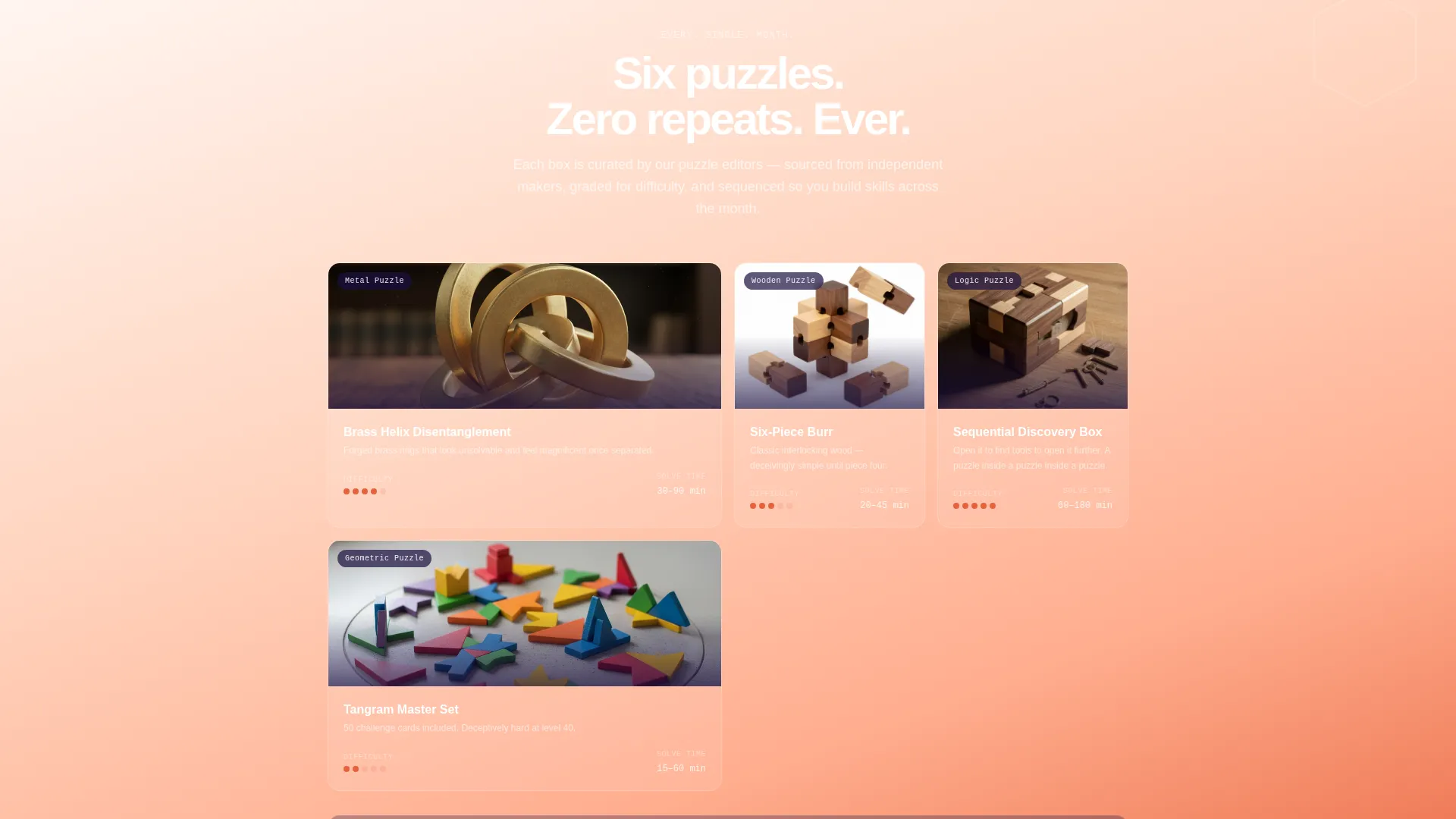
As visitors scroll deeper into the Comparison Journey, difficulty ratings, solve times, and subscriber reviews layer in progressively. This builds social proof and product confidence without front-loading the page with too much information at once.
Full-Bleed Overhead Hero
The header uses a full-bleed photo taken from directly above a kitchen table scattered with unboxed puzzle contents. Two hands reach into frame from opposite corners, creating a lived-in, tactile scene. A bold headline fades in over the image to open the page with energy and personality.
Impulse-Buy Secondary Path
A clearly marked "Send a Single Box" option sits alongside the subscription plans. This secondary call to action catches visitors who are not ready to commit to a recurring plan, keeping them on the page and giving them a lower-commitment way to convert.
Page sections overview
| Section | Purpose |
|---|---|
| Full-Bleed Hero | Opens with overhead lifestyle photo and animated headline fade-in |
| Comparison Panel One | Contrasts scrolling mindlessly versus a puzzle-filled evening |
| Comparison Panel Two | Contrasts a generic gift card versus an exciting unboxed delivery |
| Comparison Panel Three | Contrasts single retail pricing versus curated monthly subscription value |
| Social Proof Layer | Adds difficulty ratings, solve times, and subscriber reviews progressively |
| Tiered Pricing Cards | Reveals three subscription plans with hover tilt and plan details |
| Gift Toggle Section | Switches microcopy and adds gift message field for gift buyers |
| Single Box Path | Offers an impulse-friendly non-subscription purchase option |
| Pinned call to action Bar | Keeps the primary "Start Solving" button visible during scroll |
Design & branding system
The visual identity follows a Playful Geometric theme built on a four-color sunset gradient system. Warm peach washes across hero backgrounds, deep tangerine fires up buttons and price callouts, dusky violet marks section transitions, and twilight navy anchors typography and the footer. Floating geometric shapes including hexagons, tangram triangles, and interlocking circles rotate subtly as visitors scroll.
- Warm peach (#FFAD8E), deep tangerine (#E8613C), dusky violet (#6B3FA0), and twilight navy (#1A1040) form the complete palette
- Decorative geometric shapes animate on scroll, reinforcing the puzzle theme without cluttering the content
- Left-side panels in comparison sections are intentionally desaturated to make the full-color right side feel vibrant and alive
Mobile & speed optimization
The scroll-reveal animations and comparison panel layouts are designed to translate cleanly across screen sizes. Geometric decorative elements scale and reposition so they enhance the design on smaller screens rather than crowding content.
- Comparison panels stack vertically on mobile, preserving the before-and-after contrast without requiring side-by-side space
- The pinned "Start Solving" call-to-action button remains accessible at the bottom of the viewport on all device sizes
- Pricing cards display in a single scrollable column on narrow screens so plan details remain readable
How this template helps you convert
Every scroll step in Puzzlebox is structured to lower resistance and build desire before the pricing reveal. Visitors do not encounter a price until the page has already made the box feel inevitable.
- The Comparison Journey reframes the subscription as a lifestyle upgrade, not just a product purchase, so the emotional case is made long before the pricing cards appear.
- The Gift or For Me toggle reduces friction for gift buyers, who would otherwise leave to find a separate gift page, keeping both high-intent audiences on one focused path to checkout.
Other information about this template
Puzzlebox is built specifically for the puzzles and brain teasers subscription niche and reflects the real purchasing behavior of that audience. The template structure supports a direct-sales business model without requiring a separate gift product page or a second checkout flow.
- The template targets three distinct buyer personas: software engineers seeking a hands-on unwind, parents looking for screen-free family activities, and dedicated puzzle collectors
- The "Send a Single Box" secondary path is built into the pricing section, not added as an afterthought, so it feels like a natural part of the offer
- The Playful Geometric theme and sunset gradient system are consistent from hero to footer, giving the page a cohesive identity that reflects the brand personality described in the brief
Theme
Playful Geometric
Creative direction
Flash Deal
Color system
Citrus Burst
Style
Bento Grid
Direction
Marketplace/Multi
Page Sections
Scroll-reveal Comparison Panels
Tiered Pricing Cards with Hover Tilt
Gift or for Me Toggle
Progressive Social Proof Layers
Full-bleed Overhead Hero Section
Pinned Primary Call to Action
Related questions
Who is this landing page template designed for?
Can I use this template for gift subscriptions as well as personal ones?
What subscription plan options does the pricing section include?
Does the template include a way to sell a single box without a subscription?
Can the colors and geometric decorative elements be customized?



