Advanced Seismic Analytics Landing Page Template
Tremor is a comparison-table landing page template built for earthquake preparedness services. It uses a fire-station visual authority to contrast unprepared households against assessed and action-planned ones. Designed for Los Angeles seismic markets, it drives visitors toward a booked assessment through a sticky call-to-action, a scroll-triggered comparison table, and a secondary checklist capture for undecided visitors.
by Rocket studio
Quick summary
Tremor is a single-page, click-through landing page template for seismic vulnerability assessment services. It pairs a monochrome steel visual system with a problem-to-solution comparison table that escalates from inconvenience to life-safety. The page is built to convert homeowners, property managers, and school administrators into booked assessments with minimal friction.
Who this template is for
This template is purpose-built for earthquake preparedness professionals and readiness services targeting the Los Angeles seismic market. It works equally well for solo assessors and multi-property consultants who need to communicate credibility before a first conversation.
- Homeowners on soft-story foundations who need to understand their specific structural risks
- Property managers responsible for tenant safety in unreinforced masonry buildings
- School administrators whose emergency protocols have not been reviewed in years
What problem this template solves
Most people know they should have an earthquake plan. Almost none do. Generic safety pages fail because they inform without urgency. This template solves that by placing the unprepared state and the resolved state side by side, row by row, so visitors feel the gap between where they are and where they need to be.
- No clear comparison between current risk and a resolved, action-planned outcome
- No structured visual path from fear and urgency to a single booking action
- No way to capture undecided visitors before they leave without any value exchange
What you get with this template
You get a fully structured landing page layout designed around a single conversion goal: booking a seismic assessment. Every section is built to move the visitor one step closer to that action without distraction.
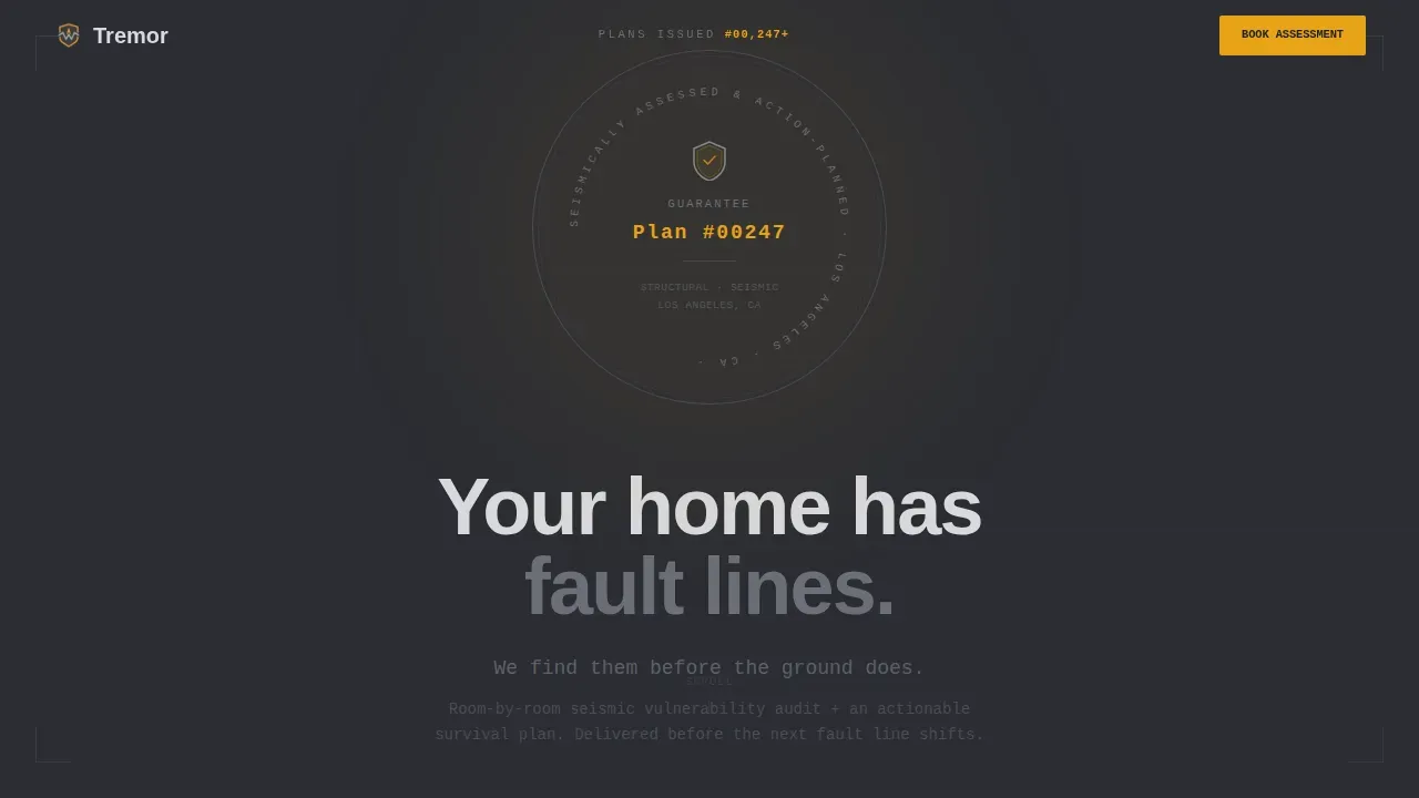
- A hero section with an embossed guarantee badge, plan counter, and authority-first headline
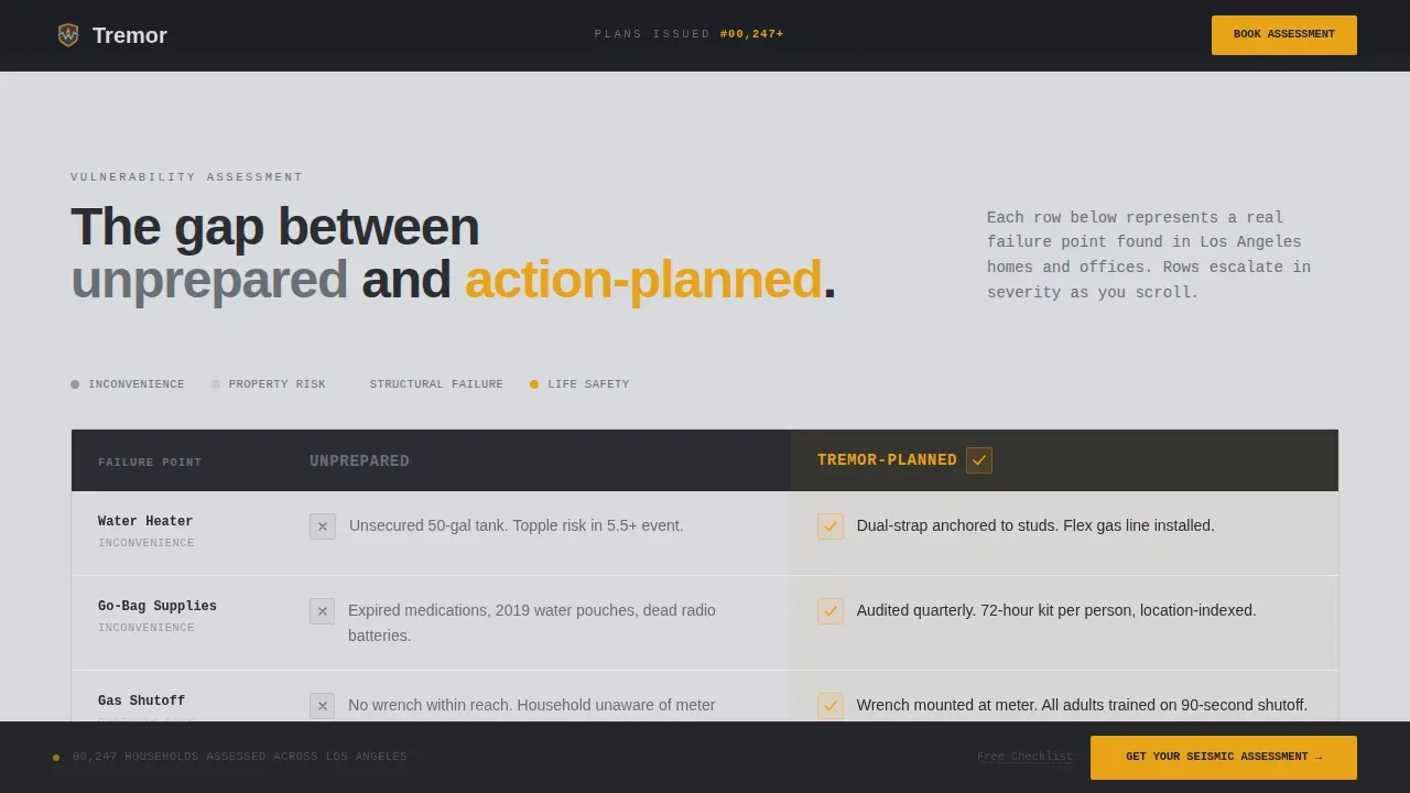
- A scroll-triggered comparison table with amber checkmark accumulation and hover states
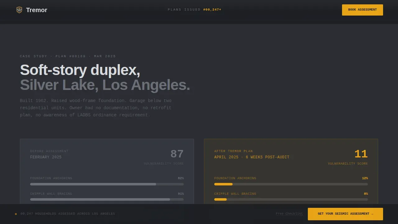
- A case study strip, a deliverables bento block, a sticky call-to-action bar, and a secondary checklist capture at the final call-to-action
Feature list
This template includes the following built-in layout and interaction capabilities.
Embossed Guarantee Badge Hero
The header centers a heavy steel-textured seal on a charcoal field. It reads "Seismically Assessed and Action-Planned" with a plan number format implying thousands of households already covered. One line of concrete-light body text follows: no photography, no stock imagery, full structural authority.
Scroll-Triggered Comparison Table
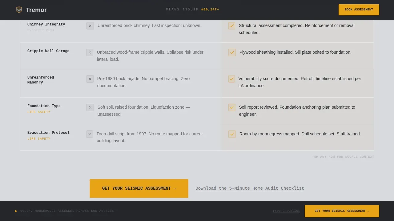
The core of the page is a two-column table. The left column is titled "Unprepared" in reinforced gray. The right column is titled "Tremor-Planned" in amber. Rows escalate from unsecured water heaters and missing gas shutoff wrenches to cripple-wall garages, expired go-bag supplies, and zero family rally points. Amber checkmarks accumulate as the visitor scrolls, building undeniable visual weight.
Before and After Case Study Strip
A dedicated horizontal strip shows a real soft-story retrofit scenario. It contrasts the assessed vulnerability score before the service with the resolved score after, giving prospective clients a concrete proof point grounded in the service's actual deliverable.
Bento Deliverables Block
An asymmetric bento layout details what the seismic assessment includes. Each cell covers a specific deliverable, such as room-by-room vulnerability findings and the actionable survival plan, keeping the scope of the service clear before the visitor clicks through to book.
Sticky Call-to-Action Bar
A "Get Your Seismic Assessment" button in emergency signal amber locks to the bottom of the viewport as the visitor scrolls. It also appears once at the midpoint of the comparison table. The sticky bar keeps the primary conversion action visible at all times without interrupting the reading experience.
Secondary Checklist Capture
Below the primary call-to-action, a text link invites visitors to download a five-minute home audit checklist in exchange for their email address. This secondary path reduces bounce for visitors not ready to book while preserving the primary conversion goal.
Page sections overview
| Section | Purpose |
|---|---|
| Hero Badge | Establish authority and social proof with plan counter |
| Comparison Table | Contrast unprepared risks against resolved Tremor-Planned outcomes |
| Case Study Strip | Show before and after vulnerability score for a soft-story retrofit |
| Deliverables Block | Detail what the seismic assessment includes in a bento layout |
| Final Call to Action | Drive booking and capture undecided visitors with checklist offer |
| Footer | Provide single-row linear navigation and contact reference |
Design & branding system
The template uses a Monochrome Steel color system built around four purposeful values. Every color earns its place. Amber appears no more than twice per viewport so it hits with the force of a warning signal each time it does.
- Structural charcoal (#2B2D33) and poured-concrete light (#D8D9DD) alternate as section backgrounds, with body text reversing accordingly
- Reinforced gray (#6B6E76) carries secondary labels and the "Unprepared" column to signal a neutral, unresolved state
- Emergency signal amber (#E8A317) is reserved exclusively for calls-to-action, the "Tremor-Planned" column, warning callouts, and hover states
Mobile & speed optimization
The template is built desktop-first, reflecting the reality that property managers and administrators most often review service pages on desktop screens. Full mobile support is included so homeowners browsing on a phone after a tremor are never left with a broken layout.
- Scroll-triggered row reveals and amber fill accumulation are handled through client-side components to keep animations smooth across devices
- Static sections use server components to keep the page lightweight and fast-loading
How this template helps you convert
This template removes every reason for a visitor to delay. The page does not ask for information before delivering value. It shows the risk gap first, then the resolution, then the booking path.
- The escalating comparison table builds emotional and practical urgency before the visitor reaches the call-to-action, so the click feels like a decision already made
- The sticky amber call-to-action button stays in view at all times, removing the need to scroll back up to act
- The secondary checklist capture gives undecided visitors an immediate reason to stay connected, reducing bounce without diluting the primary booking path
Other information about this template
This template is designed for the Los Angeles seismic market and uses United States conventions throughout, including imperial measurements and USD pricing contexts. Typography pairs DM Sans in bold and black weights for headers with IBM Plex Mono for data labels and plan numbers, reinforcing the service-utility authority of the design.
- The page tone is intentionally restrained, mirroring the authority of a structural engineer's report rather than disaster news coverage
- The plan counter format (for example, Plan #00247) functions as passive social proof, implying a substantial number of households already served
- Animation intensity is set to medium: scroll-triggered reveals and hover states add interactivity without distracting from the conversion path
Theme
Service Utility
Creative direction
Problem→Solution Arc
Color system
Monochrome Steel
Style
Comparison Table
Direction
Click-Through
Page Sections
Embossed Guarantee Badge Hero
Scroll-triggered Comparison Table
Before and After Case Study Strip
Bento Deliverables Block
Sticky Amber Call-to-action Bar
Secondary Checklist Email Capture
Related questions
What type of service is this template designed for?
Does this template include a booking form or calendar?
Can the comparison table rows be customized?
Is this template suitable for property managers as well as homeowners?
How does the secondary checklist capture reduce bounce?