Mortgage Broker Comparison Table Landing Page
Qualify is a single-page mortgage broker landing page built around case study narratives and comparison tables. It opens with a data-driven header, walks visitors through real borrower scenarios, and converts them through a streamlined rate-review booking form. The layout is designed for brokers who handle complex files and need a page that earns trust before asking for a call.
by Rocket studio
Quick summary
Qualify is a focused mortgage broker landing page that leads with numbers, builds trust through borrower case studies, and closes with a low-friction booking form. The design follows a Corporate Precision visual system. Every section is structured to move a cautious borrower or referral partner from skepticism to a scheduled rate review.
Who this template is for
This template is built for mortgage brokers who regularly work with complicated files. It is not designed for generalist lenders or banks. It suits practitioners who win business by being more thorough than their competition.
- Independent mortgage brokers serving self-employed, recently divorced, or first-generation buyers
- Brokers building referral pipelines with real estate offices and financial planning firms
- Mortgage professionals who need a page that handles objections before the first phone call
What problem this template solves
Most mortgage broker pages make vague promises. Borrowers who have already been declined once need specific evidence, not taglines. Referral partners need proof that complicated files will be handled well.
- Generic broker pages do not show how outcomes compare across lender types
- Borrowers with non-standard income or credit histories cannot find a page that speaks to their situation
- Referral partners have no way to evaluate a broker's track record from a standard homepage
What you get with this template
The template delivers a single, scrollable landing page structured around cumulative evidence. Each section adds a layer of credibility before the booking call to action appears.
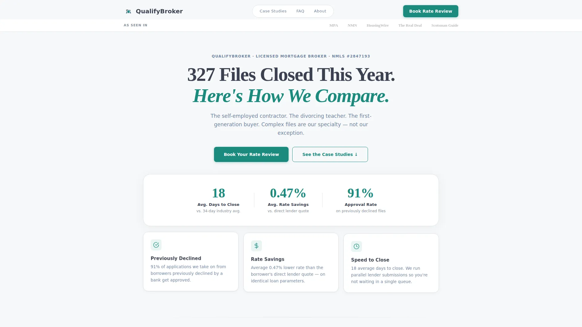
- A data-driven header with a press mentions ribbon, a headline tied to closed-file volume, and a live-updated stat row
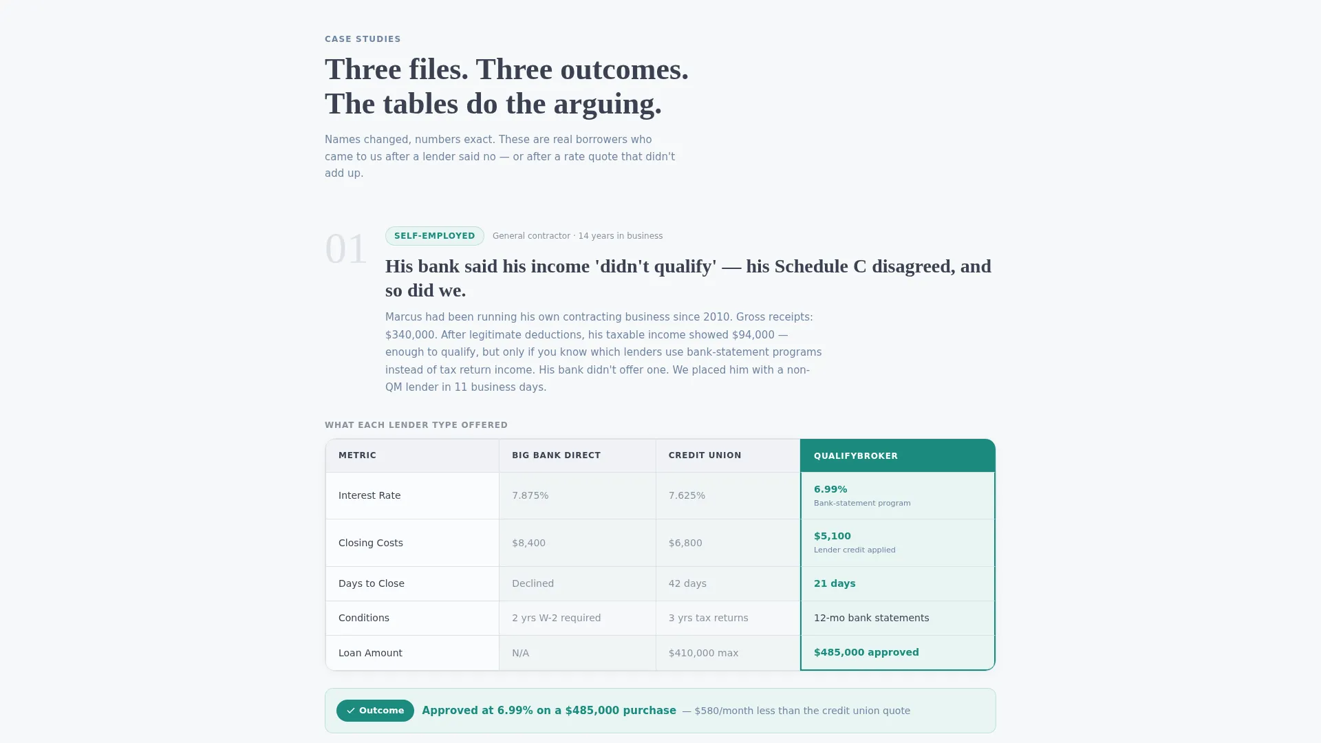
- Three or more borrower case study sections, each with a built-in comparison table showing rates, closing costs, timeline, and conditions across lender types
- Two conversion paths: a primary booking form for rate reviews and a secondary email capture for a downloadable rate comparison guide
Feature list
This section describes the core built-in components of the Qualify landing page template.
Data-Driven Header Block
The header opens with a horizontal press mentions ribbon displaying grayscale publication logos. Below it sits a full-width serif headline and a stat row showing average days to close, average rate savings versus direct lenders, and approval rate on previously declined applications. No hero image is used. The numbers and white space carry all the authority.
Borrower Case Study Sections
Each case study section opens with one sentence describing the borrower's problem. It then reveals a structured comparison table showing what three lender types offered versus what the broker secured across rate, closing costs, timeline, and conditions. The format lets the data argue without requiring the broker to make claims directly.
Inline FAQ Accordions
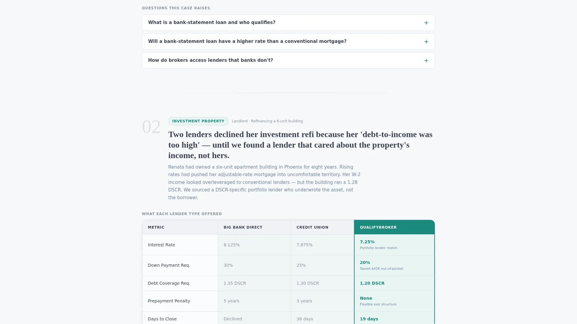
Short FAQ accordion blocks are placed between case study sections. Each accordion addresses the exact question that the preceding case study is likely to provoke. This keeps the scroll moving and resolves objections in context rather than redirecting visitors to a separate page.
Rate Review Booking Form
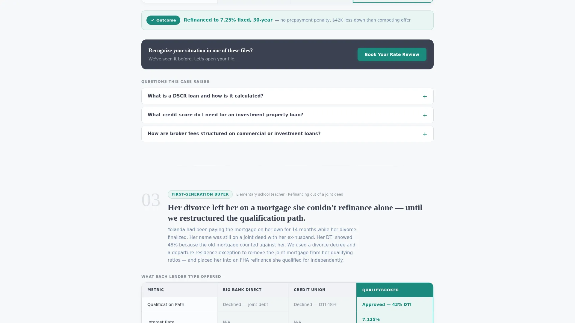
The primary conversion component is a single-step calendar embed. It asks only for first name, phone number, and loan purpose (purchase, refinance, or not sure). The form appears in the header, again after the second case study, and as a fixed bottom bar on mobile.
Secondary Email Capture Path
A secondary conversion path offers a downloadable rate comparison guide. It captures an email address from visitors who are not yet ready to book a call. This warms them into the booking funnel over time without requiring an immediate commitment.
Corporate Precision Visual System
The layout uses a tightly controlled color palette, a heavyweight serif typeface for headlines, and structured white space. Every visual element is tied to credibility signaling. The design feels like a printed financial document rather than a marketing page.
Page sections overview
| Section | Purpose |
|---|---|
| Press Mentions Ribbon | Establishes third-party credibility at the top |
| Headline and Stats | Anchors trust with closed-file data |
| Case Study One | Illustrates the self-employed borrower scenario |
| Comparison Table One | Shows lender-versus-broker outcome side by side |
| FAQ Accordion One | Answers the question the first case provokes |
| Case Study Two | Covers a jumbo loan or investment property scenario |
| Comparison Table Two | Reinforces the pattern with a second data set |
| Booking call to action Block | Places the rate review form at peak conviction |
| Case Study Three | Completes the pattern with a third borrower profile |
| Comparison Table Three | Provides a third evidence layer |
| FAQ Accordion Two | Resolves the third case study's likely objection |
| Rate Guide Capture | Offers a secondary path for not-yet-ready visitors |
| Fixed Mobile call to action | Keeps the booking form accessible on small screens |
Design & branding system
The visual identity follows a Corporate Precision theme. Every color choice and typographic decision is tied to a financial-document aesthetic that signals competence rather than warmth.
- Soft cumulus white (#F7F8FA) for open backgrounds, slate graphite (#3B4252) for body text and table borders, and muted steel blue (#6E85A0) for secondary headings and icon strokes
- A single decisive teal (#1A8A7D) reserved exclusively for call-to-action buttons, active table highlights, and selected comparison columns
- A tight authoritative serif typeface for headlines, paired with clean body text and generous white space to maintain a freshly printed financial document feel
Mobile & speed optimization
The landing page is structured to work cleanly on smaller screens without sacrificing the data density that makes it persuasive. The layout prioritizes readable tables and accessible forms at every viewport size.
- Comparison tables are designed to remain readable on mobile without horizontal scrolling breaking the layout
- The fixed bottom bar on mobile keeps the primary booking call to action visible throughout the entire scroll without interrupting the case study reading flow
How this template helps you convert
The page is built on a principle of cumulative evidence. Each scroll section adds credibility, so by the time a visitor reaches the booking form, they have already seen proof rather than promises.
- The header stat row sets a measurable baseline of credibility before the visitor reads a single word of marketing copy, reducing the instinct to dismiss the page as self-promotional
- The case study and comparison table pairing allows borrowers with non-standard profiles to see their own situation reflected in the content, which lowers hesitation and increases form completion rates
Other information about this template
This template is categorized under Professional Services with a focus on mortgage broker online presence. It is designed as a single-column flow page following an editorial magazine-style layout with data storytelling at its core.
- The template suits both direct borrower acquisition and partnership or referral-focused outreach, making it versatile across two distinct audience paths
- The creative direction draws on a team and people framing, positioning the broker as a knowledgeable guide rather than a product vendor
- The intersection niche is a mortgage broker booking page, meaning the entire scroll is oriented toward a single conversion action rather than general brand awareness
Theme
Editorial Magazine
Creative direction
Team & People
Color system
Charcoal & Amber
Style
Single Column Flow
Direction
Partnership/B2B
Page Sections
Data-driven Header with Press Ribbon
Borrower Case Study and Comparison Tables
Inline FAQ Accordion Blocks
Single-step Rate Review Booking Form
Secondary Email Capture for Rate Guide
Corporate Precision Visual Layout
Related questions
Can I tailor the case study sections to my own borrower types?
Does the template include the comparison table data or just the structure?
How does the fixed mobile call to action work?
Is this template suitable for brokers who also want to attract referral partners?
What is the purpose of the secondary email capture path?



