Mortgage Broker Landing Page Template
Qualify is a zigzag mortgage broker landing page designed to dissolve borrower anxiety one section at a time. It walks visitors through the full loan process with transparent, step-by-step sections, a progressive three-screen lead form, and a secondary email capture for first-time buyers. The result is a local, trust-first page that earns qualified leads before asking for a single piece of personal information.
by Rocket studio
Quick summary
Qualify is a mortgage broker landing page built for local operators who serve real families in real zip codes. It replaces vague rate promises with a transparent, process-first layout that walks every type of borrower through what actually happens next. The design is calm and authoritative, and the lead flow is engineered to reduce drop-off at every step.
Who this template is for
This template is purpose-built for independent mortgage brokers and small lending teams who work specific service areas. It speaks directly to the borrowers most likely to hesitate before submitting a form.
- First-time buyers who are nervous about committing to a six-figure decision
- Move-up families managing a simultaneous home sale and new purchase
- Self-employed borrowers who have already been declined by a bank's automated system
What problem this template solves
Most mortgage landing pages lead with a rate number or a generic form, which does nothing to earn trust from a cautious borrower. Visitors arrive anxious and leave without converting because the page never explained what comes next. Qualify solves that by making the process visible before asking for anything.
- Borrowers abandon forms when they do not understand what follows submission
- Generic national templates fail to signal local knowledge or geographic expertise
- Vague promises about rates create skepticism rather than confidence
What you get with this template
You get a fully structured single-page layout with alternating zigzag sections, a staged lead form, and a secondary capture path for visitors who are not yet ready to call. Every visual element reinforces the authority and local credibility of the broker.
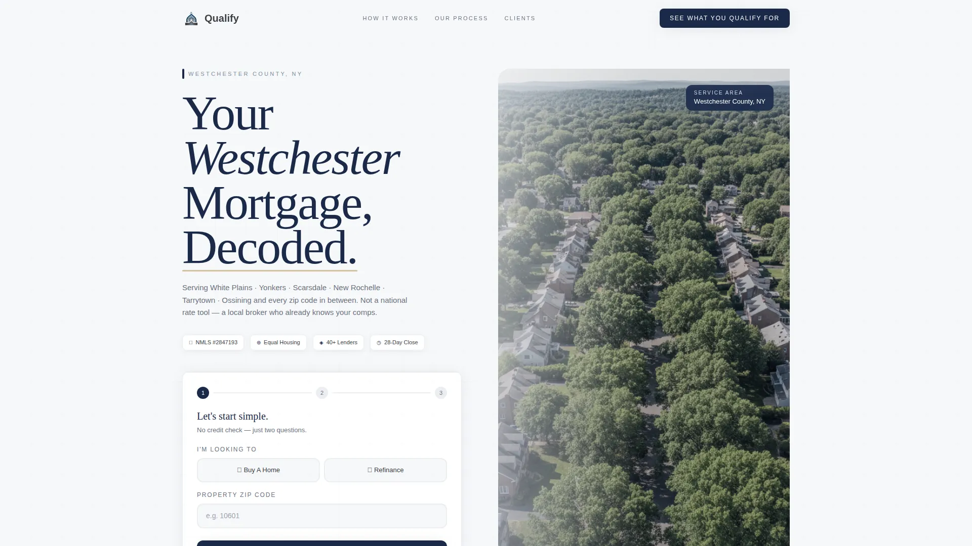
- A giant left-anchored headline section with space for a real aerial photograph of the service area
- Four numbered zigzag process sections that each address one specific borrower fear
- A three-screen progressive disclosure form and a secondary checklist download path
Feature list
This section covers the core built-in capabilities that make Qualify work as a lead generation tool for mortgage professionals.
Giant Headline Header with Local Aerial Image
The header anchors a massive weighted serif headline to the left side of the viewport. The right side holds a soft-focus aerial photograph of the actual service area, grounding the page in local geography. A subline below the headline names specific counties and neighborhoods to prove local operator status.
Four-Step Zigzag Process Layout
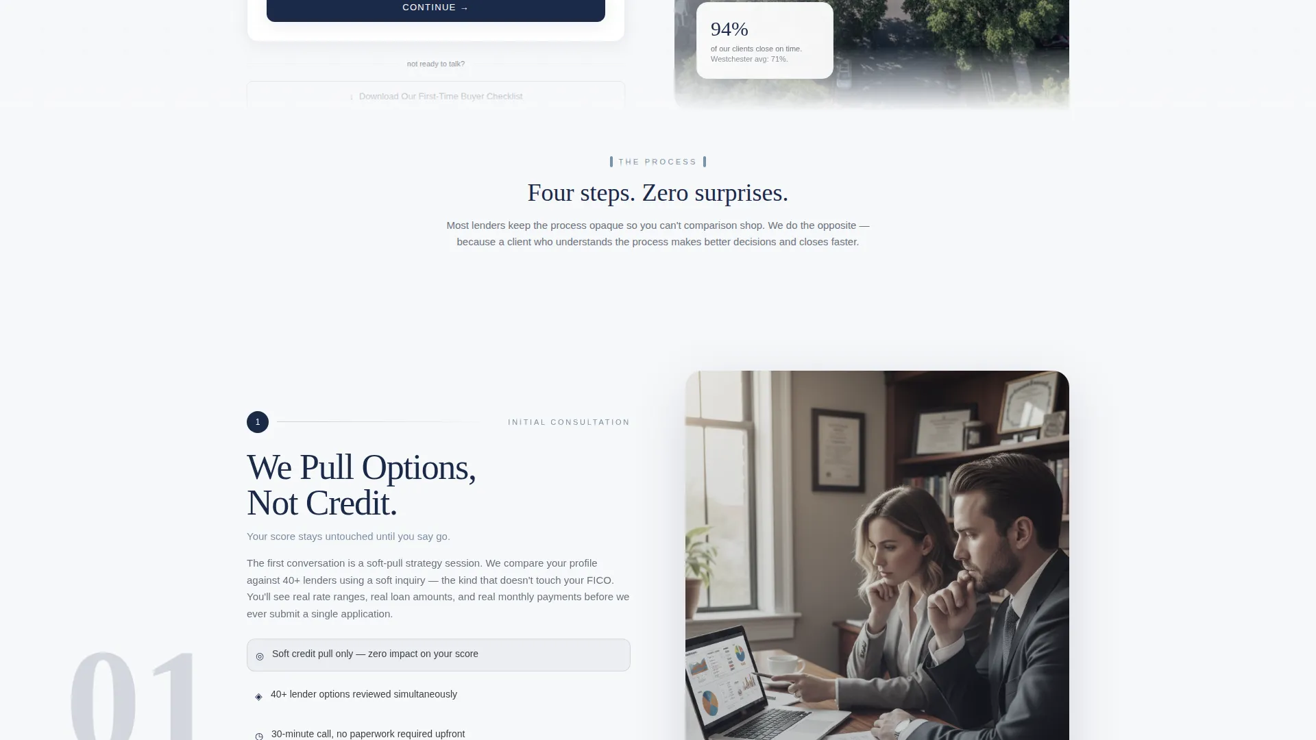
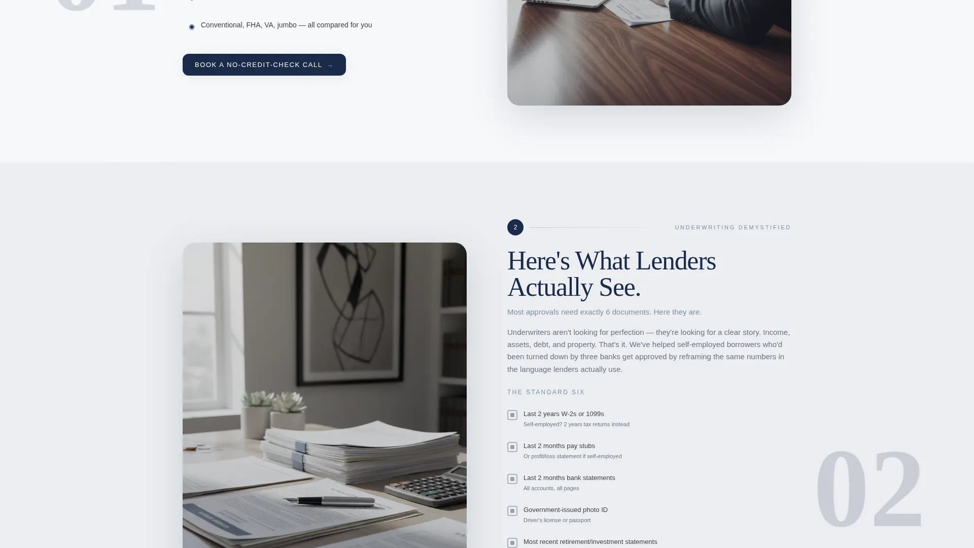
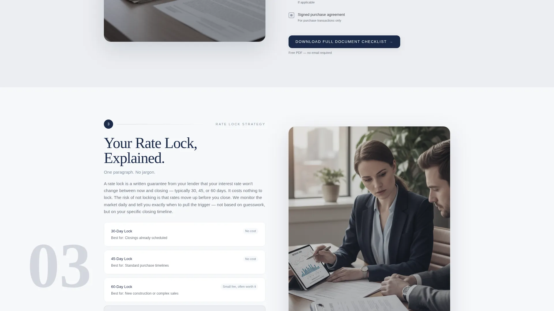
Four alternating sections peel back one layer of the mortgage process per block. Each section carries a numbered step marker in decisive navy, creating a vertical thread the eye follows naturally down the page. Sections cover the initial consultation, underwriting documents, rate lock explanation, and closing day.
Progressive Three-Screen Lead Form
The primary form uses progressive disclosure across three screens. The first screen asks only purchase or refinance intent and property zip code. The second uses sliders for estimated home value and household income range. The final screen collects name, phone number, and preferred callback window.
Sticky Mobile Call-to-Action Bar
On mobile devices, the primary call-to-action button persists as a sticky bottom bar throughout the scroll. This ensures the entry point to the form is always one tap away, regardless of where the visitor is on the page.
Secondary Email Capture Path
A secondary conversion path offers a downloadable First-Time Buyer Checklist in exchange for an email address. This captures visitors who are not ready to speak with a broker, moving them into a nurture pipeline without requiring a phone number.
Alternating Section Backgrounds
Each zigzag section alternates between cloud white and a faint cool gray. This gives every content block its own visual breathing room without introducing harsh color transitions, keeping the overall tone calm and professional.
Page sections overview
| Section | Purpose |
|---|---|
| Header Hero | Establish local authority with headline and aerial image |
| Subline Geography | Name specific counties and neighborhoods served |
| Step 1: Consultation | Explain the initial pull-options process |
| Step 2: Underwriting | Demystify what lenders review with a document checklist |
| Step 3: Rate Lock | Clarify rate lock in plain, jargon-free language |
| Step 4: Closing Day | Walk through what gets signed and why |
| Lead Capture Form | Collect borrower intent via three progressive screens |
| Checklist Download | Capture email from visitors not ready to call |
| Sticky Mobile Bar | Keep primary call to action visible throughout mobile scroll |
Design & branding system
The visual identity follows an Executive Suite theme built around a Cloud Canvas color palette. Every color choice reinforces calm authority rather than urgency or noise.
- Soft cumulus white (#F7F8FA) and faint cool gray (#ECEEF1) alternate as section backgrounds
- Brushed charcoal (#3B3F45) handles body text and section dividers, with muted slate blue (#7B8FA1) for secondary headings and iconography
- Decisive navy (#1B2A4A) is reserved exclusively for calls-to-action and trust badges, ensuring they command attention without shouting
Mobile & speed optimization
The template is structured for a clean mobile experience from the ground up. The layout reflows naturally for smaller screens, and the most critical conversion element stays in reach at all times.
- The sticky bottom bar keeps the primary call-to-action button fixed at the base of the screen throughout the entire mobile scroll
- The progressive form flow reduces cognitive load by asking only one or two questions per screen, which lowers the friction of completing the form on a phone
- Zigzag sections stack vertically on mobile, preserving the numbered step sequence and keeping the process narrative intact
How this template helps you convert
Qualify earns the lead before it asks for one. The page is built around the principle that showing competence through transparency converts better than promising an outcome you cannot guarantee.
- The zigzag process sections address specific borrower fears in sequence, reducing anxiety before the visitor reaches the form, which means they arrive with more context and more willingness to submit.
- The progressive three-screen form asks for the least sensitive information first, using sliders instead of text fields on the second screen, which keeps the experience low-friction and completion rates higher.
- The secondary checklist download path gives hesitant visitors a meaningful reason to leave their email, creating a second conversion opportunity for the segment least likely to call immediately.
Other information about this template
This template is designed specifically for mortgage brokers operating as local specialists rather than national aggregators. It works equally well for a solo broker and a small team covering several adjacent zip codes.
- The template style follows a single-column flow with zigzag alternation, making it straightforward to edit section by section without disrupting the overall layout
- The page direction is oriented toward lead generation and relationship-building, not transactional rate comparison
- The header concept uses a data-informed storytelling approach: the aerial photograph and geographic subline together function as a visual and textual proof of local presence
- This template is part of a Professional Services collection focused on Mortgage Broker Online Presence, suitable for brokers who want a polished, credible page without relying on a national brand name
Theme
Editorial Magazine
Creative direction
Team & People
Color system
Charcoal & Amber
Style
Single Column Flow
Direction
Partnership/B2B
Page Sections
Giant Headline Header with Local Aerial Image
Four-step Zigzag Process Layout
Progressive Three-screen Lead Form
Sticky Mobile Call-to-action Bar
Secondary Email Capture for Checklist
Related questions
Can I replace the placeholder aerial photograph with my own local image?
Does the template support both purchase and refinance borrower journeys?
Is the First-Time Buyer Checklist document included?
How many pages does this template include?
Can this template work for a self-employed borrower audience?



