Parametric Insurance Platform Landing Page Template
Trigger is a parametric insurance landing page template built for B2B InsurTech platforms that pay claims the moment satellite data confirms an event. Designed with a split-screen layout and a data-forward Dashboard Pro aesthetic, it leads with audited payout stats, named data sources, and a clear call to action, converting CFOs, agricultural risk officers, and reinsurance analysts into qualified prospects.
by Rocket studio
Quick summary
Trigger is a single-page, split-screen landing page template for parametric insurance platforms. It leads every scroll transition with a verifiable number, builds trust through audited event data and named orbital sources, and drives visitors toward a primary "Model Your Exposure" call to action. The layout and visual identity are precision-matched to a CFO-level, data-forward audience.
Who this template is for
This template is built for InsurTech and FinTech teams that need to convince sophisticated, skeptical buyers that satellite-triggered instant payouts are real and provable. The audience expects data, not promises, so the template front-loads proof at every section.
- CFOs and risk officers at coastal hotel chains or agricultural cooperatives evaluating hurricane and drought exposure
- Reinsurance desk analysts who need basis-risk transparency they can model and defend internally
- Parametric insurance platforms launching or repositioning a digital product to a high-trust B2B market
What problem this template solves
Traditional insurance claim pages struggle to convey speed and certainty to financially sophisticated buyers. A generic layout cannot communicate a 14-second payout trigger or $1.1 billion disbursed with zero disputed claims. This template solves that credibility gap directly.
- Buyers arrive skeptical about instant-payout claims and need audited figures, timestamps, and named data partners before they act
- Most insurance landing pages bury the proof and lead with brand copy, losing the CFO's attention in the first scroll
- Research-mode visitors need a secondary path, a whitepaper download, alongside the primary conversion action
What you get with this template
You get a fully structured, single-page landing page template with six named sections, a defined visual system, and a layered conversion funnel built around verifiable proof. Every component is specified down to typography and animation behavior.
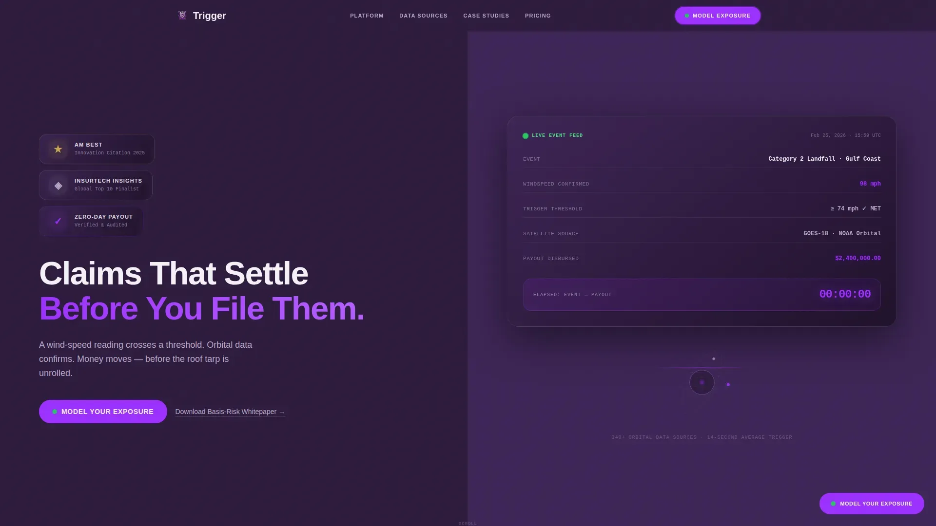
- A split-screen hero with award badge panel, a live-style frozen event dashboard tile, and a fade-in headline
- Four content sections covering stats impact, data sources, case studies, and a call-to-action block, plus a linear single-row footer
- GSAP ScrollTrigger counter animations, badge metallic shimmer, a frozen elapsed-time display, parallax transitions, and sticky call-to-action behavior
Feature list
This template includes a focused set of purpose-built components designed to earn trust from analytically rigorous buyers.
Split-Screen Hero with Award Badges
The hero section divides into two equal panels. The left panel stacks three embossed metallic badge icons representing credibility markers, with a micro-animation that simulates a physical light catch. The right panel displays a live-style dashboard tile with a frozen elapsed-time counter locked at zero to emphasize instant settlement.
Stats-First Scroll Transitions
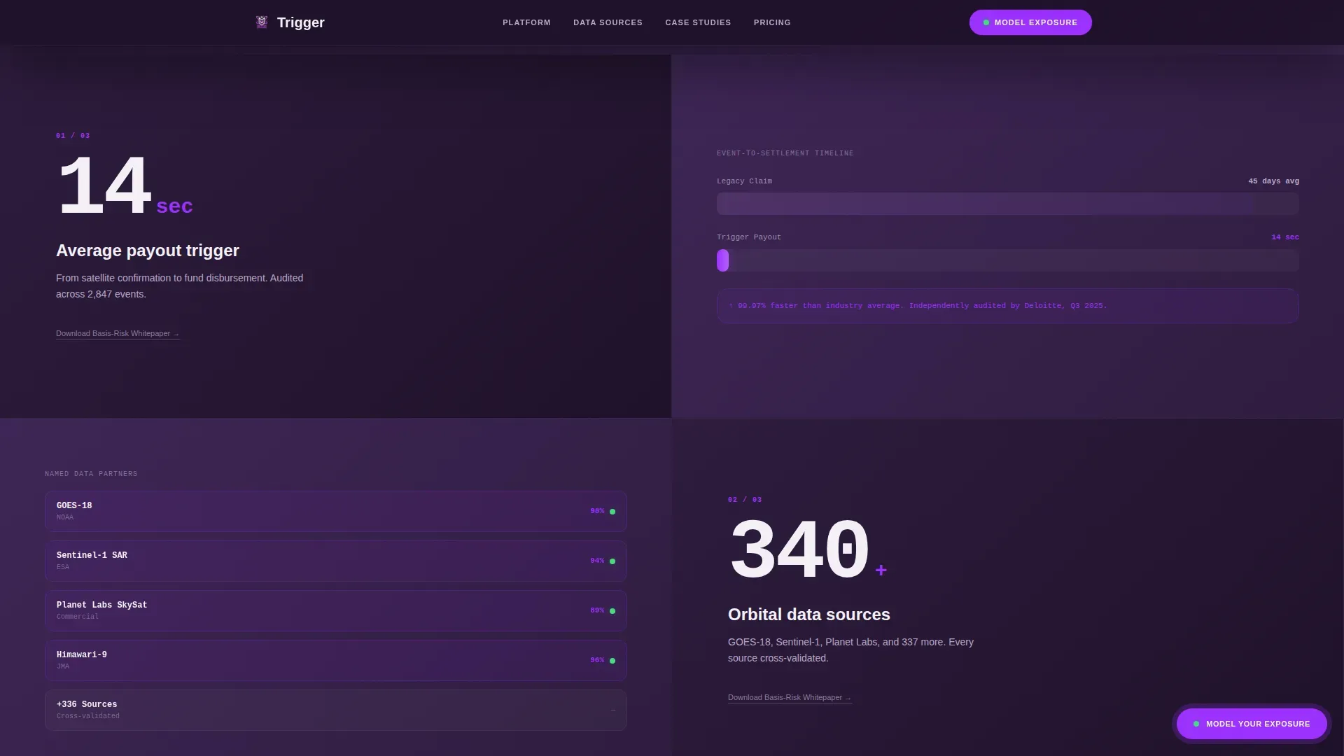
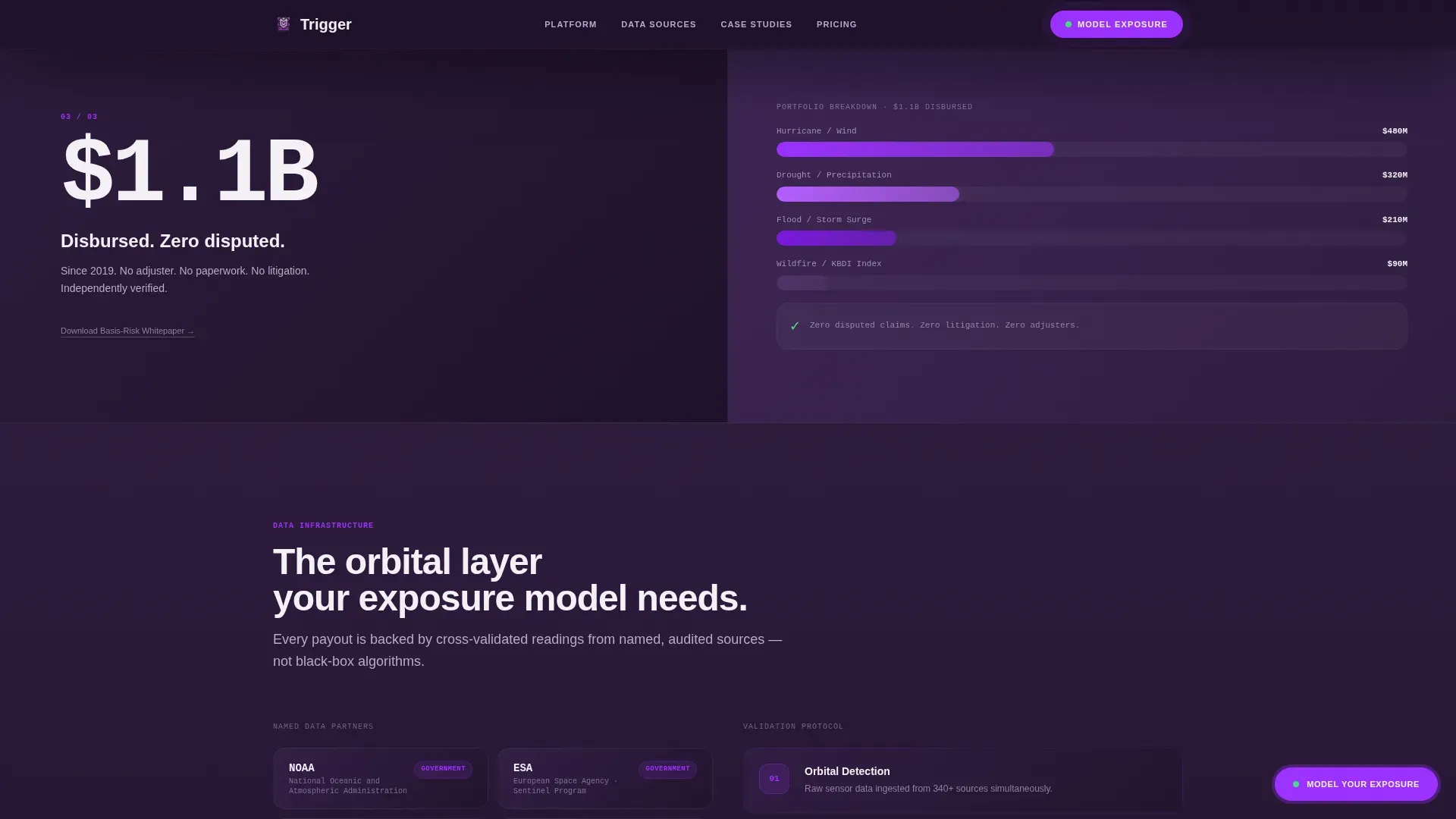
Each scroll section opens with an oversized pearl-type statistic on the left before any narrative appears on the right. Supporting visuals animate in alongside, including a satellite coverage map, a basis-risk comparison chart, and a real event timeline comparing legacy claim cycles with instant settlement. This sequence builds a sense of escalating inevitability.
Layered Click-Through Conversion Funnel
The primary call to action, "Model Your Exposure," appears as a sticky orchid-accented button after the third stat block. A softer secondary path, a "Download the Basis-Risk Whitepaper" text link, sits beside each case-study stat row for visitors still in research mode. Both paths are present on the same page without competing.
Case Study Section with Audited Event Rows
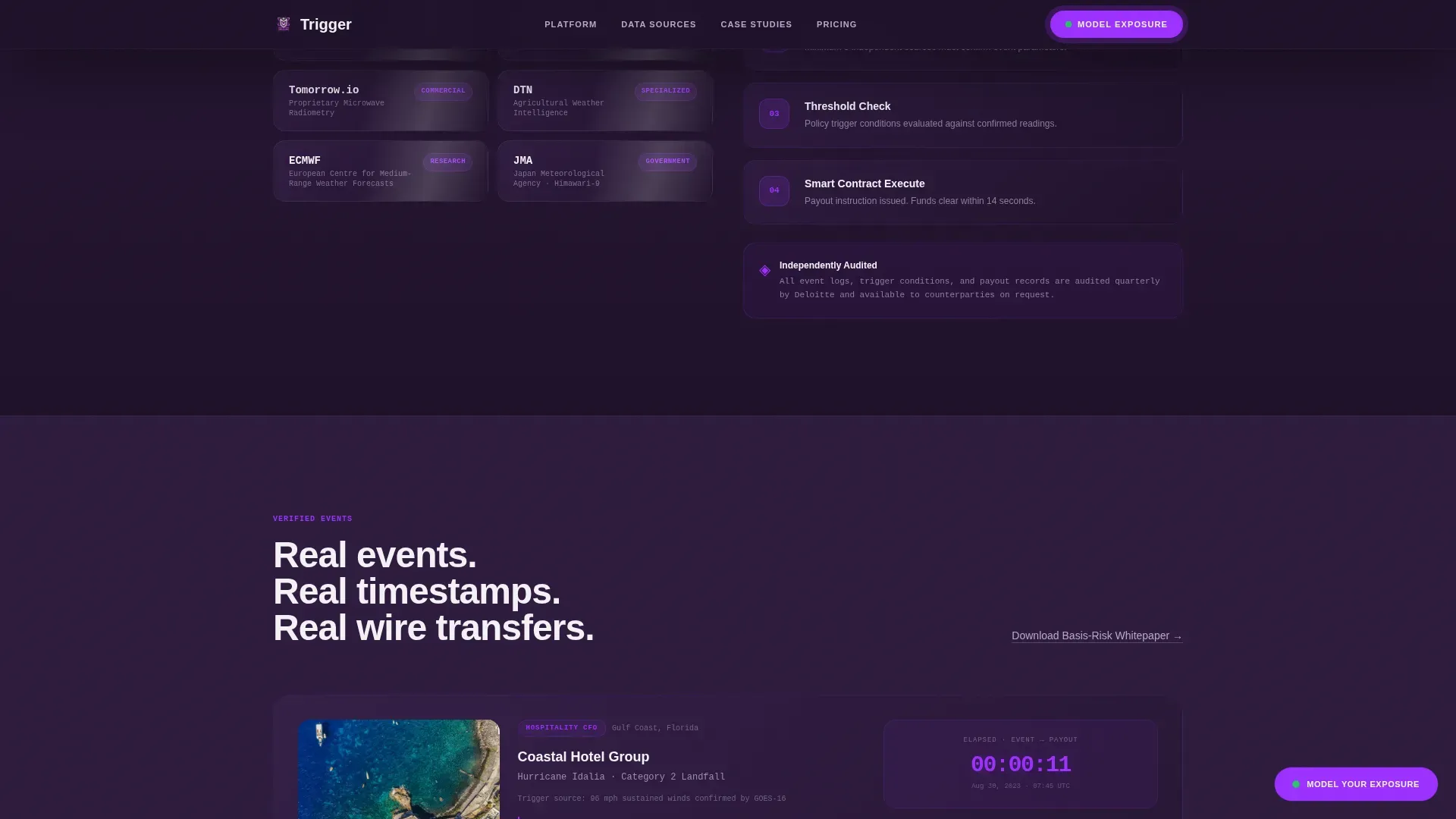
The case studies section presents named events with precise timestamps, payout amounts, and a side-by-side comparison of legacy claim timelines versus the platform's instant settlement record. The rows are styled in JetBrains Mono to reinforce data authenticity and match the dashboard aesthetic.
Sticky Call-to-Action and FAQ Accordion
The sticky call-to-action button persists as users scroll through evidence sections. An FAQ accordion component handles remaining buyer objections with hover states and smooth expansion, keeping the page clean without hiding critical information.
Dashboard Pro Visual Theme with Plum Executive Colors
The entire template is built on a Dashboard Pro visual identity. Deep aubergine panels anchor the layout, pearl card faces preserve readability, and electric orchid is reserved exclusively for live-data accents and call-to-action pulses. DM Sans handles headlines while JetBrains Mono renders all data and number fields.
Page sections overview
| Section | Purpose |
|---|---|
| Hero Split-Screen | Establishes instant-payout credibility with award badges and a frozen live event tile |
| Stats Impact Block | Delivers key proof numbers with animated satellite maps and timeline comparisons |
| Data Sources Section | Names orbital partners and provides satellite coverage proof |
| Case Studies Rows | Shows audited event timestamps comparing legacy and instant settlement cycles |
| Call-to-Action Block | Drives visitors to "Model Your Exposure" with a whitepaper secondary option |
| Linear Single-Row Footer | Closes the page with a clean, minimal single-row footer pattern |
Design & branding system
The visual identity is built on the Plum Executive color system, which communicates restrained authority with one unmistakable signal color. Every color assignment has a defined role so the palette never feels decorative.
- Deep aubergine (#2D1B3D) anchors full-width background panels; muted silver-lavender (#B8A9C9) handles secondary surfaces and data labels; crisp pearl (#F4F1F7) fills card faces and readable content areas
- Electric orchid (#9B30FF) is reserved exclusively for live-data accents, toggle states, and call-to-action pulse effects, ensuring it carries full visual weight when it appears
- DM Sans is used for all headlines and body copy; JetBrains Mono is used for all data fields, counters, and number displays to signal precision and technical authenticity
Mobile & speed optimization
The template is desktop-first by design, matching the CFO and analyst audience that evaluates parametric coverage on large-screen workstations. It is built to remain fully responsive on smaller screens without losing the data hierarchy.
- Server Components handle all static content blocks to keep initial load weight low; Client Components are scoped to animation and interactivity only
- GSAP ScrollTrigger animations, parallax transitions, and badge shimmer effects are client-side and do not block static content rendering
- The sticky call-to-action and FAQ accordion are interaction-layer components that load independently of the core page content
How this template helps you convert
The conversion architecture of this template is built around the principle that proof removes the need to persuade. By the time the primary call to action appears, the visitor has already seen audited figures, named sources, and real event timestamps.
- Every scroll opens with a hard number before a narrative, so skeptical buyers engage with data immediately rather than discounting brand copy first
- The sticky "Model Your Exposure" button stays visible through the evidence sections, reducing friction at the exact moment a buyer reaches conviction
- The secondary whitepaper text link captures research-mode visitors who are not yet ready to act, keeping them in the funnel without cluttering the primary conversion path
Other information about this template
This template is categorized under Finance & Insurance, specifically the InsurTech and Digital Insurance subcategory, with a niche focus on parametric insurance platforms. It carries an intersection match score of 13, indicating a high-specificity alignment between the design system, the creative direction, and the target audience.
- The creative direction is Stats-First Impact, meaning all scroll transitions are structured to lead with quantified proof before supporting visuals or narrative
- The header concept uses Award Badges as the primary trust signal, rendered with metallic shimmer micro-animation against a deep aubergine background
- The landing page direction is Click-Through, with a defined primary path to a product page featuring an interactive scenario builder and a secondary whitepaper download path
- Localization is set for the United States market, using USD currency formatting and MM/DD/YYYY date display
- The template style is Split Screen (50/50), applied consistently through the hero and stats sections to maintain a data-panel-plus-visual rhythm throughout the page
Theme
Dashboard Pro
Creative direction
Stats-First Impact
Color system
Plum Executive
Style
Split Screen (50/50)
Direction
Click-Through
Page Sections
Split-screen Hero with Frozen Event Tile
Stats-first Scroll Architecture
Layered Click-through Funnel
Audited Case Study Rows
Plum Executive Color System
GSAP Animation and Sticky Interaction Layer
Related questions
Who is the primary audience for this landing page template?
What conversion paths does this template include?
Can this template be adapted for different parametric trigger types?
What animations and interactive components are included?
What typography system does this template use?



