Content Writer Portfolio Directory Website Template
Quill is a cinematic, single-page landing page template built for solo content writers and word studios. It pairs a dramatic asymmetric 60/40 grid with an Ink and Paper visual identity to attract SaaS marketing directors, agency creative leads, and startup founders. The layout guides visitors through a three-act scrolling sequence that moves from problem to method to proof, ending in a focused B2B contact form.
by Rocket studio
Quick summary
Quill is a portfolio and content writer landing page template designed for independent writers who work with serious business clients. It uses an asymmetric 60/40 grid, a Void and Violet color system, and a cinematic three-act scroll sequence to present work, method, and results in one confident, unbroken flow.
Who this template is for
This template is built for freelance content writers and solo content studios who want to attract high-value B2B clients. It speaks directly to writers whose work commands attention and whose clients expect results, not just words.
- Independent content writers targeting SaaS companies, agencies, and funded startups
- Solo word studios offering blog posts, white papers, and brand narratives as a professional service
- Freelance copywriters ready to position themselves as a strategic content partner, not just a vendor
What problem this template solves
Generic portfolio pages fail to communicate the business value of good writing. Most writer websites list services and show samples without ever making the case for why the work matters. Quill solves that gap.
- Visitors leave without understanding the writer's method or the outcomes their work produces
- No clear conversion path exists for clients who are evaluating rather than ready to book immediately
- The page looks like every other portfolio, which undermines the credibility of a writer who claims to stand out
What you get with this template
You get a fully structured single-page layout that moves visitors through a deliberate narrative arc. Every section has a job, and together they build the kind of trust that turns a cold visit into a real conversation.
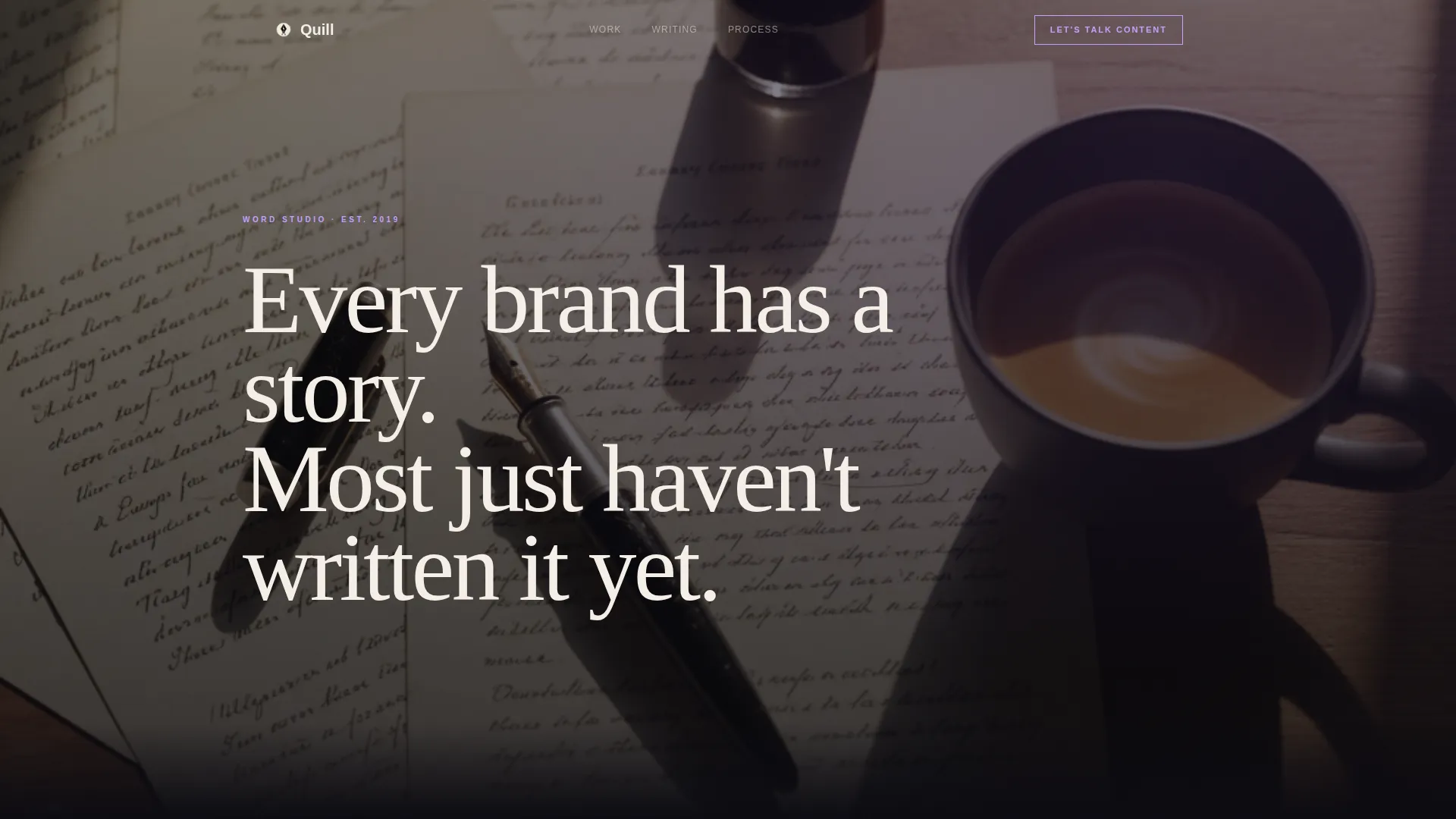
- A Type Over Image header with a moody, grain-heavy desk photograph and a large editorial serif headline that fades in word by word
- A three-act scrolling sequence covering the content problem, the writer's method with case studies and client proof, and a live blog feed with tracked results
- Two conversion paths: a primary "Let's Talk Content" contact form and a secondary "Download the Content Playbook" lead magnet for visitors who are not yet ready to book
Feature list
A paragraph introducing this section: Quill is built around a set of thoughtfully designed features that work together. Each one reflects a deliberate decision about how a content writer earns trust and drives action from a business audience.
Asymmetric 60/40 Grid Layout
The page uses a persistent 60/40 column split throughout the scrolling experience. The wider column carries the primary narrative, case studies, and blog feed. The narrower column runs supporting proof elements, client logos, metrics, and the sticky call-to-action element at different scroll speeds, creating genuine visual depth.
Cinematic Three-Act Scroll Sequence
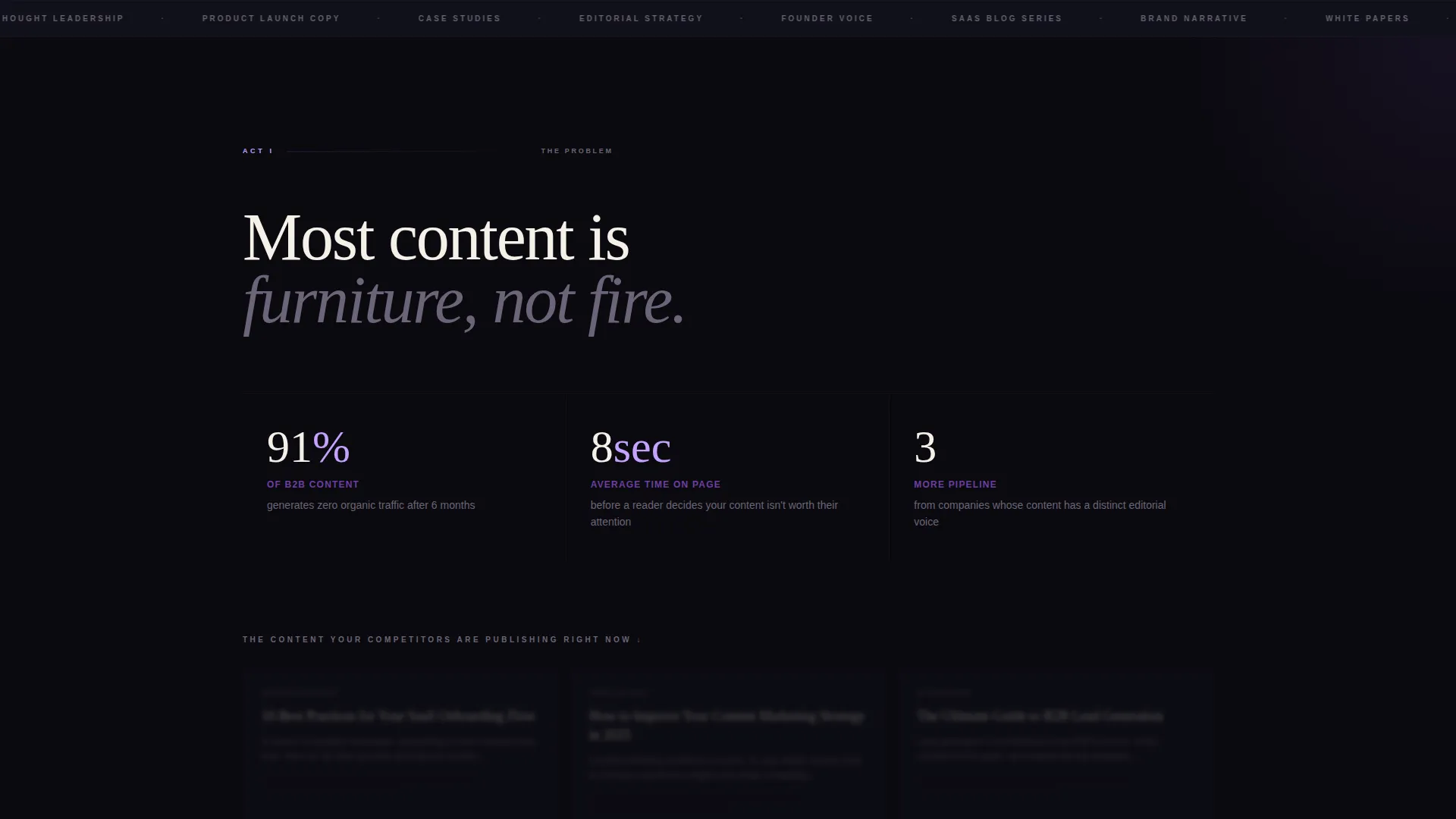
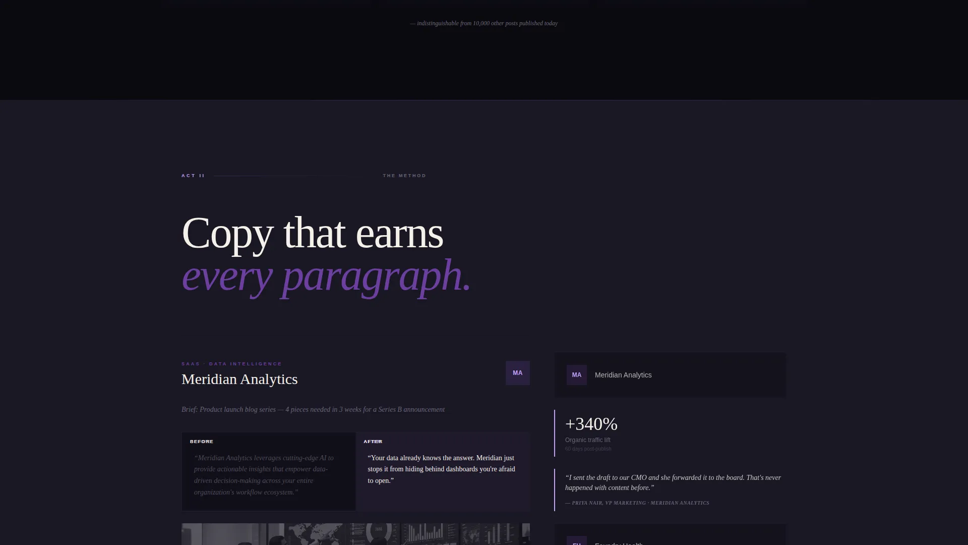
The page is structured like a film in three acts. Act one presents short, punchy statistics about ignored content alongside blurred generic blog screenshots. Act two showcases full case studies with before-and-after copy samples. Act three delivers a live blog feed paired with animated result metrics that roll upward like closing credits.
Type Over Image Editorial Header
The header places a large editorial serif headline directly over a moody overhead photograph of a desk surface. The headline fades in one word at a time, creating a typewriter-like reveal that sets a cinematic, literary tone from the first moment a visitor lands on the page.
Dual Conversion Path Design
The template includes two distinct conversion paths built into the layout. The primary path is a sticky "Let's Talk Content" contact form with fields for company name, monthly content volume, and an open qualifying question. The secondary path offers a downloadable content playbook gated behind an email field, capturing visitors who are evaluating but not yet ready to start a conversation.
Parallax Depth in the Method Section
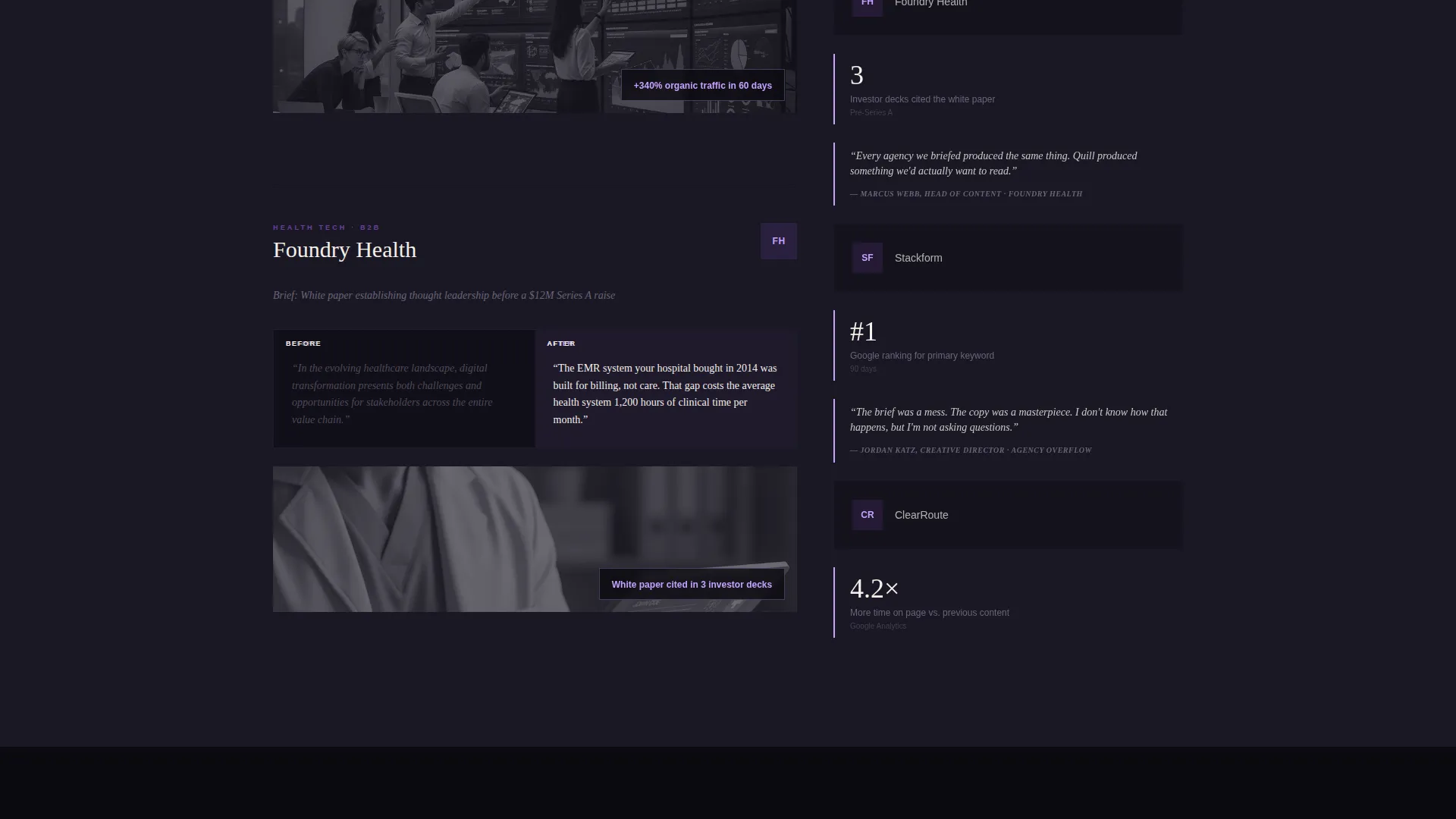
During the method act, the two columns scroll at different speeds. The wider column moves through case studies while the narrower column runs a vertical filmstrip of client logos, engagement metrics, and pull quotes. This parallax effect adds cinematic depth and keeps the visitor engaged across a content-heavy section.
Void and Violet Color System
The Ink and Paper palette uses four deliberate tones: bottomless black (#0B0A10), bruised violet (#6C3FA0), vellum cream (#F5F0E8), and editorial lilac (#C4A1FF). Black dominates structural breaks, cream holds body text, violet marks interactive moments, and lilac appears on hover states, pull quotes, and call-to-action borders.
Page sections overview
| Section | Purpose |
|---|---|
| Type Over Image Header | Opens with a cinematic desk photograph and a word-by-word serif headline reveal |
| Act One: Problem | Presents content failure statistics alongside blurred generic blog post screenshots |
| Act Two: Method | Showcases case studies in the wide column alongside a parallax filmstrip of client proof |
| Act Three: Proof | Displays a live blog feed with animated result metrics rolling upward in the narrow column |
| Sticky call to action Column | Holds the "Let's Talk Content" form after the second scroll, persistent in the narrow column |
| Full-Width call to action Closing | Repeats the primary contact form as a full-width closing section |
| Lead Magnet Path | Offers the downloadable content playbook behind an email gate for non-ready visitors |
Design & branding system
The visual identity is built around an Ink and Paper theme that feels like a literary journal produced with real editorial care. Every color, type decision, and layout choice reinforces the idea that words here are treated as a serious craft.
- Four-color Void and Violet palette: bottomless black (#0B0A10) for structure, vellum cream (#F5F0E8) for body text, bruised violet (#6C3FA0) for interactive moments, and editorial lilac (#C4A1FF) for hover states and call-to-action details
- Large editorial serif typography used for the header headline and pull quotes, creating a broadsheet-quality reading experience throughout the page
- Grain-heavy photography, blurred screenshot effects, and upward-rolling animated metrics that reinforce the cinematic creative direction at every scroll depth
Mobile & speed optimization
The asymmetric grid and parallax effects are designed with a mobile reading experience in mind. The layout adapts so the storytelling sequence remains clear and the conversion paths stay accessible on smaller screens.
- The 60/40 column structure collapses into a single readable column on mobile, preserving the three-act narrative order without losing any section
- Sticky call-to-action placement is adjusted for mobile viewports so it does not obstruct reading but remains reachable throughout the scroll
- Animated elements such as the word-by-word headline reveal and the rolling metrics are designed to perform within the constraints of a single-page layout
How this template helps you convert
Every layout decision in Quill points toward a real business outcome: turning a curious visitor into a qualified lead. The page does not just show work; it makes an argument, builds trust, and then asks for the next step.
- The three-act scroll sequence earns trust before asking for anything. By the time a visitor reaches the contact form, they have seen the problem, the method, and the proof in that order.
- Two conversion paths mean the page captures visitors at different levels of readiness. The contact form targets clients ready to talk, while the content playbook download captures those still evaluating their options.
- The qualifying question in the contact form, "What is your biggest content bottleneck right now?", starts the sales conversation before any call takes place, so both the writer and the prospect arrive prepared.
Other information about this template
Quill is part of the Portfolio and Agency category and sits within the Content Writer Portfolio subcategory. It is built specifically for the content writer blog and portfolio niche, where the intersection of storytelling craft and business development is the core value proposition.
- The template style is an Asymmetric Grid with a 60/40 split, which is relatively uncommon in portfolio templates and immediately signals a more considered, editorial approach
- The creative direction is a Cinematic Sequence, meaning the page is designed to be experienced in motion rather than scanned as a static document
- The landing page direction is Partnership and B2B, which means the tone, copy structure, and form design are all built around a professional services relationship rather than a transactional one
- The header concept is Type Over Image, where typography and photography are treated as equals rather than one being a background for the other
Theme
Ink & Paper
Creative direction
Cinematic Sequence
Color system
Void & Violet
Style
Asymmetric Grid (60/40)
Direction
Partnership/B2B
Page Sections
Asymmetric 60/40 Grid Layout
Cinematic Three-act Scroll Sequence
Type Over Image Editorial Header
Dual Conversion Path Design
Parallax Depth in Method Section
Void and Violet Color System
Related questions
Who is this landing page template designed for?
Can I use this template if I offer more than one type of writing service?
What does the contact form include?
What is the content playbook download?
Does the template include a blog section or just a portfolio?



