Complete Writers & Authors Community Blog & Content Website Template
Quill is a warm, editorial-style writers forum landing page template built for creative writing communities. It uses a single-column flow, parchment-and-amber palette, and portrait-led storytelling to convert isolated writers into engaged members. The "Pull Up a Chair" call to action and a free PDF download work together to earn signups without pressure.
by Rocket studio
Quick summary
Quill is a single-column landing page template designed for writers forum communities. It pairs a candid half-page hero photograph with generous serif typography, animated community activity, member portrait cards, live thread previews, and a dual-path signup section. The result is a page that feels lived-in and welcoming rather than polished and corporate.
Who this template is for
This template is built for anyone running or launching a writing community online. It suits community managers, writing teachers, and independent organizers who want readers and writers to feel at home the moment they arrive.
- Debut novelists, poets submitting to journals, and freelance essayists looking to build a focused writing club around their craft
- Writing teachers and school workshop leaders who want students to find peer feedback and shared accountability in one place
- Forum founders serving adults and kids alike who write historical fiction, fantasy, romance, or any genre that benefits from a warm, active community
What problem this template solves
Writers are often isolated. They post their work into silence, wait weeks for feedback, and eventually stop sharing altogether. A generic forum website rarely solves that feeling because it looks functional rather than human. This template solves the problem of first impressions: visitors need to feel that conversations are already in progress and that they are missing something good, not being asked to start something new.
- The page removes the cold, sterile look that makes writers hesitate to submit their first post
- It replaces generic buttons with specific, voice-driven calls to action so visitors feel invited rather than processed
- It shows real thread activity and member stories, giving readers the social proof they need to trust the community before they join
What you get with this template
You get a fully structured, single-column landing page layout ready to represent a warm writers forum. Every section has a clear purpose and a clear place in the conversion flow. The design, copy structure, and interactive elements all work together to move a hesitant writer from curious to committed.
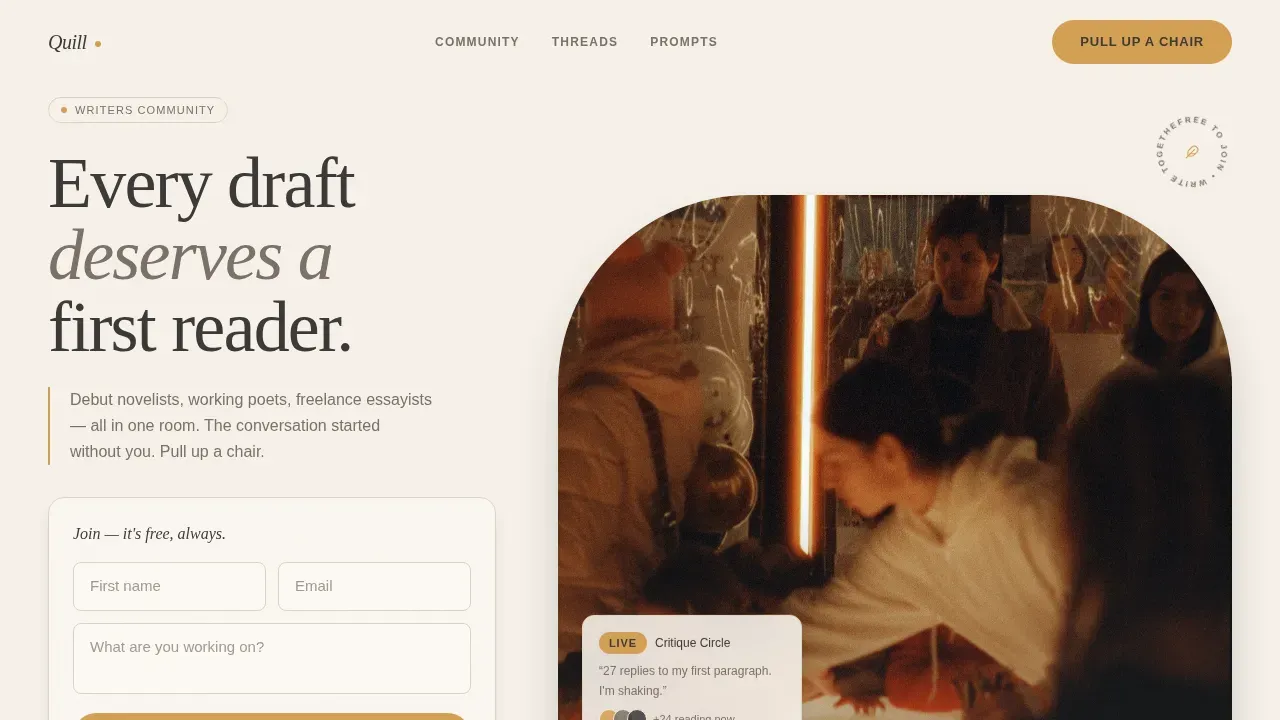
- A hero section with a half-page candid photograph, serif headline, and glassmorphism call-to-action widget
- Community portrait cards, live thread preview cards, and a side-by-side resource and signup section
- A footer in Vercel Horizontal Flow format with dot separators, completing the editorial structure
Feature list
A paragraph of context: each feature below is built directly from the template brief. Nothing here is speculative. These are the specific, prompt-backed capabilities that make Quill work as a community landing page.
Half-Page Hero with Candid Photography
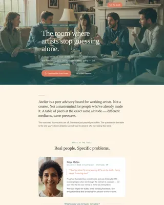
The hero uses a warm, naturally lit photograph of diverse writers mid-workshop. It pairs with a belonging-formula serif headline and a transformation subheading. The glassmorphism call-to-action widget sits beside the image and invites visitors to "Pull Up a Chair" with a free membership form asking only for a first name, email, and a single open text field: "What are you working on?"
Animated Community Activity Marquee
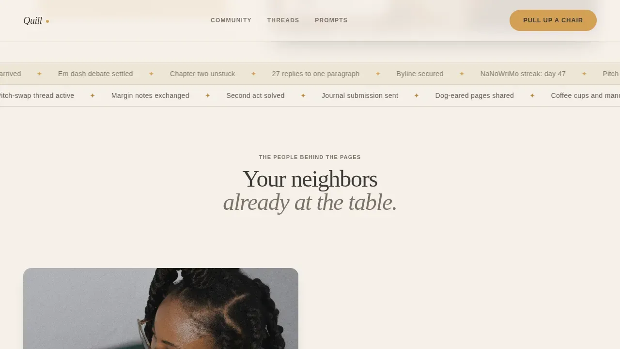
Directly below the hero, an animated scrolling strip displays live community activity phrases. This strip is crucial for demonstrating that the forum is active and that conversations are already in progress. It creates momentum and reassures visitors before they scroll further.
Member Portrait Cards
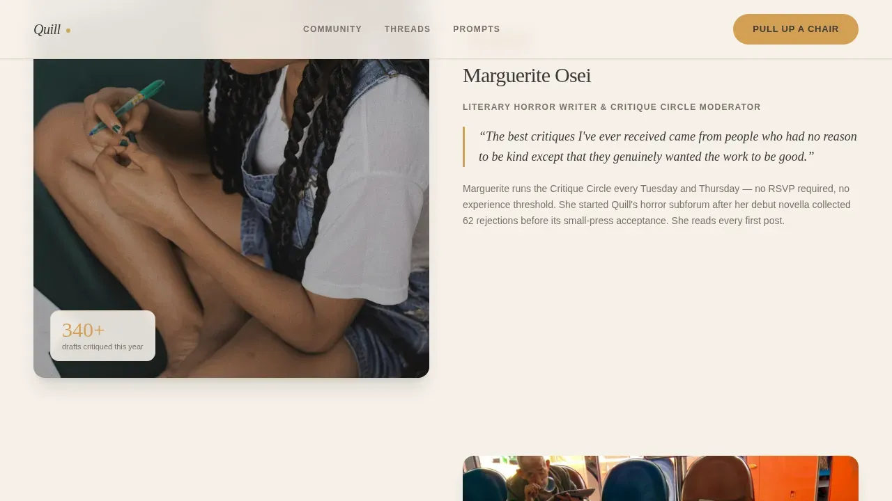
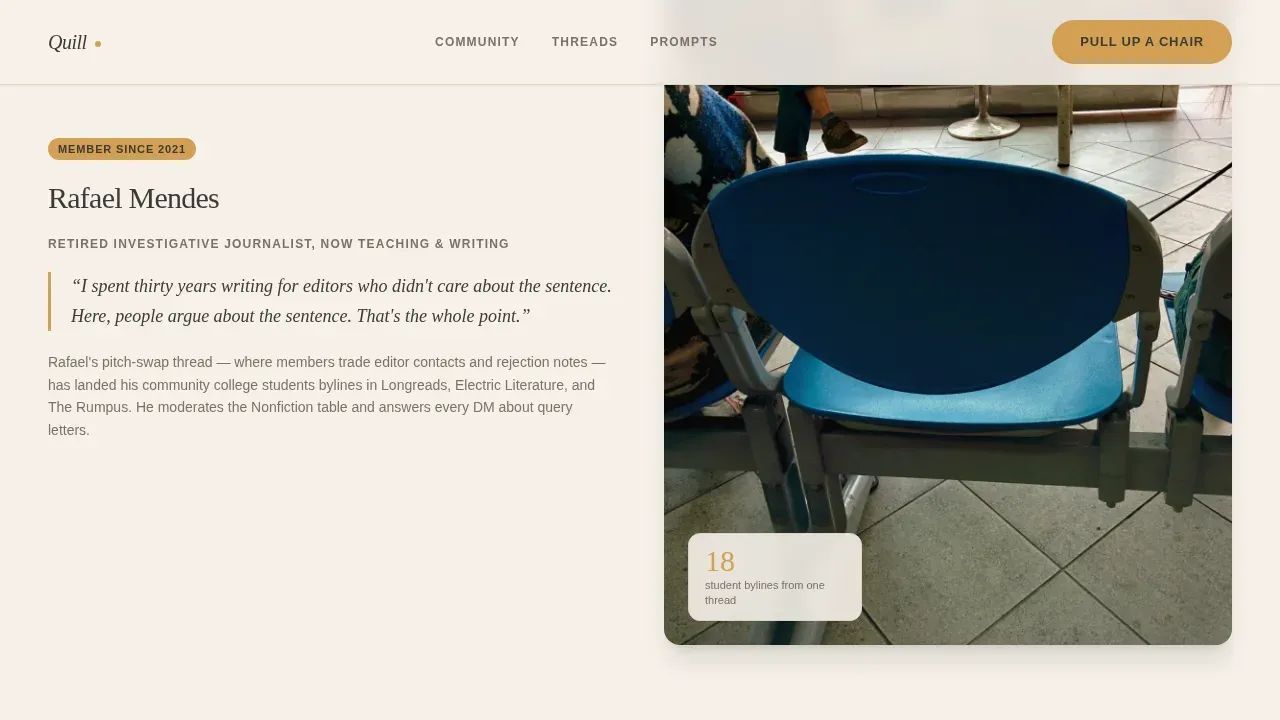
Three asymmetric portrait cards introduce real community members and moderators. Each card includes a photograph, a personal voice, and a short story. One moderator writes literary horror and leads the critique circle. A retired journalist explains how the pitch-swap thread helped her students land bylines. A thread screenshot shows twenty-seven replies to someone's first-ever posted paragraph.
Screenshot-Style Live Thread Previews
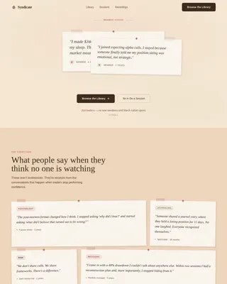
Thread preview cards are styled like real forum screenshots. They show reply counts, member involvement, and ongoing conversations. Visitors can see the structure of the community before they join, which reduces hesitation and builds trust without requiring a login.
Dual-Path Conversion Section
The resource and signup section offers two paths side by side. The primary path is the free membership form. The secondary path offers a downloadable PDF titled "50 Prompts From Our Community," gated by email alone. This format gives writers a low-commitment entry point while still capturing contact details for future engagement.
Community Hearth Design System
The entire page uses a cohesive Cloud Canvas color system: parchment cream, warm graphite, muted ink wash, and amber accent. Typography pairs Fraunces serif headlines with DM Sans body text. Scroll-reveal stagger animations, hover transitions on thread cards, and portrait hover reveals create a layered, editorial feel without heavy JavaScript libraries.
Page sections overview
| Section | Purpose |
|---|---|
| Hero with Photo | Establish belonging with a candid image, headline, and primary call to action |
| Activity Marquee | Show live forum momentum through an animated scrolling strip |
| Community Portrait Cards | Build trust through member stories and moderator introductions |
| Live Thread Previews | Demonstrate active conversation with screenshot-style thread cards |
| Resource and Signup | Offer the PDF download and free membership form side by side |
| Footer | Close the page with horizontal flow and dot-separated navigation |
Design & branding system
The visual identity follows a Community Hearth theme. The palette feels like a well-loved notebook left open on an overcast afternoon: never stark, never cold. Every surface carries the warmth of thumbed pages and editorial intention.
- Colors: parchment cream (#F5F0E8) background, warm graphite (#3D3A38) body text, muted ink wash (#7A7168) for secondary copy, and amber (#D4A054) for buttons, notification badges, and pull-quotes
- Typography: Fraunces serif for headlines and DM Sans for body text and user interface elements, creating an editorial warmth that suits a literary community
- Animations: medium-intensity scroll-reveal stagger, marquee loop, hover transitions on thread cards, and portrait hover reveals that keep the page alive without overwhelming the reader
Mobile & speed optimization
The template is designed desktop-first, which matches how most writers browse and research writing communities on laptops. At the same time, mobile adaptation is handled carefully so that members can read and post comfortably from phones, because mobile-first access is essential for any active community platform.
- Static-first build approach with optimized images keeps the page light and fast across devices
- Single-column flow means the layout adapts naturally to narrower screens without restructuring content
- A minimalist use of white space, guided by the parchment palette, keeps the page uncluttered and directs focus toward the call to action on every screen size
How this template helps you convert
The page is structured as a deliberate sandwich: it opens with a hook, moves through benefits and social proof, and closes with a clear call to action. Every scroll step earns the next one. Visitors do not feel sold to; they feel welcomed into a place where the work they care about is already happening.
- The hero section immediately conveys belonging through authentic photography and a personal headline, making the first emotional connection before a single word of copy is read
- Portrait cards and thread previews build cumulative social proof, showing specific outcomes like bylines, acceptance letters, and accountability partnerships rather than generic testimonials
- The dual-path conversion section removes friction by offering a free PDF download as a secondary entry point, so writers who are not ready to join can still share their email and stay connected
Other information about this template
This template sits at the intersection of editorial design and community-driven conversion. It is useful for a wide range of writing contexts and can support ongoing content needs beyond the initial launch page.
- The page format suits writing communities organized around genres including historical fiction, fantasy, and romance, as well as craft-focused groups covering topics like world building, editing tips, and novel structure
- Writers who focus on research-heavy genres like historical fiction will appreciate the portrait section's ability to highlight member knowledge and lived experience as social proof
- The dual-path section can support an email list strategy, which is one of the most effective long-term market tools an author or community manager can maintain for reaching readers directly
- Forum organizers can plan blog posts, articles, and community news updates that link back to this landing page, extending its reach across writing groups and school programs for students and adults
- The template's structure is compatible with discussions covering any stage of the writing journey: from deciding on a protagonist and planning chapters to editing drafts and navigating the publishing market
- Community guidelines and a respectful tone are central to what this page signals: the portrait cards, thread previews, and warm copy all demonstrate that this is a space where writers feel safe to post, share feelings about their work, and explore new ideas
- The downloadable PDF and the "editor's note" style voice used in portrait captions create an authentic, magazine-like feel that fits the literary sensibility of the community
- A common mistake in community landing pages is relying on passive voice and generic promises; this template avoids that by centering specific member stories and concrete outcomes
- Writers who have discovered communities through resources like writing clubs, school programs, and genre-specific groups will recognize the familiar warmth this page signals
- The amber accent and serif headline format are consistent throughout, so the page feels like a cohesive literary market piece rather than a patchwork of sections
Theme
Community Hearth
Creative direction
Team & People
Color system
Cloud Canvas
Style
Single Column Flow
Direction
Content/Resource
Page Sections
Candid Hero with Glassmorphism Widget
Animated Activity Marquee Strip
Asymmetric Member Portrait Cards
Screenshot-style Thread Previews
Dual-path Signup and PDF Download
Cloud Canvas Editorial Design System
Related questions
Who is this template built for?
Can I use this template for a historical fiction or fantasy writing community?
How does the free PDF download work within the conversion flow?
Is this template suitable for communities that include students and adult writers?
Does this landing page support an ongoing email or publishing strategy?