InsurTech & Digital Insurance Professional Website Template
Quotecompare is a split-screen insurance comparison landing page built for clarity and speed. Visitors answer a three-step form on the right panel while the left panel teaches them what the numbers mean. The result is a live side-by-side premium table from real carriers, delivered before anyone asks for a phone number or commits to a conversation.
by Rocket studio
Quick summary
Quotecompare is a single-page insurance comparison tool that puts real carrier premiums in front of visitors without a broker call. A multi-step form on the right half of the screen collects coverage details across three steps. The left half educates. By the end of the scroll, visitors have both the knowledge and the quote they came for.
Who this template is for
This template fits businesses and builders in the insurance technology space who want a high-converting, tool-first landing page. It is designed for digital-native audiences who prefer self-service over phone calls and forms that feel earned rather than intrusive.
- First-time homebuyers comparing renters and homeowners insurance side by side
- Small-business owners managing general liability and workers' compensation renewals
- Young parents evaluating employer plan gaps and shopping for supplemental family coverage
What problem this template solves
Shopping for insurance online is confusing. Most comparison pages hide premiums behind a lead form or redirect visitors to a broker. Visitors leave without answers. This template solves that by making the comparison tool the first thing a visitor sees, not the last.
- Visitors get real premium data before they are asked for contact information
- The multi-step form breaks a complex decision into three manageable steps
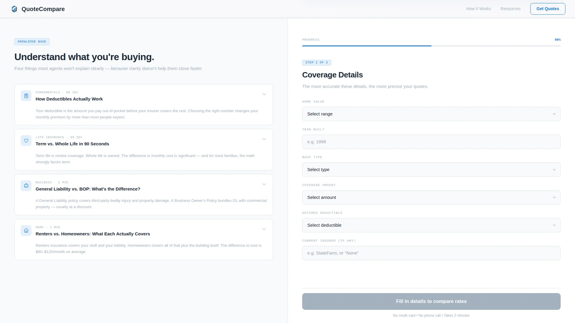
- Educational accordion cards resolve common knowledge gaps mid-session without sending visitors elsewhere
What you get with this template
You get a fully structured, desktop-first landing page with a 50/50 split-screen layout that guides visitors from awareness to comparison in a single scroll. Every section alternates between education and action, keeping visitors engaged without pressure.
- A three-step multi-step form with tile selection, coverage detail inputs, and a live sortable comparison table
- An educational left-column resource panel with expandable accordion explainer cards
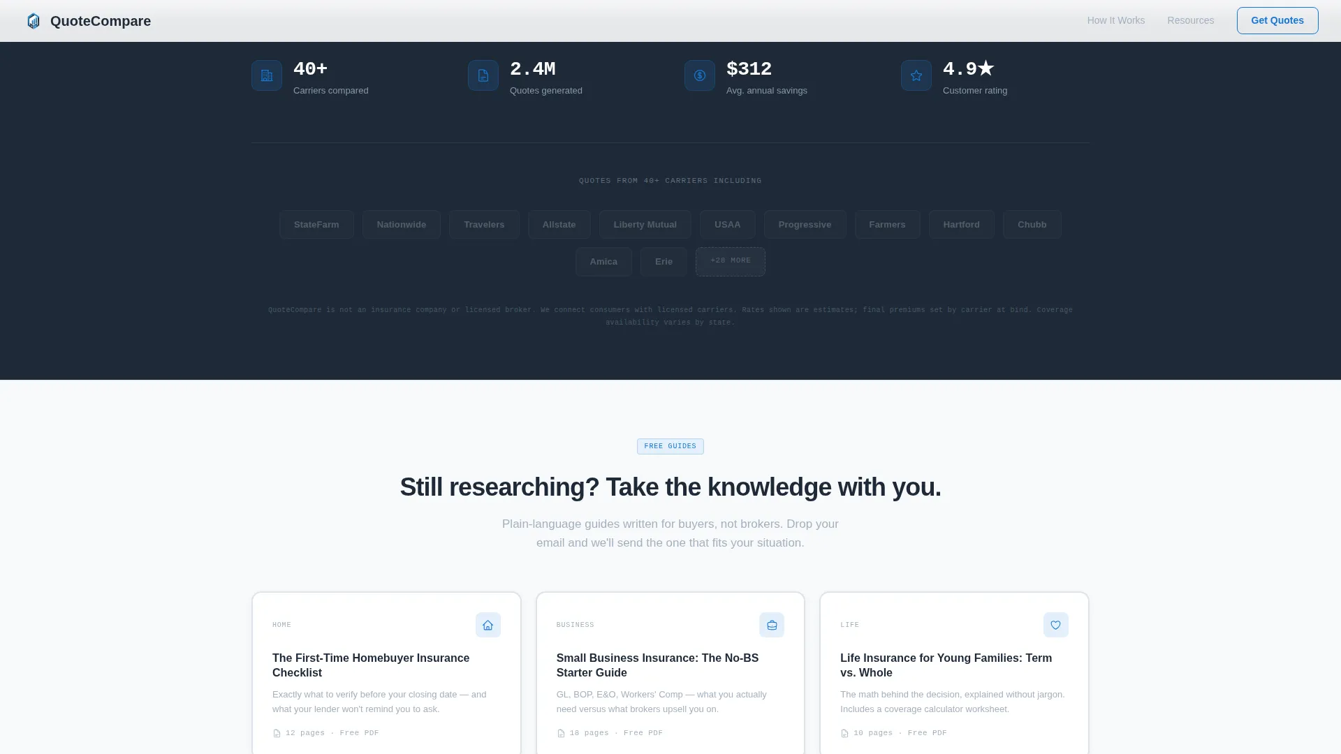
- A secondary email-capture section targeting research-mode visitors with a guide download offer
Feature list
A paragraph introduction to the feature set: every component listed below is defined directly by the template brief. Nothing is speculative. Each feature serves a specific role in moving a visitor from confusion to comparison.
Split-Screen Hero Layout
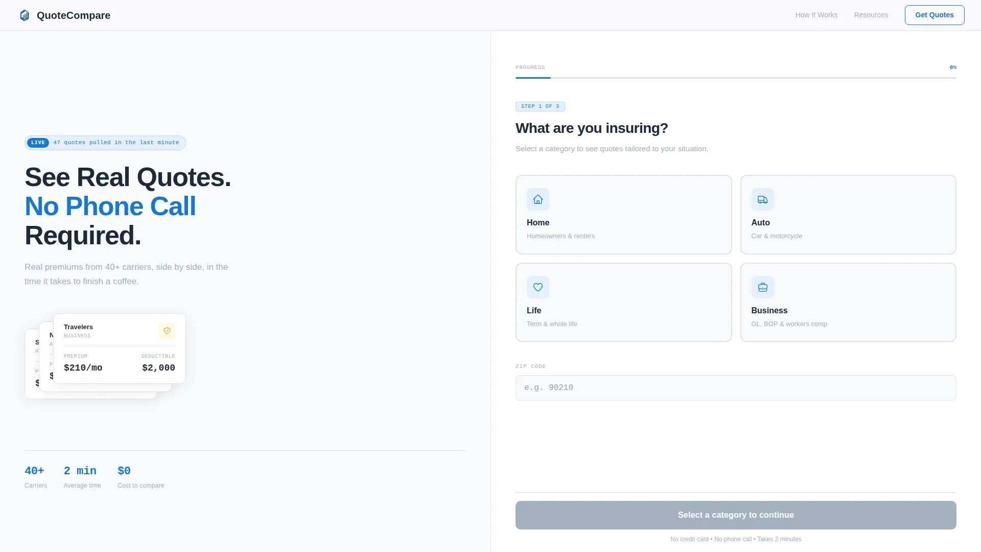
The page opens with a 50/50 viewport split. The left side carries an oversized headline and an animated policy card fan. The right side loads Step 1 of the form immediately. Visitors begin interacting before they decide whether to stay.
Multi-Step Insurance Form
The form runs across three steps: coverage type selection, coverage detail inputs, and a live results table. Step 1 offers four icon-labeled tiles for Home, Auto, Life, and Business. The primary call to action activates only after Step 2 is complete, making the click feel earned.
Live Carrier Comparison Table
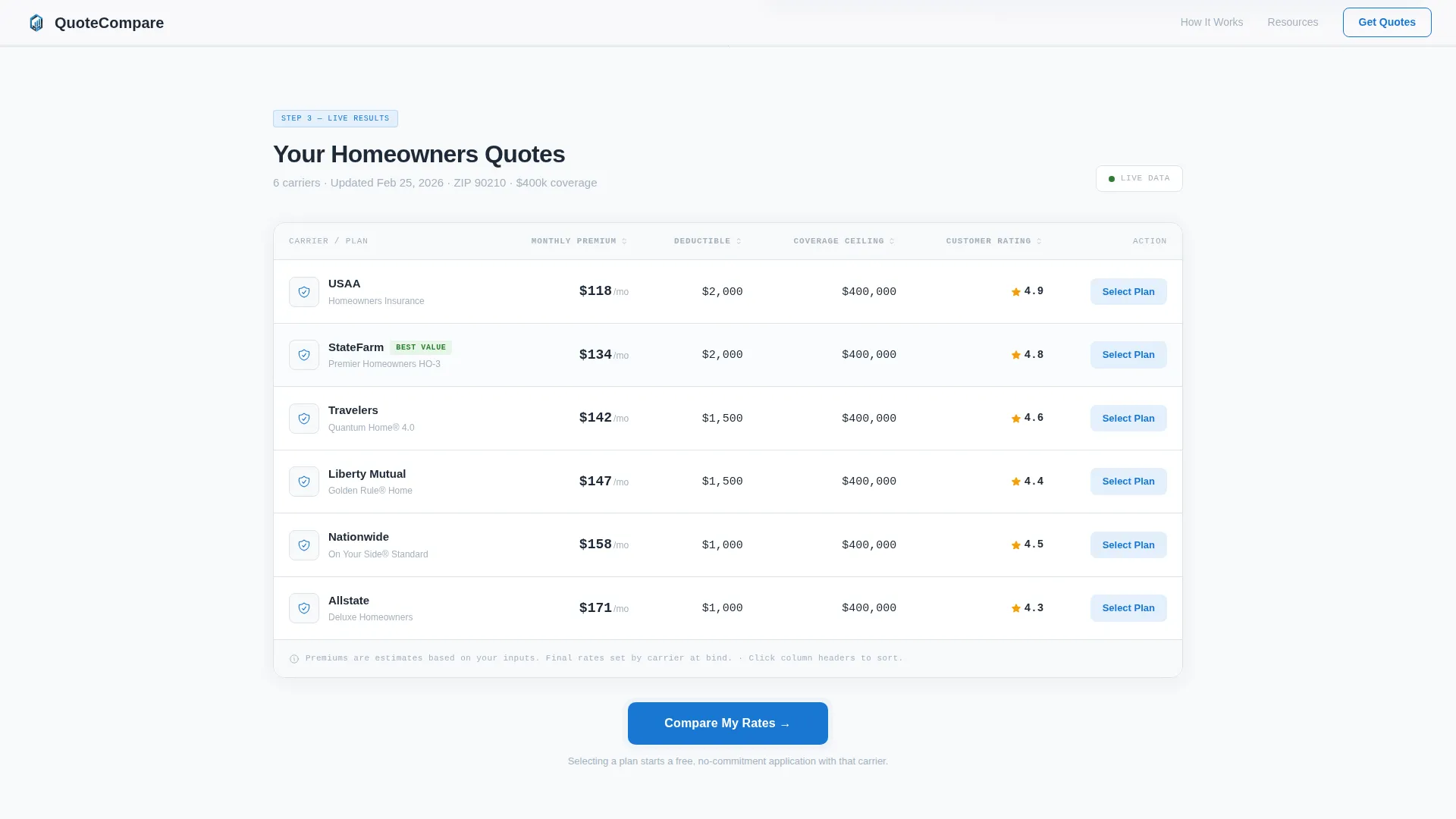
Step 3 returns a full-width sortable table of real carrier premiums. Visitors can sort by monthly premium, deductible amount, and coverage ceiling. The table replaces the need for a broker conversation at the initial research stage.
Expandable Accordion Resource Cards
The left panel below the fold holds bite-sized explainer cards on topics like how deductibles work and the difference between term and whole life policies. Each card is expandable, keeping the column skimmable without hiding useful content.
Secondary Email Capture Path
Each explainer card ends with a soft "Download the Full Guide" link. This collects only an email address and targets visitors still in the research phase. It creates a second conversion path that does not require the visitor to complete the full comparison form.
Animated Policy Card Fan
A GSAP-powered micro-animation fans out stacked policy cards in the hero left panel, each carrying a carrier logo. The animation communicates the breadth of carrier coverage at a glance, without using stock photography.
Page sections overview
| Section | Purpose |
|---|---|
| Hero Split Screen | Headline, animated card fan, and Step 1 tile form |
| Knowledge and Step 2 | Accordion explainer cards paired with coverage detail inputs |
| Live Comparison Table | Full-width sortable results from Step 3 of the form |
| Trust and Carrier Strip | Carrier logo wall, comparison count metric, and star rating badge |
| Guide Download Section | Email capture for research-mode visitors via soft secondary call to action |
| Footer | Linear single-row footer with essential links |
Design & branding system
The visual identity follows a Corporate Precision theme. Every color and type choice serves legibility and trust, not decoration. The palette is described in the brief as feeling like a freshly printed bank statement held under fluorescent light.
- Arctic White background (#F8F9FB), policy-ink charcoal (#1E2A38) for headlines, cool steel (#A3B1BF) for secondary text, and action blue (#1976D2) reserved for buttons, toggles, and interactive elements
- DM Sans handles all headlines and body copy; IBM Plex Mono is used exclusively for data labels and premium figures to reinforce a financial-data feel
- No stock photography and no decorative elements; the comparison tool and data table carry the visual weight of the page
Mobile & speed optimization
The template is built desktop-first because the 50/50 split-screen layout requires a wide viewport to function as designed. On smaller screens, the layout stacks gracefully so the form and educational content remain accessible in sequence.
- The left content column is statically rendered while the interactive right panel runs client-side, separating performance loads by responsibility
- Scroll-reveal animations, GSAP card fan transitions, and step-transition effects are set to medium intensity to balance visual feedback with load behavior
- The mobile stacked view preserves the three-step form flow and accordion resource cards without restructuring the conversion path
How this template helps you convert
This template is built around the principle that a visitor who already has an answer is far more likely to act. Every design and content decision feeds that logic.
- The multi-step form collects inputs progressively, reducing the perceived effort of getting a quote and making the final "Compare My Rates" call to action feel like a natural conclusion rather than an interruption.
- The alternating left-right rhythm of education and action raises visitor confidence with each scroll segment, so by the time the comparison table appears, the visitor already understands what they are looking at.
- The secondary guide download path captures visitors who are not yet ready to compare, giving them a reason to leave an email address and a reason to return.
Other information about this template
This template is purpose-built for the insurance technology and digital insurance comparison space. It is localized for United States audiences, using USD currency, MM/DD/YYYY date formatting, and state-based coverage language throughout the form and results table.
- The template style is Split Screen (50/50) and the page type is a single landing page, not a multi-page website
- Animation is handled through GSAP for the card fan, scroll reveals, step transitions, and a counter animation on the trust strip
- Interactivity level is high: tile selection, a sortable results table, expandable accordion cards, and multi-step form progression are all built into the template structure
- Social proof elements include a carrier logo wall, a comparison count metric, and a star rating badge in the trust strip section
Theme
Corporate Precision
Creative direction
Calculator/Tool First
Color system
Arctic White
Style
Split Screen (50/50)
Direction
Content/Resource
Page Sections
Split-screen Hero with Animated Card Fan
Three-step Multi-step Comparison Form
Sortable Live Carrier Comparison Table
Expandable Accordion Resource Cards
Secondary Email Capture Path
Trust Strip with Social Proof Elements
Related questions
What type of insurance products does this template support?
Does this template work on mobile devices?
Can the template capture leads from visitors who are not ready to compare rates?
Why does the primary call to action only activate after Step 2?
Is this template localized for a specific country or currency?



