Self-Service Clothing Store Bento Grid Landing Page
Rack is a bento grid landing page template built for self-service clothing stores. It blends a discovery-first layout with a punchy Citrus Burst color palette, guiding shoppers from free browsing to premium membership. The page moves like a clothing rack, fast, visual, and full of reasons to stop and grab something.
by Rocket studio
Quick summary
Rack is a single-page bento grid landing page template designed for self-service clothing retail. It opens with an app preview header, flows through curated discovery tiles, and closes the loop with a tiered membership comparison built to earn the upgrade. Every cell earns its space.
Who this template is for
This template speaks directly to self-service retail operators who want a landing page that sells the experience, not just the product. It fits stores where shoppers browse on their own terms and membership perks are a real differentiator.
- Self-service clothing stores offering tiered membership or loyalty programs
- Thrift and discount retailers with high turnover and frequent new arrivals
- Boutique or off-price shop owners ready to promote a self-checkout app
What problem this template solves
Most retail landing pages treat every visitor the same. Rack fixes that by building a visual journey that shows free-tier shoppers exactly what they are missing, then makes the upgrade feel like the obvious next step.
- No clear membership value story, so visitors leave without converting
- Disconnected layout that hides the self-service angle instead of leading with it
- Weak visual hierarchy that fails to separate discovery content from upgrade prompts
What you get with this template
You get a fully structured bento grid landing page with every section already sequenced for discovery and conversion. The layout is opinionated in the best way, meaning you fill in your brand details and the page does the selling.
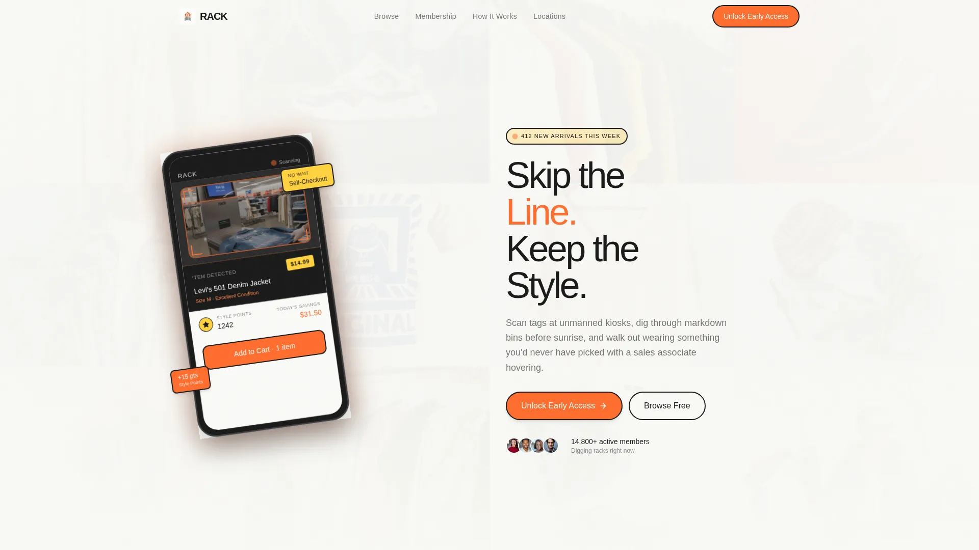
- A floating device mockup header showing a self-checkout app mid-scan
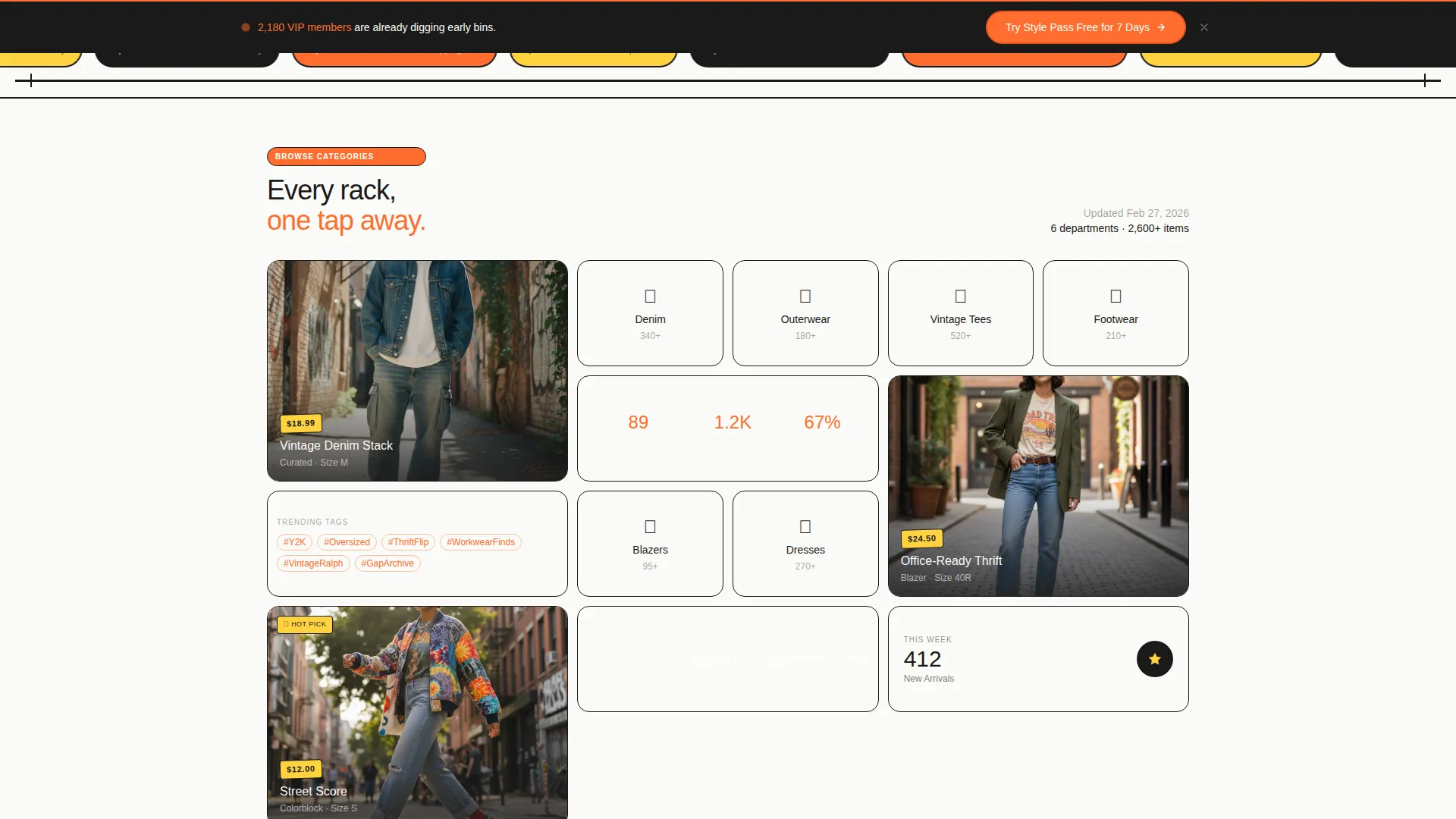
- Curated collection bento cells mixing cinematic outfit tiles with dense category and stat blocks
- A three-tier membership comparison card and a sticky secondary call-to-action bar
Feature list
This template is built around six core capabilities, each grounded in the source brief.
App Preview Header Section
The header features an angled floating phone mockup displaying a self-checkout app mid-scan. A denim jacket barcode is captured on screen, a price is rendered, and a loyalty points counter is shown ticking upward. Behind the device, a mosaic of clothing textures blurs at the edges, creating depth without distraction.
Bento Grid Discovery Layout
The page uses a bento grid structure where each cell is a discovery tile. Tall cells show single styled outfits in a cinematic format. Smaller cells display category icons, trending tags, or real-time stats such as "412 new arrivals this week."
Membership Tier Comparison Card
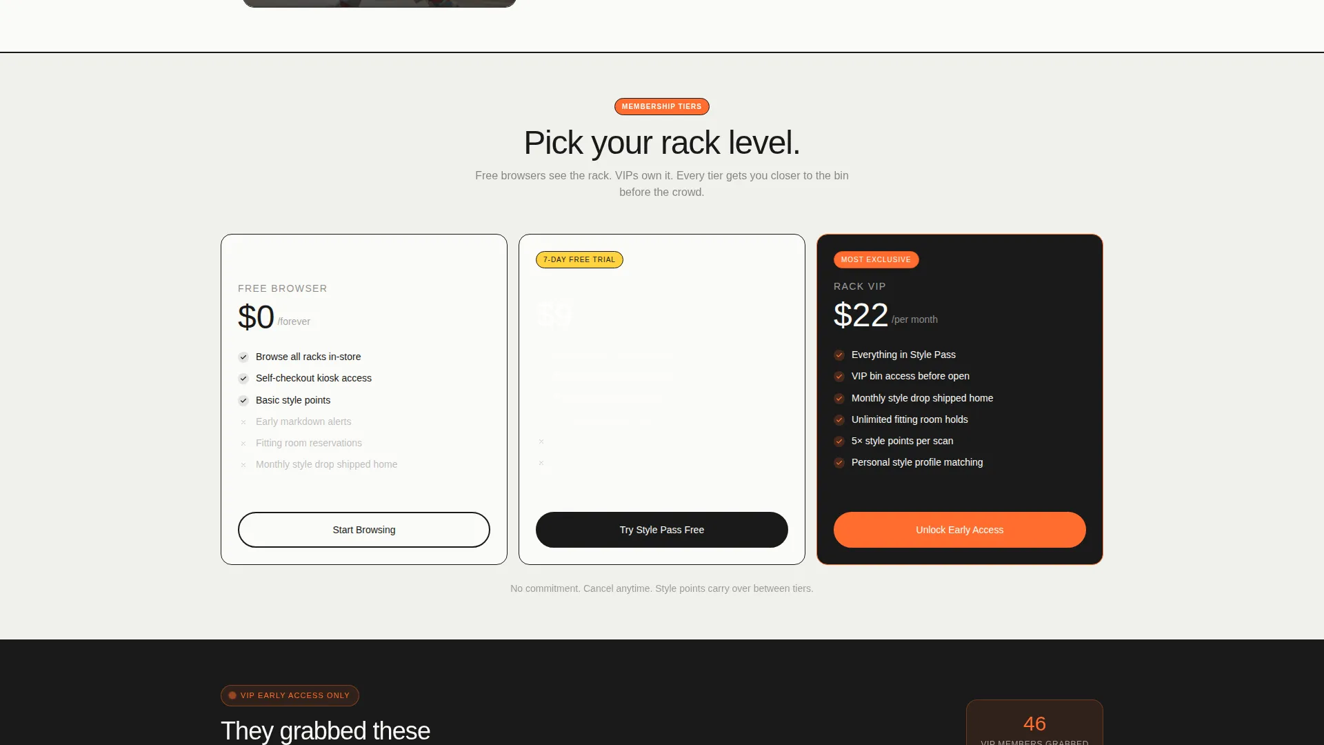
A dedicated bento card compares three membership tiers: Free Browser, Style Pass, and Rack VIP. Each tier lists tangible perks including early markdown alerts, fitting room reservations, and monthly style drops shipped to the member's home.
Upgrade Urgency Mechanics
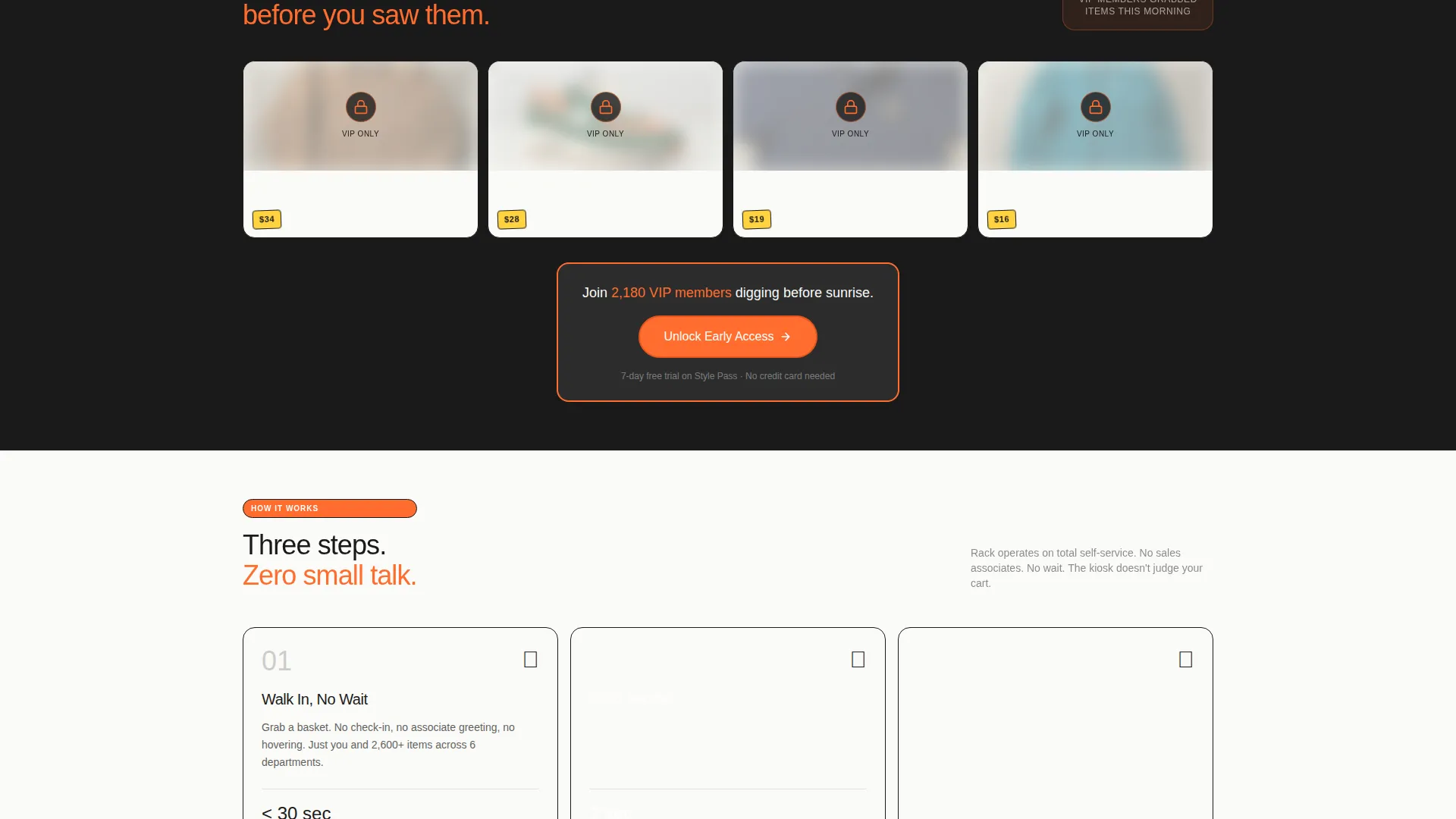
Blurred-out early-access items are displayed to free-tier visitors. A counter shows how many VIP members grabbed a piece before public release. These details make the gap between free and paid feel concrete and immediate.
Primary and Sticky calls to action
The primary call-to-action, "Unlock Early Access," appears first inside the membership tier card. A secondary call-to-action, "Try Style Pass Free for 7 Days," floats as a sticky bottom bar after the visitor scrolls past the second collection grid.
Most-Grabbed Items Ticker
A "most-grabbed items" ticker interrupts the bento grid rhythm between outfit sections. It functions as a social proof element, reinforcing the sense that the store is active and that desirable items move fast.
Page sections overview
| Section | Purpose |
|---|---|
| App Preview Header | Introduces the self-checkout app and sets the store's visual identity |
| Headline Copy Block | Delivers the core brand message: "Skip the Line. Keep the Style." |
| First Collection Grid | Opens product discovery with tall cinematic outfit tiles |
| Category Icon Cells | Lets visitors jump to departments or browse trending tags quickly |
| New Arrivals Stat Cell | Shows real-time inventory activity to create browsing momentum |
| Membership Comparison Card | Compares three tiers with specific perks and the primary call to action |
| Most-Grabbed Ticker | Provides social proof and pacing break between grid sections |
| Second Collection Grid | Continues discovery before the sticky secondary call to action activates |
| Sticky call to action Bar | Floats "Try Style Pass Free for 7 Days" after scroll threshold |
Design & branding system
The Citrus Burst color system drives every visual decision in this template. Electric tangerine dominates call-to-action buttons and category badges. Fresh-squeezed yellow highlights sale callouts and membership tier markers. White cotton provides breathing room between grid cells, and deep charcoal frames every card like the black metal arms of a clothing rack.
- Tangerine (#FF6D2E) for primary buttons, badges, and interactive accents
- Yellow (#FFD23F) for sale labels, tier highlights, and urgency callouts
- White cotton (#FAFAF7) and deep charcoal (#1A1A1A) for background and structural borders
Mobile & speed optimization
The bento grid layout is structured to reflow cleanly for smaller screens. Tall cinematic tiles stack vertically, dense stat cells remain compact, and the sticky call to action bar is designed to stay accessible at the bottom of the viewport on any device.
- Bento cells resize and reorder to maintain visual hierarchy on narrow screens
- Sticky bottom bar stays pinned without obscuring primary content on mobile
- Floating phone mockup header scales proportionally for tablet and mobile viewports
How this template helps you convert
Rack is designed so that each scroll takes a visitor one step closer to clicking. The page earns the upgrade rather than demanding it.
- Discovery tiles and real-time stats build browsing momentum early, so visitors are engaged before they reach any purchase decision.
- The membership comparison card surfaces concrete perks at exactly the right moment, right after the second collection grid has shown what is worth owning.
- Blurred early-access items and the VIP grab counter create visible, specific urgency that pushes free-tier visitors toward the "Try Style Pass Free" sticky bar.
Other information about this template
Rack fits naturally within the Retail & E-Commerce category and specifically serves the Self-Service Business subcategory. The template style follows a Gallery and Detail approach, combining large visual tiles with information-dense cells. The creative direction is Curated Collection, and the header concept is a Device Mockup. The theme is Directory and Discovery, meaning the layout prioritizes findability and forward momentum over static presentation.
- Template style: Gallery and Detail with bento grid structure
- Theme: Directory and Discovery with a retail-raw visual tone
- Creative direction: Curated Collection with escalating membership reveal
- Ideal for stores offering self-checkout kiosks, loyalty tiers, or early-access membership programs
Theme
Directory & Discovery
Creative direction
Curated Collection
Color system
Obsidian & Gold
Style
Gallery + Detail
Direction
Direct Sales
Page Sections
App Preview Header with Device Mockup
Bento Grid Discovery Layout
Three-tier Membership Comparison Card
Upgrade Urgency Mechanics
Primary and Sticky Call-to-action System
Most-grabbed Items Ticker
Related questions
Can I change the membership tier names and perks?
Does this template include a working self-checkout app?
Is the sticky call to action bar always visible on the page?
Who is this landing page template best suited for?
Can I replace the bento grid cells with my own content?



