Data Center Architecture Landing Page Template
Rack is a modular card grid landing page built for data center architecture practices. It opens with a stats tableau of oversized project metrics, walks visitors through a Problem→Solution arc of paired dark and light cards, and closes with a stepped facility assessment quiz that delivers a personalized Readiness Score and pre-fills a consultation request.
by Rocket studio
Quick summary
Rack is a single-page template designed for data center architecture firms. It leads with four animated project counters, moves through a paired card grid that names client pain points and presents direct solutions, and converts visitors through a three-step facility quiz. The Charcoal and Amber color system communicates both technical precision and calm authority.
Who this template is for
This template is built for firms and professionals who design, specify, and plan data center facilities. It speaks directly to the consultants and architects behind the infrastructure that keeps enterprise systems running.
- Data center architecture practices presenting their services to enterprise clients
- Independent data center consultants targeting IT directors and facilities managers
- Design-build firms specializing in colocation, edge, enterprise, or hyperscale facilities
What problem this template solves
Enterprise IT buyers are skeptical. They have seen too many vendor decks that promise capability without proving it. They arrive with a real deadline, a budget constraint, and a list of problems they have been carrying for months. This template earns trust before asking for contact details.
- Generic firm websites do not reflect the specific pressures of aging infrastructure or capacity mandates
- Most architecture pages bury their proof and lead with abstract credentials instead of client realities
- Prospective clients cannot self-qualify their situation, so they leave without booking a conversation
What you get with this template
The template delivers a complete, single-page layout ready to represent a data center architecture practice. Every section has a clear job, and the page flows from credibility to empathy to action without friction.
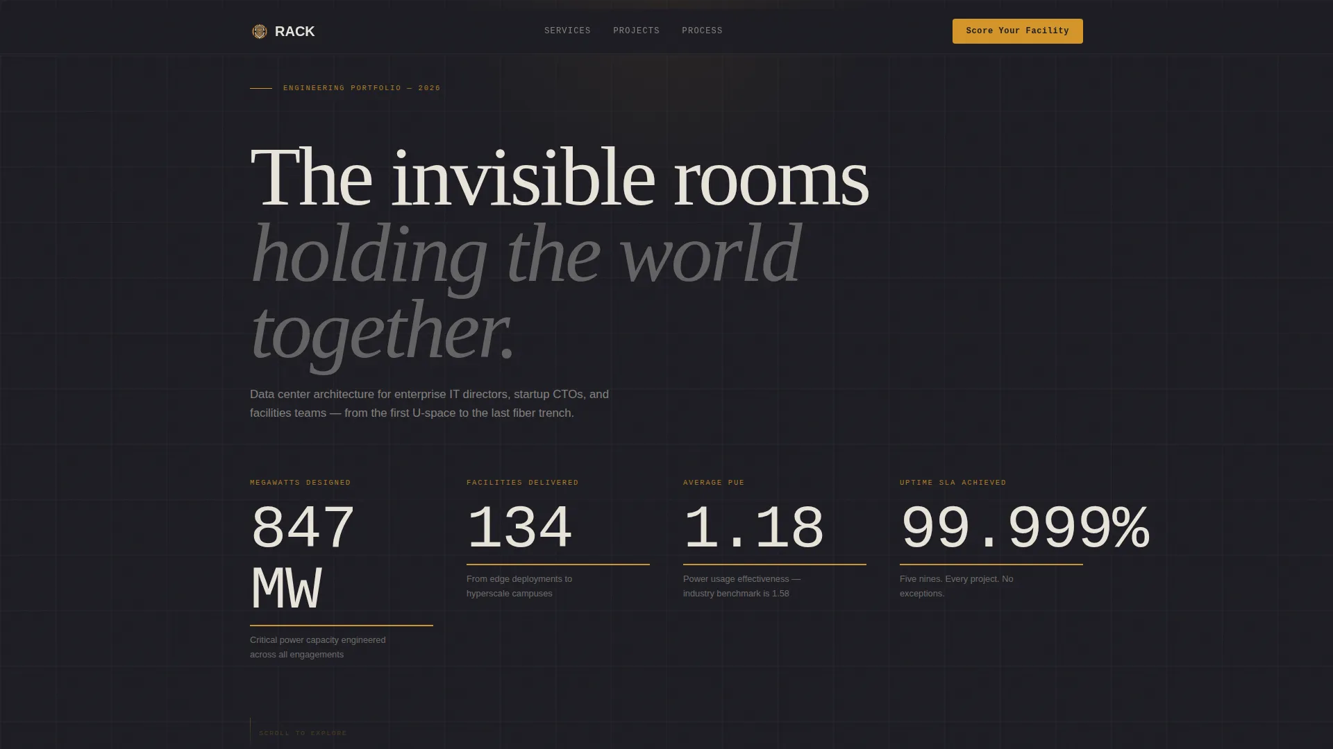
- A Stats/Metrics header with four animated counters showing megawatts designed, facilities delivered, average Power Usage Effectiveness, and uptime percentage
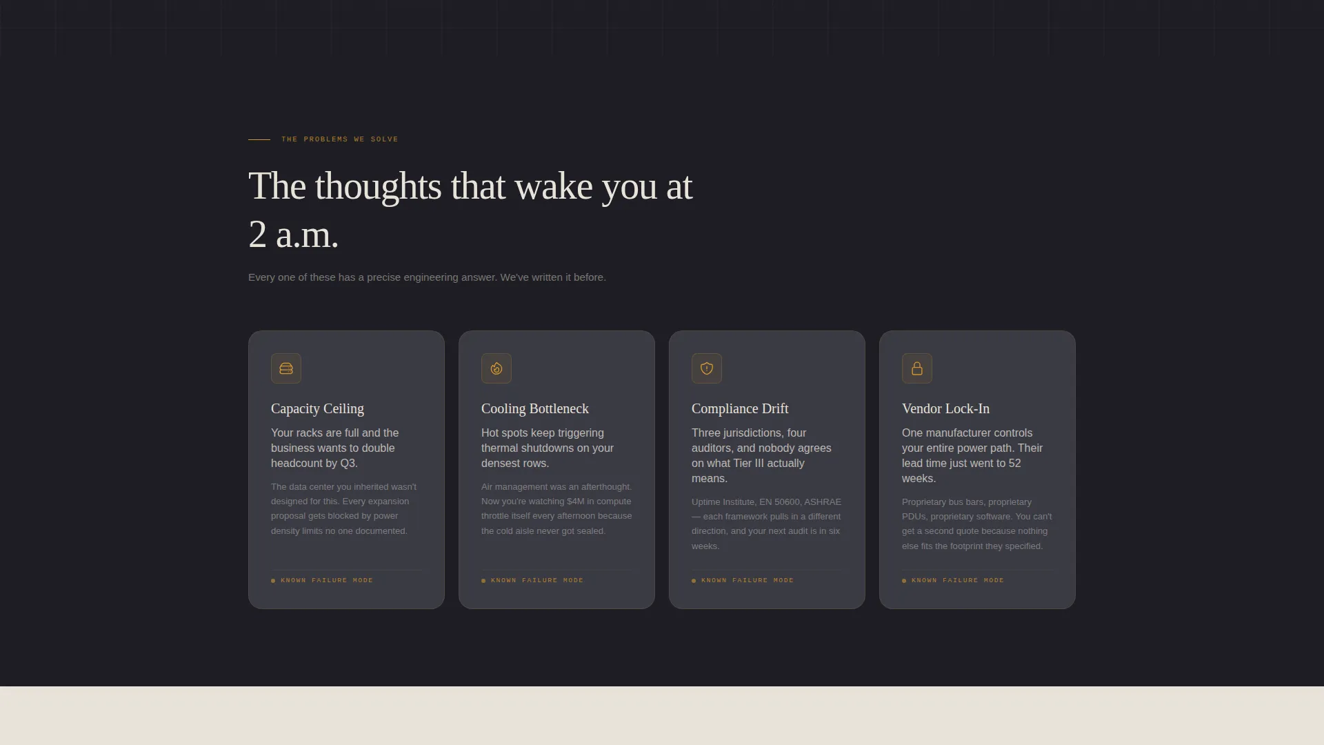
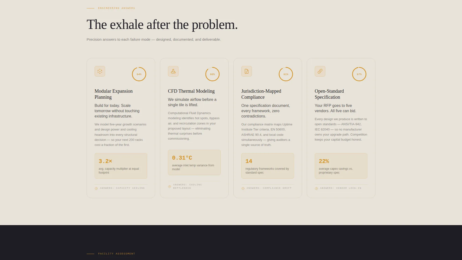
- A modular card grid arranged in a Problem→Solution arc, with eight paired cards covering capacity, cooling, compliance, and vendor lock-in
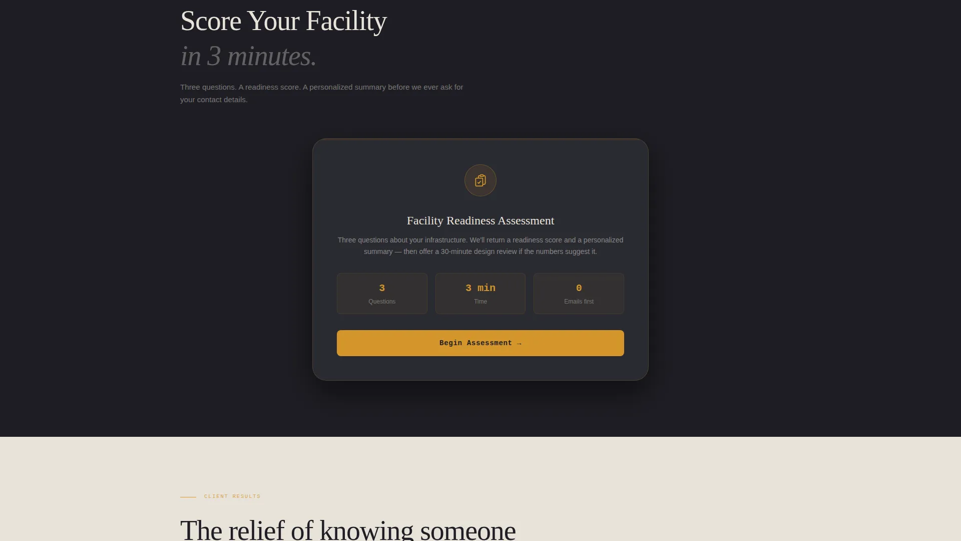
- A three-step Quiz/Assessment flow with an amber progress bar, a Readiness Score output, and a pre-filled consultation booking call to action
Feature list
This section describes the core functional components included in the template.
Animated Stats Header
Four oversized counters tick upward against a rack-black background. They display total megawatts designed, facilities delivered, average Power Usage Effectiveness across projects, and a five-nines uptime percentage. Each number uses a thin monospaced typeface with an amber underline. The counters act as the visual centerpiece, replacing a traditional hero image with earned proof.
Problem Card Grid
The first card row presents four pain-point cards on dark gunmetal surfaces. Each card carries a single amber-outlined icon and one direct sentence describing a problem a director has genuinely faced. The four problems covered are Capacity Ceiling, Cooling Bottleneck, Compliance Drift, and Vendor Lock-In.
Solution Card Grid
Directly below the problem row, four meadow-stone cards present the matching solutions. These cards are warmer and lighter in tone, featuring subtle amber progress rings. The solutions covered are Modular Expansion Planning, Computational Fluid Dynamics Modeling, Jurisdiction-Mapped Compliance, and Open-Standard Specification.
Stepped Assessment Quiz
The primary call to action opens a three-step facility quiz. Step one captures facility type from four options: colocation, enterprise, edge, and hyperscale. Step two captures current rack count and target growth horizon. Step three asks the visitor to select their top concern from the pain cards already seen. An amber progress bar tracks completion across all three steps.
Readiness Score Output
On completing the quiz, the visitor receives a personalized Readiness Score with a summary that reflects their own answers. A secondary call to action, "Book a 30-Minute Design Review," pre-fills the consultation request form with the quiz responses already captured.
Alternating Background Layout
Page backgrounds alternate between rack-black and meadow stone, creating clear visual rhythm as visitors scroll. Card surfaces use warm gunmetal with amber borders that brighten on hover. Body text is set in stone on dark backgrounds and charcoal on light ones, maintaining comfortable contrast throughout.
Page sections overview
| Section | Purpose |
|---|---|
| Stats Metrics Header | Open with four animated project counters to establish credibility immediately |
| Problem Cards Row | Present four dark pain-point cards that reflect real client pressures |
| Solution Cards Row | Respond to each problem with a lighter, solution-focused card |
| Quiz Assessment Flow | Guide visitors through a three-step self-assessment of their facility |
| Readiness Score Output | Deliver a personalized score and pre-fill a consultation booking request |
Design & branding system
The Pastoral Calm theme balances the visual weight of a technical industry with a sense of controlled warmth. The palette draws on deep rack-black, warm gunmetal, soft meadow stone, and living amber. The overall feeling is a whiskey-colored desk lamp glowing in a quiet operations center.
- Core palette: rack-black (#1E1E24) and warm gunmetal (#3A3A44) for dark surfaces; soft meadow stone (#E8E3DA) for light backgrounds; living amber (#D4952A) reserved for interactive states, progress indicators, and calls to action
- Typography uses a thin monospaced face for counters and dashboard figures, reinforcing the precision instrument aesthetic
- Card hover states brighten amber borders, giving subtle interactive feedback without distracting animations
Mobile & speed optimization
The card grid uses a modular layout that reorganizes cleanly for smaller screens. Pain and solution cards stack into a single column, keeping the Problem→Solution arc intact as visitors scroll on a phone.
- The stepped quiz flow is designed as individual full-card steps, each fitting comfortably within a mobile viewport
- The stats header scales down gracefully, keeping the four counters readable without cropping or overlapping
- Background alternation and amber accent colors are preserved across all screen sizes for consistent brand feel
How this template helps you convert
Every layout decision in this template serves the goal of moving a skeptical infrastructure buyer toward booking a real conversation. The page earns attention before it asks for anything.
- The stats header establishes proof in the first two seconds, giving visitors a concrete reason to keep reading before any copy is presented
- The paired card grid mirrors the visitor's own situation back to them, creating recognition and relevance that generic firm pages cannot match
- The quiz converts passive interest into active self-qualification, and the pre-filled booking form removes friction from the final step
Other information about this template
This template belongs to the Construction and Home category under the Data Center Construction subcategory, with a niche focus on data center architecture practices. It is built as a card grid landing page and follows the Pastoral Calm theme throughout.
- The template style is Card Grid (Modular), well suited to practices that want to present multiple service dimensions in a scannable, structured layout
- The creative direction follows a deliberate Problem→Solution Arc, a structure that resonates with buyers who arrive with a defined challenge rather than open curiosity
- The header concept is Stats/Metrics, chosen because quantified project history communicates credibility faster than paragraphs of firm description
- The landing page direction is Quiz/Assessment, reflecting a conversion strategy where self-service discovery replaces cold lead capture
Theme
Pastoral Calm
Creative direction
Problem→Solution Arc
Color system
Charcoal & Amber
Style
Card Grid (Modular)
Direction
Quiz/Assessment
Page Sections
Animated Stats Metrics Header
Paired Problem and Solution Card Grid
Three-step Facility Assessment Quiz
Personalized Readiness Score Output
Alternating Background Color System
Related questions
Can I edit the pain and solution card content to match my own services?
Does the quiz store or send visitor answers automatically?
Is this template suitable for a solo data center consultant?
Can I add more cards to the problem and solution grid?
What does five-nines uptime mean in the stats header?



