Data Center Construction Professional Website Template
The Rack landing page template is built for data center interior design firms that need to prove geographic expertise before earning a consultation. A dark-mode map hero, modular metro card grid, scrolling capability ticker, aggregate metrics section, and a persistent click-through call to action work together to turn technical credibility into qualified leads, no form required on this page.
by Rocket studio
Quick summary
Rack is a Corporate Precision landing page template designed for data center interior architecture firms. It opens with an interactive dark-mode map showing real metro markets, then flows into a modular card grid where each card represents a region the firm has served. The page builds geographic proof systematically, then drives visitors toward a capabilities consultation through a persistent bottom-bar call to action.
Who this template is for
This landing page was built for a very specific type of professional services firm. If your business plans, designs, and delivers the interior architecture of data center facilities, this template speaks your language and matches the expectations of your buyers.
- Colocation providers expanding into new metro markets who need a design partner with proven regional experience and the ability to handle complex projects at scale.
- Enterprise IT directors retrofitting legacy server room environments who need to see technical depth, not just polished brochure imagery.
- Hyperscale operators evaluating design partners who understand that every square foot of white space carries real revenue weight and that network infrastructure decisions have long operational consequences.
What problem this template solves
Data center interior design is a high-trust, high-stakes business. Prospects arrive at your landing page already skeptical. They have seen too many generic proposals from firms that talk about servers but have never routed a cable pathway in a live facility. The core problem is credibility at first impression.
This template solves that problem by leading with geographic proof rather than marketing claims. The interactive map shows your actual footprint. The metro card grid shows your density of expertise, market by market. The aggregate metrics section quantifies the megawatts deployed and facilities designed. Every element of the page plan works to answer the question the visitor is already asking: "Have they already done this in my market?"
- No-form, click-through structure means visitors are not hit with friction before they understand your value. The page earns the click by letting the data and project density do the convincing first.
- Inline card expansion keeps visitors on the page longer. Instead of navigating away, they expand a metro card to see facility interior images, kilowatt capacity figures, and regional testimonials, building confidence without breaking flow.
What you get with this template
This template delivers a fully structured, single-page layout built around the card grid (modular) format. Every section has been designed with desktop-first enterprise buyers in mind, while maintaining a responsive mobile fallback for access on other devices. The page is ready to receive your real project data, images, and market coverage details.
- Seven distinct sections covering the hero map, marquee ticker, metro card grid, aggregate metrics, call-to-action card, and footer, each with clearly defined roles in the visitor journey.
- High-interactivity components including pulsing cyan location dots, hover-triggered city cards, inline expandable project cards, scroll-reveal animations, spotlight effects, and a persistent bottom call-to-action bar that appears after the visitor scrolls past the map.
- Monochrome Steel visual system using server black, brushed aluminum, perforated panel gray, and status-indicator cyan, applied with strict logic so cyan appears only on interactive elements and hover states, exactly as indicator lights behave on live hardware.
Feature list
This template packs a focused range of features. Each one was carefully selected to serve the specific communication goal of a data center interior design firm presenting geographic proof to enterprise buyers.
Interactive Dark-Mode Map Hero
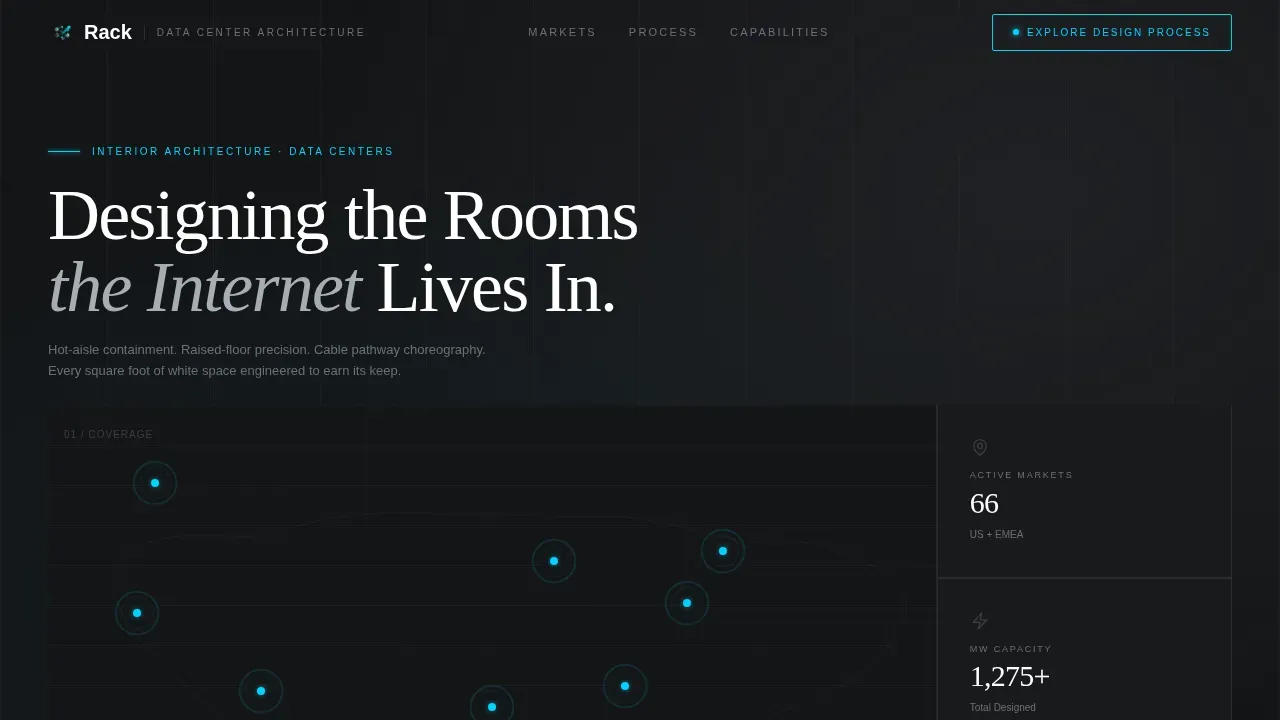
The hero section opens with a rendered dark-mode map showing real metropolitan regions where the firm has designed facilities. Each location is marked with a pulsing cyan dot. Hovering over a city slides out a card showing the facility name, total kilowatt capacity designed, and a hero thumbnail of the finished white space interior. The map uses monochrome rendering with faint topographic contour lines, making it feel like infrastructure planning software rather than a standard marketing page. This is the perfect way to communicate scale and geographic reach before a visitor reads a single word of body copy.
Modular Metro Card Grid
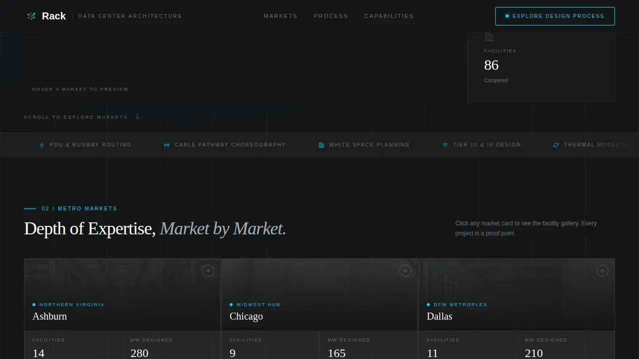
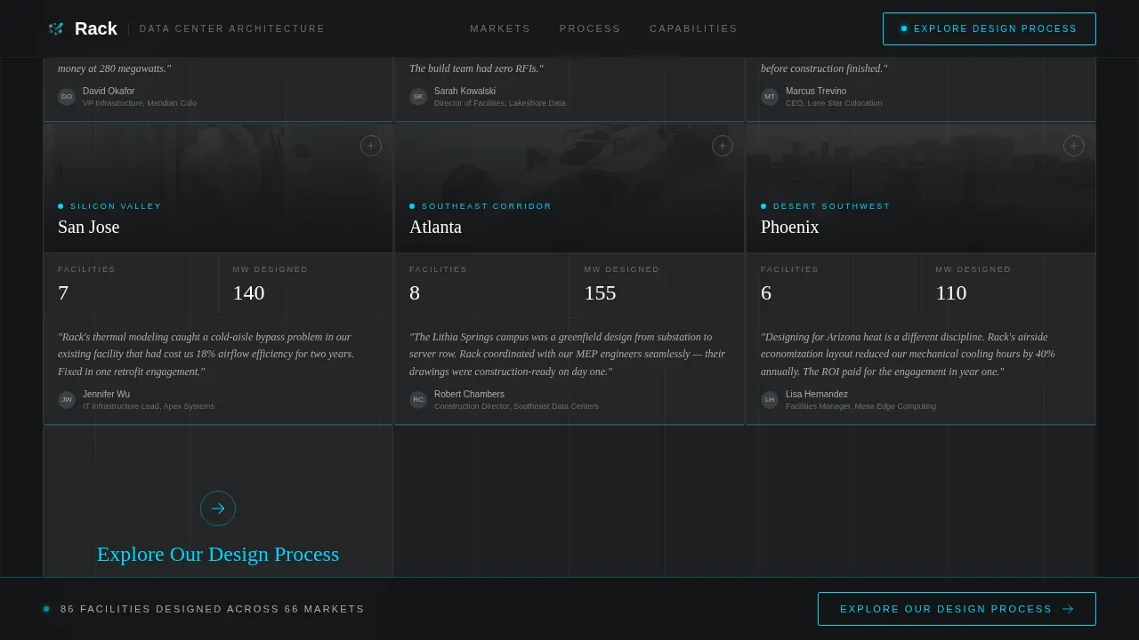
Below the map, the page loads a modular card grid where each card represents a metro market. Cards display the city skyline silhouetted against panel gray background, the number of server room facilities designed in that market, aggregate megawatts deployed, and a client testimonial from that region. Clicking any card does not open a new page; instead, it expands inline to reveal a photo gallery of that facility's interior, including containment corridors, Power Distribution Unit (PDU) installations, and overhead busway routing. This inline expansion keeps the user on the page and deepens engagement without forcing navigation.
Scrolling Technical Capability Ticker
Between the hero map and the card grid, a marquee ticker scrolls continuously through the firm's core technical capabilities: hot-aisle containment, raised-floor layouts, cable management choreography, network infrastructure planning, rack diagrams, and more. This element reinforces technical authority at a glance. It is a clever way to communicate depth of services without adding visual clutter or requiring the visitor to read a long list.
Aggregate Metrics Section
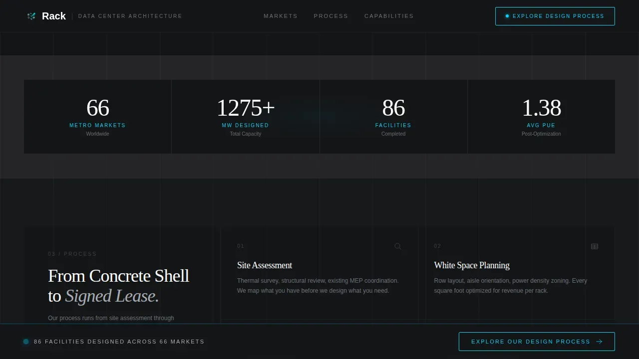
A dedicated section surfaces the firm's key proof numbers: total megawatts deployed across all markets, total data center facilities designed, and total metro markets covered. These figures give the visitor a quantitative sense of the firm's scale before they click through to the capabilities page. The section uses the same Monochrome Steel background and aluminum typography as the rest of the page, maintaining visual consistency while delivering hard data.
Persistent Click-Through Call to Action
The primary call to action, "Explore Our Design Process," appears in two places. First, it emerges as a persistent bottom bar after the visitor scrolls past the map. Second, it appears as the final card in the grid, styled identically to the project cards but reversed in cyan-on-black. There is no form on this landing page. The click-through approach respects enterprise buyers who need to understand value before committing to contact, and it keeps the conversion process clean and low-friction.
Fraunces and DM Sans Typography Pairing
The template uses Fraunces as the display serif for headlines and DM Sans as the body typeface. This pairing gives the page a precise, architectural quality. Headlines carry weight and character; body text stays clean and readable. The combination suits the technical depth of data center interior design presentations without feeling cold or overly technical.
Page sections overview
| Section | Purpose |
|---|---|
| Hero Map | Interactive dark-mode metro map with pulsing cyan markers and hover city cards |
| Capability Ticker | Scrolling marquee of core technical services and data center design capabilities |
| Metro Card Grid | Modular expandable cards per market with inline facility photo galleries |
| Aggregate Metrics | Quantified proof: megawatts deployed, facilities designed, markets covered |
| call to action Card | Cyan-on-black final card and persistent bottom bar driving click-through |
| Footer | Linear single-row footer with standard navigation and contact link |
Design & branding system
The Monochrome Steel color system is applied with the same logic a senior engineer uses when routing power and data cables through a live server room: every decision has a reason, and nothing is decorative without purpose. Backgrounds alternate between server black (#141517) and perforated panel gray (#3B3F45). Text lives in brushed aluminum (#A8ADB3). Status-indicator cyan (#00D4FF) appears only on interactive elements and hover states, never as decoration.
- Corporate Precision theme: the visual style is clean, metallic, and unornamented. It communicates the same standards a colocation provider expects from an interior design firm that works inside Tier IV facilities. The page background, typography, and spacing all reinforce the idea that this firm operates with surgical intent.
- Fraunces display serif + DM Sans body: headlines carry architectural weight while body text stays legible at any screen size. The typographic system reflects brand values that prize clarity and precision over flash.
Mobile & speed optimization
The template is built desktop-first, reflecting the reality that enterprise IT directors and colocation procurement teams typically evaluate design partners on workstations during business hours. The layout prioritizes the full-screen map experience and the wide card grid that performs best on large screens.
- Responsive mobile fallback: the card grid stacks cleanly on smaller screens, the map scales to viewport, and the persistent bottom-bar call to action remains visible and tappable. Visitors who arrive on mobile still receive a coherent, professional experience.
- Performance architecture: static sections such as the ticker, metrics, and footer are built as server components to reduce load overhead. The interactive map and expandable card components use client-side rendering only where interactivity is required. This split approach keeps the page feeling fast even with high animation density.
How this template helps you convert
This landing page was designed with one conversion goal: get the right visitor to click "Explore Our Design Process." Every section earns that click by building a specific type of trust.
- Geographic proof before the ask: the map and metro card grid accumulate evidence of real project history, market by market. By the time the visitor reaches the call-to-action card, they have already seen the firm's footprint, reviewed facility interiors, and read testimonials from clients in their region. The ask feels earned, not forced.
- No form friction: a primary call to action that leads directly to a capabilities consultation page respects the decision-making process of enterprise buyers. The landing page functions as a standalone qualifier. It communicates the offer clearly, builds confidence through density of proof, and then lets a single, prominent click carry the visitor forward.
Other information about this template
This section covers additional practical context that helps buyers, developers, and design teams get the most from the Rack template.
The rack precision data center interior design landing page template is positioned in the Construction and Home category under the Data Center Construction subcategory. It is purpose-built for the data center interior designer niche, and its design decisions reflect that specificity at every level.
Buyers working on data center proposals and client presentations will find this template useful as a starting reference for how to structure geographic proof and technical credibility into a single coherent page. The card grid layout translates well to scenarios where a firm needs to communicate its range of services across multiple metro markets without building a multi-page website.
From a planning perspective, this template aligns with how serious data center project planning actually works. Effective cooling system design should be a major part of the initial planning for any data center project, and the template's capability ticker is designed to surface that expertise early. Data center projects include both migrations and consolidations, which require in-depth planning to ensure success; the metro card grid is designed to reflect that depth by showing real facility outcomes rather than abstract service lists. Accurate growth forecasting is a critical part of data center project planning to ensure sufficient space for future needs, and the template's aggregate metrics section is the right place to communicate that the firm accounts for long-term infrastructure growth, not just day-one capacity.
The following practical tips apply to anyone deploying this template:
- Use high-quality images or 3D renders to populate the facility photo galleries inside each metro card. Before-and-after scenarios work especially well to demonstrate the benefits of precision-engineered server room environments. High-quality visuals are one of the most important elements for conversion on any data center design landing page.
- Creating a rack diagram for each featured facility helps communicate the standardization of Rack Units (RUs) and how many devices fit per enclosure in a data center. Rack diagrams are a powerful tool for communicating technical depth to enterprise IT professionals who evaluate design partners based on documentation quality.
- When building out metro card content, plan to include data on hot/cold aisle containment outcomes, since effective thermal management can reduce cooling costs by up to 30% when using hot/cold aisle layouts. This kind of specific, quantified data strengthens the testimonial and metrics sections.
- The template supports a range of business contexts. For instance, colocation providers can use the map to show planned future market expansion alongside completed projects, giving prospects a sense of the firm's growth trajectory.
- Intelligent Rack Power Distribution Units (PDUs) and redundant power paths (A and B feeds) are technical details that resonate strongly with enterprise buyers. Including this level of specificity in metro card descriptions and facility galleries signals that the firm understands real data center operations, not just architectural aesthetics.
- Multiple stakeholders, including project managers and IT professionals, will need access to project documentation and design materials. The template's click-through structure sends visitors directly to a capabilities consultation page where that detail can live, keeping this landing page focused and uncluttered.
- A polished, professional landing page can improve your conversion rates. Avoiding common mistakes, such as too many calls to action, unclear value propositions, and distracting elements, is baked into the Rack template's single-call to action, no-form approach.
- The page plan accommodates illustrations, network hardware photography, and server room imagery that would also work well in brochure templates or client-facing presentations. The same images used to populate this landing page can feed into broader marketing materials.
- Brochure templates for data centers often feature visuals that represent technology and connectivity. The Rack template's image-first card grid shares that visual logic, making it easy to repurpose approved facility photography across multiple deliverables.
- For teams that also create client-facing presentations, the Rack template's section structure, specifically the metrics section and the geographic proof narrative, maps directly to a presentation flow that works in slides. The same story told on this landing page can be adapted into a capabilities deck with minimal restructuring.
- A/B testing is a useful practice once the template is live. Testing headline variants in the hero section and testing the position of the persistent call-to-action bar are both low-effort, high-value experiments that can meaningfully improve click-through rates over time.
- The template's design system does not include a white background. The deliberate avoidance of a white background is intentional; the alternating server black and panel gray backgrounds create the immersive, facility-like atmosphere that makes this landing page feel different from generic construction or technology marketing pages. A white background would break the Monochrome Steel logic entirely.
- Planning for standards is essential in data center design to ensure that different systems and components can interoperate. The template reflects this principle in its own structure: every component follows a consistent visual grammar so the page reads as a unified, trustworthy presentation rather than a patchwork of disconnected sections.
- Data center interior design should enhance functionality and efficiency while considering aesthetics. This template makes that principle visible to prospective clients by showing the interior reality of completed facilities, not just architectural renders.
- Maintaining proper aisle widths of 3, 4 feet is critical for equipment installation and maintenance. Including this kind of operational detail in facility card descriptions signals that the design firm understands how data center facilities actually function day to day.
- Cloud computing infrastructure expansion is one of the primary drivers of new data center construction globally. This template is well suited for firms whose client base includes cloud computing operators and hyperscale providers who are evaluating interior design partners for greenfield builds.
- Software tools used during the design process, such as floor plan creation applications and network infrastructure modeling tools, are relevant context for the capabilities consultation page that this landing page links to. The landing page itself does not attempt to explain the design software stack; instead, it builds enough confidence that the visitor wants to learn more.
- The template's link to a capabilities consultation page is the single conversion action on this page. That simplicity is intentional and grounded in best practice: a landing page with one clear link and one clear message consistently outperforms pages that scatter attention across multiple destinations.
Theme
Corporate Precision
Creative direction
Local & Neighborhood
Color system
Monochrome Steel
Style
Card Grid (Modular)
Direction
Click-Through
Page Sections
Interactive Dark-mode Map Hero
Modular Expandable Metro Card Grid
Scrolling Technical Capability Ticker
Aggregate Metrics Section
Persistent Click-through Call to Action
Corporate Precision Typography System
Related questions
What types of data center design firms benefit most from this template?
Does this landing page include a contact form?
How does the metro card grid present project history to prospective clients?
Can I update the map markers and card content with my own project data?
Is this template suitable for presenting to colocation providers evaluating design partners?



