Elegant Classical Lighting Landing Page Template
Lumire is a bold brutalist neo-classical landing page built for hand-forged lighting studios. It guides qualified buyers through a cinematic, section-by-section story: maker process, blueprint detail, global installations, and a clear commission call to action. Every layout decision serves a single purpose, turning serious specifiers into bespoke clients.
by Rocket studio
Quick summary
Lumire is a storybook-style landing page designed for neo-classical lighting designers who work at the intersection of industrial craft and architectural form. The landing page unfolds in full-bleed chapters, moving visitors from first impression through maker process, technical reference, and installation proof before delivering a focused commission call to action. It is built for designers who treat light as architecture.
Who this template is for
This landing page is crafted for a very specific category of creative professional. It speaks directly to makers, studios, and independent artisans whose work defines the spaces it inhabits rather than simply decorating them.
- Interior architects and residential designers specifying fixtures for high-value projects, hotel lobbies, and statement living spaces
- Hospitality and set designers who need a single, authoritative web presence to move qualified buyers toward a bespoke commission inquiry
- Lighting studios and independent makers whose portfolio website needs to convey craft, authority, and intimacy before showing a single price
What problem this template solves
Most landing page designs built for designers flatten the story. They show a grid of images, a short bio, and a contact form. That approach fails entirely when the product is a $200,000-scale commission and the buyer is an interior architect or hotel specifier who needs to trust the maker before opening a conversation.
- The landing page solves the trust gap by introducing the maker first, showing the hands, the sparks, the steel armature, before the portfolio appears
- It solves the lead-quality problem by replacing a generic form with a deliberate click-through to a detailed intake page, filtering casual browsers from serious clients
- It solves the visual hierarchy problem by using a cinematic, chapter-by-chapter layout that builds authority one scroll at a time
What you get with this template
You get a complete, section-led storybook landing page that moves visitors through a carefully sequenced narrative arc. Every section has a defined job, and every design element reinforces the same message: this studio does work that defines architecture.
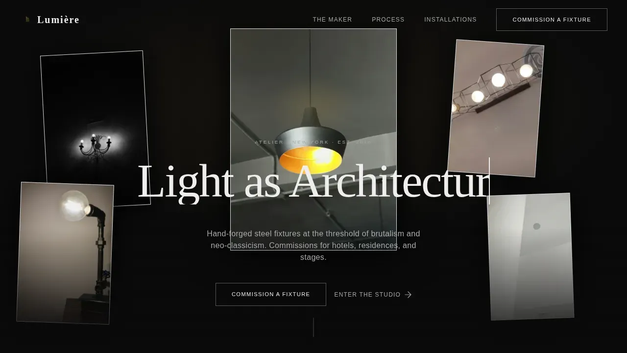
- A five-image floating hero constellation with cursor parallax, a typewriter headline, and a ghost-button call to action set against a full graphite background
- Three full-bleed narrative chapters covering maker process, technical blueprint overlay, and global installation environments, plus a secondary lookbook text link mid-scroll
- A dramatic commission close section with a solid molten-brass call-to-action button, and an arc-split footer with logo, tagline, and navigation links
Feature list
This landing page is filled with features that serve a specific conversion goal. Every design and interaction decision connects back to building trust and moving the right buyer forward.
Floating Fixture Hero with Cursor Parallax
Five fixture photographs are suspended across the viewport at staggered depths, as if hanging from invisible chains against a pure graphite background. The largest image sits dead center: a neo-classical torchière with brutalist ribbing, its bulb glowing in molten brass. As the cursor moves, subtle parallax shifts the images like real light sources reacting to presence in a room. A typewriter headline types in slowly beneath: "Light as Architecture."
Full-Bleed Maker Process Chapter
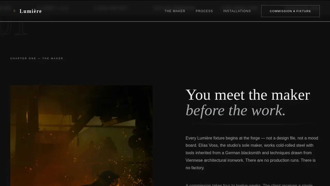
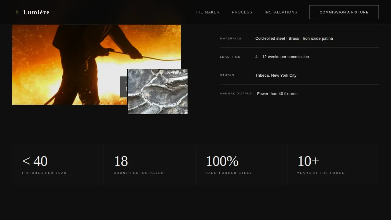
The first narrative chapter is a full-page spread devoted to the maker. Hands shaping a steel armature, sparks frozen mid-flight by the camera, raw materials caught in the middle of becoming something permanent. This section establishes intimacy before authority. Visitors meet the person before they see the portfolio, which means that by the time the installations appear, the trust is already built. The chapter uses GSAP ScrollTrigger reveals so each element enters the frame on scroll, reinforcing the sense of walking through a studio in real time.
Blueprint Technical Overlay Chapter
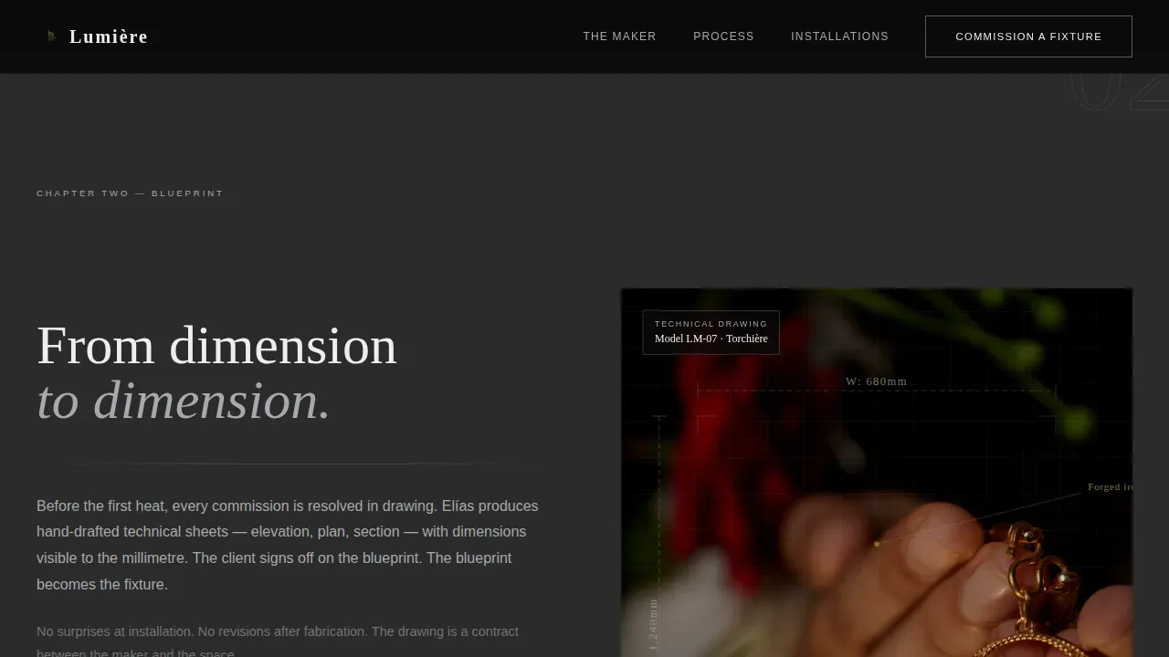
The second narrative chapter places a technical blueprint directly over the finished fixture. Dimensions remain visible. The overlay draws a line between craft and precision, describing the design logic behind the object. A secondary call to action, a text link reading "Download the Lookbook," sits below this chapter to capture earlier-stage interest through an email exchange, without distracting from the primary conversion path.
Asymmetric Installation Masonry Grid
The third chapter presents finished fixtures installed in real environments: a concrete-walled restaurant, a marble foyer, a Tribeca loft. The asymmetric masonry grid layout makes each photograph feel chosen rather than arranged. These examples function as implicit social proof, showing the work across architectural contexts and proving that the design language transcends any single style or geography.
Dual Call-to-Action Conversion System
The primary call to action, "Commission a Fixture," appears first as a ghost button in forge-white at the bottom of the hero. It resurfaces as a solid molten-brass button after the final installation spread, once the visitor has absorbed the craft and the proof. The landing page earns the click before it asks for it. No form lives on this page; the click lands on a detailed intake page designed to qualify serious buyers.
Arc-Split Footer with Brand Identity
The footer follows a clean arc-split layout: logo and tagline anchor the left, navigation links align to the right. It closes the landing page with the same restraint the rest of the design uses. Nothing is decorative for its own sake. Every element has a structural reason to exist.
Page sections overview
| Section | Purpose |
|---|---|
| Floating fixture hero | Introduces the studio with five parallax fixture images and a typewriter headline |
| Maker process chapter | Full-bleed spread showing hands, sparks, and steel armature to build maker intimacy |
| Blueprint overlay chapter | Technical fixture overlay with dimensions and a secondary lookbook call to action |
| Installation masonry grid | Asymmetric photo grid showing fixtures in global architectural environments |
| Commission close section | Full-width dramatic close with a solid molten-brass primary call-to-action button |
| Arc-split footer | Logo, tagline, and navigation links in a clean arc-split layout |
Design & branding system
The design language is bold brutalist: raw, structural, and deliberately uncomfortably beautiful. It draws inspiration from the aesthetic of a concrete gallery after hours, one fixture lit in the center of the room, its shadow climbing bare walls. The color system is called Monochrome Steel, and every choice within it is intentional.
- Cold-rolled graphite (#2B2B2B) covers full-bleed section backgrounds; brushed aluminum (#A8A9AD) handles secondary surfaces and divider lines; forge-white (#F0EDED) carries headline text that punches through the dark; and molten brass (#C9A84C) is reserved exclusively for hover states and the primary call-to-action button
- Typography pairs Fraunces serif headlines, large and authoritative, with DM Sans for body copy, keeping the reading experience grounded and clear against dark backgrounds
- Interaction design includes cursor parallax on the hero, GSAP ScrollTrigger scroll reveals, a typewriter animation on the headline, hover grayscale reveals on images, a magnetic call-to-action button, and a marquee strip, all working together to create a sense of life and presence on the landing page
Mobile & speed optimization
The landing page is built desktop-first, which reflects the reality of how interior architects and hotel specifiers work. Primary buyers open reference materials and commission landing pages at workstations, not on phones. The template remains fully responsive for mobile devices without compromising the desktop experience.
- Static sections are built with server components to keep the landing page lightweight; a single client component handles the cursor interactivity, so the animation overhead stays contained
- The minimalist nature of brutalist-inspired structure means the layout avoids unnecessary decorative code, which supports faster cross-device rendering and better compatibility across screen sizes
How this template helps you convert
This landing page is a click-through design. It does not try to close a commission in one scroll. It builds the case methodically, section by section, and then presents the call to action at the exact moment the visitor is most ready to act.
- The floating hero and typewriter headline create an immediate sense of place and authority, qualifying the visitor's interest before they read a single word of description
- The maker chapter, blueprint chapter, and installation grid form a three-act trust sequence that moves the visitor from curiosity to conviction, so the final call-to-action button feels like a natural next step rather than a demand
Other information about this template
This section covers additional context that helps designers, buyers, and platform users understand the full scope of what this landing page represents and how it fits into the broader landscape of neo brutalism in web design.
Neo brutalism in web design draws direct inspiration from architectural brutalism, a movement where raw concrete, exposed steel, and honest materials were left visible rather than painted over or hidden. The word "brutalism" itself traces back to the French phrase "béton brut," meaning raw concrete. That same philosophy of bare, unmediated honesty carries into neo brutalism as a web design style: thick outlines, hard shadows, high-contrast pairings, and elements that feel built rather than styled.
This landing page lives firmly in that tradition while adding the neo-classical layer: fluted columns, torchière silhouettes, and the formal vocabulary of grand architecture, all reinterpreted through cold-rolled steel and forge-white light.
For designers and design students seeking inspiration, successful brutalist websites have historically displayed information in a raw and playful way, using unconventional layouts and bold typography to engage users. This landing page template builds on those examples while applying them to a luxury artisan context, where the aesthetics must be dramatic without being inaccessible.
The design community around neo brutalism continues to grow. Designers apply neo brutalism principles by focusing on simplicity and functionality while embracing a playful approach to layout and graphic design. The intersection of neo brutalism with high-end product portfolios is still relatively rare, which is part of what makes this landing page a strong reference point for the category.
- AI tools can assist in creating unique landing pages by automating design processes and generating layouts based on user input, which can be useful when adapting this template to a new brand
- AI can enhance web design by providing personalized user experiences through data analysis, and natural language prompts can be used in AI tools to allow users to describe their vision in simple terms before building
- AI-powered applications can generate design elements and suggest color palettes that align with current design trends, which is helpful when exploring variations of the Monochrome Steel system for different brand identities
- AI tools can help in A/B testing landing pages by analyzing user interactions and optimizing designs for better conversion rates, and this landing page's clear section structure makes it well-suited for that kind of feedback loop
- The Lumire Bold Brutalist Neo Classical Lighting Designer Landing Page Template is designed specifically for studios whose work sits at the intersection of industrial craft and neo-classical architecture
- This template is categorized under Architecture and Design, within the Neo-Classical Architecture subcategory, and is built for the Neo-Classical Lighting Designer niche
- Designers who hope to attract high-value commissions from interior architects, hotel groups, and set designers will find the landing page layout and narrative arc well-matched to that audience
- The template store description for this design notes that the landing page balances brutal shapes with thoughtful use of space, creating a polished digital gallery feel that supports both desktop and mobile visitors
- Blog posts and community discussions around neo brutalism in graphic design often cite portfolio websites in this style as strong examples of how bold aesthetics can coexist with clear, functional layouts
- Users who want to adapt the landing page for a different design niche, such as furniture, ceramics, or architectural photography, will find the section structure and color system transferable with minimal adjustments
- Explicit permission to use and adapt this template for client projects is granted under the platform's standard license terms
Theme
Bold Brutalist
Creative direction
Creator Spotlight
Color system
Monochrome Steel
Style
Storybook/Full-Page
Direction
Click-Through
Page Sections
Floating Fixture Hero with Cursor Parallax
Three-chapter Storybook Narrative Layout
Dual Call-to-action Conversion System
GSAP Scrolltrigger Reveal Animations
Monochrome Steel Color and Typography System
Arc-split Footer with Brand Identity Block
Related questions
Who is this landing page template best suited for?
Can I adapt this template for a different design niche?
Does this landing page include a contact form?
What animation and interaction features are built into the template?
Is this template suitable for mobile users?



