Skin Analysis Platform Landing Page Template
Dermis is a Neo-Retro skin analysis app landing page template built for direct sales. It opens with a full-viewport before/after slider, layers Polaroid-style social proof, and closes with a sticky $4.99 call-to-action bar. The Desert Rose color system and scroll-linked animations create a warm, editorial feel that turns curiosity into confident clicks.
by Rocket studio
Quick summary
Dermis is a single-page, overlap/layered landing page template for a skin analysis app. It guides visitors from a dramatic before/after hero section through 30-day journey cards, an ingredient decoder, and real user timelines, all before asking for money. The page converts on two paths: a $4.99 scan purchase and a free Skin Age Estimate lead capture.
Who this template is for
This template suits anyone launching or promoting a consumer-facing skin analysis app. It is built around a direct-to-consumer sales flow and works especially well for beauty tech products with a visual proof story to tell.
- Indie developers and startups releasing a skin analysis or beauty tech app to a Gen Z or Millennial audience
- Estheticians and skin professionals who want a polished intake or lead-gen page without building from scratch
- Skincare brand marketers who need a conversion-focused landing page that shows results before asking for commitment
What problem this template solves
Most app landing pages tell visitors what the product does. This template shows them. The before/after slider, scored Polaroid timelines, and ingredient decoder all deliver evidence before the first call to action appears. Visitors who are curious but skeptical get six real user timelines to study before seeing a price.
- Skeptical browsers need proof before they pay, and this template front-loads visual evidence across every scroll beat
- Skin analysis apps are hard to explain in text alone; the draggable slider and layered section animations make the value immediately tangible
- Two-path conversion (paid scan and free lead capture) ensures visitors who are not ready to buy still enter a funnel
What you get with this template
You get a fully structured, single-page layout with five distinct content sections and a footer. Every section is pre-built with the correct hierarchy of visual proof, product explanation, social credibility, and conversion. No placeholder filler, every section slot has a defined purpose tied to the sales flow.
- A full-viewport before/after slider hero, a 30-day Polaroid journey section, an ingredient decoder panel, a six-timeline social proof grid, and a pricing call-to-action section with sticky bottom bar
- A complete Desert Rose color system with hex values applied throughout, plus Fraunces serif headlines and DM Sans body typography already set
- Scroll-linked section stacking animations, a draggable film-strip divider, Polaroid fan scroll interaction, and a persistent sticky call-to-action bar
Feature list
This template includes the following purpose-built features.
Draggable Before/After Hero Slider
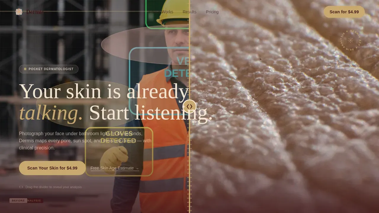
The hero fills the entire viewport. A thick retro film-strip divider separates a raw, unfiltered skin close-up on the left from the app's luminous analysis map on the right. Visitors drag the divider to reveal the transformation, making the app's value proposition physically interactive from the first second.
Scroll-Linked Overlap Section Stacking
Each content panel rises to partially cover the section before it as the visitor scrolls. This creates a layered magazine-page feel that builds a physical sense of accumulating evidence. The effect uses GPU-accelerated CSS transforms for smooth mobile performance.
Polaroid Fan 30-Day Timeline
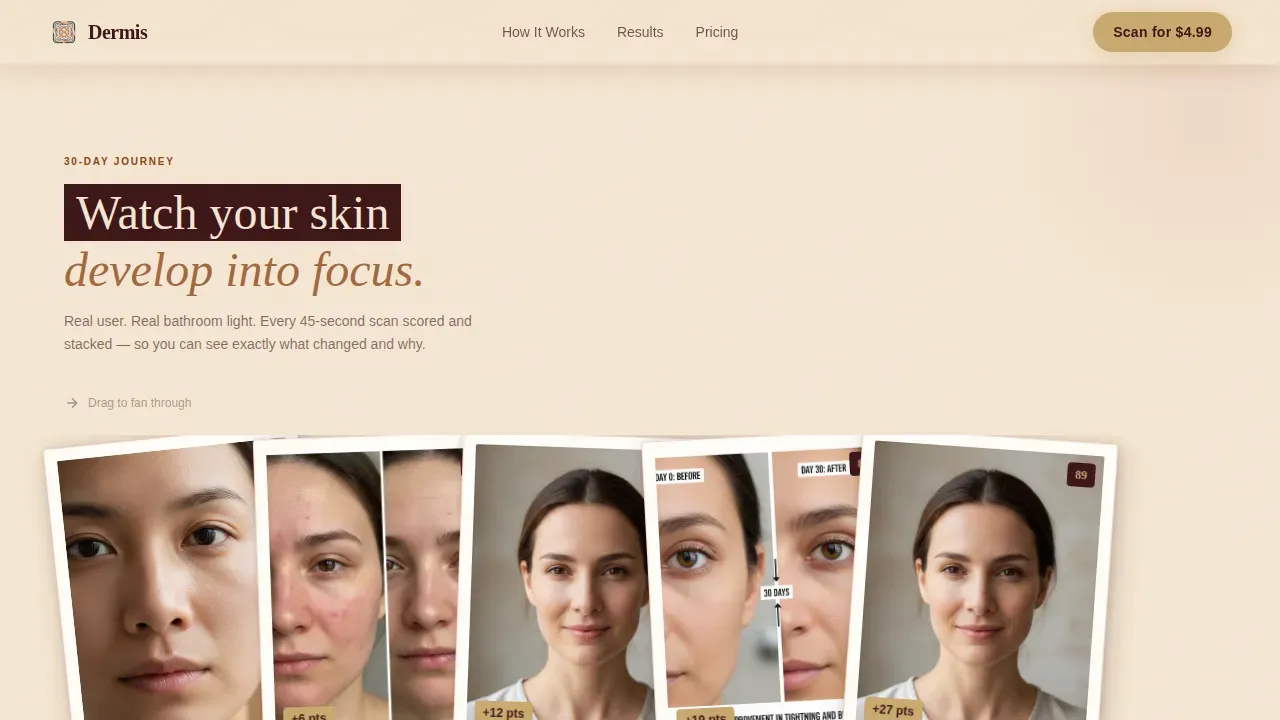
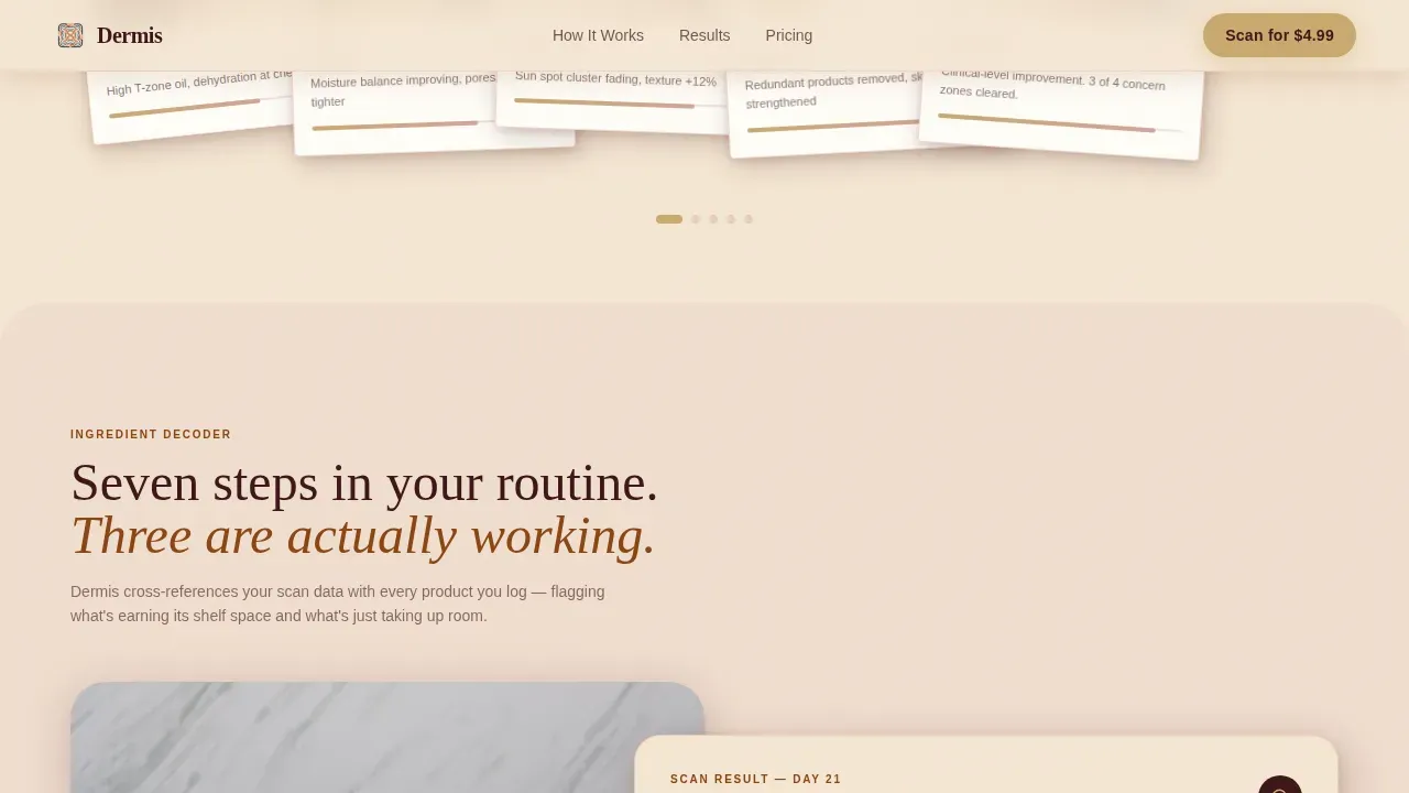
A horizontal fan of overlapping Polaroid-style cards unfolds as the visitor scrolls through the 30-day journey section. Each card is tagged with the app's scored improvement metrics, letting visitors see progress rather than just read about it.
Ingredient Decoder Overlay Card
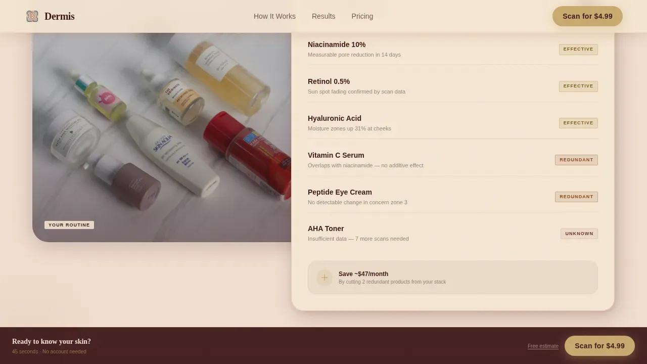
A retro-styled card overlaps a real routine photo mid-page. It flags individual products as effective or redundant based on the app's analysis output. This section visually dramatizes the app's ability to cut through a cluttered seven-step routine and surface what is actually working.
Six-Timeline Social Proof Grid
Six real before/after user timelines appear in a grid before the first direct money ask. Scored improvement data accompanies each timeline. This positions the purchase decision after evidence, not before it.
Dual-Path Conversion with Sticky Bar
The primary call to action ("Scan Your Skin for $4.99") appears first below the hero slider, then again as a sticky bottom bar that activates after the third scroll section. A secondary path offers a free Skin Age Estimate requiring only a selfie upload and email, capturing leads who are not ready to buy.
Page sections overview
| Section | Purpose |
|---|---|
| Hero Slider | Full-viewport before/after reveal with draggable film-strip divider and headline |
| 30-Day Journey | Horizontal Polaroid fan cards showing scored 30-day skin improvements |
| Ingredient Decoder | Retro overlay card flagging effective versus redundant routine products |
| Six Real Timelines | Social proof grid of six user before/after timelines before pricing |
| Pricing Call to Action | $4.99 scan purchase, free Skin Age Estimate lead capture, sticky bottom bar |
| Footer | Linear single-row footer with minimal navigation |
Design & branding system
The visual identity follows a Neo-Retro direction inspired by 1970s Vogue beauty editorials reprinted on matte stock. The palette reads as warm and analog-nostalgic while staying sharp enough to feel like contemporary tech. Soft drop shadows in diluted terracotta give layered cards depth without coldness.
- Color system: sun-bleached blush (#D4A59A), terracotta shadow (#8B4513), warm parchment (#F5E6D3), deep fig (#3C1518) for text, and faded gold (#C9A96E) for buttons and interactive elements
- Typography: Fraunces chunky rounded serif for headlines, DM Sans for body text, the combination balances editorial warmth with clean readability
- Backgrounds shift from parchment to blush as sections stack, each layer sliding slightly over the last like pages of a well-thumbed magazine
Mobile & speed optimization
The template is built mobile-first, reflecting the core use case of a visitor scanning their face under bathroom light on a phone at midnight. All animations are implemented using GPU-accelerated CSS transforms to keep scroll interactions smooth on mid-range mobile devices.
- Draggable slider, Polaroid fan scroll, pulse zone animations, and the sticky call-to-action bar are all designed for one-thumb mobile interaction
- CSS-only animations avoid heavy JavaScript rendering costs, keeping the scroll experience fluid on the devices most likely used by the target audience
How this template helps you convert
The conversion architecture is deliberately sequenced. Visitors earn the right to see the price only after the template has delivered six layers of proof and two interactive demonstrations.
- The before/after slider gives visitors an immediate, hands-on sense of what the app does before a single word of sales copy appears, lowering the barrier to continued scrolling.
- Six real user timelines appear before the first direct price ask, so the $4.99 call to action lands after trust has already been established rather than demanding it upfront.
- The free Skin Age Estimate secondary path captures email leads from visitors who are curious but not yet ready to purchase, ensuring no traffic leaves empty-handed.
Other information about this template
This template is categorized under Beauty and Personal Care, specifically the Beauty Tech and Device subcategory, within the Skin Analysis App niche. It is designed for direct-to-consumer sales in the US market with English copy, USD pricing, and US date formatting. The intersection match score for this template's niche and creative direction alignment is 13, reflecting a strong fit between the overlap/layered template style and the Before/After Reveal creative direction.
- Template style: Overlap/Layered with high animation and high interactivity ratings
- Creative direction: Before/After Reveal driving every scroll beat from hero to social proof
- Header concept: Before/After Slider filling the full viewport on load
- The footer uses Pattern 1, a linear single-row layout for minimal distraction at page end
- Localization is set to English, USD currency, and US date format out of the box
Theme
Neo-Retro
Creative direction
Before/After Reveal
Color system
Desert Rose
Style
Overlap/Layered
Direction
Direct Sales
Page Sections
Draggable Before/after Hero Slider
Scroll-linked Section Stacking
Polaroid Fan 30-day Timeline
Ingredient Decoder Overlay Card
Six-timeline Social Proof Grid
Dual-path Conversion with Sticky Bar
Related questions
Who is the primary audience for this landing page template?
Does the template support two different conversion paths?
What animations and interactions are included in the template?
What typography and color system does this template use?
Can this template be adapted for a different beauty app product?