Commuter Rail Service Landing Page Template
Rail is a storybook landing page template built for commuter rail services. It opens with a cinematic platform-at-dawn hero, then guides visitors through an interactive before/after commute comparison, escalating savings stats, and a fixed trip-planner call to action. The result is a single-page experience that turns highway commuters into confident rail riders.
by Rocket studio
Quick summary
Rail is a full-page landing page template designed for urban commuter rail services. It combines a cinematic hero, scroll-linked animations, and an interactive before/after slider to show the real cost of driving versus riding the train. By the time visitors reach the booking section, the value case is already made.
Who this template is for
This template is built for transit authorities, regional rail operators, and urban mobility teams that need to convert car commuters into regular riders. It works equally well for launch campaigns and ongoing rider acquisition.
- Daily commuters who currently drive and are open to a faster, cheaper alternative
- Corporate travel managers and professionals who need reliable, productive transit
- Weekend and occasional riders looking for a simple way to plan a trip downtown
What problem this template solves
Most transit websites list schedules without making a compelling case for switching. Potential riders leave without booking because nothing in the experience addresses their real hesitation: is the train actually better than driving?
- Visitors see no clear, side-by-side comparison of their current commute versus the rail option
- The booking path is buried, requiring too many clicks before a rider can find a train
- Time, money, and carbon savings sit in dense text instead of building as a visual story
What you get with this template
Rail delivers a structured, single-page flow that earns the booking click before asking for it. Every section is purposeful, moving from emotional impact to hard numbers to a friction-free trip planner.
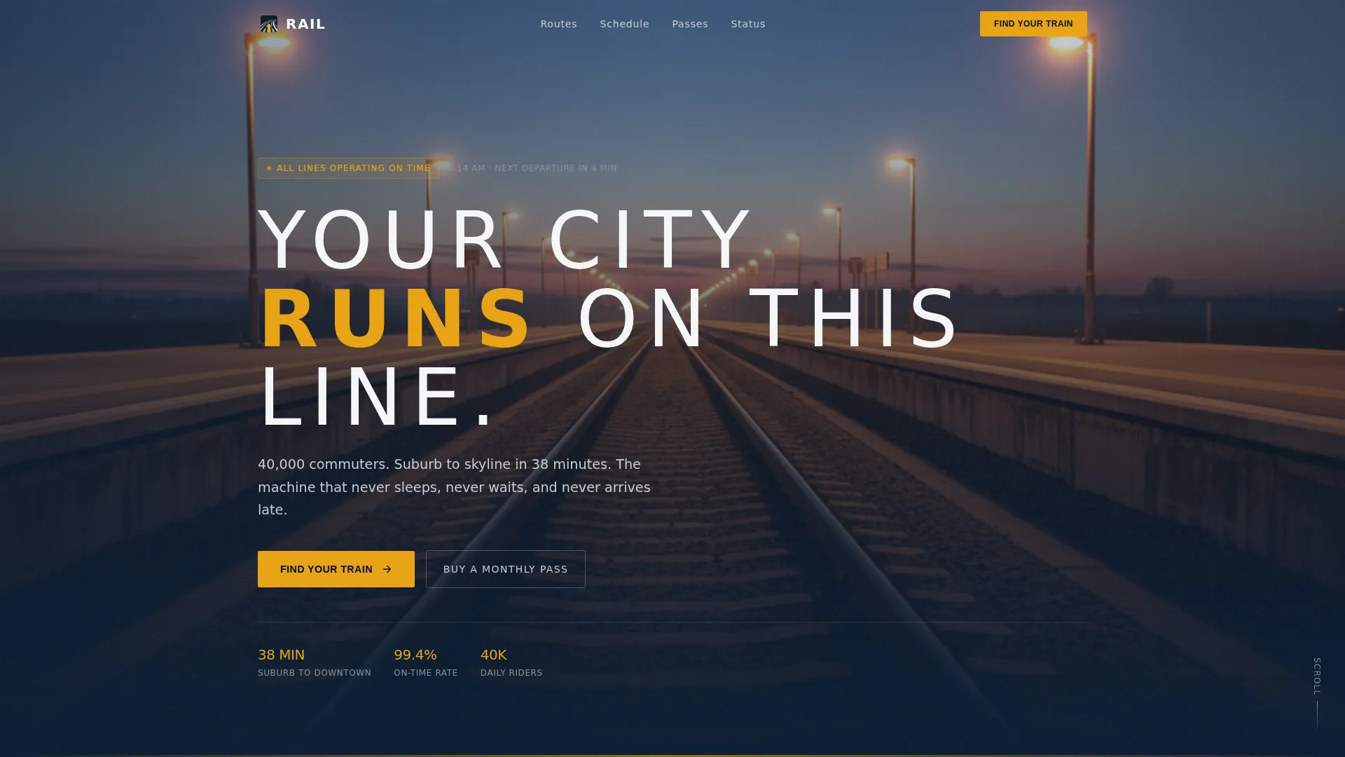
- A full-bleed hero section with a platform-at-dawn photo and a cinematic headline reveal
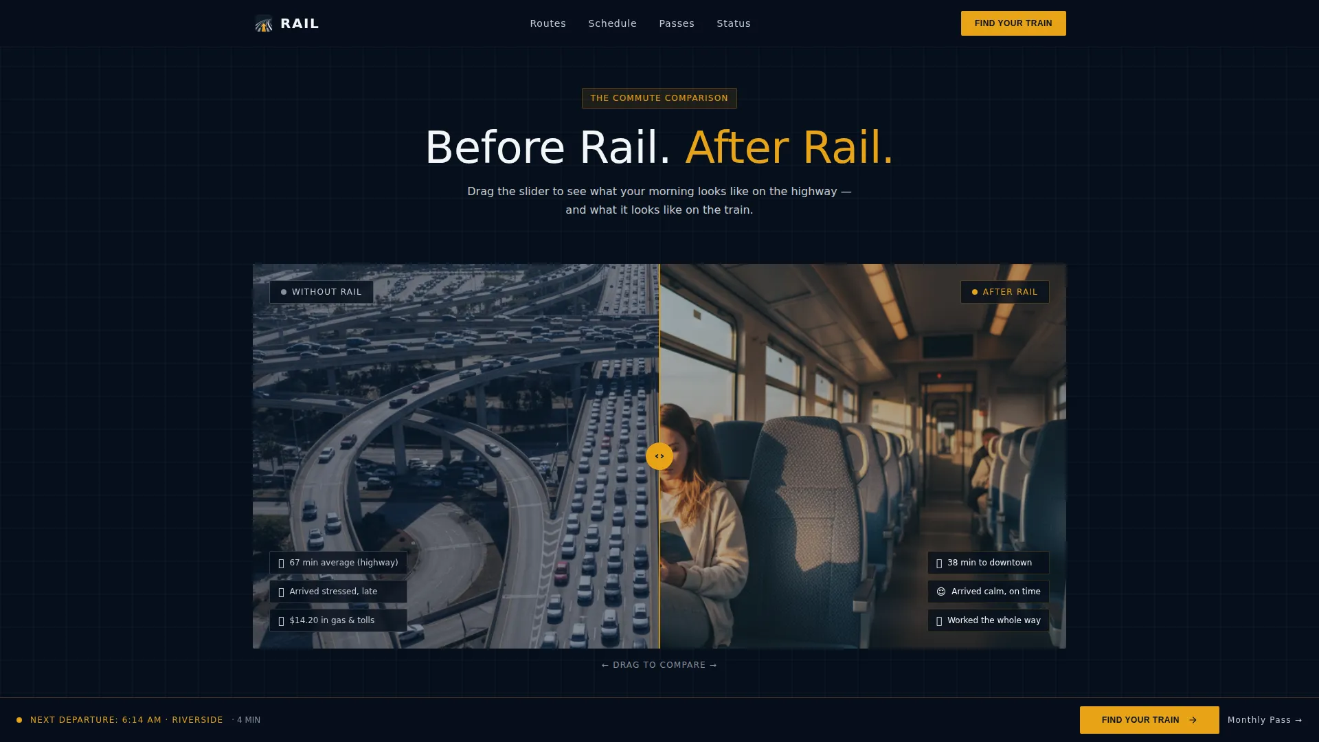
- An interactive before/after slider comparing gridlock stress with the calm rail corridor
- A fixed amber call-to-action bar that persists after the first scroll, keeping "Find Your Train" always reachable
- A minimal trip planner modal with origin, destination, date, and departure window fields
- A secondary conversion path for monthly pass purchases, built for returning regulars
Feature list
This template packs purposeful interactivity into every scroll. Each feature below is grounded in the brief and designed to move a visitor from curiosity to commitment.
Cinematic Hero with Headline Reveal
The hero fills the full viewport with a platform-level photo shot at civil twilight. Twin rails converge toward a vanishing point under a deep navy sky, platform-edge amber strips frame the concrete, and a single train approaches with headlights flaring. The headline fades in after a two-second hold in thin, tracked-out white type.
Before/After Interactive Slider
Visitors drag a slider to compare a stress heat map of highway gridlock against the clean, linear path of the rail corridor. The contrast is immediate and visceral. Each full-page scroll section snaps to the next stage of the comparison, building the argument station by station.
Escalating Stats Section
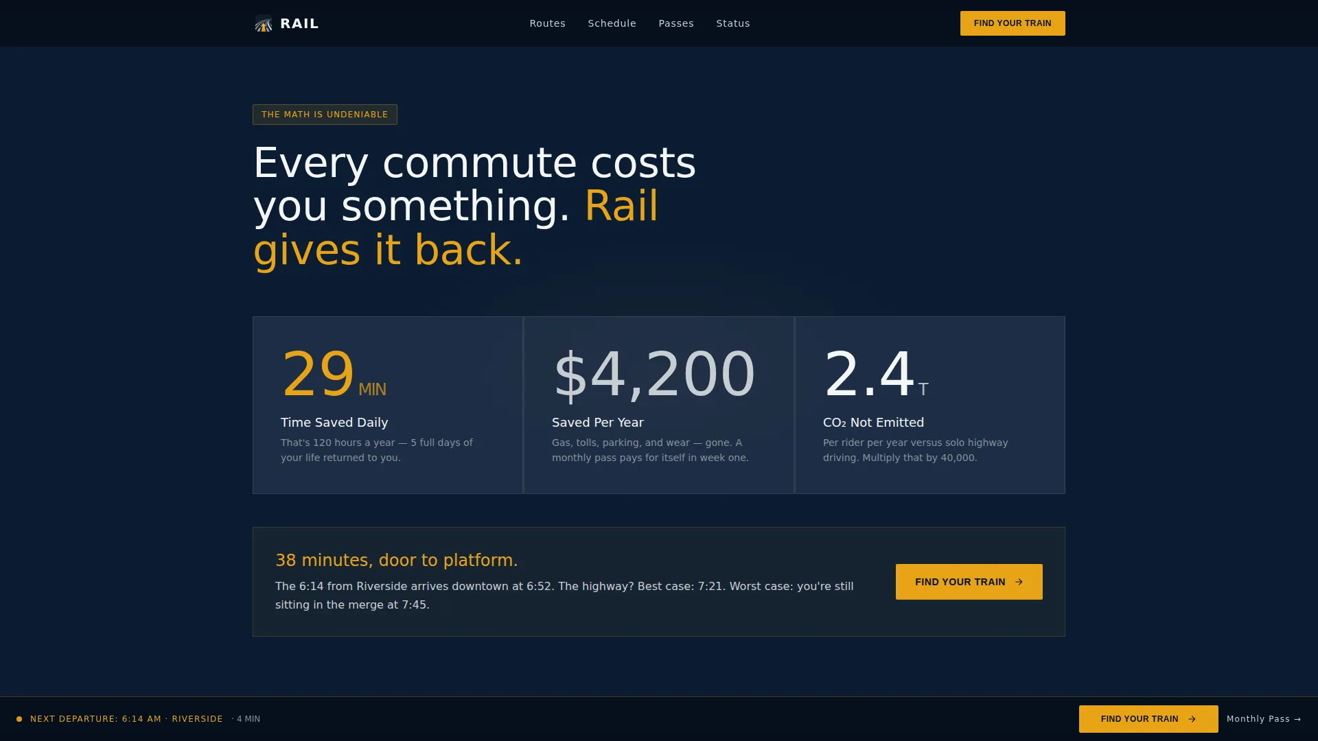
Three sequential panels surface the numbers: time saved, money saved, and carbon saved. The figures build in scale as the visitor scrolls, so the argument compounds naturally. Social proof anchors include 40,000 daily riders and on-time performance data.
Fixed Trip Planner Call to Action
A slim amber bar locks to the bottom of the viewport after the first scroll. Tapping or clicking opens a minimal modal with four fields: origin station, destination station, date, and departure window (morning peak, midday, or evening peak). It stays visible throughout the page without interrupting the reading flow.
Monthly Pass Secondary Path
A dedicated secondary call to action targets repeat commuters who already know their route. It routes directly to a pass purchase flow, reducing friction for the highest-value rider segment.
Schedule and Stations Section
A route map displays key stops with peak window labels. It gives first-time visitors a fast read on whether the line serves their corridor, removing the last practical objection before booking.
Page sections overview
| Section | Purpose |
|---|---|
| Hero with Reveal | Set the cinematic tone and introduce the headline |
| Before/After Slider | Show gridlock versus rail in one draggable comparison |
| The Numbers | Display time, money, and carbon savings with escalating stats |
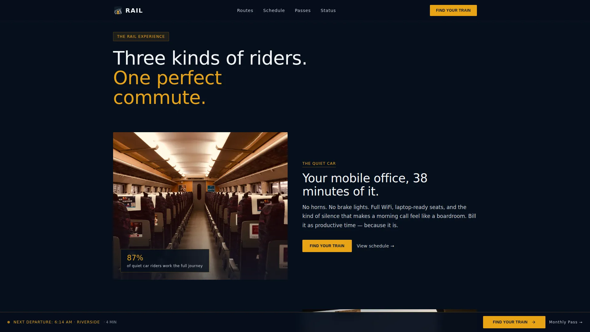
| The Experience | Highlight quiet car, mobile office use, and 38-minute arrival |
| Schedule and Stations | Show route map, key stops, and peak windows |
| Footer | Provide horizontal flow navigation and secondary links |
Design & branding system
The visual identity follows a Corporate Precision theme rooted in a Midnight Blue color system. Every color choice has a specific role, like instruments on a control-room panel, nothing decorative.
- Deep signal navy (#0B1D33) anchors full-bleed sections and sets the dark, authoritative tone
- Brushed-steel silver (#C8CDD3) handles secondary surfaces and divider lines; platform-light white (#F4F6F8) is reserved for text blocks and schedule cards
- Departure-board amber (#E8A317) appears exclusively on calls to action, live status indicators, and time stamps, giving high-contrast signal to every action point
Mobile & speed optimization
The template is built mobile-first, reflecting how commuters actually use it: checking their phone on the platform before the train arrives. Interactive elements are structured for touch input, and the fixed call-to-action bar is thumb-friendly from the first scroll.
- The trip planner modal uses large tap targets and a minimal four-field form for fast input on small screens
- Scroll-linked animations and the before/after slider are handled by client-side components, while static sections use server components to keep initial load light
- Typography uses Manrope for tracked headings and DM Sans for body text, both readable at small sizes without losing the precision aesthetic
How this template helps you convert
Rail is designed so that every scroll builds conviction before the booking moment arrives. The page earns the click rather than demanding it.
- The before/after slider makes the value comparison personal and immediate. Visitors do the math themselves, which is more persuasive than any headline claim.
- The escalating stats section compounds the argument across three dimensions (time, money, carbon), so by the numbers section visitors are already sold on the concept.
- The fixed amber call-to-action bar keeps "Find Your Train" reachable at every scroll position, removing the need to hunt for the booking entry point.
Other information about this template
Rail ships as a storybook, full-page layout and is categorized under Automotive and Transport, specifically within the Public Transit and Infrastructure subcategory for Commuter Rail Service use cases. The template is localized for the United States market, using USD pricing, 12-hour time format, and Eastern timezone conventions throughout the schedule and trip planner sections.
- Animation intensity is high: scroll-linked reveals, full-page snap transitions, and the before/after drag slider all require client-side rendering for the interactive components
- The footer follows a horizontal flow pattern, suitable for linking to route information, accessibility notices, and contact details
- Typography pairing uses Manrope for display and heading contexts and DM Sans for body and user interface copy, maintaining the control-room precision feel at every scale
Theme
Corporate Precision
Creative direction
Before/After Reveal
Color system
Midnight Blue
Style
Storybook/Full-Page
Direction
Booking/Scheduling
Page Sections
Cinematic Platform Hero Section
Interactive Before/after Commute Slider
Escalating Savings Stats Display
Fixed Amber Trip Planner Bar
Monthly Pass Secondary Conversion Path
Route Map with Peak Window Labels
Related questions
What type of transit business is this template designed for?
Can I adapt the trip planner modal for my actual station list?
Does the template include both a booking path and a monthly pass option?
How does the before/after slider work for visitors?
Is this template suitable for a service launch or an ongoing campaign?