Charity & Fundraiser Profile Professional Website Template
Rally is a masonry-style fundraising landing page built for disaster relief campaigns. It lets anyone launch a personal aid campaign in minutes, with an animated illustrated header, a scrolling wall of funded campaign cards, and resource sections that teach before they ask. The design uses Electric Indigo and warm amber to feel urgent, human, and trustworthy.
by Rocket studio
Quick summary
Rally is a single-page fundraising template designed for disaster relief personal campaigns. It combines an animated hand-drawn header, a masonry card gallery of funded campaigns, and embedded resource guides. The layout builds trust by showing proof of past results before asking visitors to act. It is direct, emotionally grounded, and ready to launch.
Who this template is for
Rally is built for real people in the middle of a crisis, not polished nonprofit communications teams. It is also for the supporters and coordinators working a step behind the front line.
- The family member organizing remote aid after a flood, fire, or earthquake
- The volunteer or community leader who needs to move fast and collect funds tonight
- A church administrator, neighbor group, or mutual aid coordinator fielding urgent requests
What problem this template solves
Most fundraising pages feel built for calm situations. They ask for patience, polish, and a plan. Disaster does not wait. Rally solves the gap between crisis onset and the moment money starts moving.
- First-time organizers feel overwhelmed by complex campaign setups that slow them down
- Visitors who land on a fundraiser page leave without giving because the page feels untrustworthy
- People who want to help cannot easily find active campaigns or know where to start
What you get with this template
Rally delivers a complete, single-page fundraising layout that handles both the emotional and practical sides of disaster relief fundraising. Every section is designed with intent.
- An animated illustrated header that opens with a hand-drawn community scene and a written tagline
- A masonry campaign card gallery with achievement badges, donor counts, and organizer quotes
- Embedded resource cards including a preparedness checklist, a fundraising guide, and a widget tutorial
Feature list
Rally includes purpose-built components drawn directly from its disaster relief focus. Each one serves a specific role in the visitor journey.
Animated Illustration Header
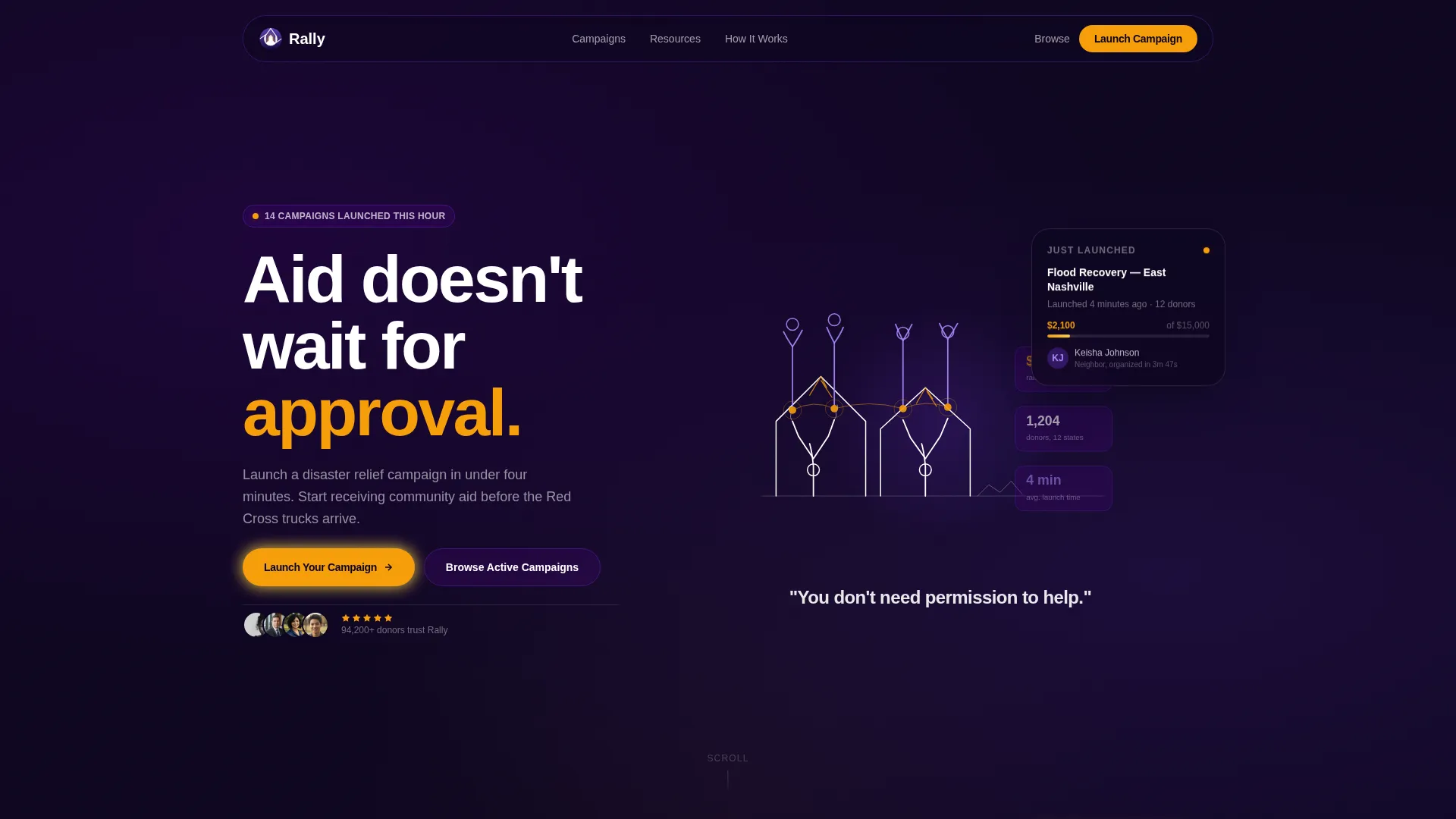
The header opens with hand-drawn lines that sketch a cracked roofline, then hands reaching up, then hands clasping together. The animation completes with the tagline "You don't need permission to help." The effect is immediate and emotional without using stock photography or distressing imagery.
Masonry Campaign Card Gallery
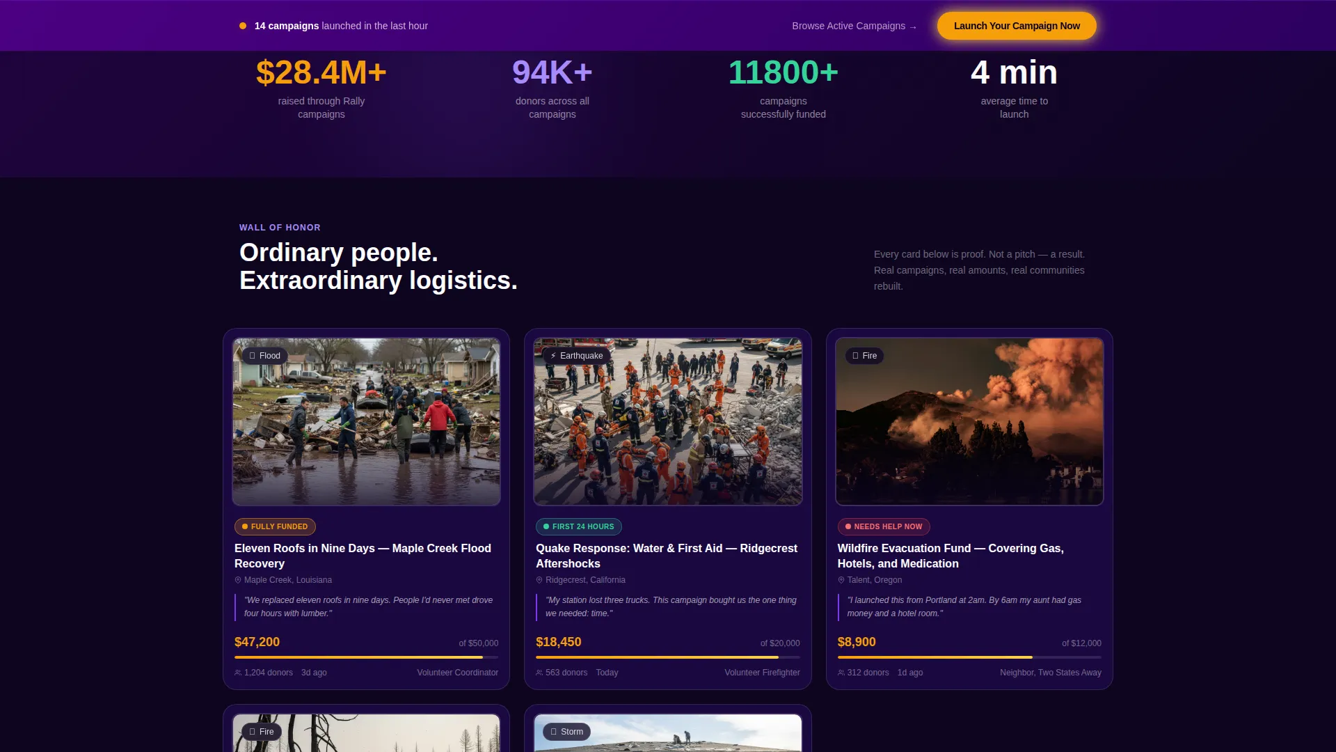
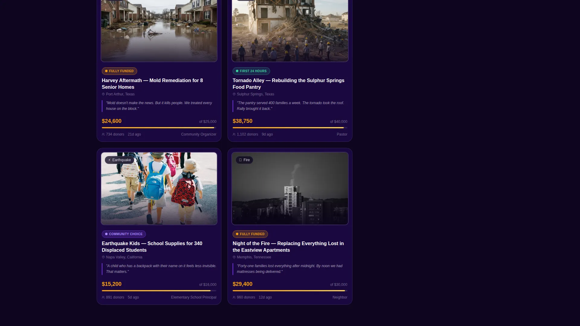
Cards are staggered in a Pinterest-style grid with mixed portrait and landscape orientations. Each card shows a photo with a thin white border, a campaign title, funds raised, donor count, and one sentence from the organizer. Animated achievement badges such as "Fully Funded," "Community Choice," and "First 24 Hours" fade in on scroll.
Pinned Primary Call to Action
A "Launch Your Campaign Now" button rendered in amber on indigo stays pinned to the bottom of the viewport throughout the scroll. It remains visible and accessible at every point without interrupting the reading experience.
Inline Resource Cards
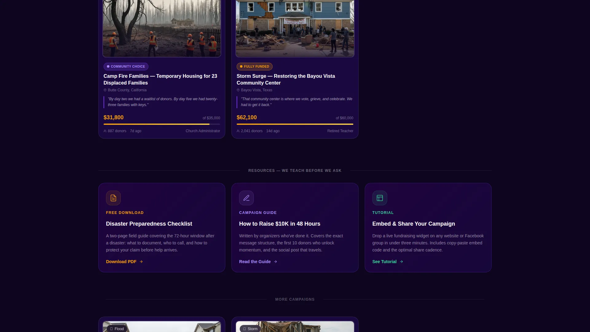
Between masonry rows, resource cards offer downloadable and embeddable content. Included guides cover disaster preparedness, a framework for raising funds quickly, and a tutorial for embedding a sharing widget. These sections give value before asking for a commitment.
Dual Visitor Pathways
The layout serves two distinct visitor types. Organizers are guided toward launching a campaign. Donors and supporters are offered a clear secondary path to browse active campaigns. Neither path competes with the other.
Electric Indigo Color System
The palette uses deep signal indigo as the primary background, charged violet for hover and active states, emergency white for card surfaces, and warm amber reserved exclusively for donation totals and progress indicators. The system creates visual hierarchy that guides the eye without instruction.
Page sections overview
| Section | Purpose |
|---|---|
| Animated header | Opens with illustrated community scene and tagline |
| Primary campaign call to action | Pinned button prompts campaign launch throughout scroll |
| Masonry card gallery | Displays funded campaigns with badges and organizer quotes |
| Resource card row | Delivers guides and tools between gallery rows |
| Secondary browse path | Directs donors toward active campaigns |
| Preparedness checklist | Downloadable resource card for disaster readiness |
| Fundraising guide card | Step-by-step framework for fast campaign success |
| Widget tutorial card | Embeddable sharing tool walkthrough for social spread |
Design & branding system
The visual identity follows a Lens and Frame theme. It treats each campaign card as a framed gallery print and the overall page as a wall of honor rather than a feed of misfortune.
- Color system: deep signal indigo (#4B0082) anchors the page; charged violet (#7C3AED) activates on hover; emergency white (#FAFAFA) surfaces cards; warm amber (#F59E0B) marks donation totals and progress bars only
- Typography and line style: thin white hand-drawn illustration lines on indigo give the header a trembling, human quality that no photograph could replicate
- Card framing: white-bordered photos, bold campaign titles, and staggered grid sizing create a gallery aesthetic that signals credibility and permanence
Mobile & speed optimization
The masonry layout is designed to reflow gracefully at smaller screen sizes. Campaign cards, resource sections, and the pinned call-to-action button all remain functional and readable on mobile viewports.
- Masonry grid adapts from multi-column desktop to a single-column stacked view on smaller screens
- The pinned bottom call-to-action remains anchored to the viewport on both mobile and desktop without blocking content
- Resource cards and badge animations are sized for thumb-friendly interaction and clear reading at mobile scale
How this template helps you convert
Rally is built around a content-first philosophy. It earns the click by giving value before making any request. The conversion path is intentional and layered.
- The animated header creates an immediate emotional connection, establishing trust within the first few seconds of the visit before any campaign details appear.
- The masonry gallery of funded campaigns functions as social proof at scale. Scrolling through dozens of completed campaigns with badges and real organizer quotes builds confidence that the platform works.
- Resource cards placed between gallery rows educate visitors and position the act of starting a campaign as taking command rather than asking for help, lowering the psychological barrier to the primary call to action.
Other information about this template
Rally sits within the Personal and Resume category, specifically the Charity and Fundraiser Profile subcategory. It is optimized for the disaster relief personal campaign niche and carries a high intersection match score reflecting strong alignment between design style, content direction, and use case.
- Template style: Masonry and Pinterest grid layout
- Header concept: Animated Illustration with hand-drawn sequential reveal
- Creative direction: Award and Recognition, treating every campaign as a documented achievement
- Landing page direction: Content and Resource, giving guides and proof before the ask
- Theme: Lens and Frame, presenting campaigns as gallery-framed results rather than ongoing pleas
- The color palette is described as feeling like a phone screen glow in a blackout: electric enough to cut through chaos, warm enough to signal human presence on the other end
Theme
Lens & Frame
Creative direction
Award & Recognition
Color system
Electric Indigo
Style
Masonry/Pinterest
Direction
Content/Resource
Page Sections
Animated Hand-drawn Illustration Header
Masonry Campaign Card Gallery
Pinned Viewport Call to Action
Inline Fundraising Resource Cards
Dual Visitor Navigation Paths
Electric Indigo Visual Hierarchy
Related questions
Who is this landing page designed for?
Can this template support both donors and campaign organizers?
What makes the masonry card layout useful for fundraising?
Does the template include any resource or educational content sections?
Is the pinned call-to-action button always visible?



