Financial Services SEO Agency Landing Page Template
Rank is a bento grid landing page template built for financial services search engine optimization agencies. It combines a Tech Glass visual identity with an interactive explorer layout, a photo grid mosaic header, and a waitlist-first conversion flow. The template is designed for agencies targeting wealth managers, fintech platforms, and mortgage lenders in highly regulated, highly competitive search verticals.
by Rocket studio
Quick summary
Rank is a single-page bento grid landing page template for a financial services search engine optimization agency. It pairs a deep Tech Glass aesthetic with an interactive explorer experience, letting visitors tap through case studies and methodology tiles before reaching the waitlist form. The page is built to earn trust through visible proof before asking for commitment.
Who this template is for
This template is built for specialist agencies that serve regulated financial sectors. It speaks directly to the sophisticated buyers those agencies pursue, and its design signals technical depth from the first scroll.
- Search engine optimization agencies focused on wealth management firms, neobanks, and mortgage lenders
- Marketing leaders at mid-market registered investment advisors (RIAs) and fintech platforms evaluating agency partners
- Compliance-aware marketing teams that need every on-page element to reflect regulatory credibility
What problem this template solves
Generic agency templates feel out of place when the audience is a Chief Marketing Officer (CMO) or Vice President of Marketing at a financial firm. Those buyers have seen every polished pitch deck, and they respond to proof, not promises. Rank is designed to close that gap immediately.
- Bland portfolio templates fail to communicate the technical depth that financial sector buyers expect
- Standard waitlist pages lack the interactive proof layers needed to justify a high-value agency relationship
- Most agency landing pages push the call to action before the visitor has seen enough evidence to trust it
What you get with this template
The template delivers a complete, conversion-focused single-page layout with a distinct visual identity and a structured interactive experience. Every section is purposeful and designed to move a skeptical, senior buyer toward the waitlist.
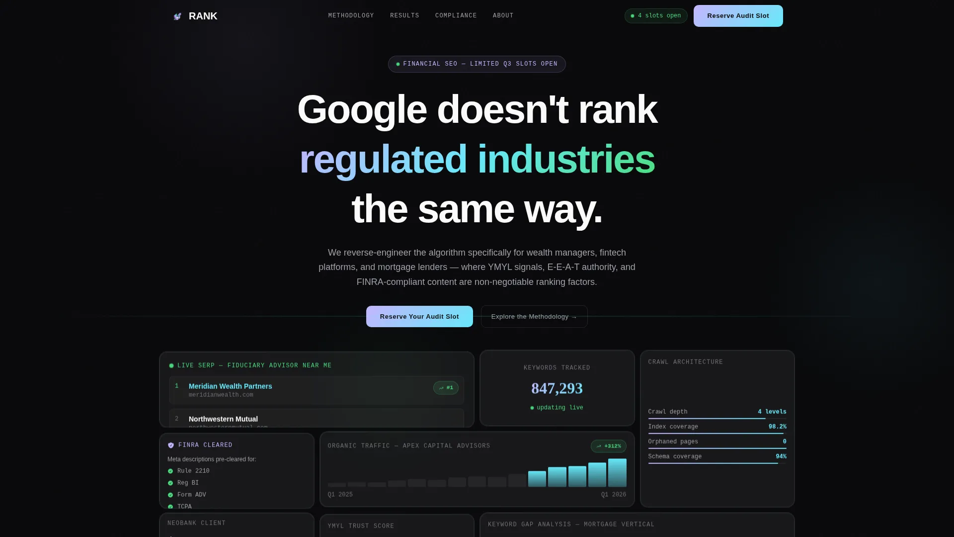
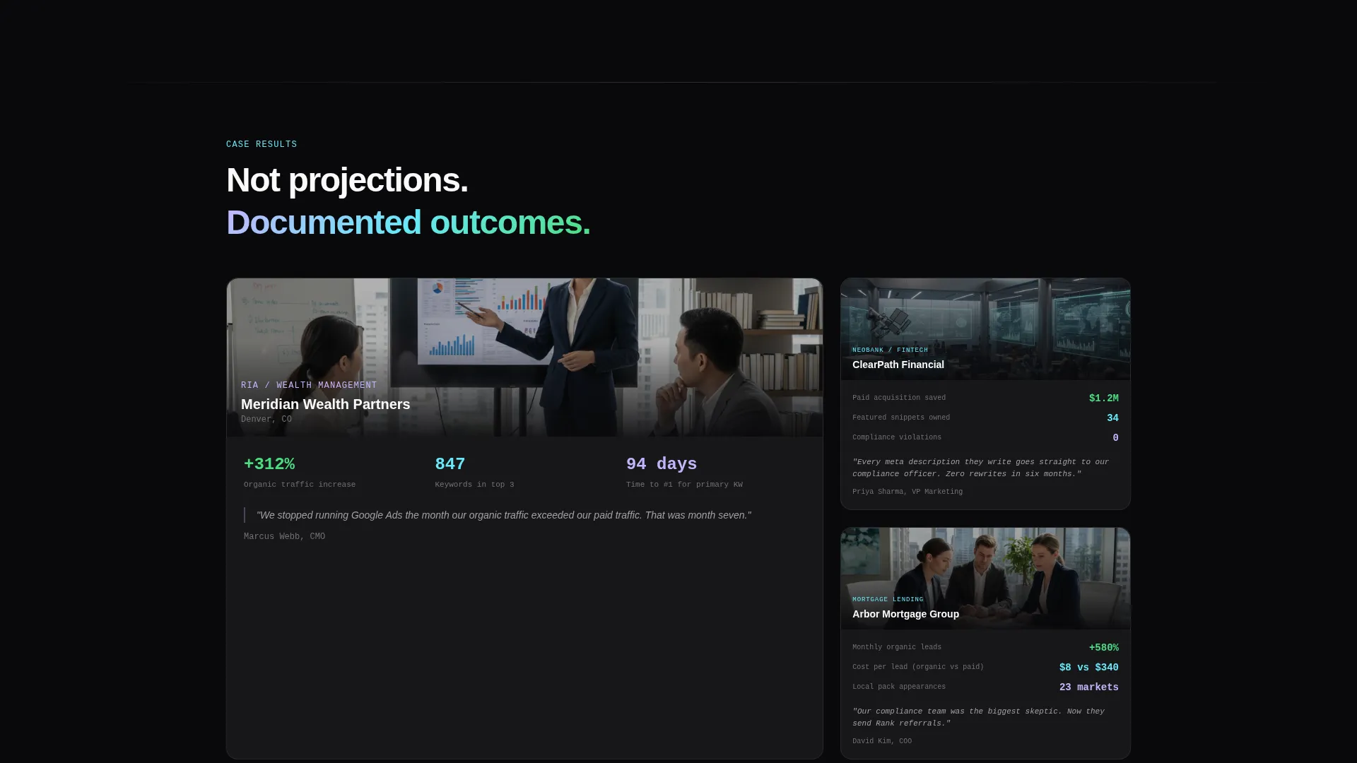
- A 4x3 photo grid mosaic header filled with search engine results page (SERP) screenshots, keyword ranking dashboards, and client result fragments
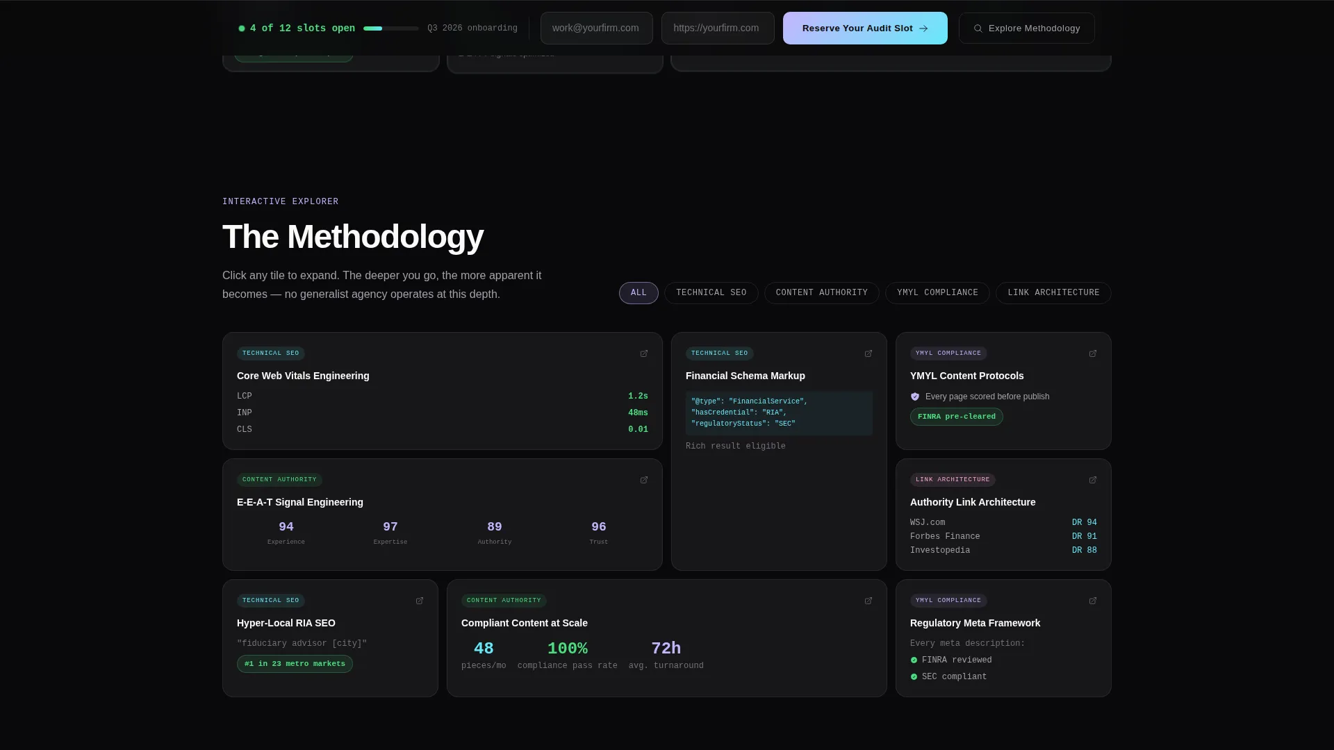
- An expandable bento grid explorer organized by service category, each tile revealing case study snippets, methodology breakdowns, and compliance workflow diagrams
- A persistent glass-morphism call-to-action bar anchored at the viewport bottom, with an inline email and company URL form and a live slot counter
Feature list
This section highlights the core built-in capabilities delivered by the Rank template as described in the source brief.
Photo Grid Mosaic Header
The header is a 4x3 bento arrangement of real SERP screenshots, ranking dashboard tiles, and client result fragments. Each tile carries a frosted glass finish with iridescent border glow. One tile displays a wealth management firm ranked at position one for a local fiduciary query. Another pulses with a live keyword tracking counter. The mosaic reads as a wall of evidence before a single line of body copy appears.
Interactive Bento Explorer Grid
Every bento tile in the main content area is clickable and expandable. Tapping a tile opens a deeper layer containing a case study snippet, a methodology breakdown, or a compliance workflow diagram. As visitors scroll, the grid reshuffles by category: Technical Search Optimization, Content Authority, YMYL Compliance, and Link Architecture. The experience rewards curiosity and progressively reveals agency depth.
Persistent Waitlist Call-to-Action Bar
A glass-morphism bar stays fixed at the bottom of the viewport throughout the visitor's session. It contains a single inline row asking only for a work email address and a company URL. The bar also displays a live counter showing remaining onboarding slots, for example "4 of 12 slots open," to create genuine, visible scarcity.
Live Slot Scarcity Counter
The template includes a live counter component that displays how many of the limited quarterly onboarding slots remain. This counter appears both in the persistent bar and contextually within the page, reinforcing the limited-access positioning without relying on vague urgency copy.
Secondary Methodology Exploration Path
Visitors who are not ready to commit to the waitlist can follow a secondary call to action labeled "Explore the Methodology." This path keeps them engaged with the interactive tile system, building confidence through the agency's visible thinking before they decide to reserve a slot.
YMYL Compliance Tile Cluster
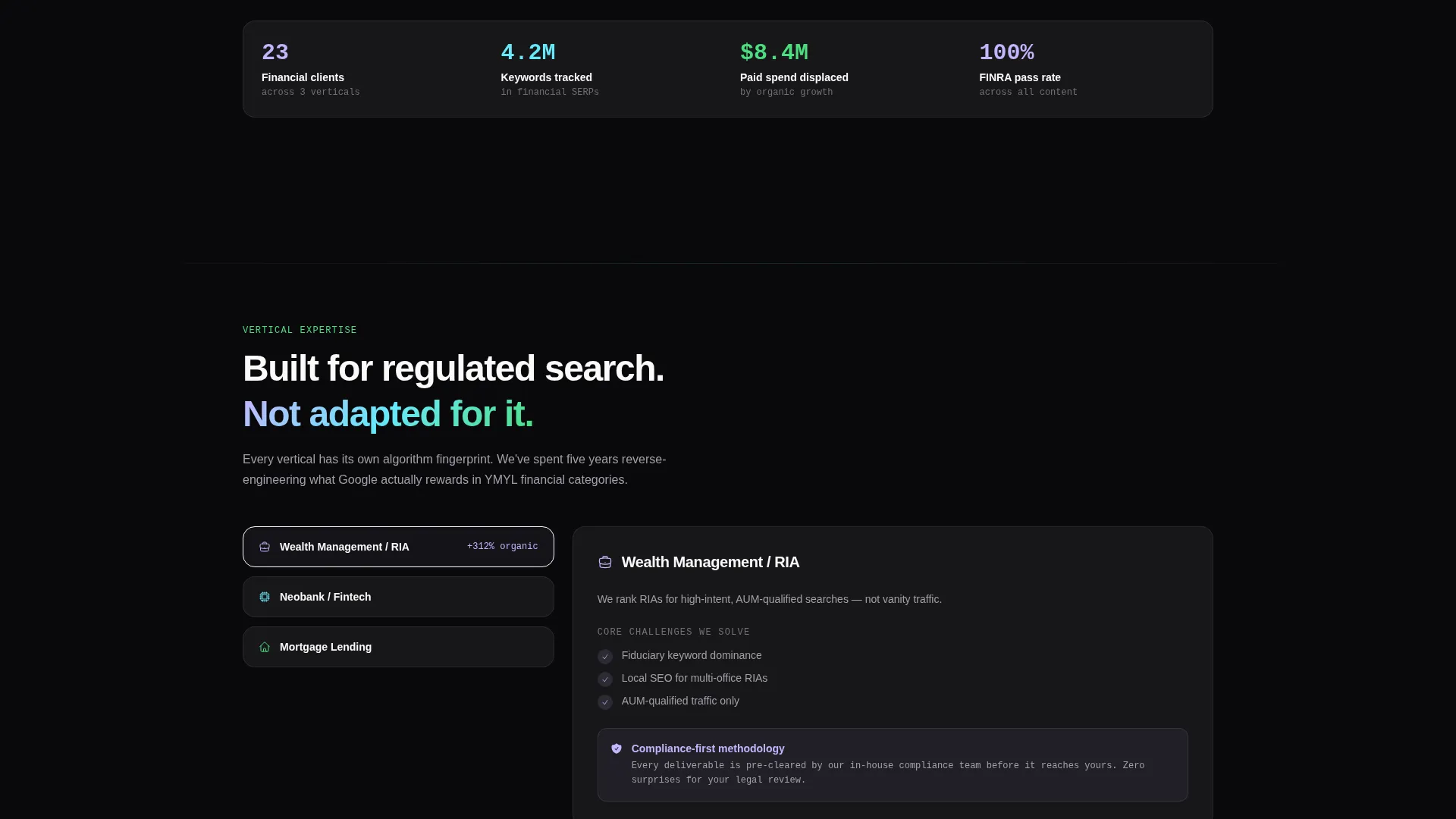
A dedicated cluster of bento tiles covers the agency's approach to Your Money or Your Life (YMYL) content compliance, including compliance workflow diagrams relevant to FINRA review processes. This cluster signals to compliance officers and regulated-sector marketing teams that the agency understands the constraints of their environment.
Page sections overview
| Section | Purpose |
|---|---|
| Photo Grid Mosaic | Opens with ranked proof and live data tiles |
| Interactive Bento Explorer | Lets visitors explore methodology by category |
| Technical SEO Cluster | Showcases crawl architecture and site structure work |
| Content Authority Cluster | Displays content strategy and YMYL compliance approach |
| Link Architecture Cluster | Covers link-building methodology for regulated sectors |
| Persistent call to action Bar | Captures waitlist signups with live scarcity counter |
Design & branding system
The visual identity follows a Tech Glass theme built on an AI Iridescent color system. The palette is intentionally narrow and disciplined, with color reserved for meaning rather than decoration.
- Core colors: void black (#09090B) for backgrounds, frosted glass panels at 6% white opacity over blur, iridescent lilac (#C4B5FD), spectral cyan (#67E8F9), and signal green (#4ADE80) used only for live data pulses and active call-to-action states
- Typography uses crisp anti-flash white (#FAFAFA) on dark surfaces, keeping body text highly legible against the deep matte background
- Bento tiles use glass-morphism borders that catch iridescent gradients at their edges, giving each tile a floating, luminous quality without cluttering the dark field
Mobile & speed optimization
The bento grid layout is structured to adapt naturally across viewport sizes. The interactive explorer and persistent call-to-action bar are both designed with touch interaction in mind.
- Bento tiles reflow into a single or two-column stack on smaller screens, keeping the mosaic proof structure intact without requiring horizontal scrolling
- The persistent bottom bar remains accessible at all screen sizes, so the waitlist form is always one tap away regardless of where the visitor is in the page
How this template helps you convert
The conversion architecture in Rank is sequenced deliberately. It earns the call to action by delivering proof before asking for anything.
- The photo grid mosaic header presents immediate, visual evidence of real client results, establishing credibility before the visitor reads a single sentence of agency copy.
- The interactive bento explorer deepens trust progressively, rewarding curious visitors with methodology detail and case study content that generic agency pages never surface.
- The persistent glass-morphism call-to-action bar with its live slot counter closes the loop at exactly the moment the visitor feels ready, reducing friction to a single inline form row.
Other information about this template
This template is categorized under Portfolio and Agency, with a specific focus on the Financial Services Marketing and Agency subcategory and the Financial Services Search Engine Optimization niche. A few additional details are worth noting for buyers evaluating fit.
- The template style is a bento grid, which suits data-dense agency positioning better than traditional single-column layouts
- The creative direction is Interactive Explorer, meaning the engagement model is curiosity-led rather than scroll-and-read
- The header concept is a Photo Grid Mosaic, distinct from a standard hero image or video header
- The landing page direction is Waitlist and Coming Soon, making it ideal for agencies opening limited quarterly onboarding rather than offering open-access signups
- The theme is Tech Glass and the color system is AI Iridescent, two design choices that together signal precision, intelligence, and a forward-facing brand posture
Theme
Tech Glass
Creative direction
Interactive Explorer
Color system
AI Iridescent
Style
Bento Grid
Direction
Waitlist/Coming Soon
Page Sections
Photo Grid Mosaic Header
Interactive Bento Explorer Grid
Persistent Waitlist Call to Action Bar
Live Scarcity Slot Counter
YMYL Compliance Tile Cluster
Secondary Methodology Exploration Path
Related questions
What type of agency is this template designed for?
How does the interactive bento explorer work for visitors?
Is this template suited for compliance-sensitive marketing teams?
Can this template support an open-signup page instead of a waitlist?
What makes the header different from a standard hero section?



