Restaurant Review Platform Website Template
Rave is a single-page landing page template built for restaurant review platforms. It combines a live-metrics header, modular glass card grids, and high-friction lead capture into one electric layout. Designed for independent owners, chain managers, and new bistro teams, it turns social proof data into a compelling, conversion-focused visual story.
by Rocket studio
Quick summary
Rave is a Tech Glass landing page template purpose-built for restaurant testimonial platforms. It leads with animated review counters, builds trust through modular case-study card grids, and closes with a low-friction lead capture form. The Acid Digital color system gives every section the urgency of a live dashboard, dark, electric, and impossible to ignore.
Who this template is for
This template is built for businesses that help restaurants grow through online reviews and social proof. It speaks directly to operators who know their reputation is their revenue.
- Independent restaurant owners who need to turn scattered reviews into visible, structured credibility
- Marketing managers at fast-casual chains handling multiple locations and review channels at once
- Newly opened bistro teams that cook brilliantly but have not yet built a public review presence
What problem this template solves
Most restaurant review platforms present their value through long feature lists and generic screenshots. Rave flips that entirely. It leads with scale and proof, then asks for commitment only after the visitor already feels the impact.
- Visitors leave before trusting a platform that cannot show real results at a glance
- Restaurant owners cannot see why a review tool matters until they see their own competitors' numbers
- Standard landing pages bury the lead capture form without earning it first through demonstrated value
What you get with this template
You get a fully structured, single-page layout that guides visitors from first impression to form submission without ever losing momentum. Every section is designed to build on the one before it.
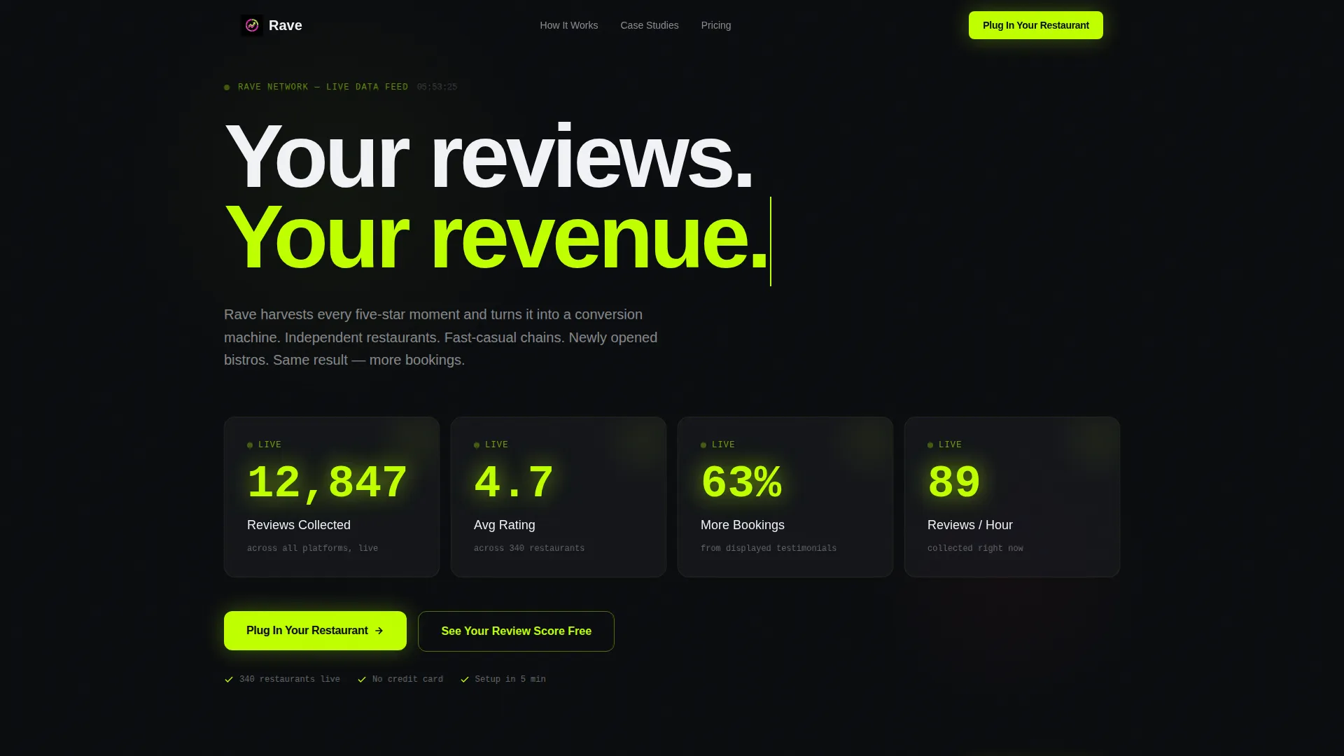
- A full-viewport animated metrics wall as the header, displaying rolling review counts, average ratings, and booking lift percentages
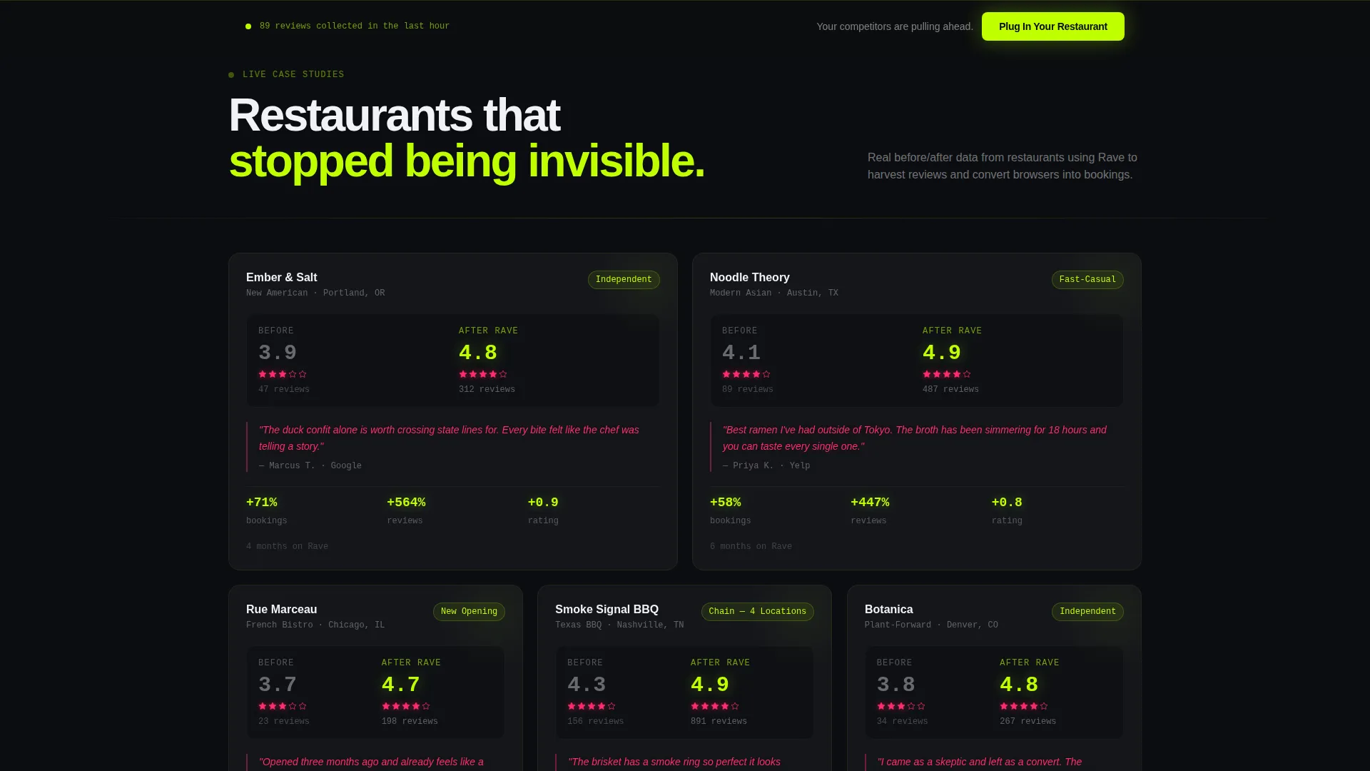
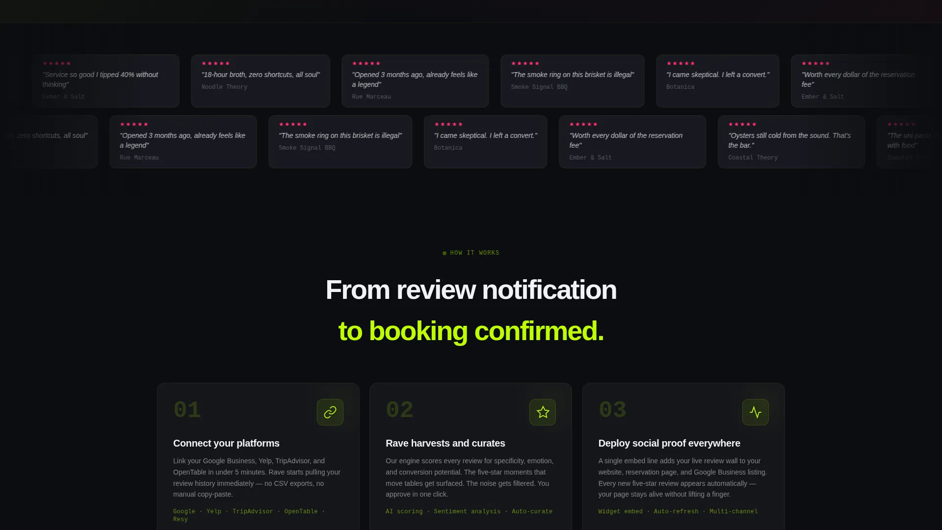
- A staggered modular card grid with restaurant case studies, before-and-after rating snapshots, pull-quote highlights, and percentage-lift badges
- Two distinct lead capture paths: a multi-field sign-up form and a one-field instant audit tool that delivers value before asking for an email
Feature list
This template ships with a focused set of purpose-built sections and visual components. Each one is designed to move a restaurant professional from skepticism to sign-up.
Animated Metrics Header
The full-viewport header displays live-style counters that animate upward on load. Review counts, average ratings, and booking lift figures roll like a stock ticker in electric lime. There is no hero image; the data itself is the visual centerpiece.
Modular Case Study Card Grid
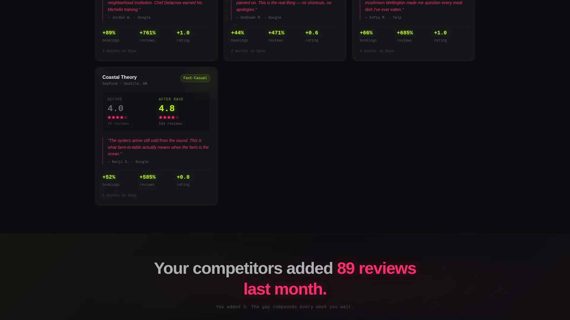
Below the header, glass-surface cards arrange themselves into a growing grid. Each card contains a before-and-after rating snapshot, a magenta-highlighted pull-quote, and a lime-pulsing percentage-lift badge. Cards stagger-animate on scroll as the grid density increases from two to four columns.
Single-Stat Interstitial Breaks
Between card clusters, full-width interstitial panels deliver sharp, single-number comparisons. Lines like "Your competitors added 89 reviews last month. You added 3." punch through the scroll rhythm and reset the visitor's urgency before the next grid section appears.
Dual Lead Capture Paths
The primary form collects restaurant name, Google Business URL, and email in that order, starting with the lowest-friction field. The secondary path is a one-field audit tool that returns a live review snapshot, capturing the lead through immediate value before any commitment is required.
Floating call to action Bar
After the metrics header, a floating bottom bar carries the primary call to action. The button reads "Plug In Your Restaurant" in electric lime against void black. It stays visible as the visitor scrolls deeper into the card grid.
Full-Width Terminal call to action Section
The page closes with a full-width terminal-style section that repeats the primary call to action. This reinforces the sign-up prompt at the natural end of the scroll journey, giving visitors a clear next step after processing all the social proof content.
Page sections overview
| Section | Purpose |
|---|---|
| Animated Metrics Header | Opens with live-style rolling counters to establish scale and trust immediately |
| Modular Card Grid | Displays restaurant case studies with ratings, pull-quotes, and lift badges |
| Interstitial Stat Breaks | Injects single-number competitor comparisons to sharpen urgency mid-scroll |
| Floating call to action Bar | Keeps the primary sign-up action visible throughout the scroll journey |
| One-Field Audit Tool | Captures leads by delivering a free review snapshot before asking for commitment |
| Full-Width call to action Terminal | Closes the page with a repeated primary call to action at natural scroll end |
Design & branding system
The visual identity runs on an Acid Digital color system layered over a Tech Glass surface treatment. Every color choice is intentional and tied to a specific content function within the layout.
- Void black (#0B0D10) forms the base background; translucent panel gray (#1A1D23 at 60% opacity) creates the frosted-glass card surfaces that let color bleed through their edges
- Electric lime (#BFFF00) drives all live data pulses, interactive border highlights, hover states, and primary call-to-action elements
- Hot magenta (#FF2D6B) is reserved for star ratings, review pull-quotes, and alert-style badges, giving those elements the visual weight of a Michelin star reimagined for a digital-native audience
Mobile & speed optimization
The card grid layout is built to reflow cleanly as viewport width decreases. Columns reduce progressively so the stagger animation and density argument remain legible on smaller screens.
- The grid transitions from four columns on wide viewports down to a single-column stack on mobile, preserving the card hierarchy and badge visibility
- The floating call to action bar repositions gracefully on narrow screens so it does not obscure card content while remaining accessible to the thumb
How this template helps you convert
The page is engineered around a specific conversion logic: show proof at scale first, create personal urgency second, and reduce friction at every form step.
- The metrics header establishes credibility in the first three seconds by presenting platform-wide review counts and booking lift figures before the visitor reads a single feature claim
- The interstitial competitor-comparison panels make the cost of inaction personal and specific, creating urgency that carries the visitor toward the lead capture sections
- The two-path lead capture system lets hesitant visitors enter through the low-commitment audit tool rather than a full sign-up form, maximizing the total number of leads collected
Other information about this template
Rave is a single-page layout delivered as a ready-to-customize template. It is suited to any team building or marketing a restaurant reputation management product.
- The template style is Card Grid (Modular), making it straightforward to add, remove, or reorder case study cards as your restaurant client roster grows
- The Launch Energy creative direction means every visual choice, stagger animations, interstitial punches, rolling counters, is designed to sustain forward scroll momentum rather than pause it
- The template fits naturally within the restaurant website templates category and is specifically shaped around the restaurant testimonials page use case
- Color values and opacity levels are defined consistently across the design system, making it practical to adapt the palette to a different brand accent if needed
Theme
Tech Glass
Creative direction
Launch Energy
Color system
Acid Digital
Style
Card Grid (Modular)
Direction
Lead Generation
Page Sections
Animated Live-style Metrics Header
Staggered Modular Card Grid
Single-stat Interstitial Panels
Dual-path Lead Capture System
Floating Primary Call to Action Bar
Full-width Terminal Close Section
Related questions
Who is this landing page template built for?
Does this template include a working review data integration?
Can I adjust the card grid to show more or fewer case studies?
What makes the lead capture approach different in this template?
Is this template suited for a single restaurant or for platform businesses?



