Community Emergency Preparedness Landing Page
The Readiness landing page template is built for community emergency planning services. It follows a Problem-to-Solution arc, converting diagnostic "red null" states into operational readiness layer by layer. With an Engineering Blueprint visual identity, a Charcoal and Amber color system, and a structured single-column flow, it guides HOA boards, township supervisors, and property managers toward taking immediate action.
by Rocket studio
Quick summary
Readiness is a single-column landing page template for community emergency preparedness services. It opens with a stark diagnostic of what most neighborhoods lack, then walks visitors through each readiness layer being built. The design feels like an emergency operations center: dark surfaces, amber indicators, and clean schematic type that radiates authority before a single word is read.
Who this template is for
This template is built for professionals responsible for community-level safety planning. It speaks directly to decision-makers who carry the weight of other people's preparedness on their shoulders.
- HOA board presidents managing wildfire, flood, or storm exposure across residential subdivisions
- Rural township supervisors coordinating limited volunteer fire and rescue resources across large service areas
- Apartment complex managers in flood zones or high-risk urban areas who need to run their first tenant drill
What problem this template solves
Most neighborhoods have no formal emergency plan. That gap is invisible until a disaster exposes it, and by then the window to act has closed. This template makes that gap visible and urgent, then immediately offers a structured path forward.
- Visitors arrive without realizing how many critical planning layers their community is missing
- The diagnostic framing converts vague concern into specific, actionable urgency
- The two-call to action structure captures both serious leads and early-stage prospects in one page flow
What you get with this template
You get a fully structured, single-column landing page designed around a Problem-to-Solution arc. Every section builds on the last, moving visitors from awareness to action with the confidence of a field-tested operations brief.
- A diagnostic checklist section showing red null states for missing community planning layers
- A section-by-section readiness build-up converting each null state into an operational status
- Two conversion paths: a short-form risk assessment intake and a free downloadable one-page audit checklist
Feature list
This template delivers a focused set of components built specifically for emergency preparedness lead generation and community service positioning.
Diagnostic Checklist Opening
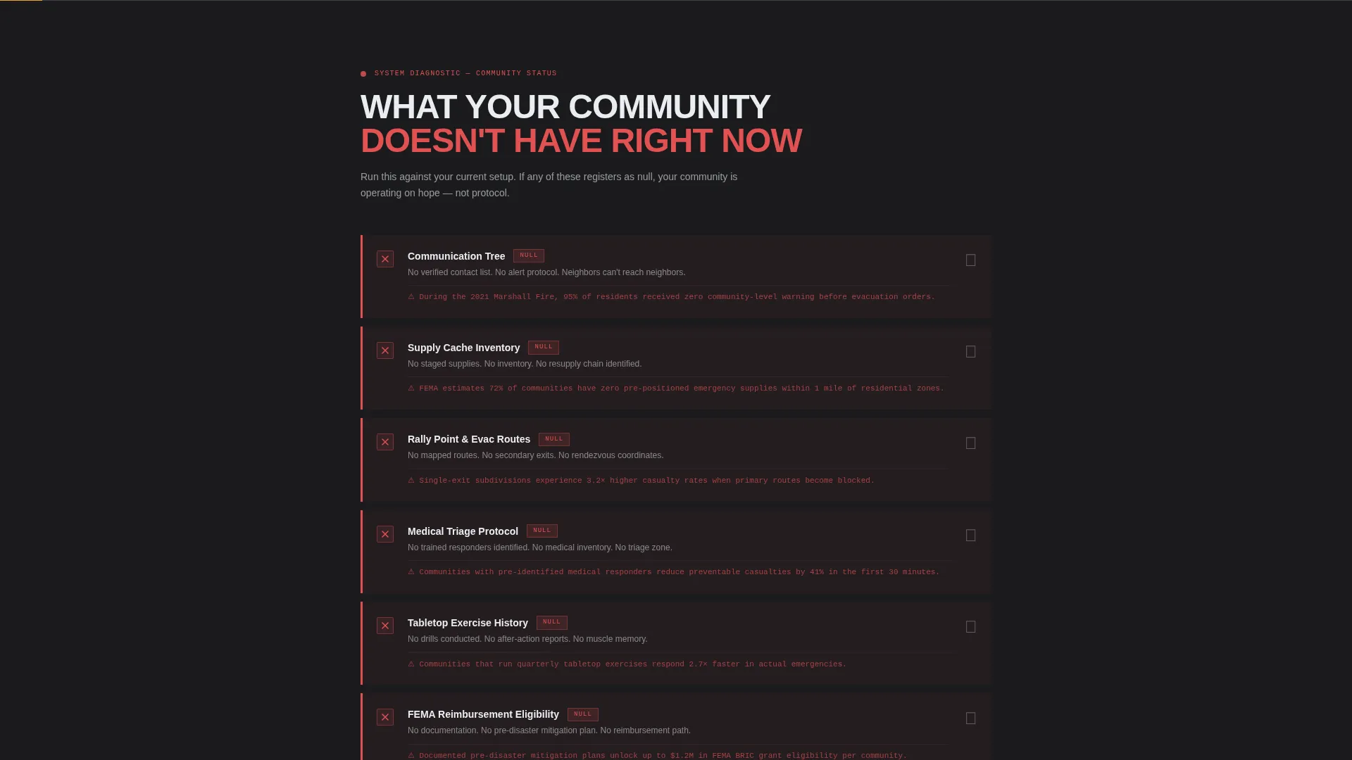
The page opens with a stark checklist of what most communities lack: no communication tree, no supply inventory, no rally points, no medical triage protocol. Each item is shown as a red null state, creating immediate diagnostic tension that pulls visitors into the solution arc that follows.
Problem-to-Solution Scroll Arc
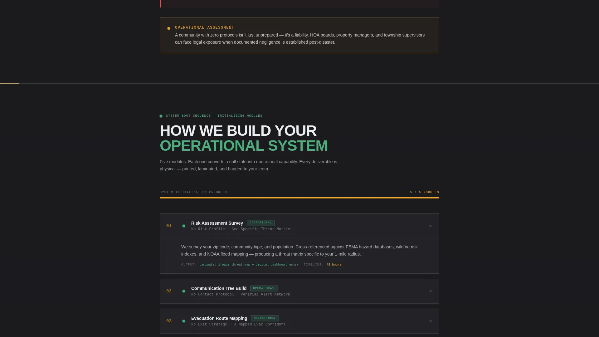
Each scroll section converts one red null state into a green operational status. The sequence moves from risk assessment surveys to printed go-bags to quarterly tabletop exercises, showing exactly how the service builds readiness layer by layer.
Comparison and Versus Structure
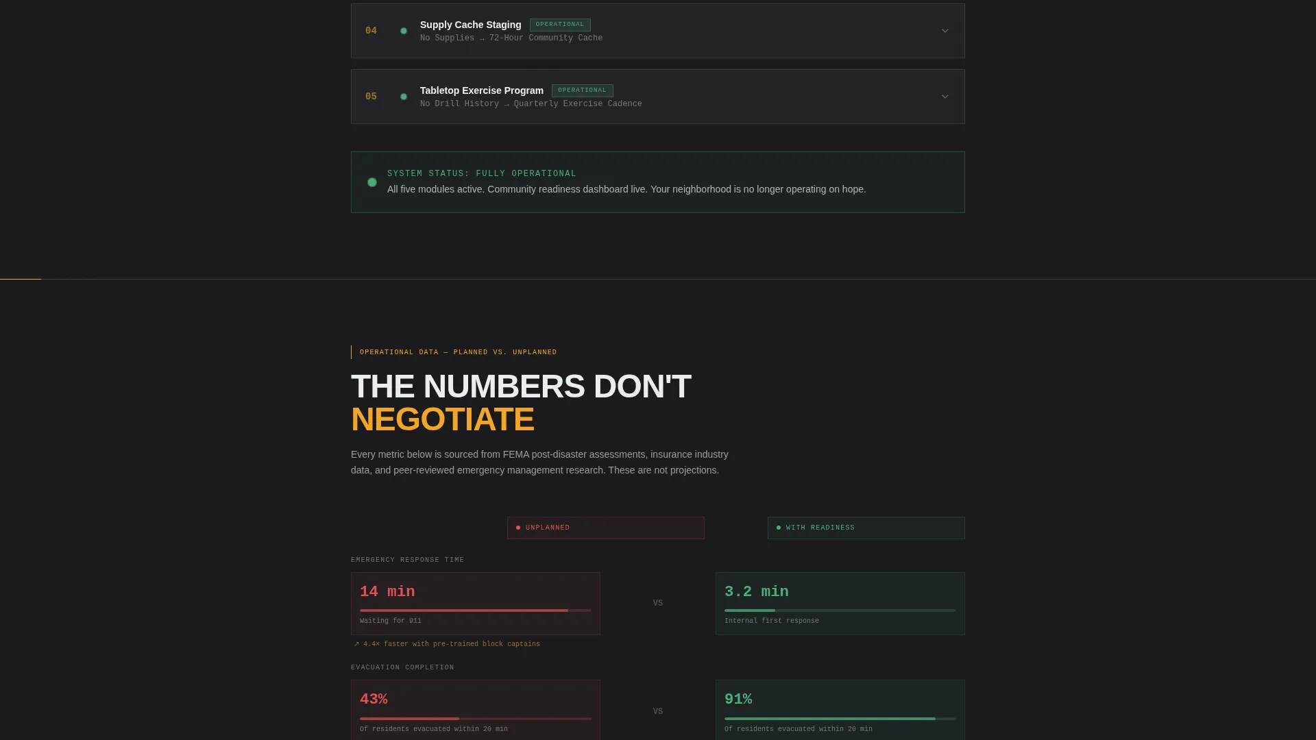
Every major section frames the unplanned community against the planned one. Response time gaps, casualty projections, insurance recovery rates, and FEMA reimbursement eligibility are presented as direct comparisons, giving visitors concrete stakes rather than abstract warnings.
Risk Assessment Intake Form
The primary call to action is a short-form intake that asks for zip code, community type (subdivision, apartment complex, rural township, or mobile home park), population count, and top perceived threat selected from a dropdown. This qualifies serious leads while keeping the form fast to complete.
Free Audit Checklist Download Path
A secondary conversion path offers a free one-page downloadable checklist. It requires only an email address, giving immediate value to visitors who are not yet ready for the full assessment while keeping them in the pipeline.
Engineering Blueprint Visual System
The template uses a deep graphite substrate, technical grid gray, high-visibility safety amber, and clean schematic white. Amber is reserved for actionable elements only: buttons, alert callouts, and key data points. The result feels like the inside of an emergency operations center rather than a marketing page.
Page sections overview
| Section | Purpose |
|---|---|
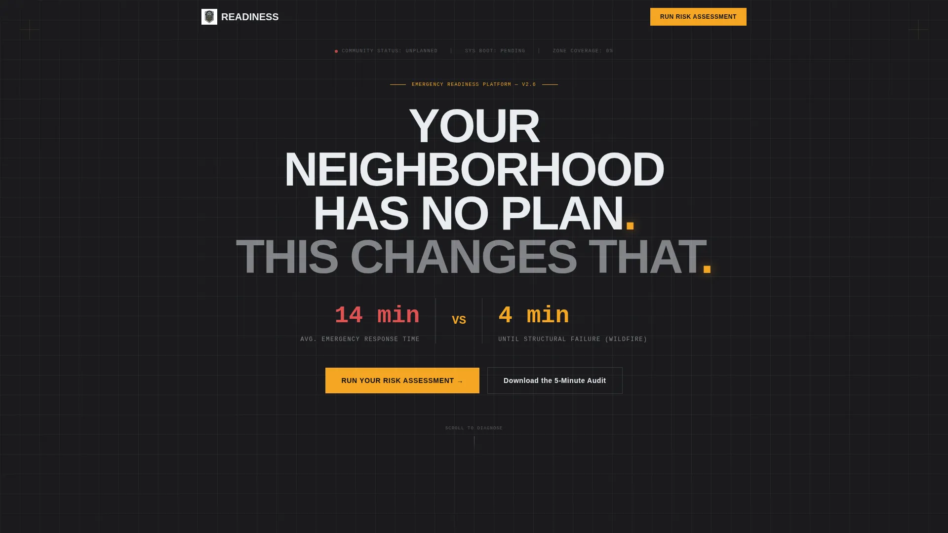
| Hero Headline Block | Establishes immediate stakes with bold centered type and no imagery |
| Response Time Stats | Shows the gap between average emergency response time and structural failure window |
| Diagnostic Null Checklist | Lists missing community planning layers as red null states |
| Risk Layer Buildout | Converts each null state into an operational green status section by section |
| Unplanned versus. Planned Comparison | Frames response gaps, casualty projections, and recovery rates side by side |
| Risk Assessment Form | Captures qualified leads via a short intake with community-type and threat dropdown |
| Free Audit Download | Offers the one-page checklist download in exchange for an email address |
| Operational Dashboard View | Shows a fully operational community readiness dashboard as the final state |
Design & branding system
The visual identity follows an Engineering Blueprint theme. The palette and type choices work together to signal precision and authority rather than warmth or approachability, which is exactly the register that earns trust in high-stakes safety contexts.
- Color system uses deep graphite (#1B1B1E) as the base, technical grid gray (#3A3D42) for depth layering, high-visibility safety amber (#F5A623) on all actionable elements, and clean schematic white (#EAEDF0) for body text and diagram lines
- Typography uses a condensed engineered typeface with tight tracking; the headline alone carries the visual authority with no supporting imagery required
- Amber is applied with strict function logic: it appears only on buttons, alert callouts, and key data points, never as decoration
Mobile & speed optimization
The single-column flow is the natural format for mobile viewing. Every section is designed to read clearly at any screen width, with no complex grid layouts that would require horizontal scrolling or break on smaller displays.
- Single-column structure adapts cleanly to mobile screens without layout adjustments
- Short-form intake fields and the email capture path are designed to be thumb-friendly and fast to complete on a phone
- Dark background with high-contrast amber and white text maintains legibility across varied screen brightness and ambient light conditions
How this template helps you convert
The page is engineered around two conversion paths that serve different readiness levels in your audience. Neither path asks for more than visitors are prepared to give at that moment.
- The risk assessment intake form qualifies serious leads by asking four specific questions about their community, giving your service team the context needed to follow up with a relevant proposal immediately.
- The free audit checklist download lowers the barrier for first-time visitors, capturing an email address in exchange for immediate value and keeping early-stage prospects engaged with your service.
Other information about this template
This template is built for service providers operating in the community emergency preparedness and business continuity planning space. It suits both direct-to-community outreach and partnership or business-to-business (B2B) positioning.
- The template style uses a Card Grid modular layout approach for the comparison and feature sections, making it straightforward to update or extend individual modules
- The Service Utility theme means the layout prioritizes function and data clarity over decorative design, which aligns with the expectations of the target audience
- The Case Study Narrative creative direction supports the scroll arc by treating each completed readiness layer as a demonstrated outcome rather than a promise
- The Charcoal and Amber color system is consistent with established visual language in emergency management and industrial safety contexts, lending instant credibility to the service
- This template is well-suited for organizations pursuing FEMA preparedness program alignment or community resilience grant positioning, where documented planning frameworks carry institutional weight
Theme
Service Utility
Creative direction
Case Study Narrative
Color system
Charcoal & Amber
Style
Card Grid (Modular)
Direction
Partnership/B2B
Page Sections
Diagnostic Null-state Checklist
Problem-to-solution Scroll Arc
Comparison and Versus Structure
Dual Conversion Path Design
Engineering Blueprint Visual System
Risk Assessment Intake Form
Related questions
Can I customize the community types in the intake form dropdown?
Does this template work for both direct community clients and B2B partnerships?
What is included in the free audit checklist section?
Is this template suitable for both rural and urban community audiences?
Can I add or remove the comparison sections from the template?