Real Estate Marketing & Agency Portfolio Website Template
Real is a Bold Brutalist landing page built for real estate pay-per-click agencies that need to prove results fast. A collage-style header layers torn ad dashboards and circled metrics into a war-room visual. Three escalating client case studies, an asymmetric 60/40 grid, and a short audit intake form turn skeptical visitors into qualified leads.
by Rocket studio
Quick summary
Real is a single-page, lead-generation template designed for real estate pay-per-click agencies. It uses an asymmetric 60/40 grid, a collage-style header loaded with proof fragments, and a case-study narrative that stacks credibility across three client stories. Every layout decision points visitors toward one clear action: requesting a free ad spend audit.
Who this template is for
This template is built for agencies and specialists who sell pay-per-click advertising services to real estate professionals. It works best when you need to convert cold traffic into booked consultations or audit requests.
- Real estate PPC agencies pitching brokerage owners and solo agents
- Regional marketing teams that need to demonstrate lead volume by zip code
- Independent consultants scaling past referral work and into paid acquisition
What problem this template solves
Most agency landing pages bury their proof in testimonials that nobody believes. Buyers arrive skeptical, scan for a number they can trust, find generic copy, and leave. This template solves that by leading with raw evidence and making the math visible before asking for anything.
- Visitors never reach a call-to-action without first seeing real cost-per-lead figures and return-on-ad-spend results
- The three-story case study format removes objections one by one as the visitor scrolls
- The audit form feels like a natural next step because the page earns the click first
What you get with this template
You get a fully structured single-page layout built around one objective: converting real estate professionals into agency leads. The layout, copy architecture, and visual system all ship together.
- An asymmetric 60/40 grid with a collage header, three case study sections, and two call-to-action placements
- A primary lead form with a budget-range slider and a secondary gated download path
- A Bold Brutalist visual identity using an AI Iridescent color system with animated gradient accents
Feature list
This template ships with six purpose-built components. Each one serves the lead-generation goal directly.
Collage Scrapbook Header
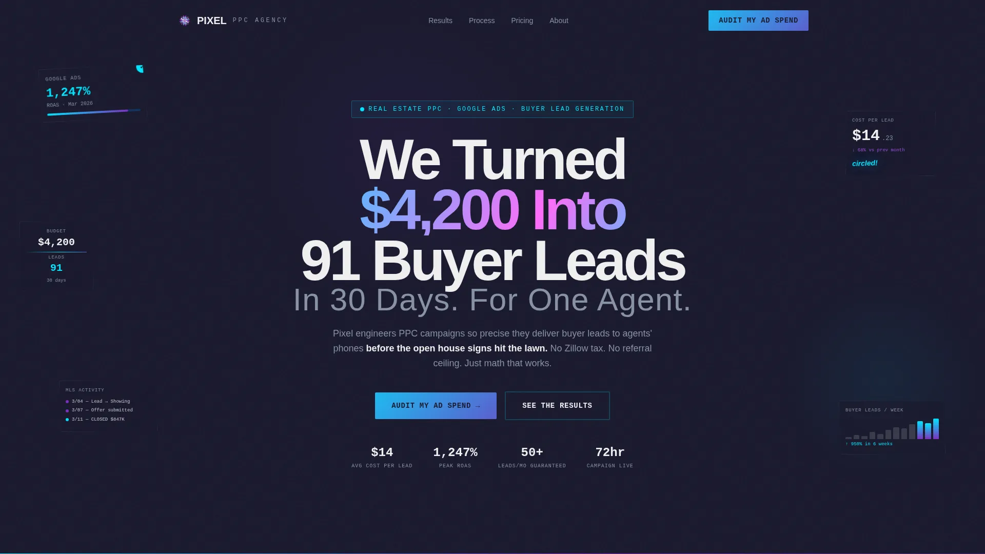
The header is a layered explosion of torn ad dashboard fragments, MLS printout scraps, circled conversion graphs, and marker-font cost-per-lead callouts. It fills the full viewport at competing angles. The chaos communicates credibility before the visitor reads a single word.
Asymmetric 60/40 Grid Layout
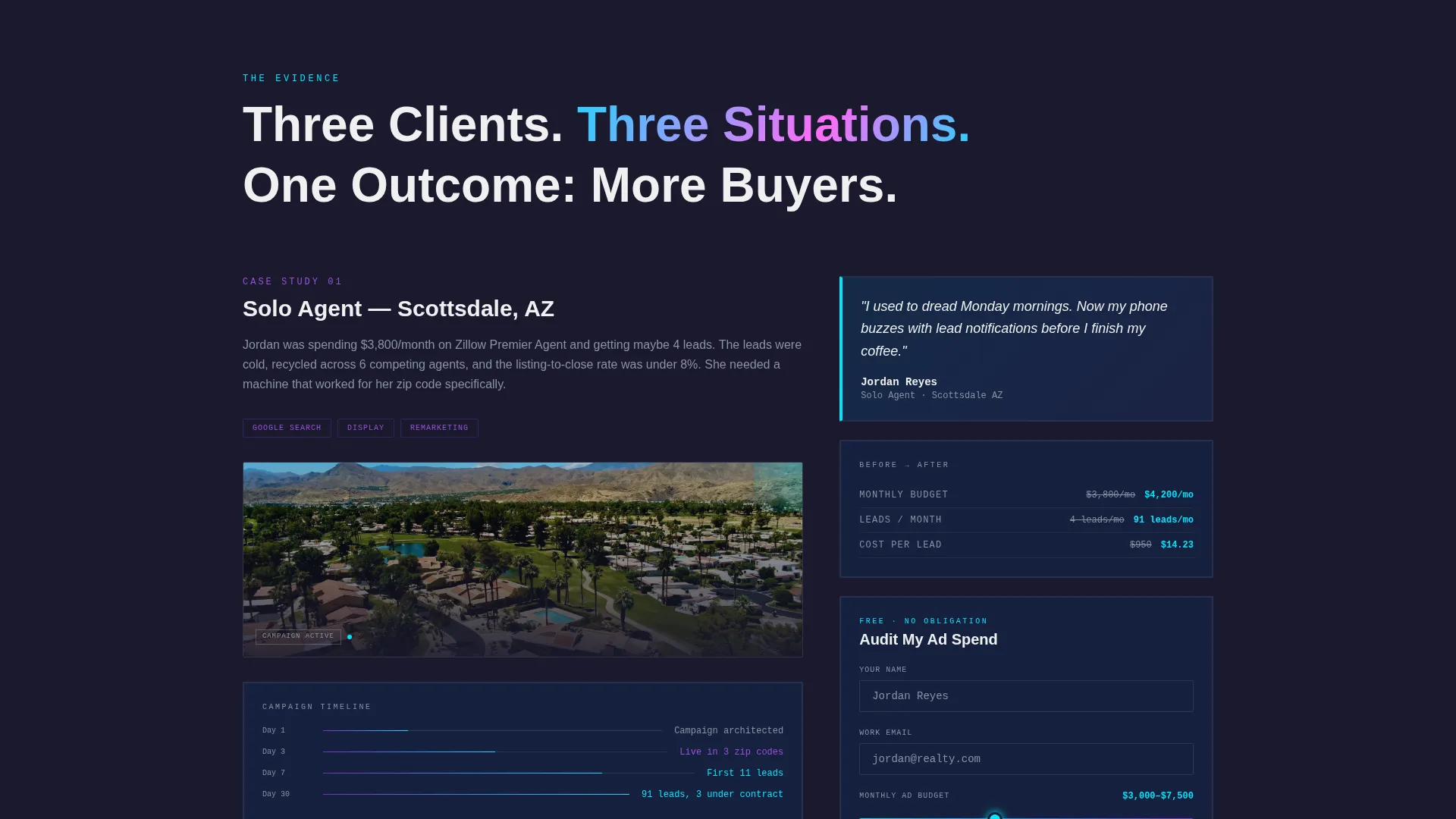
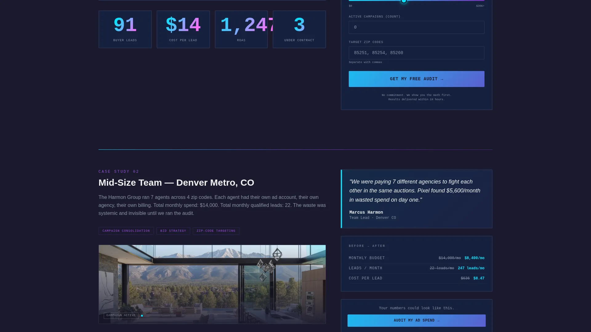
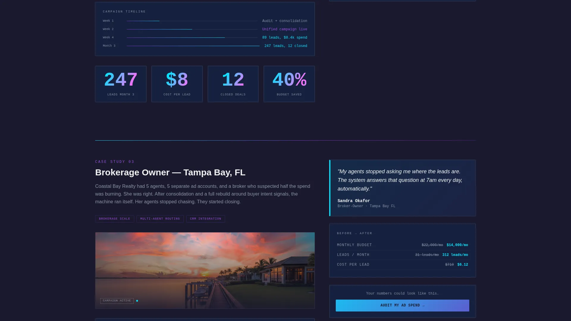
The 60-column carries case study metrics, timelines, and actual ad screenshots. The 40-column runs pull quotes, before-and-after spend comparisons, and animated counter numbers that tick upward as the visitor scrolls. This split keeps proof and context visible at the same time.
Three-Story Case Study Narrative
Three complete client stories unfold in escalating stakes: a solo agent in a saturated market, a mid-size team expanding into a new county, and a brokerage owner consolidating five agents' budgets. Each story builds on the last so skepticism has nowhere to go by the third.
Animated Scroll Counters
Numerical results in the 40-column animate upward as the visitor scrolls past each case study section. This draws attention to key figures and keeps engagement high through the longer narrative scroll.
Dual Conversion Paths
The primary call-to-action is an "Audit My Ad Spend" form with a monthly budget slider, active campaign count field, and target zip code input. A secondary path offers a downloadable playbook PDF that captures email from visitors not yet ready to talk.
Sticky Sidebar Form Placement
After the first case study, the audit intake form reappears as a sticky element in the 40-column. It stays visible during the remaining two case study sections without interrupting the narrative flow.
Page sections overview
| Section | Purpose |
|---|---|
| Collage Header | Opens with layered proof fragments and the primary headline |
| Brutalist Headline | Punches the core result claim through the collage in knockout type |
| Case Study One | Solo agent story with metrics and the first audit form placement |
| Sticky Audit Form | Resurfaces the lead intake in the 40-column sidebar |
| Case Study Two | Mid-size team expansion story with animated counters |
| Case Study Three | Brokerage consolidation story completing the proof stack |
| Playbook Download | Secondary gated path for email capture |
Design & branding system
The visual identity is Bold Brutalist filtered through an AI Iridescent color system. The result feels like a neon oil slick on wet asphalt: industrial weight with something algorithmic alive underneath.
- Deep slab charcoal (#1A1A2E) anchors all backgrounds; raw white (#F0F0F0) keeps data-heavy text blocks legible
- Holographic violet (#7B2FBE) and electric cyan (#00E5FF) run as gradient accents that shimmer across hover states and section dividers
- Typography uses oversized knockout type for headlines and functional slab faces for body text, reinforcing the brutalist tone throughout
Mobile & speed optimization
The template is designed so the proof-heavy layout stays readable on smaller screens without losing the visual impact of the collage header or the grid split.
- The asymmetric 60/40 grid collapses to a single-column stack on mobile, keeping case study metrics and forms accessible
- Animated counters and gradient hover states are built to run smoothly without adding unnecessary visual noise on touch devices
How this template helps you convert
Every structural decision in this template is engineered to reduce friction and increase the likelihood that a visitor submits the audit form.
- The collage header front-loads specific numbers so visitors arrive at the first call-to-action already primed with proof rather than doubt.
- The sticky sidebar form keeps the audit intake reachable during the longest section of the page, so readers who engage deeply never have to scroll back up to convert.
Other information about this template
This template is part of the Pixel template collection, designed for agencies operating in performance-driven niches where showing results is more persuasive than describing services.
- The page architecture suits agencies running Google Ads campaigns for real estate clients who need a dedicated post-click landing page separate from their main site
- The downloadable playbook path makes this template useful for building an email list alongside direct lead capture
- The case study narrative structure can be adapted for agencies in adjacent performance marketing verticals where proof stacking is the primary sales tool
- This template works particularly well as a standalone campaign landing page for cold traffic arriving from paid search or paid social ads
Theme
Bold Brutalist
Creative direction
Case Study Narrative
Color system
AI Iridescent
Style
Asymmetric Grid (60/40)
Direction
Lead Generation
Page Sections
Collage Scrapbook Header
Asymmetric 60/40 Grid
Three Escalating Case Studies
Animated Scroll Counters
Dual Conversion Paths
Sticky Sidebar Form
Related questions
What type of agency is this template designed for?
Can I adapt the three case study sections to my own client results?
What are the two conversion paths included in this template?
How does the sticky sidebar form work?
Does this template work for agencies outside real estate?



