Stroke Recovery Care Professional Website Template
Recover is a split-screen landing page template built for stroke recovery support groups. It pairs animated social-proof counters with a scrollable self-audit checklist, guiding caregivers and survivors toward a single low-friction call to action. The design balances clinical clarity with genuine warmth, making it the right starting point for any peer support community serving families after stroke.
by Rocket studio
Quick summary
Recover is a single-page template designed for stroke recovery support groups. It opens with a stats wall that establishes immediate credibility, then walks visitors through a structured self-audit checklist. Each section surfaces real gaps in a family's recovery plan. By the bottom of the page, visitors have already identified what they need, and the call to action feels like a natural next step.
Who this template is for
This template is built for the people running peer support circles and recovery communities, not for clinical providers or hospitals. It speaks directly to the organizations that fill the space between discharge and long-term recovery.
- Stroke recovery support groups and nonprofits looking to grow weekly session attendance
- Community health coordinators or volunteers managing caregiver outreach programs
- Peer-led organizations that want a credible, emotionally grounded online presence
What problem this template solves
Families touched by stroke often find their way online late at night, overwhelmed and unsure where to start. A generic contact page or calendar listing does nothing for someone who is still processing what just happened. This template meets that person where they are.
- Caregivers and survivors arrive without a clear picture of what they are missing, and the audit format helps them see it
- Most landing pages ask for commitment before earning it; this template earns the click by letting visitors inventory their own situation first
- Support groups often lack a page that feels both trustworthy and human; this template delivers that tone without sacrificing clarity
What you get with this template
You get a complete, ready-to-customize single-page layout with every structural decision already made. The visual hierarchy, section order, and interaction logic are all built in.
- A stats wall hero section with three animated counters and a full-panel photography slot
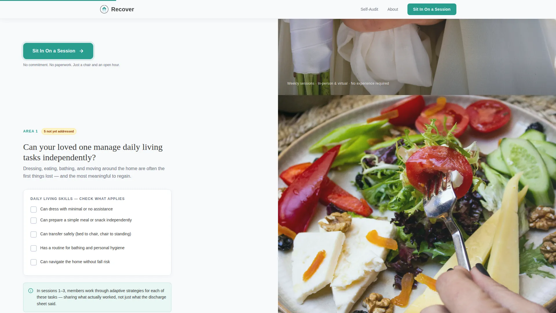
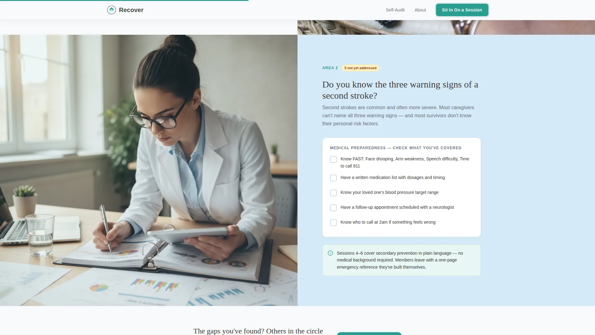
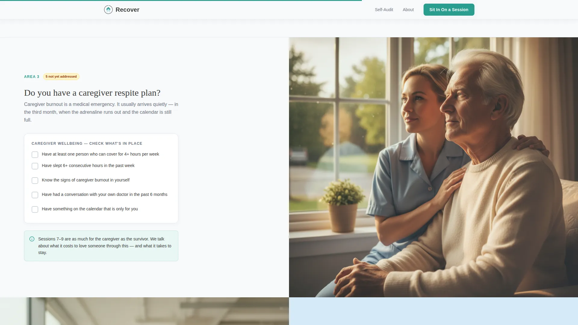
- Four self-audit checklist sections with interactive, tappable checkboxes covering daily living, medical preparedness, caregiver wellbeing, and social recovery
- Three strategically placed "Sit In On a Session" call-to-action interstitials plus a full-width closing section, all in warm teal
Feature list
This section covers the core built-in capabilities that make the Recover template function as designed.
Animated Stats Counter Hero
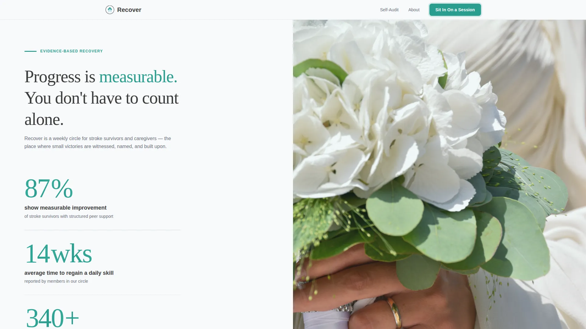
The header splits into two equal panels. The left panel holds three large, scroll-triggered counters: 87% improvement with structured peer support, 14 weeks average to regain a daily living skill, and 340+ families supported since 2019. Numbers animate upward on load, set in light teal against clinical white. The right panel holds a single full-bleed photograph slot sized for maximum emotional impact.
Interactive Self-Audit Checklist
Four checklist sections run down the page in a 50/50 split-screen layout. Left panels pose plain-language questions about the visitor's real situation. Right panels show exactly what the support group covers in that area. Each checkbox is interactive and tappable, so visitors can track their own gaps as they scroll.
Repeating Click-Through Call to Action
A warm teal "Sit In On a Session" button appears immediately after the hero, repeats after every third checklist section, and anchors the final full-width closing panel. No form appears on this page. The button carries visitors to a separate registration page, keeping the landing page friction-free.
Scroll-Triggered Section Reveals
Each checklist section enters the viewport with a staggered reveal animation. Checkbox micro-interactions respond to user input. Counter animations fire on scroll entry. All motion is purposeful and measured, reinforcing the sense of steady, forward progress.
Dual Typeface Display System
The template pairs DM Sans for body text and user interface elements with Fraunces, a serif display typeface, for headlines and emotionally weighted moments. The contrast between utilitarian and expressive type reinforces the template's clinical-warmth tone without requiring any custom font configuration.
Footer with Horizontal Flow Layout
The footer follows a horizontal flow pattern, providing space for organizational links, contact details, and any supporting navigation. It sits cleanly beneath the final call-to-action panel without competing with the primary conversion path.
Page sections overview
| Section | Purpose |
|---|---|
| Stats Wall Hero | Establish credibility with animated social-proof counters and a therapy-rail photo |
| Daily Living Checklist | Prompt visitors to assess independence in dressing, eating, and basic tasks |
| First call to action Interstitial | Offer the session invite early, for visitors ready to act without scrolling further |
| Medical Preparedness Checklist | Surface gaps in stroke warning sign awareness and medication management |
| Caregiver Wellbeing Checklist | Reveal missing respite plans and emotional support structures |
| Second call to action Interstitial | Re-offer the session invite at the page's midpoint |
| Social Communication Checklist | Address speech, connection, and community recovery needs |
| Final call to action Panel | Full-width warm teal close that consolidates the audit's findings into one action |
| Horizontal Flow Footer | Provide organizational navigation and supporting links |
Design & branding system
The visual identity follows an Educational Guide theme built around the Arctic White color system. Every color choice serves a functional role: the palette feels clinical enough to trust and warm enough to stay on.
- Clinical white (#F8F9FA) as the primary background, soft graphite (#3D3D3D) for body text, and pale glacier blue (#D6EAF8) for alternating section backgrounds
- Warm teal (#2A9D8F) applied consistently to every interactive element, call-to-action button, progress indicator, and animated counter value
- DM Sans handles all body and interface text for readability; Fraunces serif display adds emotional weight to headlines and key statements
Mobile & speed optimization
The template is built desktop-first, with the split-screen layout as its primary presentation. On smaller screens, the 50/50 panels collapse into a clean vertical stack so nothing is lost in translation.
- Split-screen sections reflow to single-column stacks on mobile, preserving the checklist-and-answer pairing in readable order
- The template is static-first with no external data fetching, keeping load behavior predictable across devices and connection speeds
- Counter animations and scroll-triggered reveals are designed to work within the stacked mobile layout without breaking the audit flow
How this template helps you convert
The Recover template earns the click rather than asking for it upfront. The entire scroll is structured as a conversion journey, not a sales pitch.
- The animated stats counter hero establishes immediate, specific credibility before the visitor reads a single word of body copy, making the organization feel real and established.
- The self-audit format turns passive reading into active self-assessment. Every unchecked box is a quiet, self-generated reason to attend a session, without pressure from the page itself.
- The repeating call-to-action placement meets visitors at multiple decision points. Whether they are ready after the first stat or only after the final checklist, the button is always one scroll away.
Other information about this template
This template is part of a Health and Medical category set, specifically designed for the stroke recovery support group niche. It reflects the real behavioral patterns of its target audience, people who arrive overwhelmed and leave with clarity.
- The "Sit In On a Session" button links to a registration page that includes a date picker, a location or virtual toggle, and one optional open-text field asking what would help the visitor most right now
- The page uses no form fields on the landing surface itself, which reduces friction for emotionally exhausted visitors who are not yet ready to commit personal details
- The template works equally well for in-person weekly circles and virtual support sessions, since the registration page includes a location or virtual toggle
- Checklist sections are organized around four recovery dimensions: daily living skills, medical preparedness, caregiver wellbeing, and social and communication recovery
- The photography slot in the hero is sized and positioned for a single tight, emotionally resonant image; the brief was written around a hand gripping a therapy rail, but any similarly composed image works
Theme
Educational Guide
Creative direction
Checklist & Audit
Color system
Arctic White
Style
Split Screen (50/50)
Direction
Click-Through
Page Sections
Animated Stats Counter Hero
Interactive Self-audit Checklist
Repeating Click-through Call to Action
Scroll-triggered Reveals and Micro-interactions
Dual Typeface Display System
Horizontal Flow Footer
Related questions
Who is the primary audience for this landing page template?
Does this template include a sign-up form?
Can I customize the checklist questions for my group's specific program?
How many times does the call-to-action appear on the page?
Is this template suitable for virtual support groups as well as in-person ones?



