Branding & Design Agency Portfolio Website Template
Rebrand is a cinematic, overlap-layered landing page built for rebranding specialists. It pairs a full-screen video header with a Gallery Walk scroll experience, guiding visitors through layered case studies and a sequential lead-capture form. The Void & Violet color system and Lens & Frame visual theme make every section feel like a curated exhibition of brand transformation.
by Rocket studio
Quick summary
Rebrand is a single-page, overlap-layered landing page template designed for rebranding studios. It opens with a cinematic full-screen video header, walks visitors through parallax-driven case studies, and closes with a focused lead generation form. The design runs on a Void & Violet palette and a Lens & Frame theme that communicates precision, clarity, and creative authority.
Who this template is for
This template is built for branding and design studios whose primary service is strategic rebranding. It speaks directly to practitioners who work with established businesses ready for a sharp visual identity overhaul.
- Rebranding specialists pitching to mid-market company CMOs and growth-stage founders
- Brand studios serving legacy businesses whose visual identity has fallen out of step with the market
- Design agencies that want a portfolio-led landing page that converts serious prospects into qualified leads
What problem this template solves
Many branding agencies lose prospects before the first conversation because their own website fails to demonstrate the transformation they promise. A generic portfolio page cannot carry the weight of a premium repositioning offer.
- Visitors leave without understanding the depth of the studio's strategic process
- No clear conversion path exists for prospects at different stages of readiness
- The visual presentation feels inconsistent with the high-caliber work the studio actually produces
What you get with this template
This template delivers a complete, ready-to-customize landing page structure built around three goals: show the work, explain the process, and capture the lead. Every section is purposefully ordered to move a skeptical visitor toward commitment.
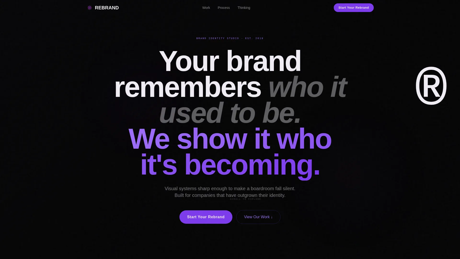
- A full-screen cinematic video header with a tracked-out headline and desaturated footage accented by violet pulses
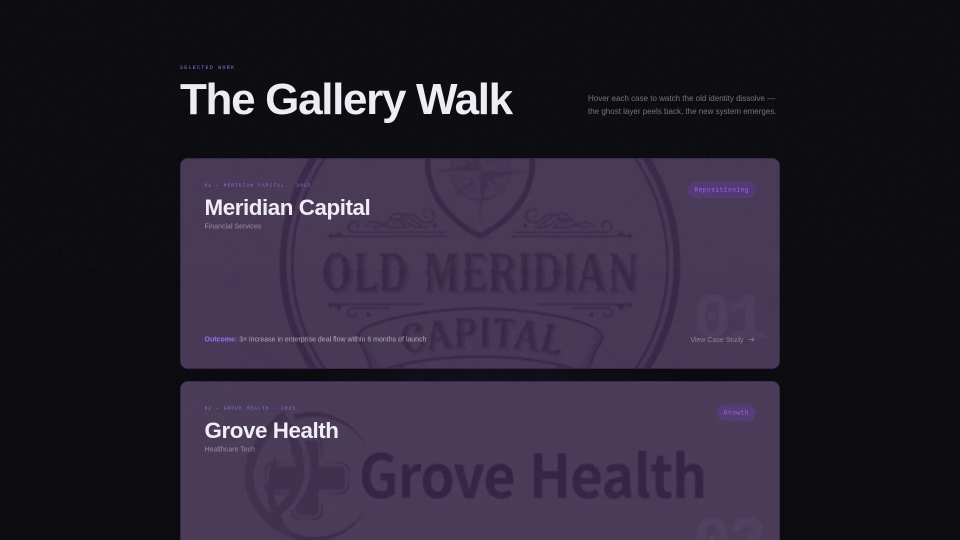
- A Gallery Walk case study section with translucent ghost layers, parallax card shifts, and a three-part reveal sequence
- A dual conversion path: a primary "Start Your Rebrand" call-to-action form panel and a secondary downloadable Rebrand Readiness Audit gated by email
Feature list
This section covers the core built-in capabilities of the template as defined in the design brief.
Full-Screen Video Header
The header runs a slow, cinematic montage of brand artifacts being physically deconstructed. Footage is desaturated except for violet accents that pulse through each transition. A single large headline in tracked-out white sans-serif type anchors the composition.
Gallery Walk Case Study Scroll
Each case study is a layered composition. The old brand identity sits as a translucent ghost layer behind the new system. Cards overlap and shift with parallax as the visitor scrolls, with each reveal earning a deliberate pause before the next layer stacks on top.
Sequential Lead Capture Form Panel
The primary conversion form slides in from the right as an overlay panel. It asks three questions in sequence: company name and URL, the reason driving the rebrand chosen from a dropdown, and the preferred timeline. The flow feels structured rather than demanding.
Fixed Navigation Call-to-Action Pill
The "Start Your Rebrand" call-to-action appears as a fixed pill inside the top navigation bar. It stays visible throughout the entire scroll, ensuring the primary conversion action is always one click away regardless of where the visitor is on the page.
Rebrand Readiness Audit Gate
A secondary conversion path offers a downloadable PDF audit for visitors not yet ready to commit. Access is gated behind a single email field. This captures leads earlier in the decision process without competing with the primary form.
Overlap and Layered Section Design
The template uses an overlap and layered composition style throughout. Cards from different sections visually stack and intersect, creating depth without clutter. The layout reinforces the studio's positioning as a precise, deliberate creative practice.
Page sections overview
| Section | Purpose |
|---|---|
| Video Header | Opens with cinematic brand deconstruction footage and headline |
| Fixed Nav Pill | Keeps the primary call-to-action visible during full scroll |
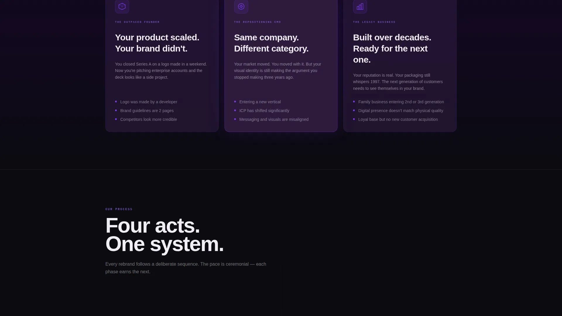
| Problem Framing | Establishes the tension between outdated identity and market position |
| Strategy Reveal | Peels back the studio's rebranding methodology and thinking |
| Case Study One | Shows old versus new identity with ghost-layer parallax composition |
| Case Study Two | Continues the Gallery Walk with a second layered brand transformation |
| Case Study Three | Completes the three-part case study sequence with full identity reveal |
| Primary call to action Section | Full-width conversion block placed after the third case study |
| Audit Download Gate | Secondary lead path for visitors not yet ready to start |
| Form Overlay Panel | Slide-in panel with three sequential qualification questions |
Design & branding system
The visual identity runs on the Void & Violet color system and a Lens & Frame theme. The overall feeling is cinematic and precise, like a darkroom moment before the print emerges: shadow-heavy, charged, and then struck by a single ultraviolet glow.
- Color palette: absolute black (#0B0B0F) dominates backgrounds, deep aubergine (#2D1B3D) fills overlapping card layers, electric violet (#7C3AED) marks every interactive surface and hover state, and exposed white (#F0ECF4) carries all body and headline typography
- Typography: tracked-out white sans-serif headlines float above dark backgrounds like gallery labels, keeping the reading experience clean and authoritative
- Spatial composition: negative space is used intentionally to let key visual elements breathe, and overlap layers add depth without visual noise
Mobile & speed optimization
The template is structured to translate its cinematic desktop experience into a focused, readable mobile layout. Layered compositions are adapted so that depth and hierarchy remain clear on smaller screens.
- The fixed navigation pill and call-to-action remain accessible on mobile viewports throughout the scroll
- Parallax and overlay effects are contained within defined section boundaries to maintain layout stability across device sizes
- The slide-in form panel and email gate are designed to function cleanly as touch-friendly interactions on mobile
How this template helps you convert
The entire page is built around a deliberate conversion architecture. Every section moves the visitor one step closer to either starting the conversation or entering the lead funnel through the audit download.
- The Gallery Walk case study sequence builds trust progressively, showing transformation across three client stories before asking for any commitment.
- The dual conversion path captures prospects at two different stages of readiness: the three-question form panel for decision-ready visitors, and the Rebrand Readiness Audit PDF gate for those still evaluating.
- The fixed call-to-action pill in the navigation ensures the primary conversion action is never more than one click away, regardless of scroll depth.
Other information about this template
This template fits within the Portfolio & Agency category and specifically targets the Branding & Design Agency subcategory. It is designed for studios operating in the rebranding specialist niche where the quality of visual presentation directly influences whether a prospective client makes contact.
- The Lens & Frame theme was matched to this niche because it frames brand work the way a photographer frames a subject: with intention, precision, and a clear point of view
- The template style is classified as Overlap and Layered, a deliberate structural choice that mirrors the rebranding process itself, where old and new identities coexist briefly before the new one takes over
- The creative direction is Gallery Walk, which turns the scroll into a curated exhibition rather than a standard page scan
- The header concept is Full-Screen Video Background, chosen specifically to communicate motion and transformation from the first second of a visit
- The landing page direction is Lead Generation, meaning every design and layout decision supports moving visitors toward one of two conversion actions

Theme
Lens & Frame
Creative direction
Gallery Walk
Color system
Void & Violet
Style
Overlap/Layered
Direction
Lead Generation
Page Sections
Full-screen Cinematic Video Header
Gallery Walk Parallax Case Studies
Slide-in Lead Capture Form Panel
Fixed Navigation Call-to-action Pill
Email-gated Audit Download
Overlap and Layered Layout System
Related questions
Can I customize the headline and video in the header section?
What are the three questions in the lead capture form?
What is the Rebrand Readiness Audit and how does it work?
Is this template suitable for a solo brand consultant or only for larger studios?
Can the case study section be edited to show fewer than three projects?



