Restaurant Booking Confirmation & Upsell Thank-You Page Template
This restaurant thank-you landing page template turns a booking confirmation into an interactive upsell experience. Built on a dark Carbon Fiber color system, it combines a glowing product-screenshot header, a modular card grid, and a real-time "Build Your Evening" upgrade tool. Diners explore add-ons, see side-by-side comparisons, and lock in upgrades before they ever leave the page.
by Rocket studio
Quick summary
This single-page template greets diners the moment their reservation is confirmed. A glowing user interface mockup of their booking leads directly into a modular card grid where guests can build their ideal evening. Every upgrade card shows a clear "Without" versus "With" comparison, and a floating bottom bar tracks the running total in real time.
Who this template is for
This template is built for restaurants that want to do more with their confirmation moment. It fits venues with premium add-ons, ticketed experiences, or curated dining packages.
- Upscale and fine-dining restaurants looking to lift per-cover revenue through post-booking engagement
- Private dining coordinators who want guests to upgrade or customize their event before arrival
- Tasting-counter and chef's-table concepts where each seat is an experience worth enhancing
What problem this template solves
Most restaurant confirmation pages stop at "You're booked." That is a missed opportunity. Diners are in a high-trust, high-anticipation state right after booking, and a static thank-you page does nothing with that energy.
- Guests leave the confirmation page without exploring upgrades they would have genuinely wanted
- Restaurants lose upsell revenue that could have been captured with almost no friction
- The post-booking moment feels flat rather than building excitement for the evening ahead
What you get with this template
You get a fully structured landing page designed to hold attention and invite interaction from the first scroll. Every section is purposeful, from the confirmation header down to the floating call-to-action bar.
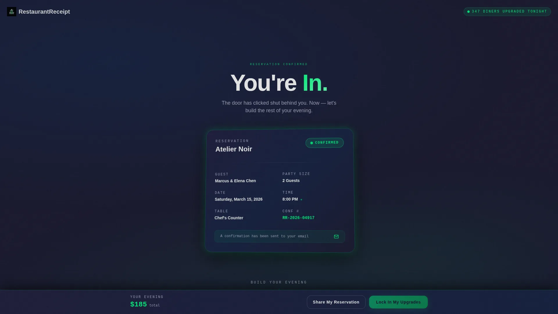
- A product-screenshot-style header card showing the reservation details with a pulsing green confirmed badge and a brief confetti animation
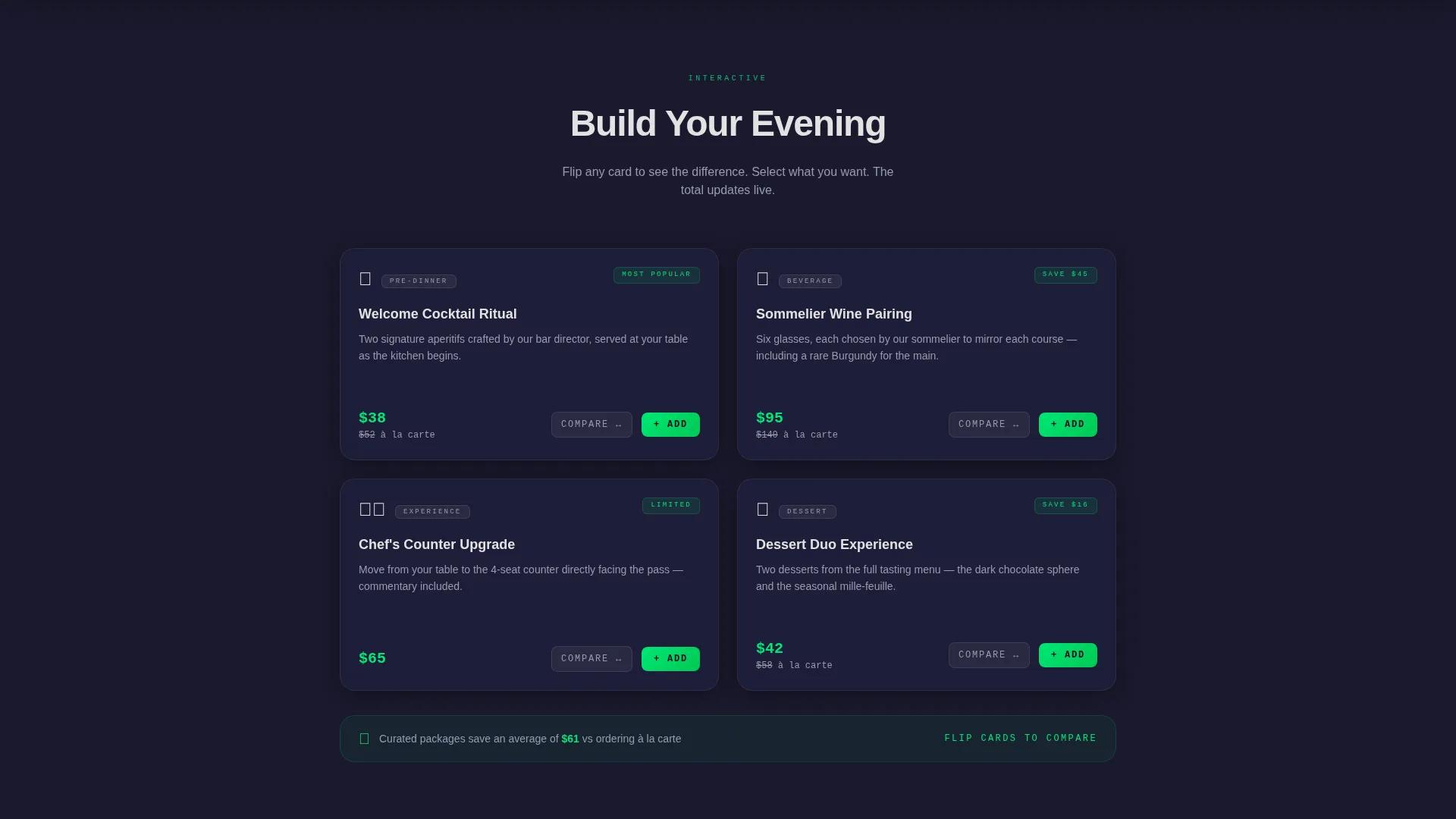
- A modular "Build Your Evening" card grid where diners toggle cocktail, wine, upgrade, and dessert add-ons with live cost comparisons
- A floating bottom bar pinned to the viewport that updates a running total and surfaces the primary "Lock In My Upgrades" call to action
Feature list
This template packages several distinct interactive components into one cohesive post-booking experience.
Glowing Confirmation Header Card
The header renders the reservation as a beautiful user interface card. It displays the restaurant name, date, party size, and a pulsing electric-green confirmed badge. A micro-animation plays on the timestamp, and a subtle confetti particle effect runs for two seconds before fading out cleanly.
Modular "Build Your Evening" Card Grid
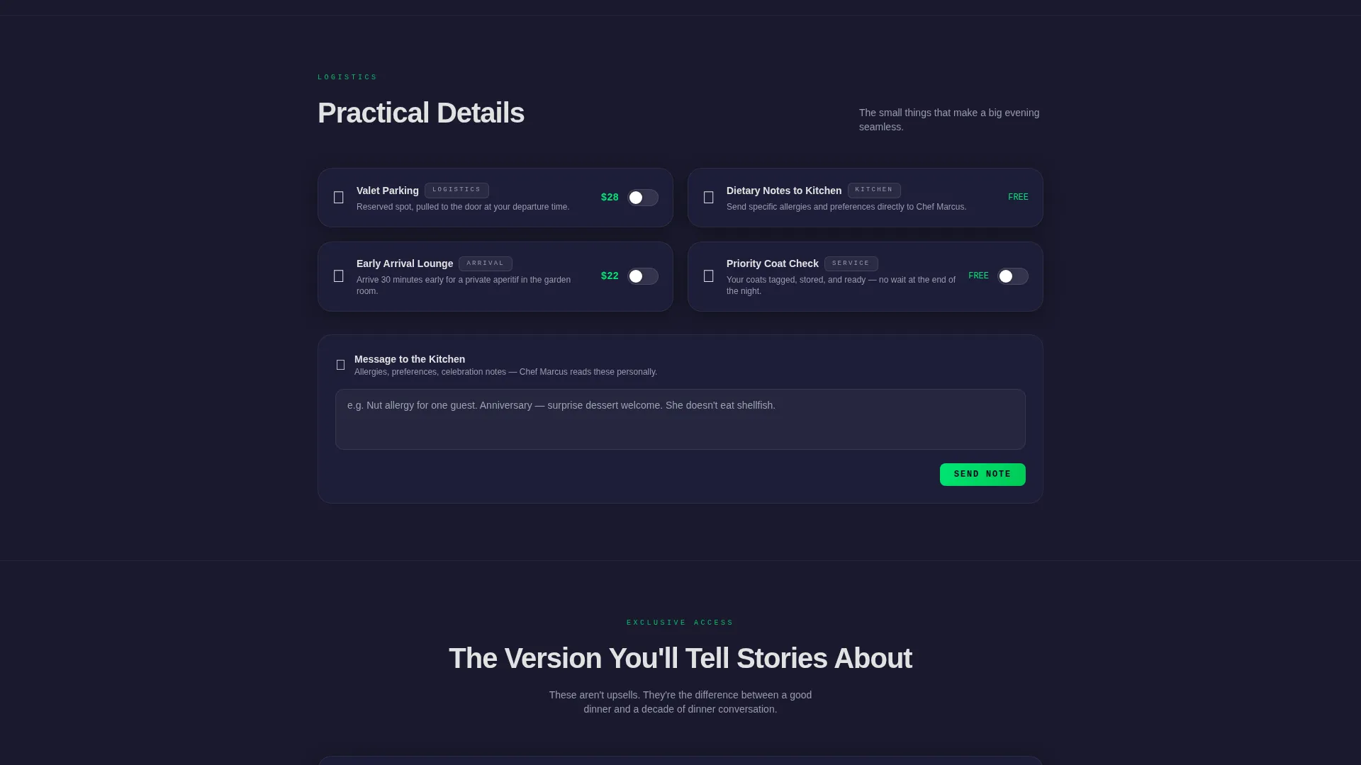
The core of the page is a card grid organized by escalating intent. Rows move from practical choices like parking and dietary notes up to aspirational upgrades such as a kitchen tour or a signed menu. Each card is a self-contained module that flips, stacks, and recalculates independently.
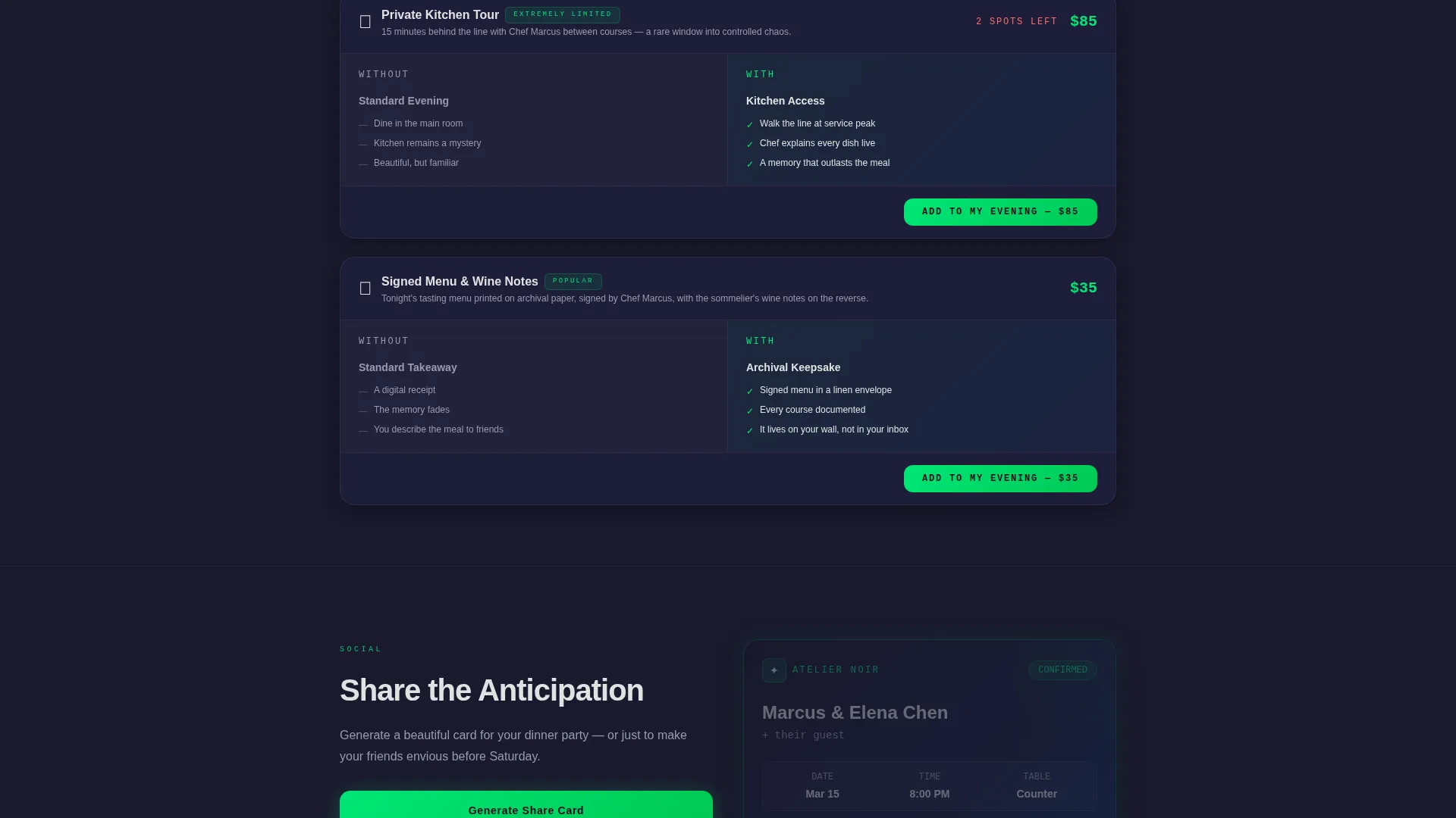
Live Cost Comparison Columns
Every upgrade card splits into two columns labeled "Without" and "With." Diners see the standard experience alongside the enhanced version, including the price difference between ordering à la carte and choosing the curated package. The comparison is visual and immediate.
Floating Upgrade Bar with Running Total
A bottom bar stays pinned as diners scroll. It updates in real time as cards are selected, showing the accumulating total and keeping the primary call to action visible at all times. This removes friction from the decision-to-action path.
Shareable Reservation Card
A secondary call-to-action path lets guests generate a shareable card formatted for texting. This turns the confirmation page into a social touchpoint for groups, couples, and event bookings where multiple people need the details.
Startup Velocity Visual Theme
The Carbon Fiber color system and Startup Velocity theme give the page a polished, high-contrast aesthetic. Cards float on subtle elevation shadows, and the electric confirmation green is reserved strictly for success states and interactive pulses, keeping the visual language consistent and purposeful.
Page sections overview
| Section | Purpose |
|---|---|
| Confirmation Header Card | Displays booking details with pulsing confirmed badge and confetti animation |
| Build Your Evening Grid | Modular card grid for toggling dining upgrades and add-ons |
| Practical Upgrades Row | Cards for parking, dietary notes, and arrival logistics |
| Aspirational Upgrades Row | Cards for kitchen tour, signed menu, and premium experiences |
| Comparison Card Columns | Side-by-side "Without" and "With" view for each enhancement |
| Floating Upgrade Bar | Pinned total tracker and primary call-to-action button |
| Share Reservation Path | Generates a shareable card for texting to the dinner party |
Design & branding system
The visual identity runs on the Carbon Fiber color system, styled through the Startup Velocity theme. The palette reads like the dashboard of a high-performance electric vehicle at night: dark, precise, and quietly energetic.
- Core colors: deep carbon black (#1A1A2E), machined graphite (#16213E), titanium highlight (#0F3460), cool silver-white text (#E2E2E2), and electric confirmation green (#00E676) used only for success states and interactive pulses
- Cards use subtle elevation shadows to create a sense of depth, making each module feel like a detachable component with physical weight
- Backgrounds stay in the carbon-to-graphite range throughout, maintaining contrast and visual focus on interactive elements
Mobile & speed optimization
The modular card grid is structured to reflow naturally across screen sizes. Each card is a self-contained unit, which means the layout adapts without breaking the interactive logic.
- Cards stack vertically on smaller screens while retaining their flip and recalculate behavior
- The floating bottom bar remains pinned and functional on mobile viewports, keeping the call to action reachable at all times
- The confetti animation is lightweight and self-terminating after two seconds, keeping the visual load brief and intentional
How this template helps you convert
This template is engineered around the post-booking mindset. Diners have already said yes. The page meets them in that committed state and makes the next step feel like a natural continuation rather than a sales push.
- The confirmation header validates the booking immediately, reducing anxiety and building trust before any upsell is introduced
- The "Build Your Evening" card grid frames upgrades as personalization choices rather than add-on fees, lowering psychological resistance and encouraging exploration
- The live running total in the floating bar makes the upgrade decision transparent and concrete, so diners feel in control rather than pressured into a choice
Other information about this template
This template is part of a restaurant website templates collection focused on the post-booking experience. It is designed as a standalone landing page that can be paired with a reservation system's confirmation redirect.
- Template style: Card Grid (Modular), which supports flexible content arrangement across dining upgrade categories
- The "Share My Reservation" feature supports group dining scenarios where the organizer needs to distribute details quickly
- The Comparison/Versus layout architecture is built into the card structure, so every upgrade naturally presents the value case without extra copywriting
- This template fits the restaurant thank you page niche specifically, addressing the gap between a confirmed booking and a guest's arrival
Theme
Startup Velocity
Creative direction
Calculator/Tool First
Color system
Carbon Fiber
Style
Card Grid (Modular)
Direction
Comparison/Versus
Page Sections
Glowing Confirmation Header Card
Modular Build Your Evening Grid
Live Cost Comparison Columns
Floating Upgrade Bar with Running Total
Shareable Reservation Card Generator
Related questions
Can I customize the upgrade options in the card grid?
Does the floating bottom bar work on mobile devices?
What is the confetti animation and can it be removed?
Who is the shareable reservation card designed for?
Is this template suitable for a tasting menu or chef's counter concept?



