Hoarder Cleanup Landing Page Template
Reclaim is a single-column hoarder cleanup landing page template built around a guaranteed price promise. It leads with an address input, a bold no-surprise-fees pledge, and a structured sales flow that eliminates every unknown for emotionally drained clients. The warm stone and engineering blueprint visual system makes the offer feel grounded, trustworthy, and ready to act on.
by Rocket studio
Quick summary
Reclaim is a guarantee-led landing page template for hoarder cleanup services. It opens with a location input, delivers a localized cost estimate, and walks the visitor through a transparent process from first call to final broom sweep. Every section is built to reduce fear, build trust, and move an overwhelmed visitor toward booking.
Who this template is for
This template is designed for hoarder cleanup crews who need a professional, emotionally intelligent web presence. It speaks directly to clients who are already under stress and need clear answers fast.
- Adult children managing a parent's estate or inherited home full of accumulated belongings
- Spouses or family members who have watched usable rooms disappear over years
- Property managers handling unit turnovers that standard cleaning services will not take on
What problem this template solves
Most cleanup service pages bury the price, skip the process, and feel cold. Visitors carrying guilt, grief, or urgency leave without booking because nothing on the page earns their trust.
- Visitors arrive paralyzed by not knowing what cleanup will cost or how long it will take
- Emotional hesitation stops people from filling out a standard contact form with no guarantees
- No-judgment language and price transparency are rarely communicated clearly on competitor pages
What you get with this template
You get a complete, single-column landing page flow built from a single core promise: the price quoted is the price paid. Every section supports that claim with visual evidence, process clarity, and social proof.
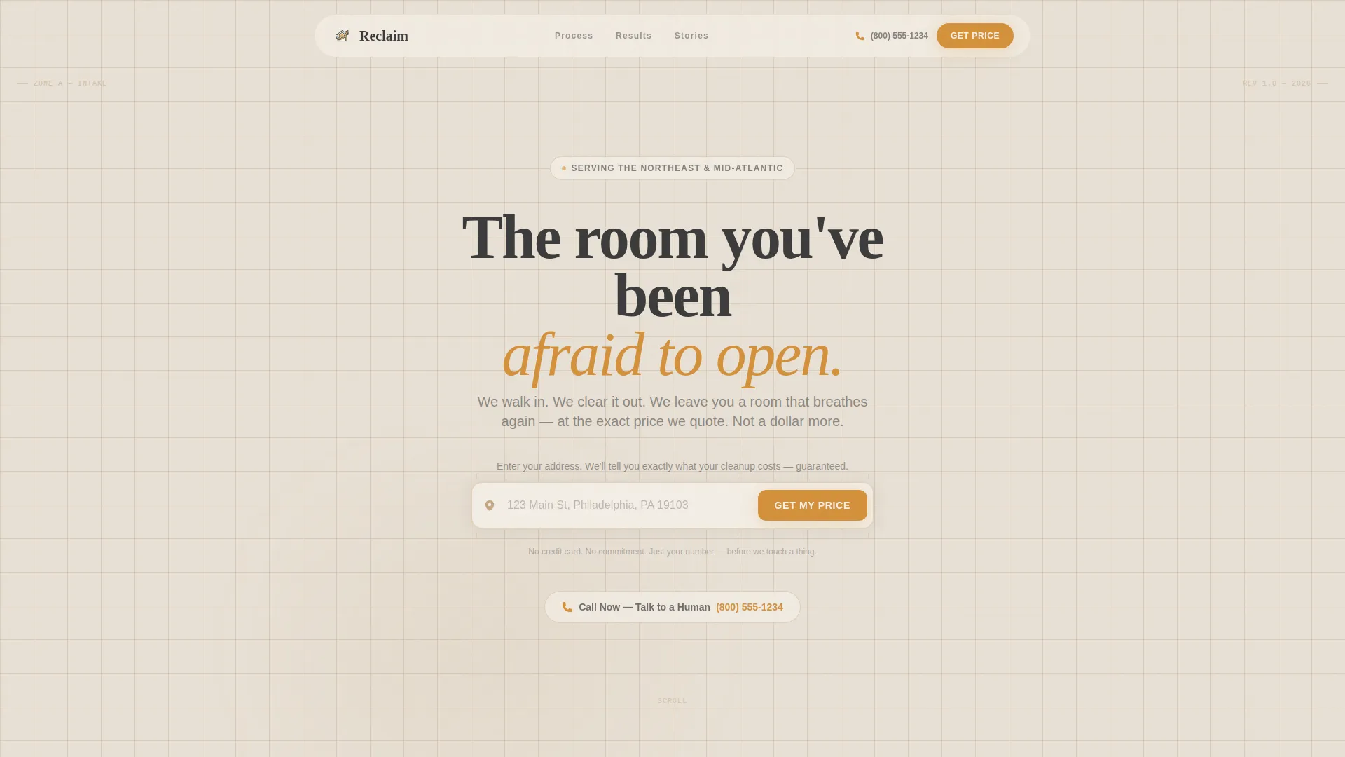
- An address input header that responds with a localized service confirmation and estimated crew arrival window
- A bold guarantee badge, a visual cost breakdown, a step-by-step process diagram, before-and-after photography sections, and a direct booking form
- A dual call-to-action path: an online quote form and a live phone number for visitors who need voice reassurance first
Feature list
This template ships with a focused set of purposeful sections and components. Each one is built to remove a specific barrier between a hesitant visitor and a confirmed booking.
Address-Responsive Header Input
A centered address field on a clean limestone background invites the visitor to type their zip code. The page responds with a localized service confirmation and an estimated crew arrival window, making the problem feel immediately solvable.
Ironclad Guarantee Badge
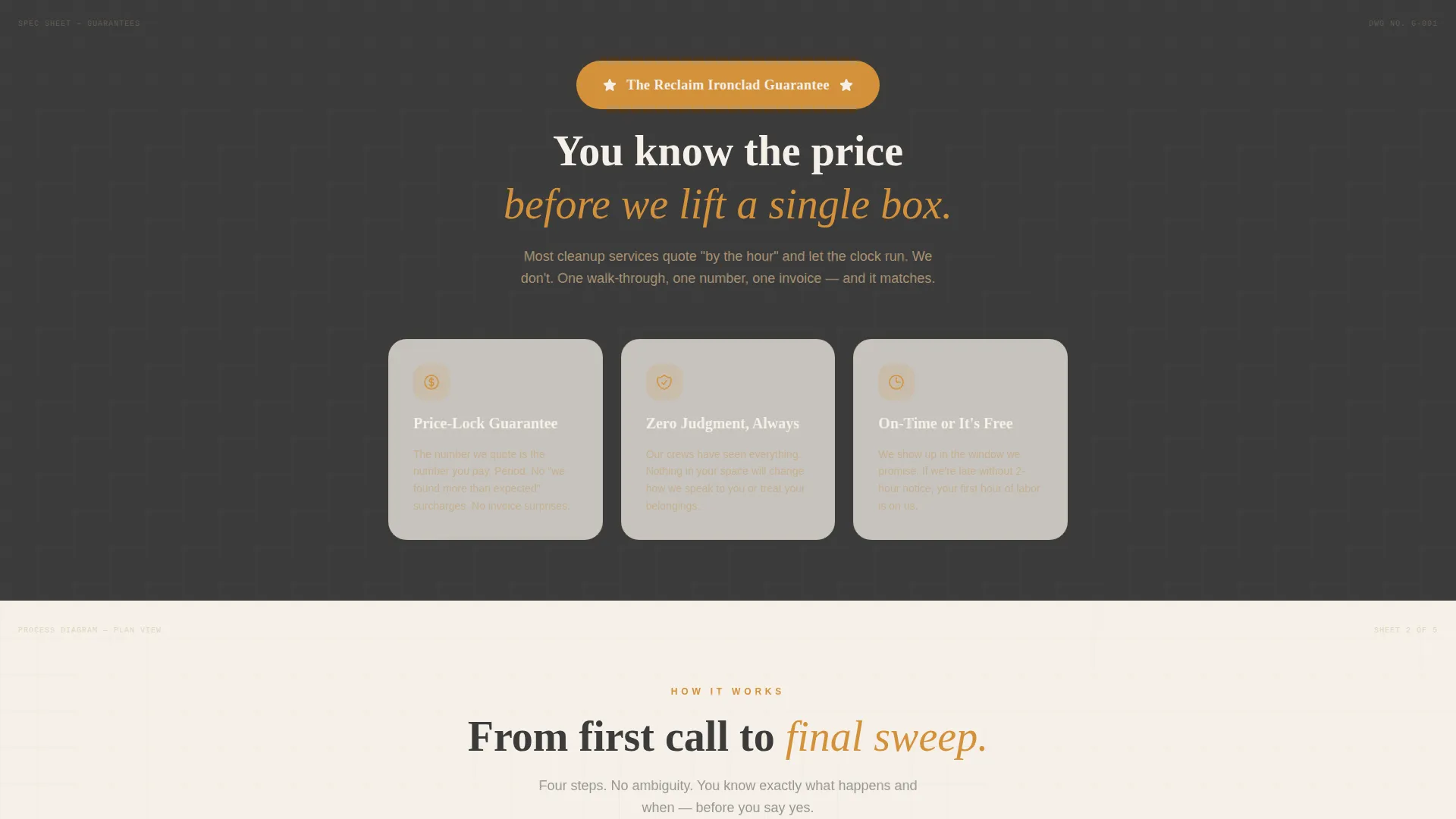
A bold guarantee badge appears directly below the header before any service detail is explained. It communicates the core promise in plain language: the price quoted is the price paid, with no surprise fees and no judgment.
Blueprint-Style Cost Breakdown
A visual cost breakdown reads like a structural spec sheet. It shows visitors exactly how their quote is calculated, using measurement-style annotations that mirror the engineering blueprint theme to make pricing feel concrete and trustworthy.
Step-by-Step Process Diagram
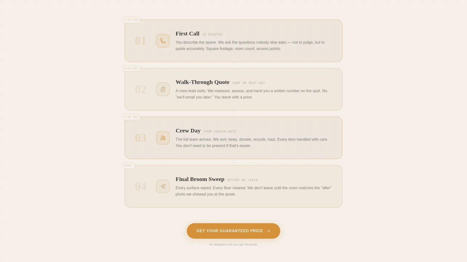
A clear process diagram walks from first call to final broom sweep. Each stage is labeled so the visitor understands exactly what happens, when it happens, and who is responsible at every point.
Clutter Severity Slider with Photo References
The booking form includes a simple slider for clutter severity. Visual reference photos at each level let the visitor self-identify without shame, reducing drop-off from clients who feel embarrassed about the state of the space.
Dual Call-to-Action Path
The primary call to action, "Get Your Guaranteed Price," repeats after the guarantee reveal and again after social proof. A secondary path, "Call Now, Talk to a Human," provides a live phone number for visitors who need a conversation before committing.
Page sections overview
| Section | Purpose |
|---|---|
| Address Input Header | Opens the page with a localized cost-estimate prompt |
| Guarantee Badge Block | Delivers the no-surprise-fees promise before any service detail |
| Visual Cost Breakdown | Shows how pricing is calculated in a blueprint spec format |
| Process Diagram | Maps every step from first call to final cleanup |
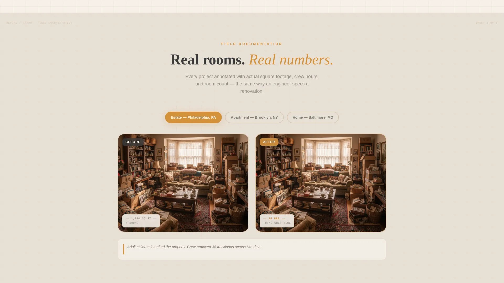
| Before and After Gallery | Uses annotated photography to prove real-world results |
| Testimonials Block | Shares family member accounts focused on relief and outcome |
| Booking Quote Form | Collects address, room count, severity, and preferred start date |
| Secondary call to action Strip | Provides a live phone number for visitors needing voice contact |
Design & branding system
The visual identity uses an engineering blueprint theme layered over a warm stone color palette. The result feels like a freshly plastered wall in a renovated brownstone: structural and warm at the same time, never clinical.
- Color palette: limestone cream (#E8E0D5) for backgrounds, sandstone tan (#C4A882) for accents, charcoal graphite (#3B3B3B) for primary text, and steady amber (#D4913B) reserved for call-to-action buttons and guarantee badges
- Blueprint-style grid lines and measurement annotations frame each section, giving the layout an architectural quality that reinforces precision and reliability
Mobile & speed optimization
The single-column flow is a natural fit for mobile visitors. Someone calling from a driveway or a parking lot outside an inherited home can scroll, self-identify, and reach the form without pinching or zooming.
- The stacked single-column structure keeps tap targets large and the reading order logical on smaller screens
- The address input, severity slider, and call-to-action buttons are each designed to be the first thing a mobile visitor sees in their viewport as they scroll
How this template helps you convert
The page earns the sale by removing every unknown before it asks for a commitment. Visitors arrive overwhelmed. The template guides them from paralysis to action through a deliberate, trust-first sequence.
- The guarantee badge appears before any service description, so the visitor's first impression is safety rather than a sales pitch, which lowers the emotional barrier to reading further.
- The severity slider with photo references lets the visitor self-qualify without shame, which dramatically reduces form abandonment from clients who fear being judged for the state of the property.
Other information about this template
This template is purpose-built for a niche that most general cleaning service page templates ignore entirely. It fills a real gap in the hoarder cleanup and estate cleanout market.
- The template is delivered as a single-column landing page with no multi-page navigation required
- The engineering blueprint theme and warm stone system are production-ready and can be adapted to match a specific brand palette
- The no-judgment language woven into every section is intentional and consistent, from the severity slider labels to the testimonial captions
- This layout is well suited for paid traffic campaigns targeting searches related to hoarder house cleanup, estate cleanout, and extreme clutter removal services
Theme
Engineering Blueprint
Creative direction
Guarantee-Led
Color system
Warm Stone
Style
Single Column Flow
Direction
Direct Sales
Page Sections
Address-responsive Header Input
Ironclad Guarantee Badge
Blueprint-style Cost Breakdown
Step-by-step Process Diagram
Clutter Severity Slider
Dual Call-to-action Path
Related questions
What type of business is this template designed for?
Can I customize the colors and guarantee copy?
Does the template include a live quote calculator?
Is this template suitable for property managers, not just families?
How many calls to action does the template include?



