Training Services Landing page Template
A modular card grid landing page built for unconscious bias training companies targeting people ops leaders, DEI committees, and learning and development directors. It guides visitors through a Problem-to-Solution arc, from recognizing bias in their own hiring decisions to booking a structured training program, using an interactive search hero, animated cost cards, and a three-step lead generation form.
by Rocket studio
Quick summary
This landing page template is designed for unconscious bias training companies selling to HR and people operations teams. It opens with an interactive search box that implicates visitors in their own hiring patterns, then scrolls through bias scenarios, measurable business costs, structured solutions, and training format options. The primary call to action drives visitors toward a custom training plan inquiry.
Who this template is for
This template is built for training companies in the DEI and inclusion space. It speaks directly to decision-makers who are responsible for how their organizations hire, develop, and retain people.
- People ops leaders at Series B startups scaling from around forty to four hundred employees
- DEI committee leads at tech companies preparing for or responding to an inclusion audit
- Learning and development directors who need a more effective alternative to generic bias webinars
What problem this template solves
Most bias training landing pages look like course catalogues. They list topics and formats without ever making the visitor feel the problem personally. This template flips that. It makes the visitor recognize their own decision patterns before they reach the first scroll.
- Visitors leave generic training pages unconvinced because they don't see their own behavior reflected
- DEI buyers face internal skepticism and need concrete business-impact data to justify investment
- Long, friction-heavy inquiry forms lose qualified leads before they submit
What you get with this template
This is a fully structured, single-page lead generation layout with high interactivity and a dark electric visual identity. Every section is built as a modular card grid so individual rows can be reordered or adjusted without disrupting the overall flow.
- An interactive hero with a search box and simulated autocomplete that surfaces bias patterns as the visitor types
- Five content row sections moving from problem to solution, plus a sticky call-to-action bar and a full-width base card
- A three-step progressive disclosure lead form and a secondary email gate for a free Bias Audit Scorecard download
Feature list
This template is built around interactive moments, not static copy. Each feature below is grounded in the page structure and functionality described in the brief.
Interactive Bias Search Hero
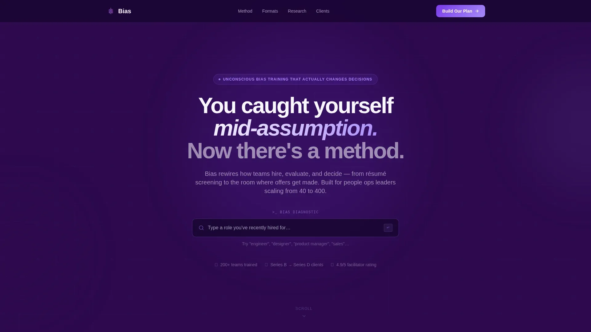
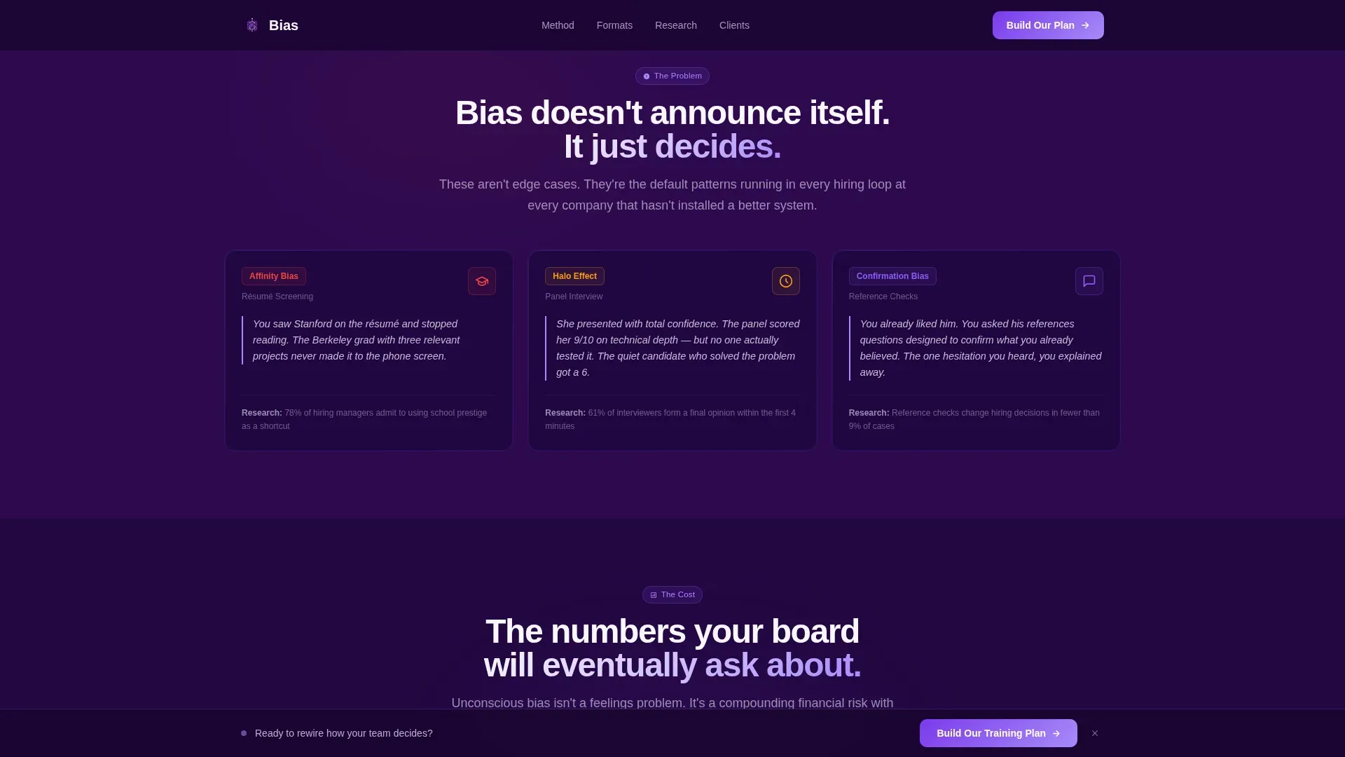
The header section centers a search box against a deep indigo background. Placeholder text reads "Type a role you've recently hired for..." and as a visitor types, autocomplete suggestions surface bias pattern labels in real time, such as affinity bias in resume screening or halo effect in panel interviews. It creates immediate self-recognition before a single scroll.
Problem-to-Solution Card Arc
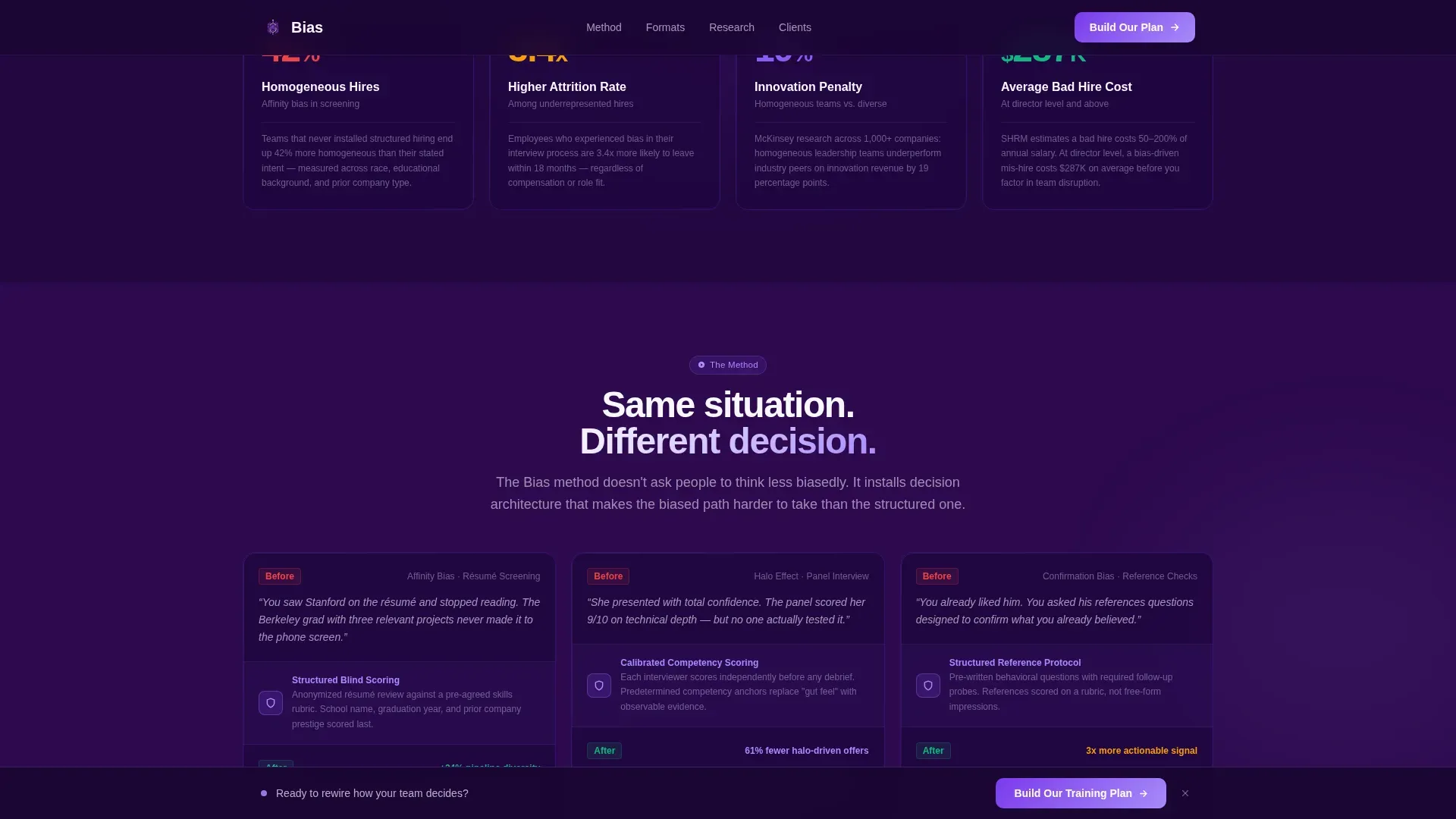
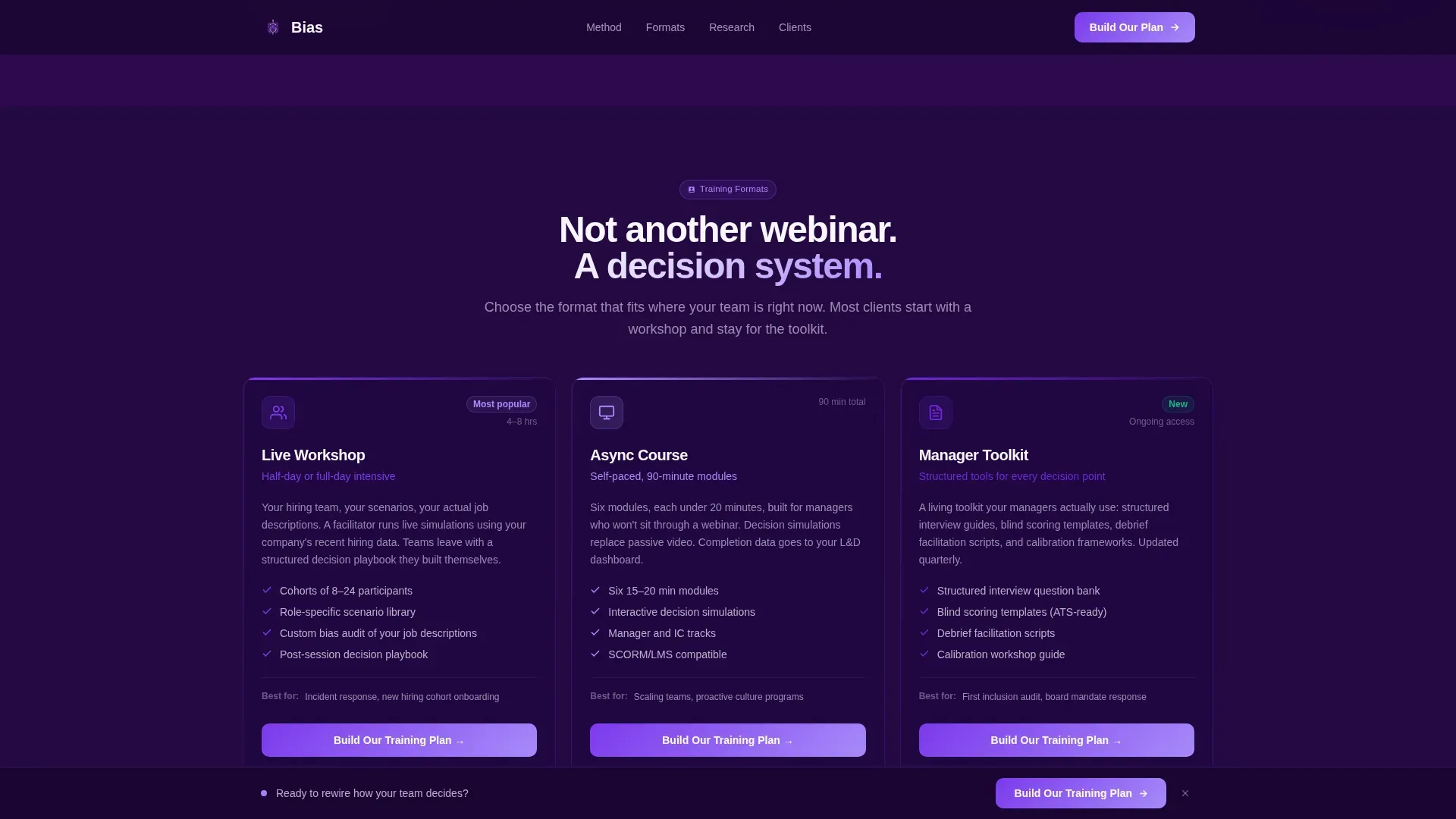
Four sequential card rows guide the visitor from discomfort to clarity. The first row shows bias type scenarios as micro-stories. The second shows animated counters with hiring homogeneity stats, attrition data, and innovation cost figures. The third replays the same scenarios with structured decision frameworks applied. The fourth presents training format options as product-style tiles.
Animated Scroll-Linked Counters
The cost row uses scroll-triggered animated counters to reveal measurable business impact figures. Numbers increment as cards enter the viewport, making the data feel live and authoritative rather than static.
Three-Step Progressive Disclosure Form
The primary lead generation form is split into three low-friction steps. Step one collects company size and industry. Step two asks what triggered the search using checkboxes. Step three captures name, work email, and preferred start quarter. Each step feels like a conversation, not a form.
Dual Conversion Paths
A sticky bottom bar keeps the primary call to action, "Build Our Training Plan," visible throughout the scroll. At the page base, a full-width card repeats it. A secondary path offers a free Bias Audit Scorecard PDF gated behind just an email address, capturing visitors who are not yet ready to book.
Staggered Card Reveal Animations
Cards across all grid rows animate in with staggered entrance transitions as the visitor scrolls. Hover states on interactive cards shift from deep indigo to charged violet with brightening borders, keeping the dark aesthetic energized without overwhelming the content.
Page sections overview
| Section | Purpose |
|---|---|
| Interactive Search Hero | Implicate visitors in their own hiring bias before they scroll |
| Bias Type Cards | Show three real-world bias scenarios as short micro-stories |
| Business Cost Row | Display animated counters for homogeneity, attrition, and innovation impact |
| Solution Replay Row | Replay the same scenarios with structured frameworks and changed outcomes |
| Training Format Tiles | Present live workshop, async course, and manager toolkit as product options |
| Sticky Call to Action | Keep the primary inquiry prompt visible throughout the page scroll |
| Lead Generation Form | Collect qualified leads through a three-step progressive disclosure flow |
| Scorecard Email Gate | Capture earlier-stage visitors with a free Bias Audit Scorecard download |
| Page Base Card | Repeat the primary call to action in a full-width closing section |
| Footer | Single linear row with essential links and brand information |
Design & branding system
The visual identity follows a Startup Velocity theme. The palette is built around a late-night screen aesthetic: dark, focused, and electric. Cards float on subtle elevation and violet borders brighten on hover, directing attention without disrupting the deep background.
- Color system: deep space indigo (#2D0A4E) as the primary background, charged violet (#7C3AED) on interactive cards and hover states, signal white (#F8F7FF) for text and spacing, and neon lilac (#A78BFA) on call-to-action elements
- Typography: DM Sans in bold weights for headings, Manrope for body copy and interface labels
- Interaction style: hover state transitions on cards, neon accent pulses on call-to-action buttons, and staggered card entrance animations on scroll
Mobile & speed optimization
This template is designed desktop-first, reflecting how people ops and DEI decision-makers typically evaluate vendor solutions at their desk. The layout scales down to solid mobile support so the page remains functional for visitors on any device.
- Card grid rows reflow to single-column stacks on smaller screens, preserving the Problem-to-Solution reading order
- CSS animations handle the scroll-linked counters and card reveals, using IntersectionObserver to trigger effects only when elements enter view
How this template helps you convert
Every design and structural decision in this template is built to reduce the distance between a visitor recognizing their problem and submitting a lead form.
- The interactive search hero creates immediate personal recognition, meaning visitors arrive at the problem row already engaged rather than skeptical
- The animated cost cards give DEI buyers the business-impact language they need to justify internal budget conversations, lowering the barrier to inquiry
- The dual conversion path, a primary training plan form and a secondary scorecard download, captures leads at two different stages of buyer readiness in a single scroll
Other information about this template
This template is a strong fit for the HR and hiring space, particularly for companies operating in the DEI and inclusion segment where buyer trust is hard to earn through generic marketing. A few additional details worth knowing before you use it:
- The footer uses a Pattern 1 linear single-row layout, keeping the page base clean and uncluttered
- Device priority is desktop-first, with English (US) localization, USD pricing context, and US date formatting built into the copy structure
- The template is built for B2B sales cycles where multiple stakeholders, people ops, DEI leads, and L&D directors, may review the page at different times
- The progressive disclosure form is designed to reduce perceived friction by breaking a longer inquiry into three conversational steps rather than one long form
Theme
Startup Velocity
Creative direction
Problem→Solution Arc
Color system
Electric Indigo
Style
Card Grid (Modular)
Direction
Lead Generation
Page Sections
Interactive Bias Search Hero
Problem-to-solution Card Arc
Scroll-linked Animated Counters
Three-step Progressive Disclosure Form
Dual Conversion Path Design
Staggered Card Reveal Animations
Related questions
Who is this landing page template designed for?
What makes the hero section different from a standard header?
Can this template capture leads at different stages of buyer readiness?
What training formats does the page present?
Is this a single page or a multi-page template?


