Specialist Eating Disorder Care Appointment Booking Website Template
A sidebar companion landing page built for eating disorder clinical trial recruitment. The multi-step qualification form matches patients by diagnosis, treatment history, and location to actively enrolling Phase II and III studies. Visitors see real matched trials before sharing any contact details, then schedule a 15-minute screening call directly from an inline calendar.
by Rocket studio
Quick summary
This landing page template is a guided qualification tool for eating disorder clinical trial recruitment. A five-step sidebar form matches patients to open Phase II and III study slots by diagnosis, treatment background, and geography. The visitor sees real trial matches first, then books a screening call inline. The entire process is designed to replace a three-phone-call referral chain.
Who this template is for
This template is built for healthcare organizations, academic medical centers, and clinical research teams that need to recruit patients into eating disorder studies. It also serves patient advocacy groups and therapist networks looking for structured referral pathways.
- Research coordinators recruiting for Phase II and III eating disorder trials
- Clinical practices and therapists whose patients have plateaued on standard protocols
- Parents and patients searching late at night for options beyond outpatient or residential programs
What problem this template solves
Finding an enrolling clinical trial for anorexia nervosa (AN), bulimia nervosa (BN), binge eating disorder (BED), or avoidant/restrictive food intake disorder (ARFID) typically requires multiple phone calls, referral chains, and manual eligibility checks. Patients who have already cycled through cognitive behavioral therapy for eating disorders (CBT-E) and residential programs are exhausted before the process even begins. This template compresses that friction into a single, guided experience.
- Patients leave before finding a match because traditional trial finders feel clinical and impersonal
- Therapists lack a direct referral link they can hand to a plateaued client with confidence
- Trial coordinators lose qualified candidates who drop off during long intake processes
What you get with this template
You get a complete single-page qualification flow with a persistent sidebar step tracker and inline calendar booking. Every section is purpose-built to reduce drop-off and earn trust before asking for contact information.
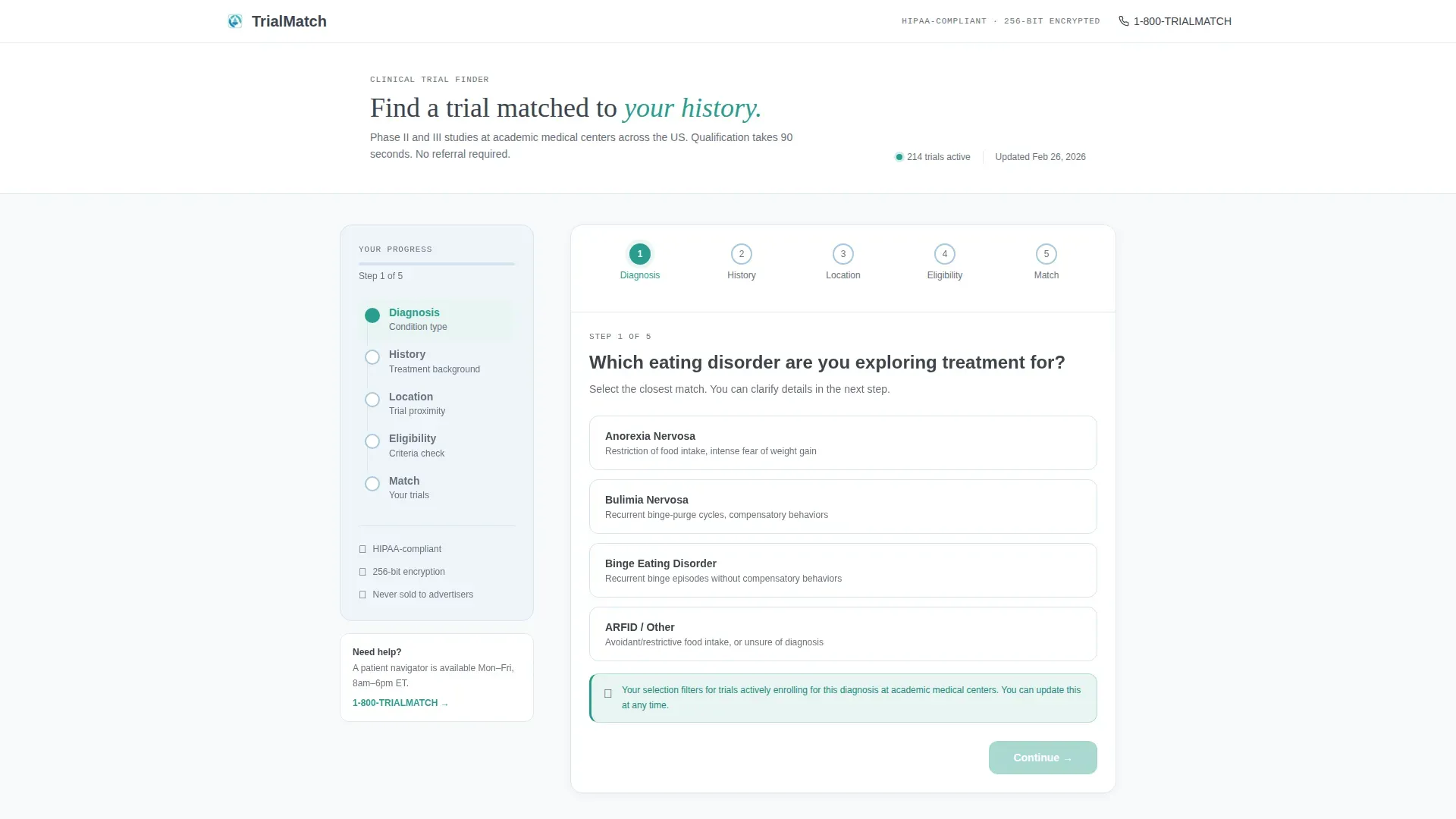
- A five-step multi-step form with slide transitions, a teal progress bar, and contextual reassurance copy beside each question
- A post-form trial results section showing matched study name, site city, and compensation range with a direct scheduling call to action
- A secondary save-matches path using an email-only field that generates a PDF summary for visitors not ready to call
Feature list
A brief overview of each core capability built into this template.
Five-Step Qualification Form
The form opens with a single centered question on a clean white card. Visitors select their eating disorder diagnosis, then move through treatment history, location, eligibility criteria, and contact details. Each step slides in from the right while the sidebar tracks progress and checks off completed steps with a small teal checkmark.
Sidebar Step Tracker
A vertical step map sits persistently to the left of the form. It shows five labeled stages: Diagnosis, History, Location, Eligibility, and Match. As each step is completed, a teal checkmark appears beside it. Contextual reassurance copy surfaces beside relevant fields to answer the question before the visitor thinks to ask it.
Inline Calendar Booking
The final step displays one to three matched trials. Each result shows the study name, site city, and compensation range. A teal "Schedule Screening Call" button opens an inline calendar widget with available 15-minute phone slots within the next five business days.
Match-First Contact Flow
The template deliberately withholds the contact form until after the visitor has seen real trial matches. This sequencing earns trust and reduces abandonment. The visitor provides a name, phone number, and preferred call window only after seeing results that are relevant to them.
Save Matches Email Capture
A secondary path below the trial results reads "Not ready to call? Save your matches." An email-only field triggers a PDF summary of the matched trials. This captures visitors who need more time without losing them entirely.
Contextual Reassurance Cards
Each form step surfaces a short reassurance line beside the active question. Examples include a note about encryption next to the contact step and a filter explanation next to the medication history field. These micro-copy moments reduce anxiety at the exact point where visitors are most likely to pause.
Page sections overview
| Section | Purpose |
|---|---|
| Multi-Step Form | Qualifies visitors across five diagnosis, history, location, eligibility, and contact steps |
| Sidebar Step Tracker | Shows vertical progress map with teal checkmarks and reassurance copy |
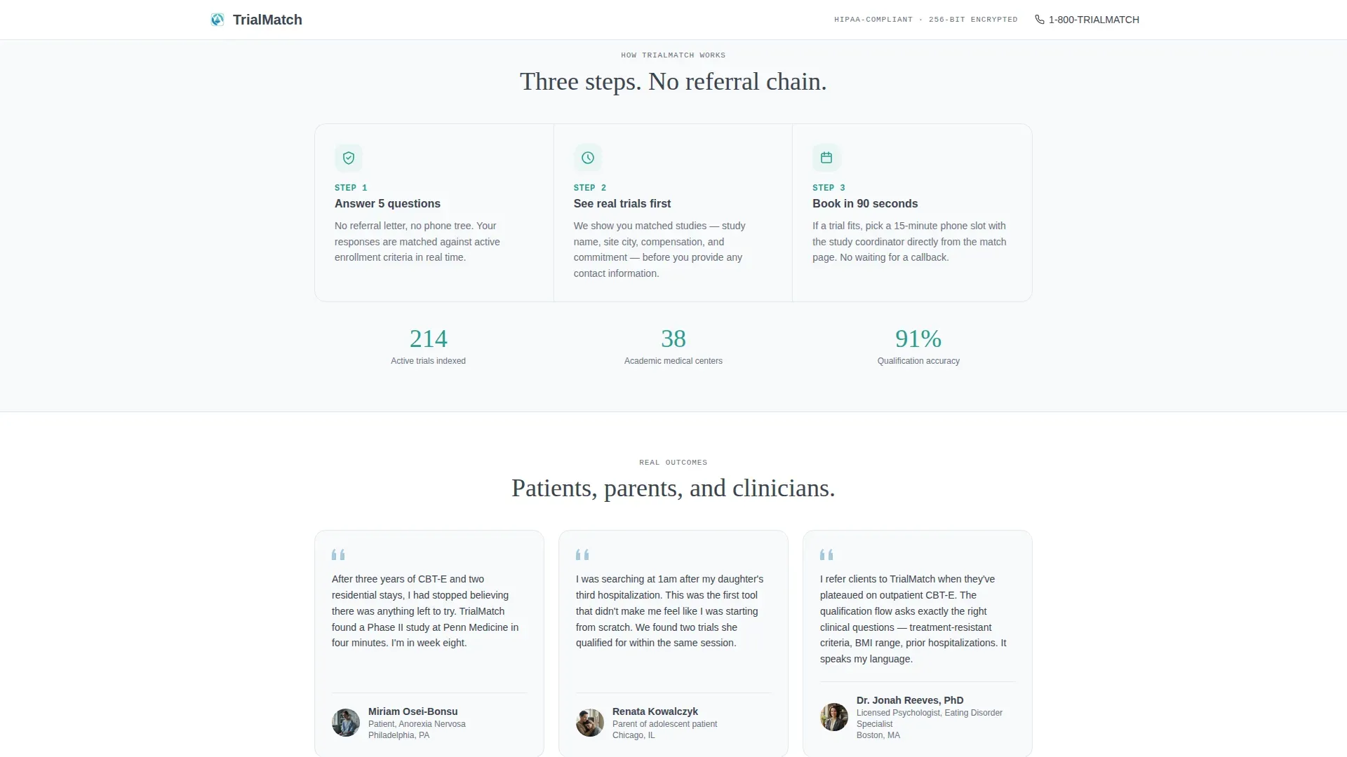
| Trust Strip | Explains how the matching process works using three horizontal pill cards |
| Trial Results Display | Shows one to three matched trials with study name, city, compensation, and scheduling call to action |
| Inline Calendar Widget | Lets visitors book a 15-minute screening call without leaving the page |
| Save Matches Capture | Secondary email field for visitors who want results saved as a PDF |
| Testimonials Section | Patient, parent, and therapist quotes with specific outcomes |
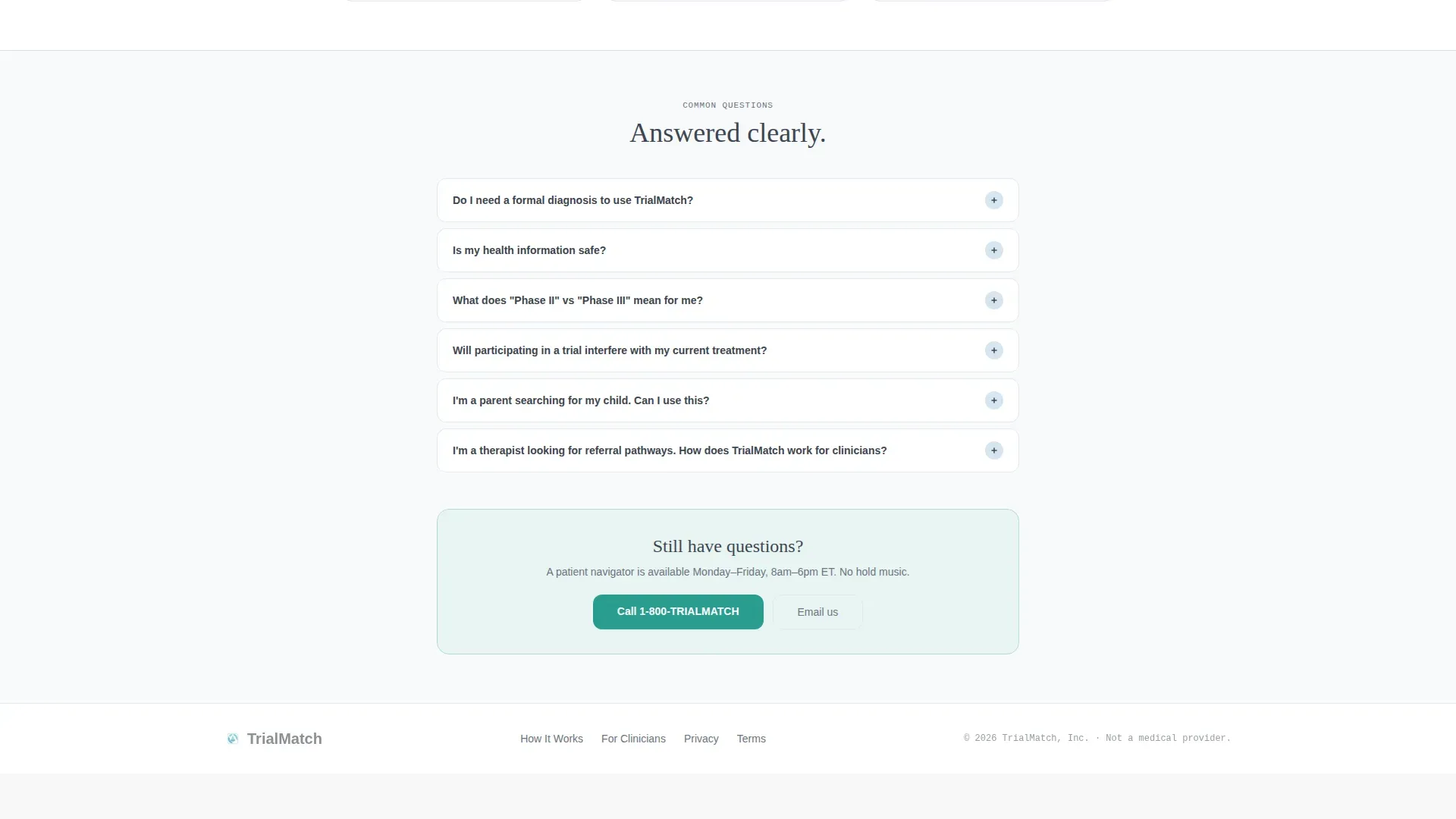
| FAQ Accordion | Answers clinical eligibility and process questions with expandable panels |
| Footer Strip | Single-row linear footer with essential links |
Design & branding system
The visual identity follows a Medical Clarity theme. The palette is deliberately narrow: one dominant background tone, one text color, one divider and rail color, and a single action color used only where interaction happens. The result feels like a freshly prepared intake room, structured and calm without being cold.
- Arctic White (#F8F9FB) covers all backgrounds; soft graphite (#3D4550) handles all body text; pale glacier blue (#D6E4F0) marks section dividers and the sidebar rail
- Teal (#2A9D8F) appears exclusively on buttons, the progress bar fill, active form states, and checkmark reveals
- Typography pairs DM Sans for body copy with Fraunces for headings, creating a tone that reads as clinical yet approachable
Mobile & speed optimization
The desktop layout is designed first around the sidebar-plus-form split. On smaller screens, the sidebar collapses and a horizontal progress bar with five small circles replaces the vertical step map. Form steps stack in full width, and the inline calendar remains accessible without horizontal scrolling.
- Static sections like the trust strip, testimonials, and footer use server-side rendering for fast initial loads
- The form state machine runs as a client-side component, keeping interactive transitions smooth without blocking the rest of the page
- Step slide animations and progress bar fills are set to a medium intensity, keeping motion purposeful without causing distraction on mobile
How this template helps you convert
The template is structured so that every moment of value delivery happens before a commitment is requested. This ordering reverses the typical trial recruitment pattern and removes the most common reasons visitors abandon.
- Visitors see their diagnosis options immediately upon arrival, with no hero image or marketing copy to scroll past, making the first click feel purposeful rather than promotional.
- Real trial matches, including study name, location, and compensation range, appear before any contact information is collected, so the visitor has a concrete reason to complete the form.
- The inline calendar closes the loop in one session: a matched visitor can book a 15-minute screening call within the same page visit, eliminating the follow-up call that often loses candidates.
Other information about this template
This template is categorized under Health & Medical with a subcategory focus on eating disorder care and clinical trial recruitment. It is built for a United States audience, using USD compensation ranges and US-based geography for trial matching. The template style is Sidebar Companion, and the creative direction is a Step-by-Step Guide format.
- The header concept is a Multi-Step Form, meaning the first visible element is a functional qualification card, not a banner or hero section
- The landing page direction is Booking and Scheduling, with the primary conversion goal being a completed screening call appointment
- The template is designed for desktop-first use with a responsive mobile fallback, and the color system is Arctic White throughout

Theme
Medical Clarity
Creative direction
Step-by-Step Guide
Color system
Arctic White
Style
Sidebar Companion
Direction
Booking/Scheduling
Page Sections
Five-step Multi-step Qualification Form
Persistent Sidebar Step Tracker
Match-first Contact Sequencing
Inline Calendar for Screening Calls
Save Matches Email Capture
Contextual Reassurance Micro-copy
Related questions
What eating disorders does this template's form cover?
Does a visitor have to share contact details before seeing trial matches?
Can someone save their trial matches without booking a call?
Who is this landing page template designed for?
How does the sidebar work during the qualification process?



