Stroke Recovery Care Professional Website Template
Recover is a stroke recovery support group landing page built on a clean split-screen layout. It pairs scroll-triggered animated statistics with an interactive self-assessment checklist, guiding caregivers and survivors toward a single clear action: sitting in on a peer support session. The design feels clinical enough to trust and warm enough to stay.
by Rocket studio
Quick summary
Recover is a single-page template built for a weekly peer support circle serving stroke survivors and their caregivers. The layout uses a 50/50 split screen, animated metrics, and an interactive checklist audit to turn quiet uncertainty into a clear next step. Every section earns the final call to action before visitors reach it.
Who this template is for
This template is built for people running or promoting stroke recovery support groups. It speaks directly to the people who show up in those groups and to the people who manage their care.
- Stroke recovery organizations, community health programs, and peer support coordinators launching or promoting a weekly group
- Caregivers and family members searching for structured support after a loved one's stroke
- Stroke survivors in the months following their event who are ready to seek peer connection and proof of progress
What problem this template solves
Families affected by stroke often search for help in fragmented, exhausting ways. A caregiver Googling at 2 a.m. needs a page that meets them with calm authority, not a cluttered form or a wall of medical jargon. This template solves the trust gap between a desperate search and a committed first step.
- Visitors arrive unsure whether peer support is right for them, and the checklist audit helps them recognize their own unmet needs without pressure
- Recovery groups often struggle to communicate concrete value; the animated statistics make the case immediately and visually
- Most support group pages ask for commitment too early; this template earns the click through honest self-assessment before the call to action appears
What you get with this template
This template delivers a fully structured, single-page layout with every section defined and ready to customize. The design system, interaction patterns, and content flow are all built in.
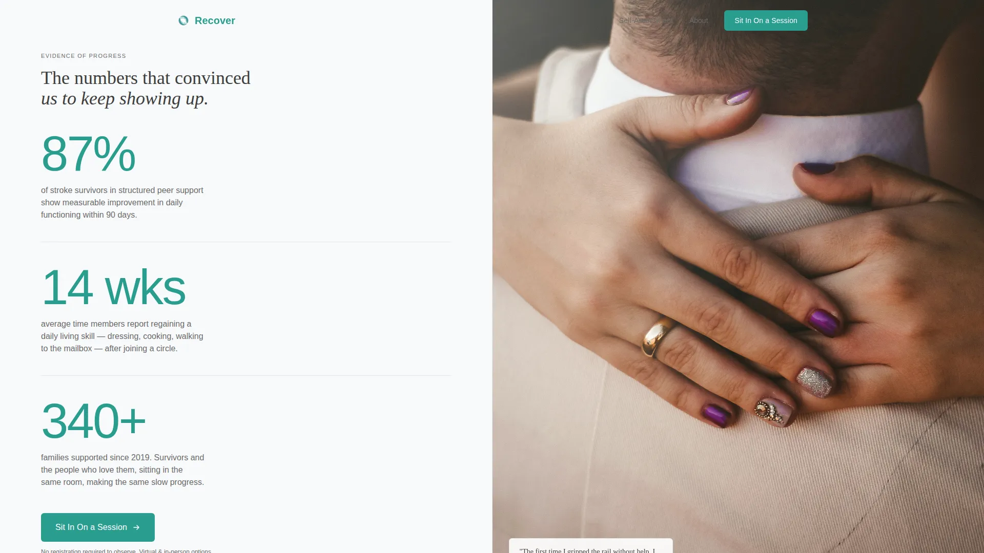
- A hero section with a split-screen stats wall, three animated counters, and a full-bleed photograph panel
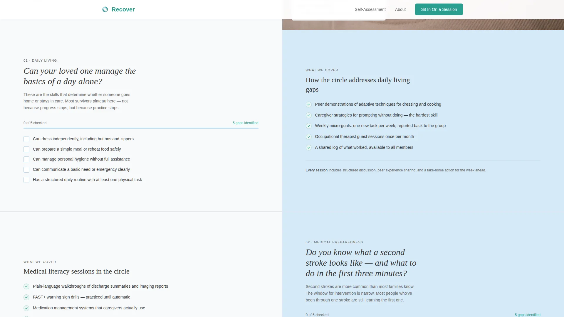
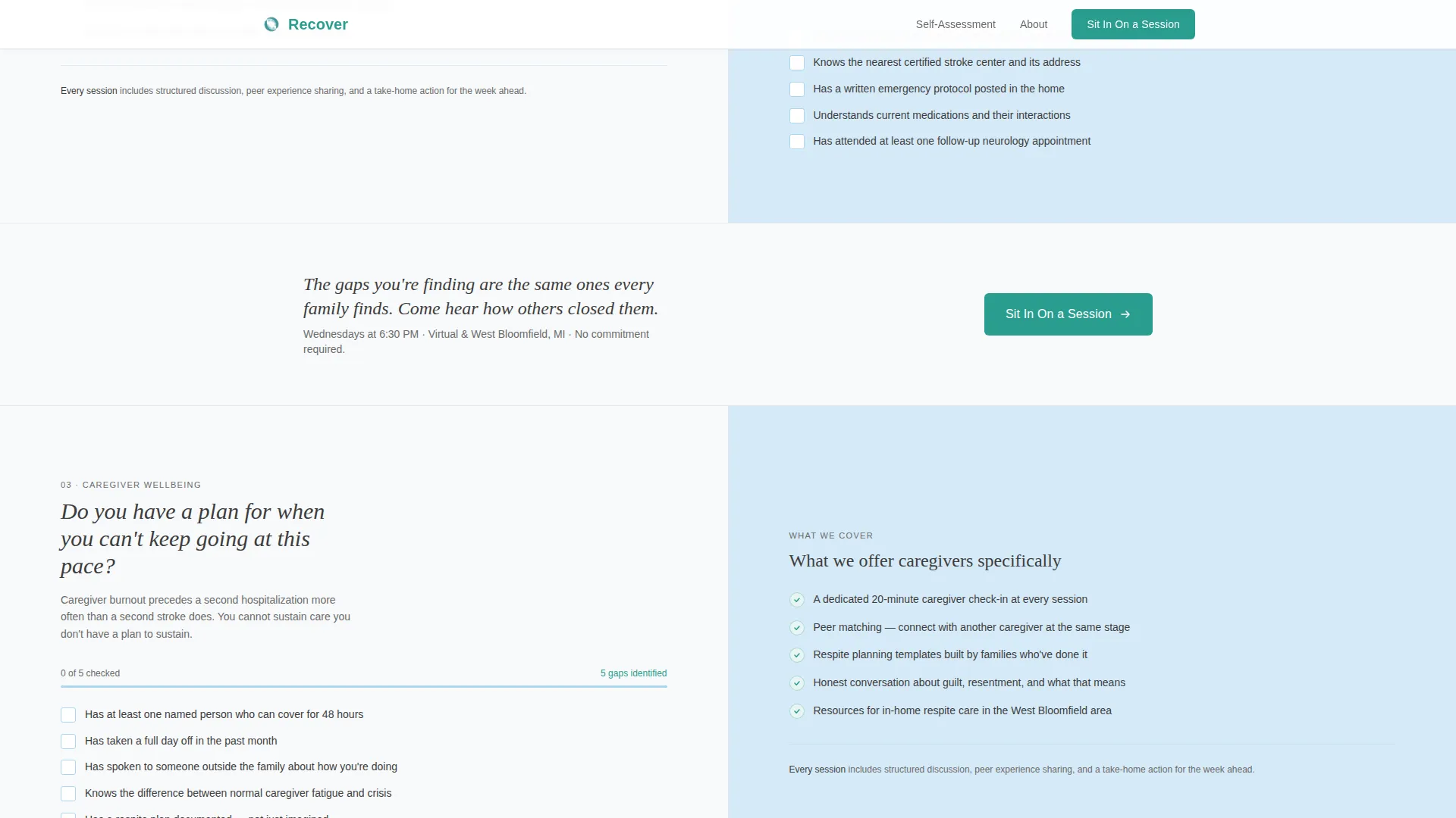
- Three checklist sections that let visitors self-assess their readiness and identify gaps in daily living skills, medical preparedness, and caregiver wellbeing
- Two repeated call-to-action placements in warm teal, a linear single-row footer, and a click-through flow to a separate registration page
Feature list
This template is built around a set of purposeful, prompt-defined features that work together to support the recovery community it serves.
Scroll-Triggered Animated Counters
Three large statistics tick upward as visitors scroll into the hero section. The figures cover peer support outcomes, average skill recovery timelines, and total families served since 2019. They are set in light teal against clinical white to feel both credible and impossible to overlook.
Interactive Self-Assessment Checklist
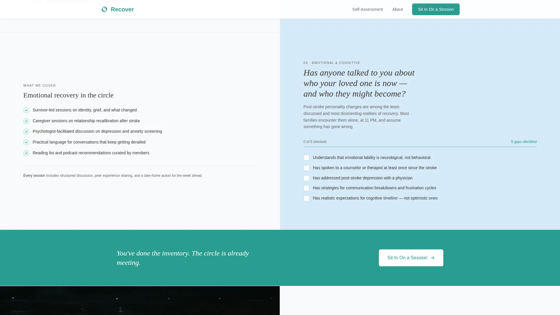
Three checklist sections ask plain-language questions about daily living skills, medical preparedness, and caregiver wellbeing. Visitors can tick actual checkboxes as they scroll. Unchecked boxes create quiet, honest urgency without any pressure copy.
50/50 Split Screen Layout
Every section divides the viewport evenly between a question or statement on the left and supporting content on the right. The layout is desktop-first and stacks cleanly for mobile, maintaining readability across devices.
Repeating Click-Through Call to Action
The primary call to action, labeled "Sit In On a Session," appears first beneath the hero and repeats after every third checklist section. It links to a separate registration page rather than triggering a form on this page, keeping the landing page focused and uncluttered.
Staggered Content Reveals
Checklist sections and supporting panels use staggered scroll-triggered reveals. The sequenced animation reinforces the sense of progressive discovery that matches the recovery theme of the page.
Educational Guide Visual Hierarchy
Display headings use a serif accent typeface to signal care and depth. Body text uses a clean sans-serif for clinical legibility. The combination creates a reading experience that feels both medically trustworthy and humanly warm.
Page sections overview
| Section | Purpose |
|---|---|
| Stats Hero Panel | Opens with animated social proof counters and a single evocative photograph |
| Daily Living Checklist | Lets visitors self-assess independence in everyday tasks |
| Call to Action 1 | First "Sit In On a Session" button placement after the first checklist |
| Medical Preparedness Checklist | Prompts reflection on second-stroke warning signs and readiness |
| Caregiver Wellbeing Checklist | Surfaces gaps in respite planning and caregiver self-care |
| Call to Action 2 | Second button placement after the third checklist section |
| Linear Footer Row | Closes the page with a minimal, single-row footer pattern |
Design & branding system
The visual identity follows an Educational Guide theme built around clinical warmth. Every color choice and type pairing reinforces a single feeling: sterile enough to trust, warm enough to stay.
- Color palette: clinical white (#F8F9FA) for backgrounds, soft graphite (#3D3D3D) for body text, pale glacier blue (#D6EAF8) for alternating section fills, and warm teal (#2A9D8F) for all interactive elements and progress indicators
- Typography: Fraunces as the display and serif accent typeface for headings; DM Sans as the body typeface for clean, accessible reading at all sizes
- Interactive elements including checkboxes and call-to-action buttons consistently use warm teal, creating a visual thread that connects self-assessment progress to the final conversion step
Mobile & speed optimization
The template is designed desktop-first around the 50/50 split-screen layout, with a defined mobile stacking behavior that preserves the checklist flow on smaller screens.
- The split panels restack vertically on mobile so left-panel questions always appear above their right-panel responses, maintaining logical reading order
- Scroll-triggered counter animations and checkbox interactions are handled by client-side components, while static content is served through server components to keep initial load clean
- The single-page click-through structure avoids heavy form elements on this page, reducing the interactive load to counters and checkboxes only
How this template helps you convert
The entire page is designed as a slow, self-directed audit. Conversion is earned rather than demanded. By the time a visitor reaches the final call to action, they have already identified their own gaps.
- The animated statistics in the hero section establish credibility instantly, giving caregivers and survivors a reason to keep reading before any ask is made
- The checklist audit creates progressive self-awareness; each unchecked box is a quiet signal that the group covers exactly what the visitor has not yet addressed
- The "Sit In On a Session" button appears only after trust is built through the audit, so the click feels like a natural conclusion rather than an interruption
Other information about this template
This template is part of the Health and Medical category, specifically built for the stroke recovery support group niche. It is a single-page, click-through landing page and not a multi-page site.
- The registration page linked from the call-to-action buttons is a separate page and is not included in this template; the registration flow includes a date picker, a location or virtual toggle, and one optional open-ended field
- The footer uses Pattern 1, a linear single-row layout, keeping the close of the page as uncluttered as the rest of the design
- The template is localized for a United States English context and does not include pricing, currency formatting, or multi-language support
- Content tone is informed by real recovery timelines: 87 percent of stroke survivors show measurable improvement with structured peer support, 14 weeks is the average time members report regaining a daily living skill, and 340 or more families have been supported since 2019
Theme
Educational Guide
Creative direction
Checklist & Audit
Color system
Arctic White
Style
Split Screen (50/50)
Direction
Click-Through
Page Sections
Scroll-triggered Animated Counters
Interactive Self-assessment Checklist
50/50 Split Screen Layout
Repeating Click-through Call to Action
Staggered Scroll-triggered Reveals
Educational Guide Visual Hierarchy
Related questions
Does this template include the registration page?
Can the checklist questions be edited to match our group's focus areas?
How do the animated counters work?
Is this template suitable for a virtual-only support group?
What happens when a visitor clicks "Sit In On a Session"?



