Fitness Studio Careers Website Template
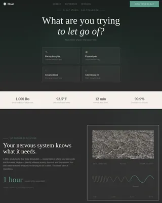
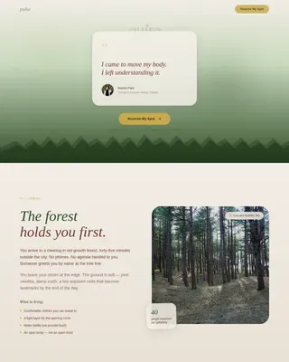
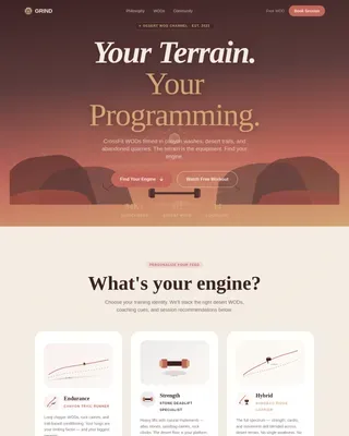
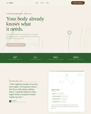
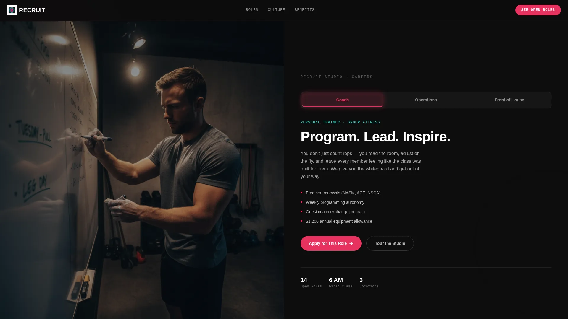
Recruit is a split-screen fitness studio careers landing page built to make job seekers feel the energy of your studio before they apply. A Feature Tab Switcher, interactive floor map, and glassmorphic visual design work together to guide coaches, operations staff, and front-desk candidates from curious browsing to a confident click on "See Open Roles."
by Rocket studio
Quick summary
Recruit is a single-page careers landing page designed specifically for fitness studios. It uses a 50/50 split-screen layout, role-specific tab switching, and an interactive studio floor map to pull candidates deep into your culture before asking them to apply. The page is built to feel immersive, tactile, and worth exploring.
Who this template is for
This template is built for fitness studio owners, hiring managers, and studio operators who want to attract mission-fit talent. It speaks directly to candidates who care about culture as much as compensation.
- Personal trainers and group fitness instructors looking for a real community
- Front-desk staff and operations managers who have outgrown large chain gyms
- Studio teams ready to replace a generic job board listing with a branded recruiting experience
What problem this template solves
Most fitness studio job pages look identical to every other employer listing online. They list duties and a salary range, then ask for a resume. Candidates with options scroll past. This template replaces that flat experience with one that earns trust first.
- Candidates arrive on a page that feels alive, not like a form waiting to be filled out
- Role-specific content appears immediately, so a trainer and an operations manager each see what matters to them
- The exploratory flow lets visitors commit mentally before they commit with a click
What you get with this template
You get a fully designed, single-page careers landing page that functions like a guided studio tour. Every section is built around candidate experience, from the ambient header video to the benefits explorer at the bottom.
- A split-screen header with three role tabs, each swapping both the video loop and the role description simultaneously
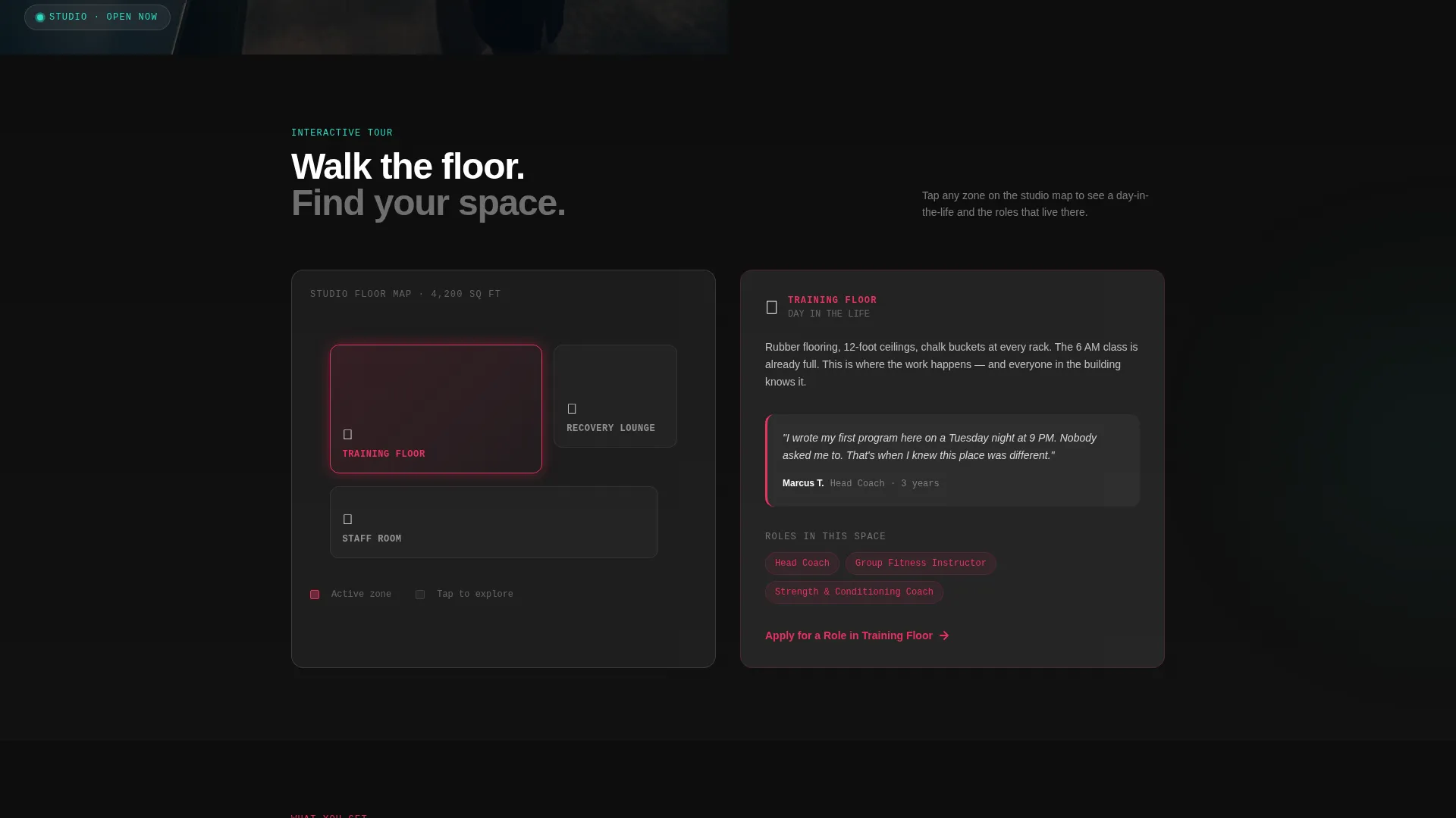
- A clickable studio floor map with glassmorphic day-in-the-life cards for each space
- A persistent "See Open Roles" call-to-action button and inline "Apply for This Role" links inside every tab and floor-map card
Feature list
This section covers the core interactive and design components built into the Recruit template.
Role-Switching Feature Tab Switcher
The header splits the screen 50/50. The left side plays a looping ambient studio video. The right side holds three frosted-glass tabs: Coach, Operations, and Front of House. Clicking any tab swaps the video and the role description at the same time. Tabs lift with a teal glow on hover and press down with a magenta underline when active.
Clickable Studio Floor Map
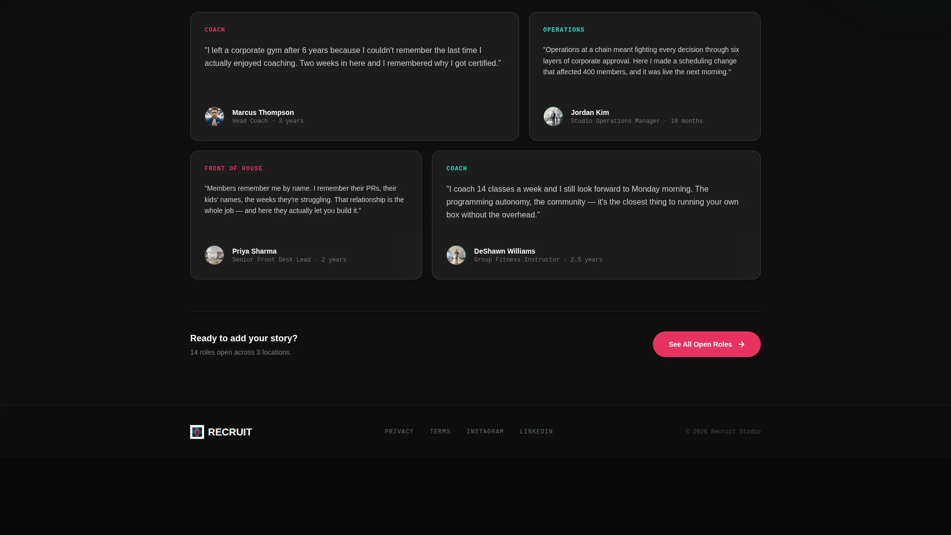
Below the header, the left panel becomes an interactive map of the studio floor. Visitors can tap the training floor, the recovery lounge, or the staff room. Each tap populates the right panel with a glassmorphic card containing a day-in-the-life vignette, real staff quotes, a short looping clip, and the roles connected to that space.
Flip-Card Benefits Explorer
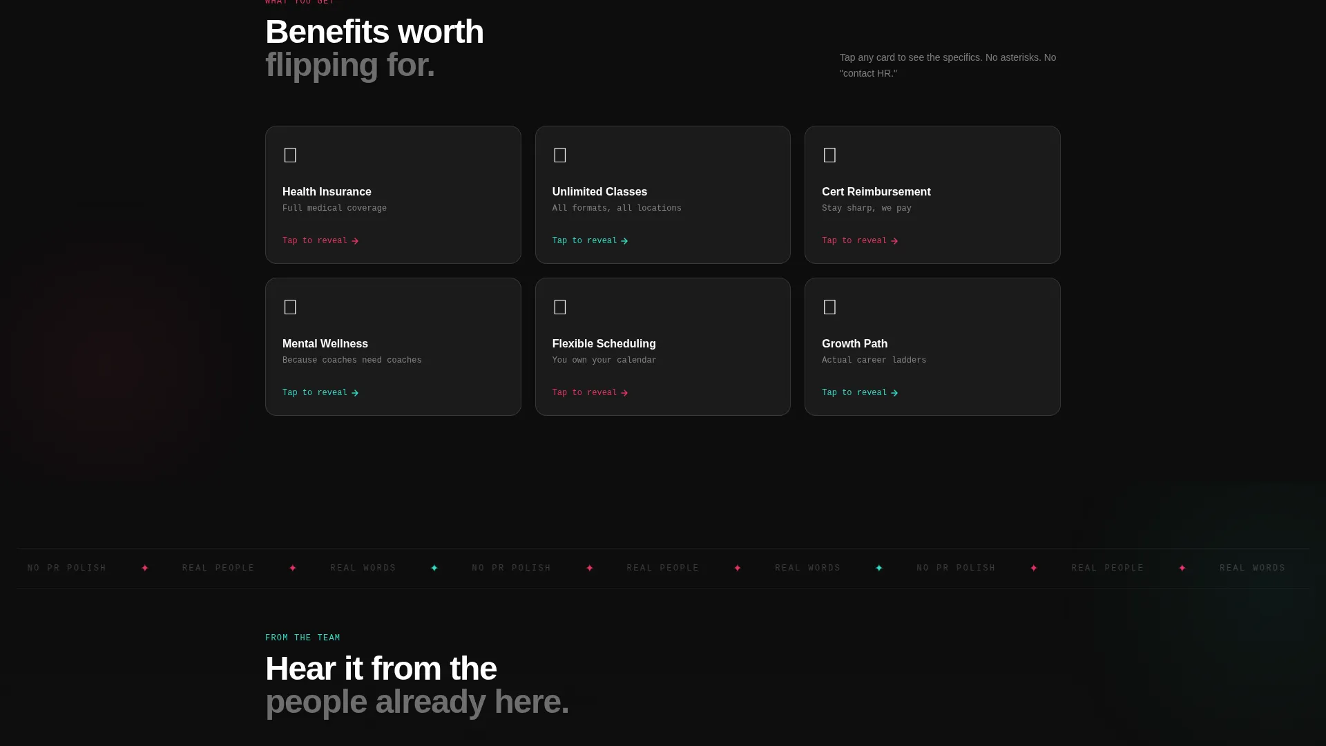
Frosted cards display benefit categories on the front face. Clicking a card flips it to reveal specific coverage details on the back. This interaction deepens the candidate's sense of what working at the studio actually means in practical terms.
Persistent Click-Through Call to Action
A magenta "See Open Roles" button anchors to the bottom-right corner after the first scroll. It pulses gently with a glassmorphic shadow to stay visible without being aggressive. A secondary "Apply for This Role" link lives inside each tab panel and floor-map card for candidates who are ready sooner.
Glassmorphic Visual System
Content panels float on translucent frosted cards above a deep near-black background. Blurred card edges catch the magenta and teal accent colors beneath. Text stays crisp white on glass. Magenta is reserved for primary calls to action. Teal handles hover states, active tabs, and interactive feedback throughout the page.
Page sections overview
| Section | Purpose |
|---|---|
| Split Screen Header | Introduces studio atmosphere and role tabs |
| Feature Tab Switcher | Swaps video and role content per department |
| Studio Floor Map | Lets candidates explore spaces interactively |
| Day-in-the-Life Cards | Shows real context for each studio area |
| Benefits Explorer | Reveals specific perks through flip-card interaction |
| Persistent call to action Button | Routes engaged visitors to open role listings |
| Role-Specific Apply Links | Connects department-focused candidates directly |
Design & branding system
The visual identity follows a Directory and Discovery theme executed through a glassmorphic color system. The palette is designed to feel like looking through a fogged glass partition into a lit studio room.
- Core colors: deep studio black (#0D0D0D) for backgrounds, frosted glass white at 60% opacity (#FFFFFFCC) for content cards, electric magenta (#E6335F) for calls to action, and cool teal (#2EDBC7) for hover and active states
- Typography stays crisp white on translucent glass panels, keeping readability high against the dark surround
- All interactive elements use teal for rollovers and selected states, with magenta reserved for primary action moments
Mobile & speed optimization
The template is built with a responsive layout so the split-screen structure adapts cleanly across screen sizes. Interactive components are designed to remain usable on touch devices.
- The floor map tap interactions and tab switcher are built for touch input, not mouse-only use
- Frosted card animations and video loops are contained within the layout so they do not disrupt the reading flow on smaller screens
How this template helps you convert
The page is designed around a principle of earned commitment. Visitors are never asked to apply cold. They explore first, then decide.
- The tab switcher delivers role-specific content immediately, so each candidate type sees relevant information within seconds of arriving
- The floor map and day-in-the-life cards build a mental picture of the actual workplace, which increases the candidate's confidence before they ever reach the application link
- The persistent call to action button stays visible throughout the scroll without interrupting exploration, capturing intent at the exact moment a visitor is ready to act
Other information about this template
This template sits within the Fitness Studio Website Templates subcategory under Technology. It is purpose-built for the fitness studio careers page niche and matches the Interactive Explorer creative direction.
- The template style is Split Screen (50/50), following the Directory and Discovery theme with a Glassmorphic color system
- The header concept is a Feature Tab Switcher, and the landing-page direction is Click-Through, meaning every design decision prioritizes guiding visitors toward a role application
- This template can support any fitness studio type, including boutique strength gyms, group fitness concepts, recovery-focused studios, and multi-discipline facilities
Theme
Directory & Discovery
Creative direction
Interactive Explorer
Color system
Glassmorphic
Style
Split Screen (50/50)
Direction
Click-Through
Page Sections
Role-switching Feature Tab Switcher
Clickable Studio Floor Map
Flip-card Benefits Explorer
Persistent Click-through Call to Action
Glassmorphic Split-screen Layout
Related questions
Can I update the tab content for different roles?
Does the floor map require custom studio photography?
Can I add more than three role tabs?
Is this template suitable for a studio that is not currently hiring?
How does the persistent call to action button behave on scroll?