Mission-Driven Nonprofit RPO | Free Website Template | Rocket
The Recruit landing page template is built for nonprofit Recruitment Process Outsourcing (RPO) providers who need to convert overwhelmed HR leaders fast. It uses a dark Electric Indigo color system, Hero's Journey card grid narrative, and a three-field free audit form to move executive directors from awareness to action. Mission-fluent messaging, before-and-after hiring metrics, and first-person client stories do the heavy lifting.
by Rocket studio
Quick summary
Recruit is a single-page, card grid landing page template designed specifically for nonprofit RPO providers. It targets executive directors, development directors, and board members who are losing mission-critical staff faster than they can replace them. The page narrates a Hero's Journey from vacancy pain to hiring momentum, using a bold Electric Indigo visual identity and a freemium audit offer to convert visitors into qualified leads.
Who this template is for
This template serves RPO providers whose clients are nonprofit organizations struggling with chronic understaffing. It is purpose-built for a B2B services context where trust, sector credibility, and speed of value delivery matter more than flashy product demos. If you place embedded recruiters inside mission-driven organizations, this is your nonprofit landing page.
Your ideal buyers include:
- Executive directors and HR directors at nonprofits with five to two hundred staff who have multiple unfilled program manager, grant writer, or development roles
- Board members and development directors watching high turnover erode restricted funding and stall the organization's mission
- Nonprofit-focused hiring consultants and staffing firms who want a specialized landing page that speaks fluently to the sector's unique pressures
What problem this template solves
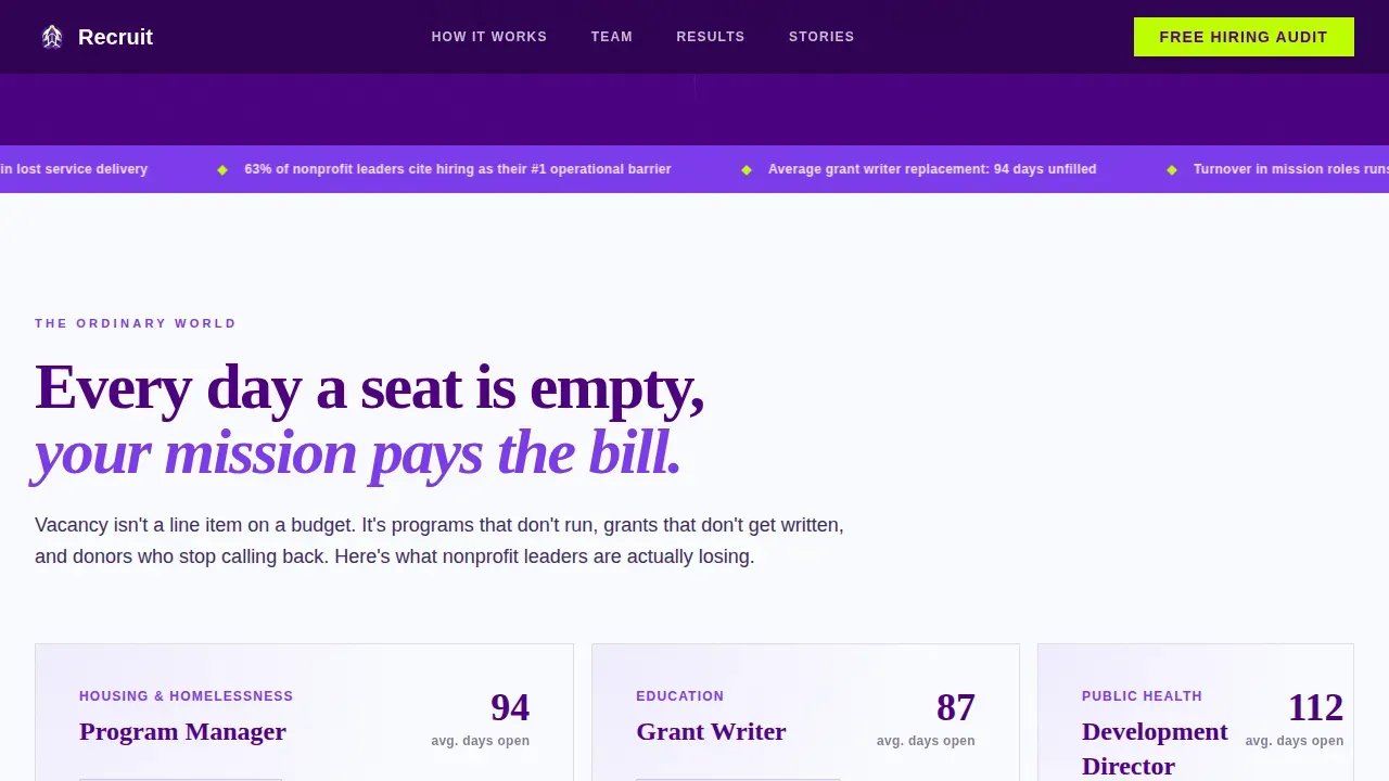
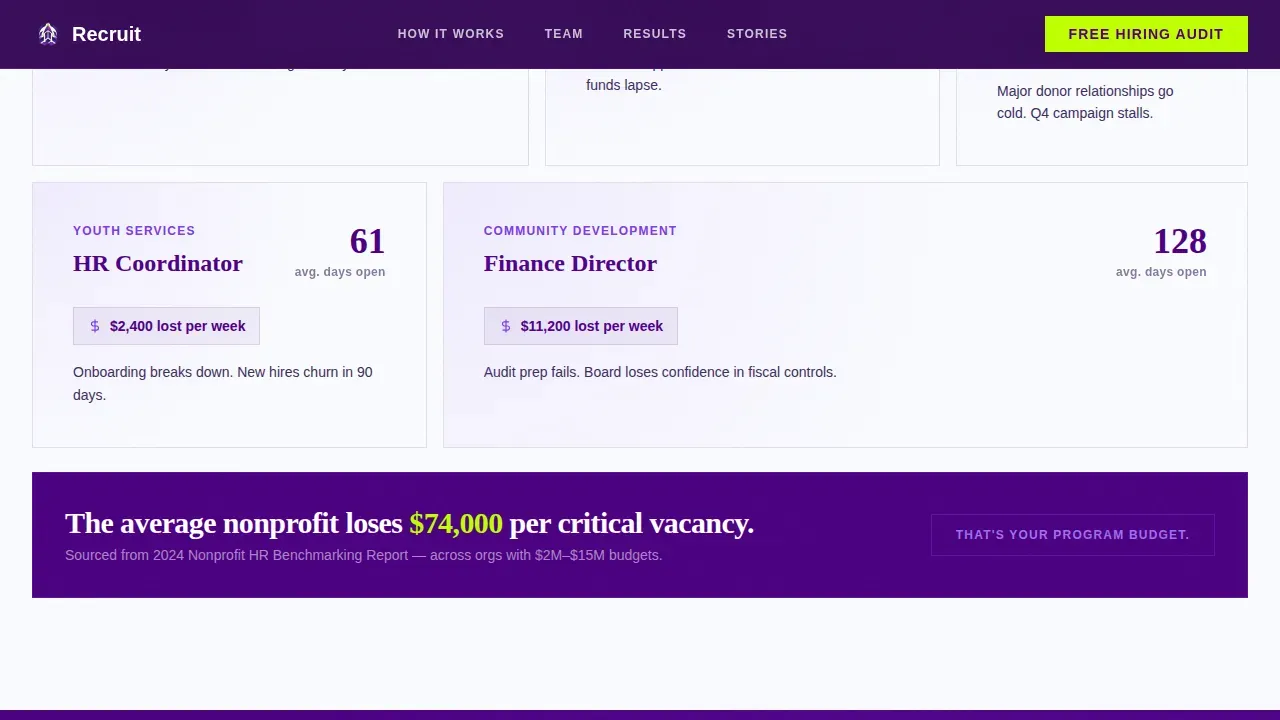
Most nonprofit organizations are not short on passion. They are short on time, budget, and a hiring process that actually works at their scale. The average time-to-fill a mission-critical role in the nonprofit sector sits at 87 days. Every empty seat carries a real cost: unfulfilled program deliverables, overworked staff, and donors watching outputs stall.
A generic landing page cannot carry that argument. This template solves the specific communication gap between an RPO provider's capabilities and a nonprofit leader's immediate sense of urgency:
- It frames the vacancy problem in sector-specific terms that resonate with a nonprofit's mission, budgets, and funder relationships, so website visitors feel understood within seconds of arriving
- It presents embedded RPO as a practical, affordable alternative to scattered job boards and retained search firms, making the call to action feel like relief rather than another sales pitch
- It provides a clear, low-commitment entry point through a free hiring audit offer, reducing friction for leaders who are already stretched and skeptical of outside vendors
What you get with this template
This nonprofit landing page template ships as a fully structured, modular card grid layout ready to customize. Every section is built to a specific narrative purpose, and the visual system is pre-configured so you can adapt colors, copy, and recruiter profiles without rebuilding from scratch.
Here is what is included:
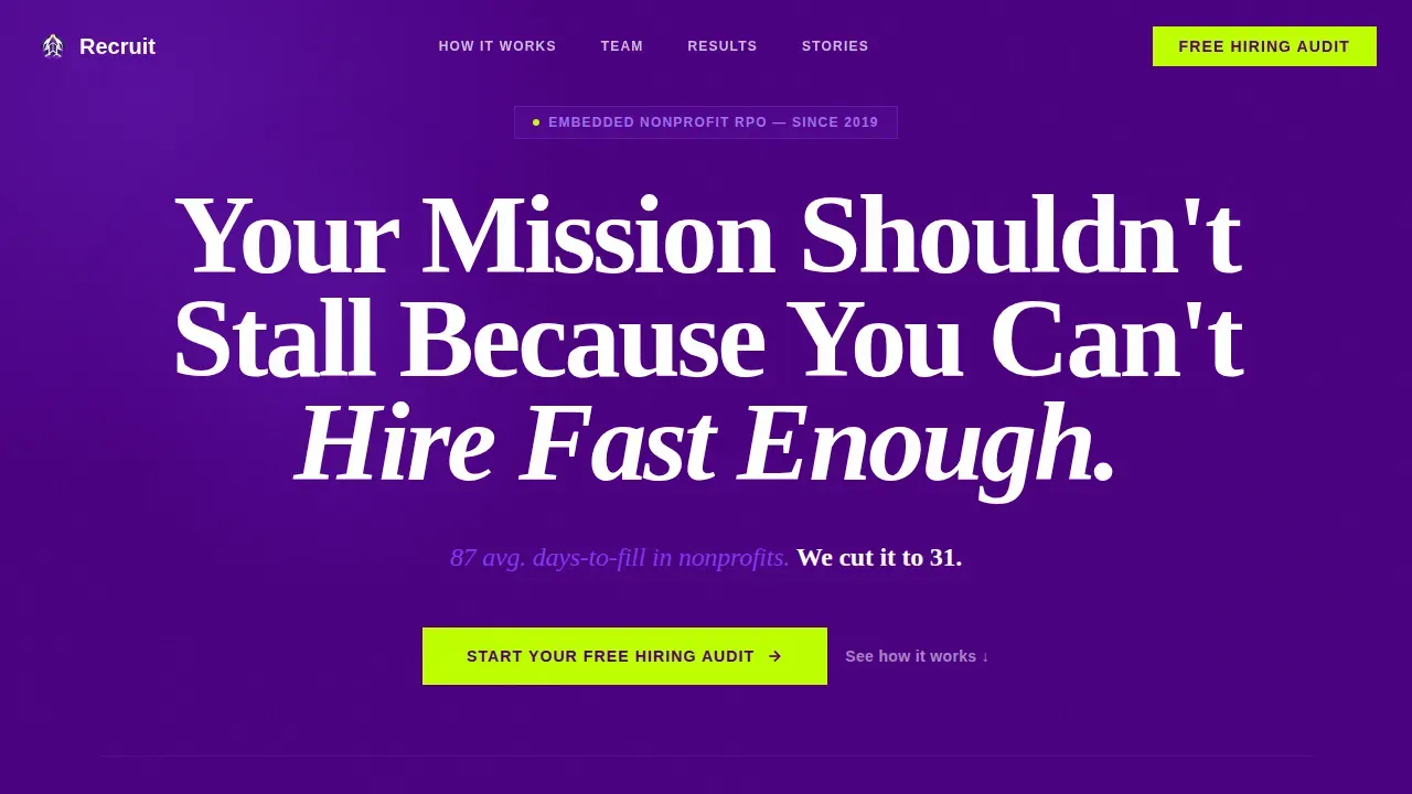
- A Hero section with a giant centered headline on deep indigo, a stat callout in charged violet, and a lime call to action button that reads "Start Your Free Hiring Audit"
- Five core card grid modules covering vacancy cost, embedded RPO education, recruiter profiles by sector specialization, before-and-after hiring dashboards, and first-person client success stories
- A sticky bottom call to action bar that appears after the third card row, keeping the primary conversion path prominently displayed throughout the scroll
- A three-field audit form modal capturing organization name, number of open roles, and biggest hiring pain point via dropdown
- A secondary conversion path offering a gated "Nonprofit RPO Playbook" PDF download for visitors not ready to book an audit
- A linear single-row footer with contact details and navigation essentials
Feature list
This section covers the core built-in capabilities that make Recruit a practical, conversion-ready nonprofit landing page for RPO providers.
Giant Headline Hero with Stat Bar
The hero opens with a single enormous headline in white type on deep indigo: "Your Mission Shouldn't Stall Because You Can't Hire Fast Enough." No image, no illustration. Below it, a charged violet stat line states the 87-to-31-day time-to-fill reduction. The emptiness around the words creates a pitch-deck urgency that immediately communicates the nonprofit's mission problem and the provider's solution. A lime call to action button sits directly below, functioning as the page's first conversion trigger and guiding visitors toward the audit form without distraction.
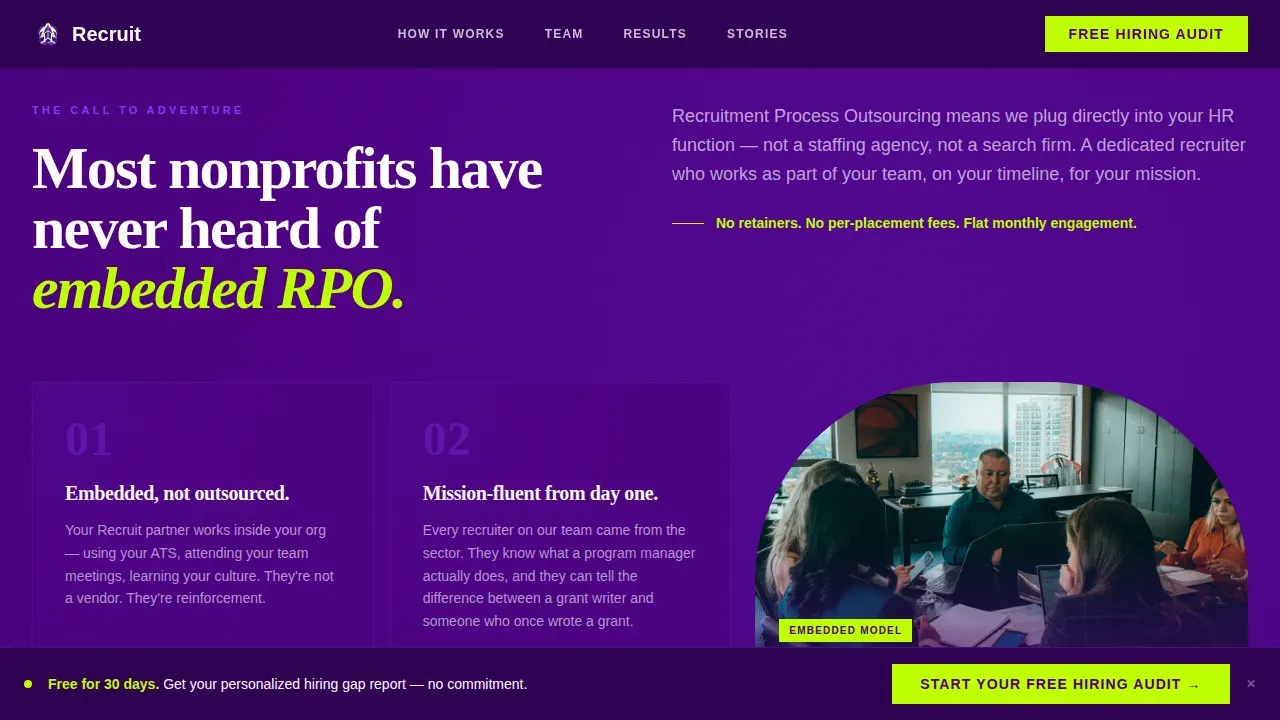
Hero's Journey Card Grid Narrative
The scroll follows a structured storytelling arc across five modular card sections. The Ordinary World cards quantify the cost of vacancy in mission-critical roles. The Call to Adventure section introduces embedded RPO as a concept most nonprofit organizations have never encountered. The Mentor cards profile actual recruiters with sector specializations in housing, education, and public health. The Ordeal cards display before-and-after hiring dashboards showing time-to-fill collapsing and candidate quality scores climbing. The Return section presents first-person client stories from organizations of different sizes and cause areas. Visitors can scan nonlinearly or scroll sequentially. The cumulative effect builds an undeniable case.
Dual Conversion Path with Audit Form Modal
The primary call to action triggers a lightweight three-field modal form. Fields capture organization name, number of open roles, and biggest hiring pain point selected from a dropdown with options for retention, sourcing, speed, or all three. The free audit delivers a personalized report on hiring gaps benchmarked against peer nonprofit organizations. A secondary path offers a gated PDF download, the Nonprofit RPO Playbook, requiring only email and organization type. Both paths are designed to convert visitors at different stages of readiness without putting them all on the same page flow.
Sticky Bottom Call to Action Bar
After the visitor passes the third card row, a sticky bottom bar appears and remains visible throughout the rest of the scroll. It repeats the primary call to action in lime on indigo, creating a persistent conversion anchor without interrupting the narrative. This design choice follows best practices for nonprofit landing pages: keep the call to action prominently displayed at every stage of the reader's journey, so no motivated visitor has to scroll back up to act.
Electric Indigo Visual Identity System
The entire landing page runs on a four-color system. Deep indigo (#4B0082) dominates section backgrounds and card surfaces. Charged violet (#7C3AED) marks active states and hover interactions. Near-white (#FAFBFF) breathes between modules. High-voltage lime (#BFFF00) appears exclusively on call to action buttons and progress indicators. Typography pairs DM Sans for body text with Fraunces for editorial headlines, creating the pitch-deck conviction and mission urgency the audience expects. This visually appealing system earns trust before a single word is read.
GSAP ScrollTrigger Animations and Interactive Elements
Card entrances are staggered using GSAP ScrollTrigger reveals. A marquee stat bar runs between sections, reinforcing key hiring metrics in motion. All card surfaces include hover states that shift to charged violet on interaction. The audit form modal and sticky bottom bar are built as client components for smooth interactivity. These interactive elements create a sense of momentum, communicating that the RPO provider operates with the same velocity it promises to deliver for the nonprofit's hiring process.
Page sections overview
| Section | Purpose |
|---|---|
| Hero Headline | Opens with vacancy urgency and lime call to action |
| Ordinary World Cards | Quantifies mission cost of unfilled roles |
| Embedded RPO Introduction | Educates on RPO as a nonprofit hiring solution |
| Recruiter Profile Cards | Builds trust through sector-specialized recruiter bios |
| Before/After Dashboards | Shows measurable time-to-fill improvement with data |
| Client Story Testimonials | Delivers first-person social proof across org sizes |
| Sticky call to action Bar | Keeps conversion path visible throughout the scroll |
| Audit Form Modal | Captures lead via three-field low-friction form |
| PDF Playbook Download | Secondary path for visitors not ready to commit |
| Single-Row Footer | Provides contact details and essential navigation |
Design & branding system
The Recruit template runs a dark, high-conviction visual identity that feels like a well-rehearsed pitch at midnight. Every color earns its place, and nothing is decorative without purpose. This is a visually appealing system built for a target audience that trusts precision over embellishment.
Key design elements include:
- A four-color Electric Indigo palette: deep indigo for backgrounds, charged violet for active states, near-white for breathing room, and lime reserved exclusively for call to action triggers and progress indicators
- Editorial typography pairing DM Sans body text with Fraunces headlines, creating a tone that blends mission urgency with operational confidence
- Card grid layout with staggered GSAP ScrollTrigger reveals, arch-shaped recruiter profile cards, horizontal scroll testimonials, and a marquee stat bar that keeps key data in motion between sections
Mobile & speed optimization
Executive directors are desktop-first users, but a significant portion of nonprofit leadership teams review vendor pages on tablets and mobile devices during commutes, board meetings, or site visits. The template is built to remain fully readable and conversion-ready across all screen sizes.
Mobile-focused details include:
- Responsive card grid that reflows from multi-column desktop to single-column mobile without breaking the Hero's Journey narrative sequence, ensuring mobile users stay engaged throughout the full scroll
- Client components for the sticky bottom call to action bar and audit form modal are scoped for smooth performance on mobile devices, while static server components handle the content-heavy sections
- Mobile optimization ensures the lime call to action button and form fields remain easy to tap on small screens, protecting conversion rates from mobile traffic loss on this nonprofit landing page
How this template helps you convert
A nonprofit landing page succeeds when it removes doubt faster than the visitor accumulates it. Recruit is architected around a single conversion goal: the free hiring audit. Every design decision and content choice guides visitors toward that one action without distraction.
- The Hero's Journey narrative structure eliminates the need for a visitor to explore multiple dedicated web pages. Each card module advances the argument sequentially, so a nonprofit HR leader who enters as a skeptic exits as a warm lead. The clear call to action is prominently displayed at the hero, inside the card flow, and in the sticky bar, creating three natural conversion moments without feeling pushy.
- Social proof is embedded directly into the card grid rather than siloed in a separate testimonials section. Before-and-after hiring dashboards show concrete data. First-person client stories from organizations of different cause areas and sizes let website visitors see themselves in the success. This combination of quantified impact and compelling stories is what converts visitors who have been burned by overpromising vendors before.
- The dual conversion path respects where the visitor is in their decision process. Leaders ready to act start their free audit immediately. Leaders still researching download the Nonprofit RPO Playbook and enter a nurture sequence. Neither path puts pressure on the visitor to commit before they are ready, which follows best practices for effective nonprofit landing pages focused on building trust before asking for time.
Other information about this template
Beyond the core hiring narrative, the Recruit template is structured to support a broader range of nonprofit-focused communication needs through straightforward customization. Because it is a modular card grid, individual sections can be updated independently to reflect new recruiter profiles, updated hiring metrics, or seasonal campaign priorities.
Nonprofit organizations that run fundraising campaigns alongside hiring initiatives will find the card format flexible enough to accommodate messaging about fundraising efforts, upcoming events, or career opportunities without requiring a full rebuild. The same layout can support a fundraising landing page variation, a fundraising platform introduction, or an event page for sector networking, simply by swapping the card content while keeping the visual identity intact.
- The template is adaptable for organizations that want to raise awareness about both hiring and fundraising goals. A fundraising landing page section, donation form panel, or donation landing page link can be added within the existing card grid without disrupting the primary hiring narrative. This makes the template useful well beyond its initial RPO context.
- Nonprofit website templates in this category typically include sections for mission statements, impact stories, and donation pages. The Recruit template can support a donation page link, a dedicated donation page callout, or a donation landing reference in the footer, keeping the nonprofit website cohesive for visitors who arrive from social media or email marketing campaigns.
- For nonprofit organizations that accept donations or manage recurring donations alongside their hiring activities, the modular structure allows a donation flow panel or donation form to be added as a card module. A dedicated donation page, a fundraising landing page card, or a donation landing page link can be placed on the same page without competing with the primary hiring audit call to action.
- The template supports search engines discoverability through clean semantic structure, helping attract organic traffic from nonprofit HR leaders searching for hiring solutions. A clear mission statement and prominently displayed contact details also help with direct navigation from past supporters, board members reviewing vendor options, or website visitors arriving through digital marketing campaigns.
- Organizations that want to raise money, promote fundraising events, or highlight career opportunities alongside their RPO offer can use the secondary card rows to carry those messages. Annual donations context, financial support messaging, and dedicated web pages can be linked from the footer or from a dedicated landing section within the grid.
- For teams that want to utilize testing and optimize visitor behavior over time, the modular layout makes it straightforward to swap individual card content and compare results across different audiences and campaign periods.
- The template works as both a basic landing page starting point and a premium template for established RPO providers who want a polished, sector-credible web page from day one. A free plan build is achievable using the provided layout structure, while more complex deployments can layer in additional interactivity.
- Nonprofits recruit effectively when their landing page speaks directly to the hiring pain their leadership team feels. This template is built on that insight. Effective headlines immediately communicate the organization's mission and the why behind the role, connecting applicant values to the nonprofit's purpose and making every word earn its place on the page.
- The Recruit mission-driven nonprofit RPO landing page template is a focused, single-objective design. It does not include distracting navigation links or multiple competing calls to action. This focus is intentional and follows established best practices for effective nonprofit landing pages and specialized landing pages in the B2B services sector.
Theme
Startup Velocity
Creative direction
Hero's Journey
Color system
Electric Indigo
Style
Card Grid (Modular)
Direction
Freemium/Trial
Page Sections
Giant Headline Hero with Stat Callout
Hero's Journey Card Grid Narrative
Dual Conversion Path with Audit Form Modal
Sticky Bottom Call to Action Bar
Electric Indigo Visual Identity System
GSAP Scrolltrigger Animations and Hover States
Related questions
Can I use this template for a nonprofit that also runs fundraising campaigns?
Does the template include the audit form and sticky call to action bar out of the box?
How does the Hero's Journey structure help convert nonprofit HR leaders?
Is this template suitable for a small nonprofit organization with limited design resources?
What makes this different from a generic HR or staffing landing page template?


