Aquarium Store Landing Page Template
Reef is a split-screen landing page template built for neighborhood aquarium stores that earn trust face by face. It pairs a press-mention header with staff portraits and specialty scenes, guiding visitors toward a map, store hours, or phone call. The charcoal and amber palette feels as deliberate and warm as a rimless display tank on custom cabinetry.
by Rocket studio
Quick summary
Reef is a single-page, click-through landing page template designed for local aquarium stores. It uses a 50/50 split-screen layout to introduce the team, showcase press credibility, and direct visitors to call, get directions, or plan a visit. Every section is built to earn trust before asking for a click.
Who this template is for
This template suits independent aquarium shops that compete on expertise rather than price. It works best when the store has a recognizable team, some local press history, and a loyal hobbyist customer base who values specialist knowledge.
- Local aquarium retailers serving freshwater, saltwater, and planted-tank hobbyists
- Neighborhood fish stores with staff credentials worth showing off
- Store owners who want walk-in traffic and phone calls, not form submissions
What problem this template solves
Most local aquarium shops have no landing page that matches the quality of their in-store experience. A generic directory listing or outdated website undersells the expertise inside. Visitors searching online cannot tell the difference between a big-box pet aisle and a specialist reef shop until they walk through the door.
- No visible team presence online makes the store feel anonymous
- Press features and community endorsements sit unused, never seen by new visitors
- Potential customers have no clear path from search result to store visit
What you get with this template
You get a fully structured, single-page layout that leads with credibility and closes with a clear visit prompt. The template organizes everything a local buyer needs to feel confident enough to drive over.
- A press-mention header with space for badges, review counts, and editorial pull-quotes
- Alternating staff portrait sections with matching specialty scenes
- A persistent bottom bar with primary and secondary call-to-action buttons
Feature list
This template delivers a focused set of layout components built specifically for trust-first, click-through conversion in a local specialty retail context.
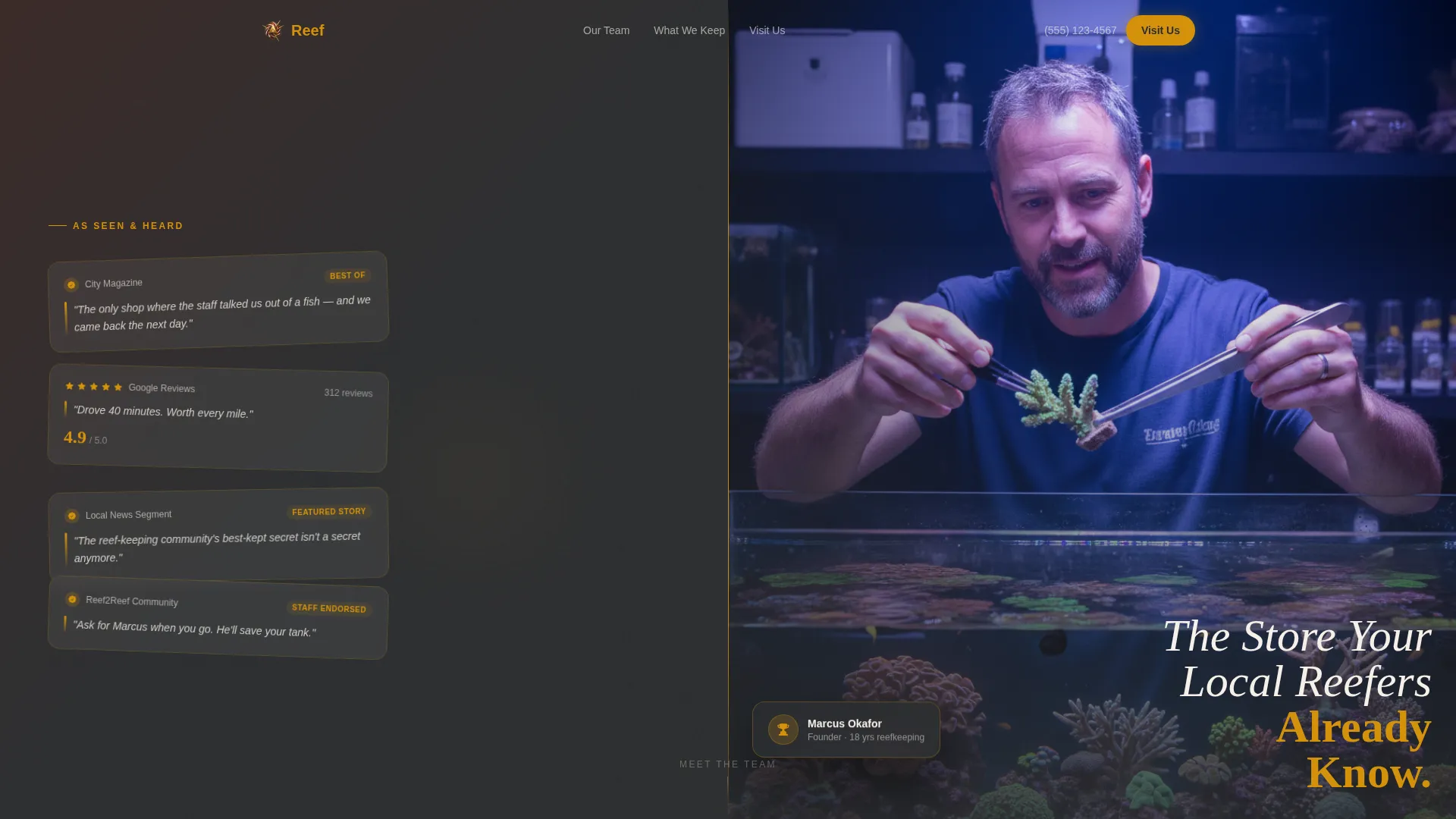
Split-Screen Press Header
The header opens on a 50/50 split. The left panel arranges press badges, local feature logos, Google review counts, and pull-quotes like editorial clippings on a corkboard with amber highlights. The right panel holds a founder portrait shot at shallow depth-of-field with soft blue tank-light behind them. A headline fades in over the press side.
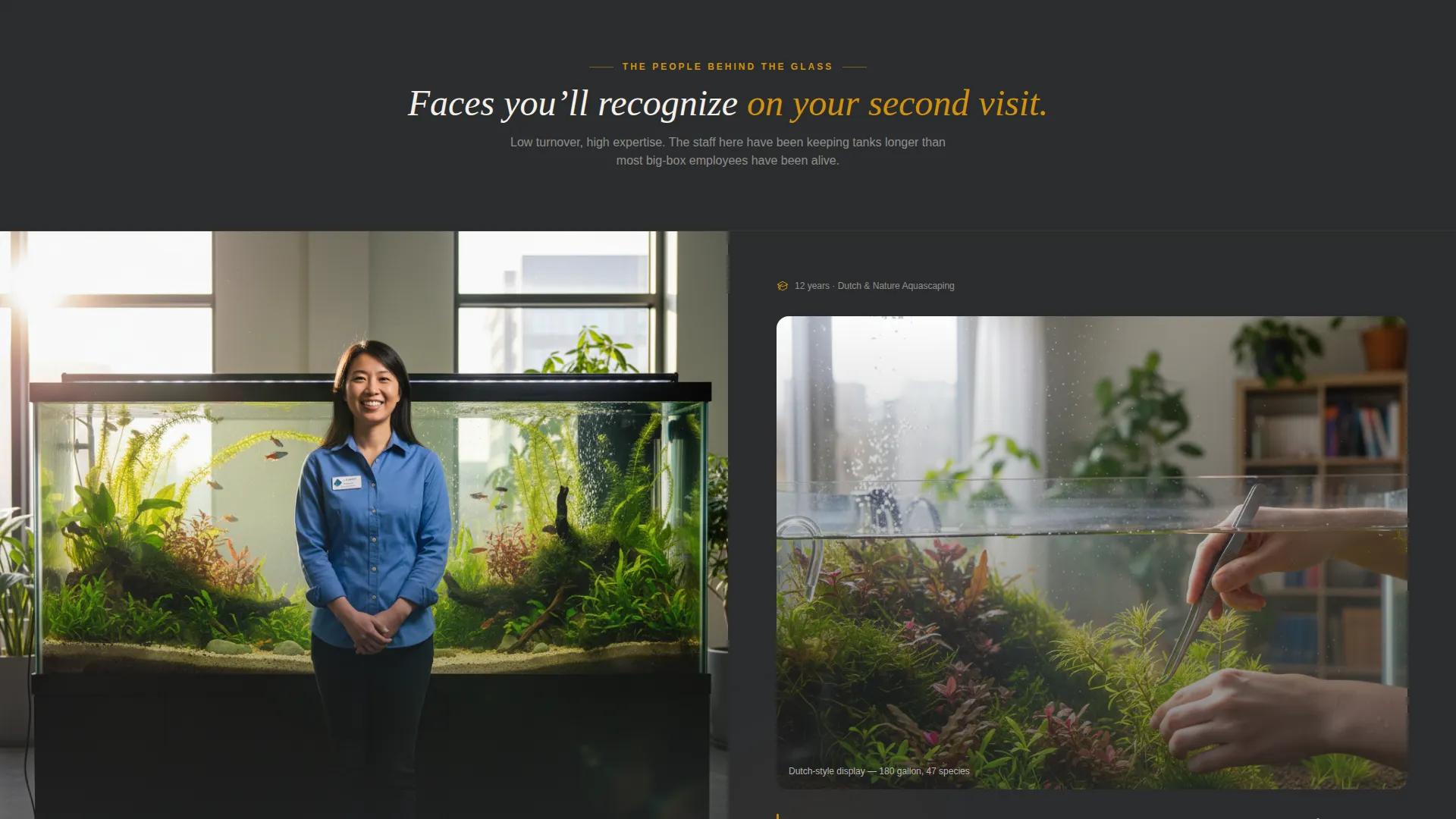
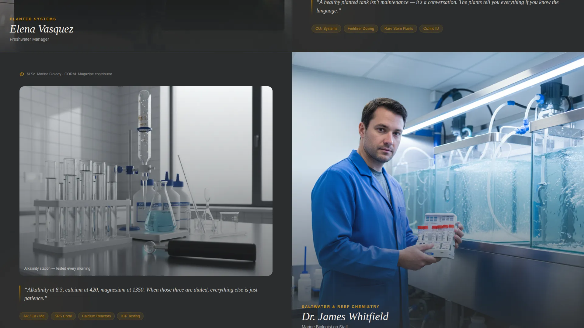
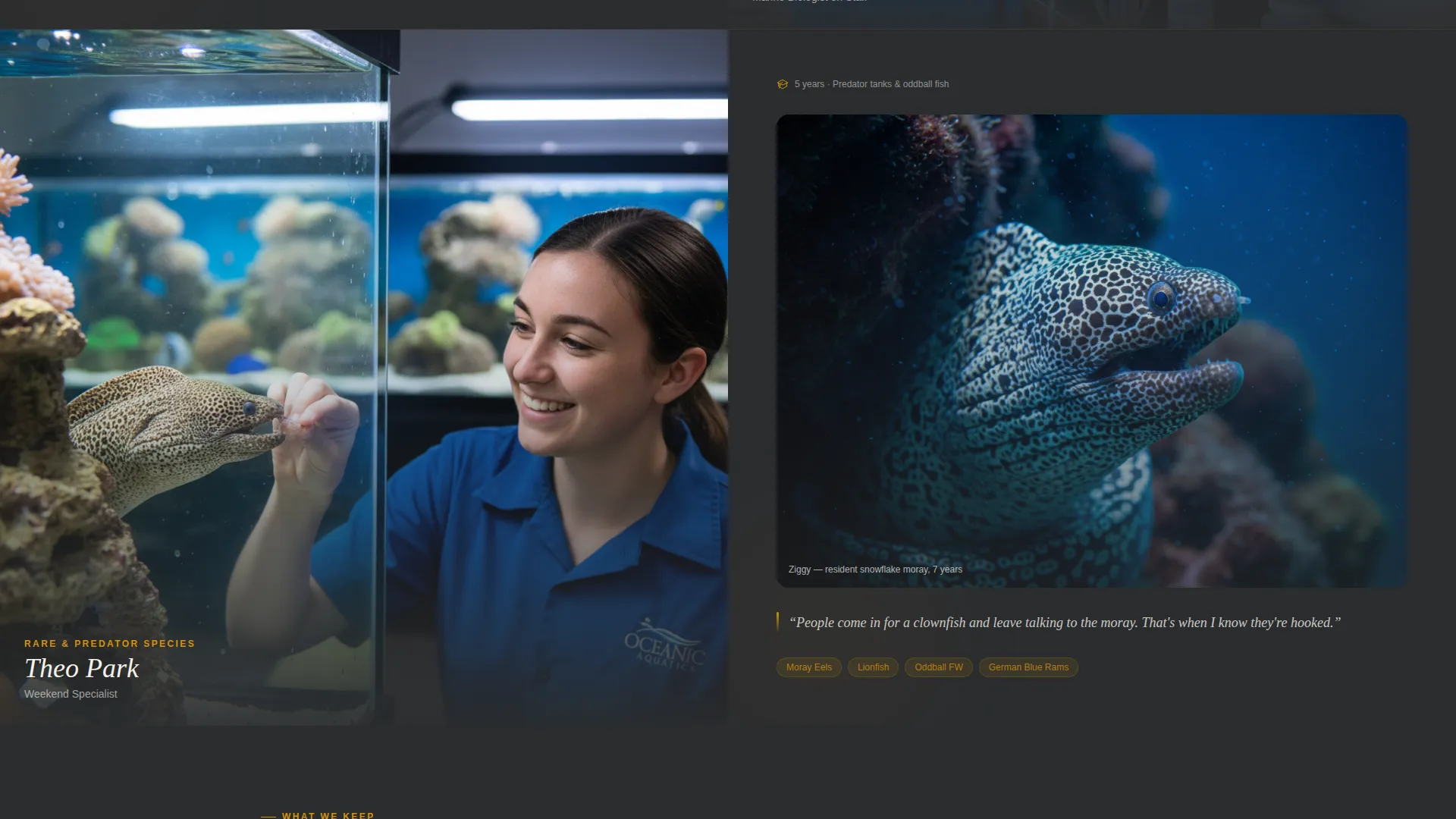
Staff Portrait Scroll Sections
Each scrolling section introduces one team member. One half of the screen shows a staff portrait mid-action, and the other half shows their specialty in context. The layout alternates which side carries the portrait, creating a visual zigzag that keeps the eye moving downward.
Persistent Bottom Call-to-Action Bar
A fixed amber button reading "Visit Us This Weekend" stays visible as visitors scroll. It links to the map embed and store hours section below. A secondary button labeled "Call the Fish Room" triggers the phone dialer directly. There are no form fields anywhere on the page.
Map and Store Hours Section
The lower portion of the page holds a map embed alongside clearly displayed store hours. This section is the destination for the primary call-to-action button, giving visitors everything they need to plan a same-day visit without leaving the page.
Charcoal and Amber Visual System
The color palette uses deep wet-stone charcoal, aquarium-cabinet mahogany, warm amber, and clean substrate white. The combination is deliberately understated so photography and staff portraits carry the visual weight. The result feels like a high-end rimless tank on custom furniture.
Page sections overview
| Section | Purpose |
|---|---|
| Split-Screen Header | Establishes press credibility and introduces the founder |
| Headline Fade-In | Anchors the store's neighborhood authority |
| Staff Section One | Introduces first team member with specialty scene |
| Staff Section Two | Introduces second team member with specialty scene |
| Staff Section Three | Introduces third team member with specialty scene |
| Map and Hours | Gives visitors directions, hours, and visit context |
| Persistent Bottom Bar | Keeps primary and secondary calls to action always visible |
Design & branding system
The template follows an Executive Suite theme expressed through a Charcoal and Amber color system. Every color choice is intentional, creating a high-end but approachable feel that lets photography dominate.
- Deep wet-stone charcoal (#2B2D2F) and mahogany (#3E2723) form the dark structural base
- Warm amber (#D4920B) highlights pull-quotes, buttons, and accent details throughout
- Clean substrate white (#F5F0E8) handles text fields and breathing room between sections
Mobile & speed optimization
The split-screen layout is structured to reflow cleanly on smaller screens. Portrait images and press clippings stack vertically on mobile without losing their editorial feel.
- Each 50/50 panel becomes a full-width block on narrow viewports
- The persistent bottom bar remains accessible on mobile for tap-to-call and map links
- Staff sections maintain portrait-to-scene pairing even when stacked vertically
How this template helps you convert
The page is designed as a click-through experience with a single goal: turn a curious visitor into someone who walks through the door or picks up the phone. Every layout decision supports that goal.
- The press-mention header builds immediate credibility before a visitor reads a single line of body copy, reducing hesitation early
- The alternating staff sections replace anonymous store descriptions with real faces and verifiable credentials, deepening trust with every scroll
- The persistent bottom bar with "Visit Us This Weekend" and "Call the Fish Room" keeps conversion actions one tap away at all times
Other information about this template
This template is purpose-built for the aquarium store local search context. It prioritizes foot traffic and phone calls over digital lead capture. There are no form fields, no newsletter sign-ups, and no checkout flows. The entire page is structured to answer one question: why should I drive here instead of somewhere else?
- The template fits naturally into a local aquarium store marketing strategy focused on community trust and specialist reputation
- It is designed for aquarium store local search visibility, giving nearby hobbyists a compelling reason to visit
- The press clipping layout supports any combination of city magazine badges, forum endorsements, local news mentions, and review platform counts
- Store owners can adapt staff section copy to reflect their own team credentials, from marine biology backgrounds to years of hands-on reef-keeping experience
Theme
Executive Suite
Creative direction
Team & People
Color system
Charcoal & Amber
Style
Split Screen (50/50)
Direction
Click-Through
Page Sections
Split-screen Press Mention Header
Alternating Staff Portrait Sections
Persistent Bottom Call-to-action Bar
Map Embed and Store Hours Block
Charcoal and Amber Color System
Related questions
Does this template include any contact forms?
Can I use this template if my store focuses only on freshwater fish?
How many staff members can I feature in the scroll sections?
What kind of press content works in the header panel?
Is this template suitable for a store that also sells online?



