Music School Marketing Comparison Website Template
This referral tiered shield comparison landing page template is built for music schools ready to turn happy families into active referrers. A Slate and Sky Legal Shield design showcases Bronze, Silver, and Gold reward tiers side by side. Every rule is visible, every credit is earned, and the numbers prove the program's generosity before the page asks for anything.
by Rocket studio
Quick summary
This referral landing page template helps music schools launch a transparent, data-led referral program. It opens with hard stats, walks visitors through a three-tier shield comparison, and closes with a simple form and a clear call to action. The page earns trust before it asks for anything, making it one of the best referral tools for community-driven enrollment growth.
Who this template is for
This template is built for music school owners and administrators who want to grow enrollment through a structured customer referral program. It serves both the person referring and the potential new family being referred. If your happiest families are already talking about your school at soccer pickup or around the office, this referral page gives that conversation a home.
- Music school owners running a tiered referral program for the first time
- Enrollment managers who want a dedicated landing page to replace informal word-of-mouth
- Marketing coordinators building a referral campaign that needs clear, data-backed proof
What problem this template solves
Most referral landing pages fail because they bury the good stuff. Families cannot easily see what they earn, when credits apply, or whether the program actually works. A tiered structure adds complexity, requiring the design to guide the user from the "why" to the "how" and then to the "which tier" decision. Many businesses struggle with designing an effective referral landing page due to poor design and unclear messaging. This template solves all of that directly.
- Families scan and leave when reward details are hidden or confusing
- A referral program with no dedicated landing page loses conversions to generic pages and vague social media posts
- Without visible social proof and hard numbers, even loyal customers hesitate to refer
What you get with this template
You get a complete, single-page referral landing page layout built around transparency and tiers. The page is designed to show every rule in plain sight, prove the program's generosity with real numbers, and make it easy to refer a friend in a few clicks. A well-structured referral landing page builds trust by clearly displaying how the program works and what rewards participants can expect.
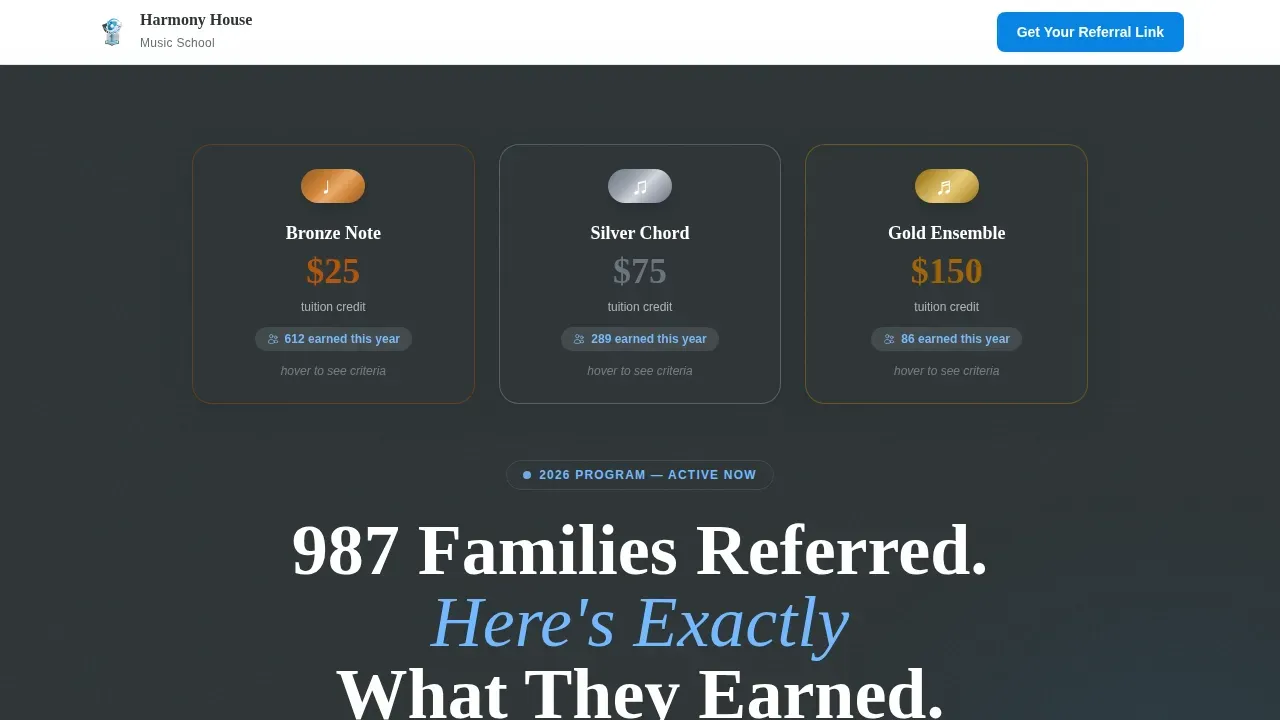
- A hero section with three embossed shield badge icons (Bronze Note, Silver Chord, Gold Ensemble) showing exact credit values and live tier counts
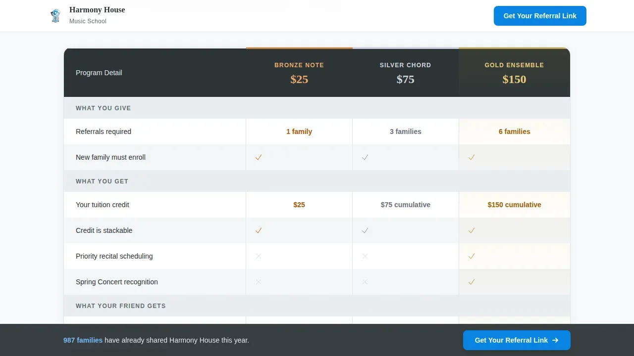
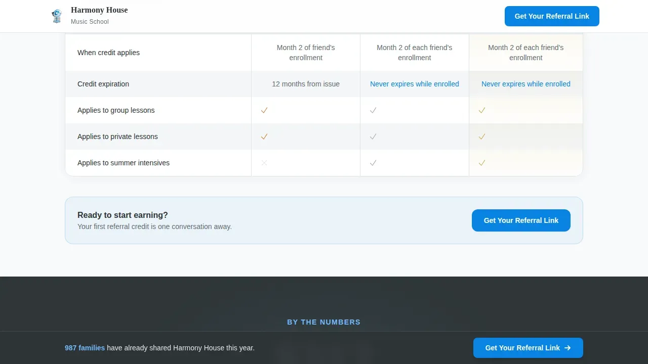
- A full side-by-side referral comparison table covering every program detail: rewards, stacking rules, expiry, and what the referred friend receives
- A sticky bottom bar call to action, a short referral form, and a downloadable program guide path
Feature list
This referral landing page template is packed with prompt-backed features designed to move visitors from curious to committed. Each component reinforces the Legal Shield theme: authoritative, transparent, and warm.
Three-Tier Shield Badge Hero
The hero presents three embossed shield icons representing the Bronze Note ($25 credit), Silver Chord ($75 credit), and Gold Ensemble ($150 credit) tiers. Each badge displays the exact reward value and the number of families who have already earned it this year. A micro-animation flips each badge on hover to reveal its unlock criteria, giving the referral page a premium, minted feel without losing clarity.
Stats-First Impact Panels
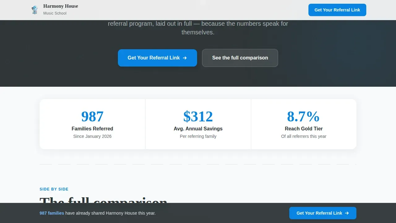
Before a single program rule appears, the page opens with hard, real numbers: total referrals this year, average savings per referring family, and the percentage of referrers who reach Gold tier. This stats-first layout earns the visitor's attention. It shows the referral program works by letting the data speak first, which drives stronger conversion rates than leading with rules or fine print.
Side-by-Side Referral Comparison Table
The comparison table places all three tiers next to each other in a structured grid. Each row covers what you give, what you get, what your referred friend gets, when credits apply, how rewards stack, and what expires. The table allows easy evaluation of different shield levels and clearly states what is required to reach each tier. Legalese is formatted as readable accordion panels beneath each table row, reinforcing the shield theme: nothing hidden, nothing buried.
Sticky Call to Action Bar and Referral Form
A sticky bottom bar keeps the primary call to action visible at every scroll point. The main call to action reads "Get Your Referral Link" and appears after the first comparison table. A short referral form captures the referrer's name, student name, and preferred contact method. Keeping the signup form brief reduces friction; using too many fields in a sign-up form can create friction and lead to potential customers dropping off the page.
Breather Stat Panels
Between data-dense table sections, single-stat breather panels give the eye a rest. A panel reading "Average referrer saves $312/year" appears mid-scroll to reinforce value without adding complexity. These panels keep the referral page readable across a long scroll journey and maintain the tone of a program confident enough to put its numbers in plain sight.
Downloadable Program Guide Path
A secondary conversion path offers "Download the Full Program Guide" as a branded portable document format file. It requires only an email address to unlock. This path captures families who want all tier details, stacking rules, and frequently asked questions in one place before they sign up, making it a reliable lead-capture layer alongside the primary referral link path.
Page sections overview
| Section | Purpose |
|---|---|
| Hero Badge Trio | Introduce three shield tiers with exact reward values and flip animation |
| Stats Impact Row | Open with hard referral numbers before explaining any program rule |
| Comparison Table | Compare Bronze, Silver, Gold tiers side by side across all program details |
| Accordion Legalese | Surface terms and conditions in readable, expandable panels beneath the table |
| Breather Stat Panel | Rest the eye with a single bold savings figure mid-scroll |
| How It Works | Show a visual three-step flow: refer, enroll, credit applied |
| Referral Form Block | Capture referrer name, student name, and preferred contact method |
| Testimonials Block | Display real family quotes tied to named tier unlocks for social proof |
| frequently asked question Accordions | Address common questions and reduce hesitation before the final call to action |
| Sticky call to action Bar | Keep "Get Your Referral Link" visible at every scroll position on the page |
| Footer Row | Single-row linear footer with essential program and school information |
Design & branding system
The template uses a Slate and Sky Legal Shield visual identity. Deep charcoal slate (#2D3436) anchors headers and body text, giving the referral page the weight of a notarized document. Open-sky blue (#74B9FF) highlights tier thresholds and progress indicators. Accent cerulean (#0984E3) marks every clickable element and earned reward. Cloud white (#DFE6E9) breathes between dense comparison rows. The typography pairs Fraunces serif headings with DM Sans body and interface text, balancing authority with approachability. Maintaining a clear and consistent brand identity across every section keeps potential participants from feeling confused or misled.
- Slate dominates headers and body text; sky blue marks tier progress and badge highlights
- Cerulean accents every call to action button, referral link element, and reward indicator
- Cloud white card surfaces and generous whitespace prevent the dense comparison table from feeling overwhelming
Mobile & speed optimization
The template is designed desktop-first to prioritize table readability across wide viewports. On smaller screens, the three-tier comparison table stacks into a swipeable or scrollable format so mobile users can still compare all shield levels clearly. Mobile optimization is essential to ensure forms are thumb-friendly and load quickly on mobile devices. Optimizing images and minimizing scripts are necessary to maintain fast loading speeds, keeping the referral landing page responsive across all screen sizes.
- The sticky call to action bar remains accessible on mobile devices, keeping the referral link prompt always in reach
- The short referral form is designed for thumb-friendly input with minimal required fields
- Accordion panels collapse by default so mobile users see a clean scroll path without wall-to-wall text
How this template helps you convert
A good referral landing page does not just explain the program; it proves its value before asking for anything. This template is built around a proven landing structure that leads with data, earns trust through transparency, and removes every barrier to sharing. The referral program works because the page makes the case for participation before the first call to action button appears.
- Hard stats appear before any rules, so the referral page earns credibility instantly. Visitors see how many families have already earned rewards and what they saved, which makes the decision to refer a friend feel low-risk and high-reward.
- The side-by-side comparison table gives both the referrer and the potential new family a complete picture of benefits. Both the referrer and the referred friend can see exactly what they gain, when credits apply, and how rewards stack, removing every common objection before it forms.
- A focused call to action and a simple form keep the sign-up path short. The sticky bottom bar means the next step is always one tap away, supporting stronger conversion rates than generic templates with buried or scattered calls to action.
Other information about this template
This template is a strong fit for any small business in the professional services or local education space that relies on word-of-mouth to grow its customer base. It works equally well as a referral program landing page for music lessons, tutoring, arts classes, or other community-anchored services. Because the referral page examples built into the layout are data-driven and tier-structured, the template adapts to nearly any referral campaign that needs clear, visible rewards.
- The layout functions as a dedicated landing page with no standard site navigation, keeping visitors focused on the referral offer and away from distractions
- A referral program can significantly increase customer acquisition by leveraging existing customers to attract new ones, and this page is built to activate that channel
- Referral landing pages allow you to track key metrics like conversion rates, referral counts, and reward redemptions; the template's form and guide-download path support both primary and secondary lead capture
- The template can support referral tracking software connections for teams that want to track referrals and distribute rewards automatically as their referral engine scales
- Referral Factory, as a referral program software category tool, is an example of the kind of platform this referral page can support alongside or independently, depending on your referral marketing stack
- The downloadable guide path doubles as an affiliate program-style asset, giving referred friends and partner programs a shareable, branded resource
- Using a landing page builder with drag and drop builder capabilities, this template can be adapted for different brand voice tones and social media platforms without rebuilding from scratch
- Referral program templates can be customized to fit different industries and business goals, making this layout reusable for any local service running a customer referral program
- Automation tools that connect to the signup form can help teams track referrals, manage reward redemptions, and surface valuable insights without manual follow-up
- The page's promotional strategy follows a content and resource direction: prove generosity first, then invite friends to participate, then capture the sign-up, making it an effective referral landing model for schools that want more customer referrals from their existing customer base
- Including social proof through badge counts, testimonials, and live referral stats helps reassure potential customers and referred customers that the program is legitimate and worth sharing
- Including security seals or partner logos as trust badges can reassure users about the program's legitimacy when added to the footer or adjacent to the referral form
- Influencer marketing and social media amplification are natural extensions for schools that want to share the referral page across social media platforms and grow web traffic beyond their current families
Theme
Legal Shield
Creative direction
Stats-First Impact
Color system
Slate & Sky
Style
Comparison Table
Direction
Content/Resource
Page Sections
Three-tier Shield Badge Hero with Flip Animation
Stats-first Impact Opening
Side-by-side Tier Comparison Table
Sticky Call to Action Bar and Short Referral Form
Breather Stat Panels Between Table Sections
Downloadable Program Guide Lead Capture
Related questions
What makes this a good referral landing page for a music school?
How does the three-tier shield comparison table work?
Can I edit the referral rewards and tier thresholds in this template?
Does the template support capturing both the referrer and the referred friend?
Is a dedicated landing page better than a referral section on the main school website?



