Telemedicine & Health Tech Professional Website Template
The Refill landing page template turns the overwhelm of managing multiple prescriptions into a single, calming digital experience. Built as a 50/50 split-screen layout, it guides visitors through a Problem-to-Solution scroll arc using expressive line-art illustration and a soft morning-fog color system. The primary conversion goal is email capture via a personalized free guide download.
by Rocket studio
Quick summary
The Refill template is a healthcare landing page designed for prescription management apps. It pairs a breathable Soft Mist color system with SVG line-art illustration and a scroll-driven Problem-to-Solution arc. Visitors collect a free PDF guide by submitting their email and medication count, making this a strong content-led capture tool for healthcare services.
Who this template is for
This template serves anyone building a digital presence around prescription management, caregiver support, or consumer health services. It works especially well when the product needs to earn trust before asking for a sign-up.
- Adult caregivers who remotely manage a family member's prescriptions and need a reassuring first impression
- Patients with complex medication regimens who want to understand what the app does before they commit
- Healthcare founders, life coaches working in wellness, and health-tech teams launching a prescription management app to clients
What problem this template solves
Managing prescriptions is stressful. Patients juggle refill deadlines, allergies, insurance prior-authorizations, and multiple pharmacy contacts simultaneously. A generic landing page design cannot carry that emotional weight. This template was created specifically to meet that tension and resolve it visually.
- Visitors arrive anxious about medication chaos and find a calm, organized layout that mirrors the relief the app promises
- The split-screen form flow and medication-count selector make it easier for users to self-identify and receive information that fits their situation
- Healthcare landing pages built without emotional storytelling lose trust quickly; this template uses line-art illustration and empathetic copy structure to hold visitors long enough to convert
What you get with this template
The template includes a complete set of structured sections, interactive components, and a cohesive visual design system. Every element is provided with a clear purpose and a defined place in the scroll experience.
- A hero section, a multi-panel Problem-to-Solution arc, persona cards with standalone tips, an inline pharmacy compatibility search, and an email capture form with a medication-count selector
- SVG line-art draw animations and scroll-linked panel reveals that guide the eye from clutter to clarity without requiring a single stock photo
- A Soft Mist color system with defined hex values, Fraunces serif headlines, DM Sans body type, and a footer in the Vercel Horizontal Flow pattern
Feature list
This template includes purpose-built features for healthcare landing pages that prioritize calm, trust, and conversion.
Split-Screen Scroll Arc
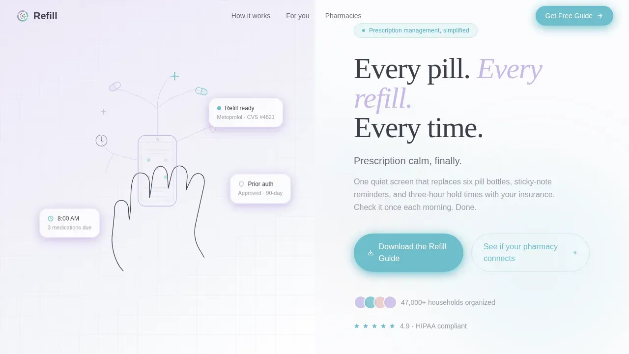
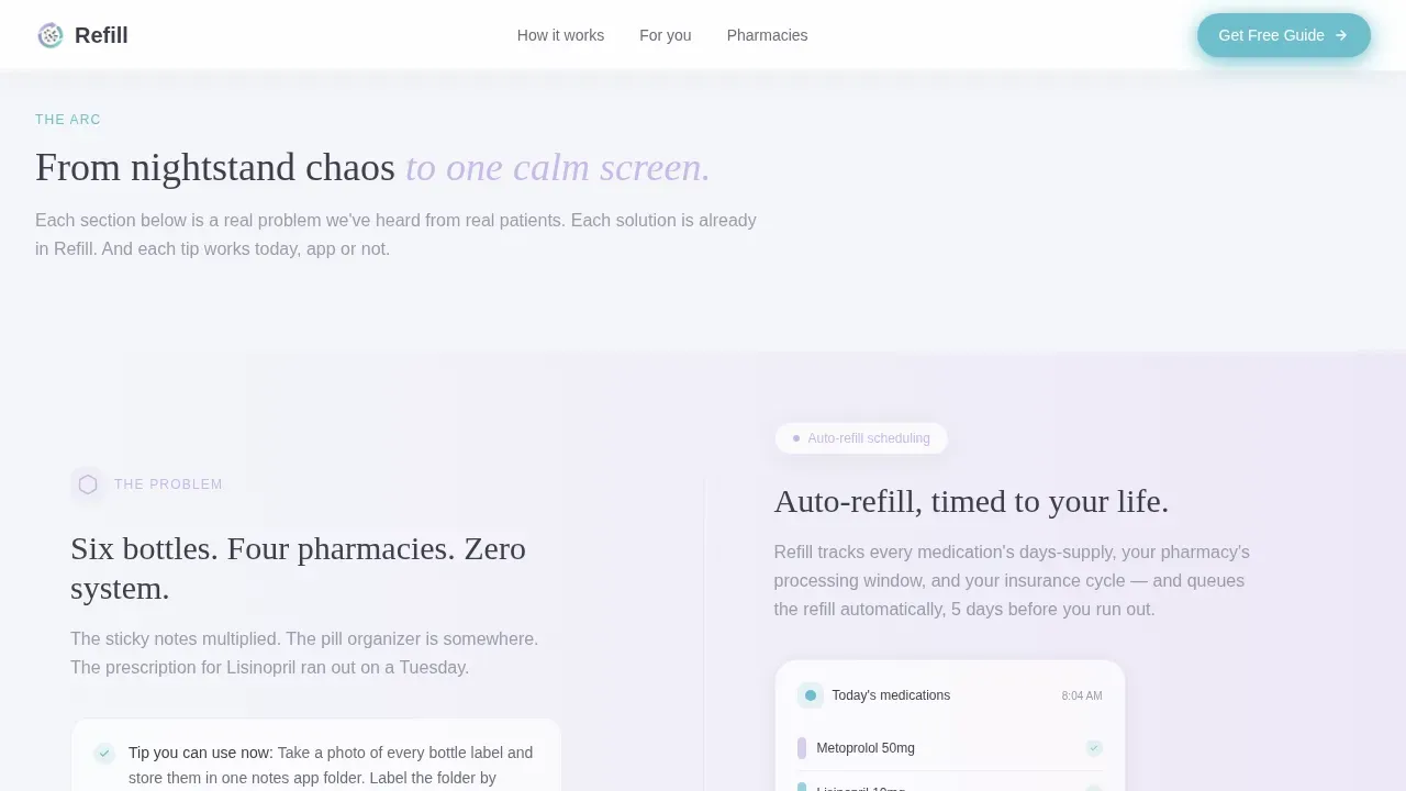
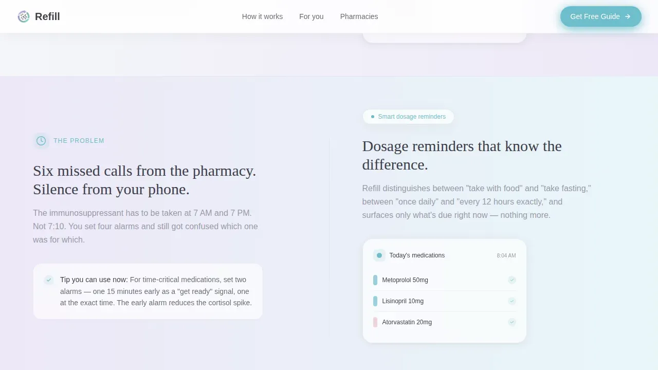
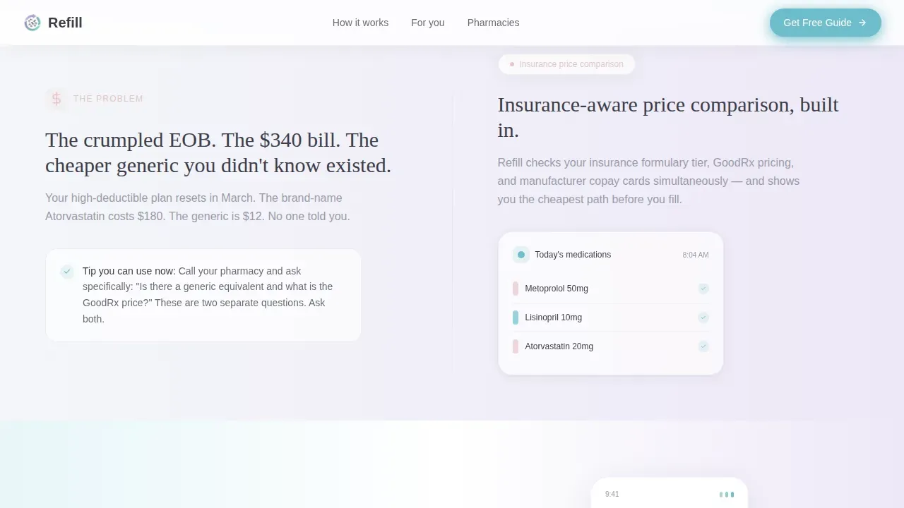
The 50/50 split-screen layout drives the entire page. The left panel displays line-art illustrations of prescription clutter; the right panel fills in progressively with app solutions as users scroll. Each reveal is tied to a scroll event so the transformation feels earned rather than sudden. This design structure keeps patients engaged and helps them see the value in order.
Personalized Email Capture Form
The primary call-to-action form collects an email address and a medication-count selection (1 to 3, 4 to 8, or 9 and above). This lets the template generate a personalized version of the free PDF guide for each visitor. Simplified forms reduce cognitive load, and this one asks only for required fields so patients can complete it quickly and return to reading.
Inline Pharmacy Compatibility Search
A soft-teal text link opens an inline search field where visitors type a pharmacy name and instantly view compatibility results. This section builds trust before the main form appears. It gives users a concrete reason to stay on the landing page and signals that the service connects with real-world pharmacy networks.
Persona Cards with Actionable Tips
Three persona cards display specific user stories: the long-distance caregiver, the transplant patient, and the cost-conscious freelancer. Each card includes a standalone tip the visitor can act on today, even without the app. This approach builds professionalism and credibility by demonstrating genuine understanding of real patient situations.
SVG Line-Art Illustration Header
The header spans the full viewport as a single continuous line-art drawing. A hand holds a phone whose screen dissolves into pill capsules, clock faces, and pharmacy crosses, all rendered without a break in the line. This visual strategy communicates simplicity and calm without relying on clinical stock photography.
Medication-Count Selector
The medication selector embedded in the capture form personalizes the guide delivery. Patients who manage a large number of prescriptions receive a more detailed document than those managing just one or two. This feature adds a practical data-collection layer to the form without adding friction for visitors who want to sign quickly.
Page sections overview
| Section | Purpose |
|---|---|
| Hero split screen | Introduces the app with line-art illustration on the left and headline call-to-action on the right |
| Problem arc panels | Shows prescription clutter on the left and fills the right panel with solutions as visitors scroll |
| Persona cards | Displays three real-user stories with a standalone tip and an active medication scenario each |
| Pharmacy compatibility search | Lets visitors type a pharmacy name and view connection details inline |
| Email capture form | Collects email and medication count to deliver a personalized PDF refill guide |
| Footer flow | Wraps the page in a horizontal footer pattern with links and trust signals |
Design & branding system
The design system is built around the Soft Mist color palette, a range of tones that feel like a clean pharmacy at dawn before the overhead lights come on. Backgrounds shift between morning fog white and faint lavender so gradually that the gradient reads as natural light rather than a designed effect.
- Color tokens: morning fog white (#F4F6F9) for backgrounds, inhale lavender (#C9B8E8) for accents, pulse blush (#E8C4C4) for secondary warmth, and reassurance teal (#6FBECC) for call-to-action buttons and active states
- Typography: Fraunces light serif for headlines, DM Sans for body text, and muted graphite (#3D3D4A) for all readable text to maintain a breathable clinical feel
- Illustration style: thin graphite stroke line art with SVG draw animations and floating card micro-animations that complete themselves in sync with the page scroll
Mobile & speed optimization
The template is designed desktop-first for the 50/50 split layout, but it stacks gracefully on smaller screens. Each section reorders into a single-column flow on mobile devices so patients on any device can still read and complete the form without friction.
- Interactive sections such as the pharmacy search and the email capture form are built as client-side components, while static content sections use server-side rendering to keep the initial load light
- Large, readable typography and clearly contrasting teal call-to-action buttons ensure the form fields and action prompts remain easy to tap on touchscreen devices
- Scroll-linked animations are designed to degrade cleanly on devices that do not support motion, so no section of the page breaks or disappears for any visitor
How this template helps you convert
The Refill template earns its conversion by giving real value before asking for anything. By the time a visitor reaches the email capture form, they have already received practical information on organizing their prescriptions.
- Each problem panel in the scroll arc includes a standalone tip visitors can use today, building trust in the voice behind the form so they feel confident enough to share their email address
- The medication-count selector personalizes the experience, making the guide feel like a document created specifically for the visitor's situation rather than a generic healthcare report
- The inline pharmacy compatibility search gives visitors a concrete interaction point earlier in the page, warming them up before they reach the final capture section
Other information about this template
This template sits in the Health and Medical category under the Telemedicine and Health Tech subcategory. It was created with a Soft Gradient theme and falls under the Content/Resource landing page direction, meaning the primary goal is to collect emails by delivering genuine value rather than pushing a direct sale.
- The template supports customization of your company logo placement, color tokens, and form fields so you can align it with your brand without rebuilding the layout
- You can embed the prescription refill form on an existing website or deploy the full landing page as a standalone destination
- The form is built to collect patient information including medication count and email, and the medication-count selector can be modified to store additional segmentation data as your services grow
- Many patients prefer to manage and refill prescriptions online, and this template is designed to meet that expectation with professionalism and calm
- The template is also relevant for life coaches working in health and wellness, medical staff building patient-facing resources, and office teams that want to simplify the prescription refill process for clients
- You can customize the prescription refill form fields to match your exact process, add your company logo, and enable payments or billing flows if your healthcare service requires them
- A Psych/Medical Note template for medical staff has been created separately and includes features such as the Active Diagnoses and Problem List section, which captures client diagnoses and problem data from connected programs; the Subjective/CC/HPI/Notes section for documenting the subjective part of a patient visit; and a Current Medications section that can display only active medications by pulling data from external systems
- The 'Delete from Note' functionality lets medical staff select only the sections relevant to a specific note, while the 'Do Not Include in PDF' option excludes certain sections from the final document
- Documentation of CURES can be check-marked to indicate when it was last completed and by whom, keeping records clear and auditable
Theme
Soft Gradient
Creative direction
Problem→Solution Arc
Color system
Soft Mist
Style
Split Screen (50/50)
Direction
Content/Resource
Page Sections
50/50 Split-screen Scroll Layout
Personalized Email Capture Form
Inline Pharmacy Compatibility Search
SVG Line-art Draw Animation
Persona Cards with Standalone Tips
Problem-to-solution Arc Sections
Related questions
Can I customize the form fields to match my prescription refill process?
Who is this template best suited for?
Does the template include a pharmacy compatibility search?
Can I add my company logo and adjust the color system?
Is this a single-page landing page or a multi-page website?



