Luxe Zero Waste Store Landing Page Template
Refill is a single-page landing page template built for bulk and zero-waste stores. It uses a masonry grid layout, an Obsidian and Gold color system, and visible per-unit pricing to guide visitors straight to the product. The design feels editorial and minimal, with every section working quietly toward one goal: the click.
by Rocket studio
Quick summary
Refill is a luxe minimal landing page template designed for bulk and zero-waste grocery stores. A price-anchored hero image opens the page, followed by a curated masonry grid that moves from pantry staples to household and body care. Visible pricing on every tile and a value comparison strip make the case for conscious living before the visitor ever leaves the page.
Who this template is for
This template suits store owners who sell by weight, run a zero-waste refill concept, or want to position a food and lifestyle retail brand as both intentional and affordable. The layout rewards businesses where the product itself is the story.
- Bulk and zero-waste grocery store owners looking for a design-forward landing page
- Food and lifestyle retailers who want editorial product presentation without a full catalog build
- Makers and independent shop owners selling pantry staples, household goods, or body care refills
What problem this template solves
Most retail templates force products into rigid rows that feel more like a stock spreadsheet than a curated shop. Refill solves the mismatch between beautiful physical stores and flat, uninspiring digital storefronts.
- A masonry grid replaces catalog-style rows, so products feel hand-picked rather than mass-listed
- Visible per-tile pricing removes the friction of clicking through to find the cost
- The weekly basket comparison strip anchors value before doubt can form
What you get with this template
The template delivers a complete single-page layout structured to move a curious visitor toward a confident click. Every section has a clear role, and nothing is redundant.
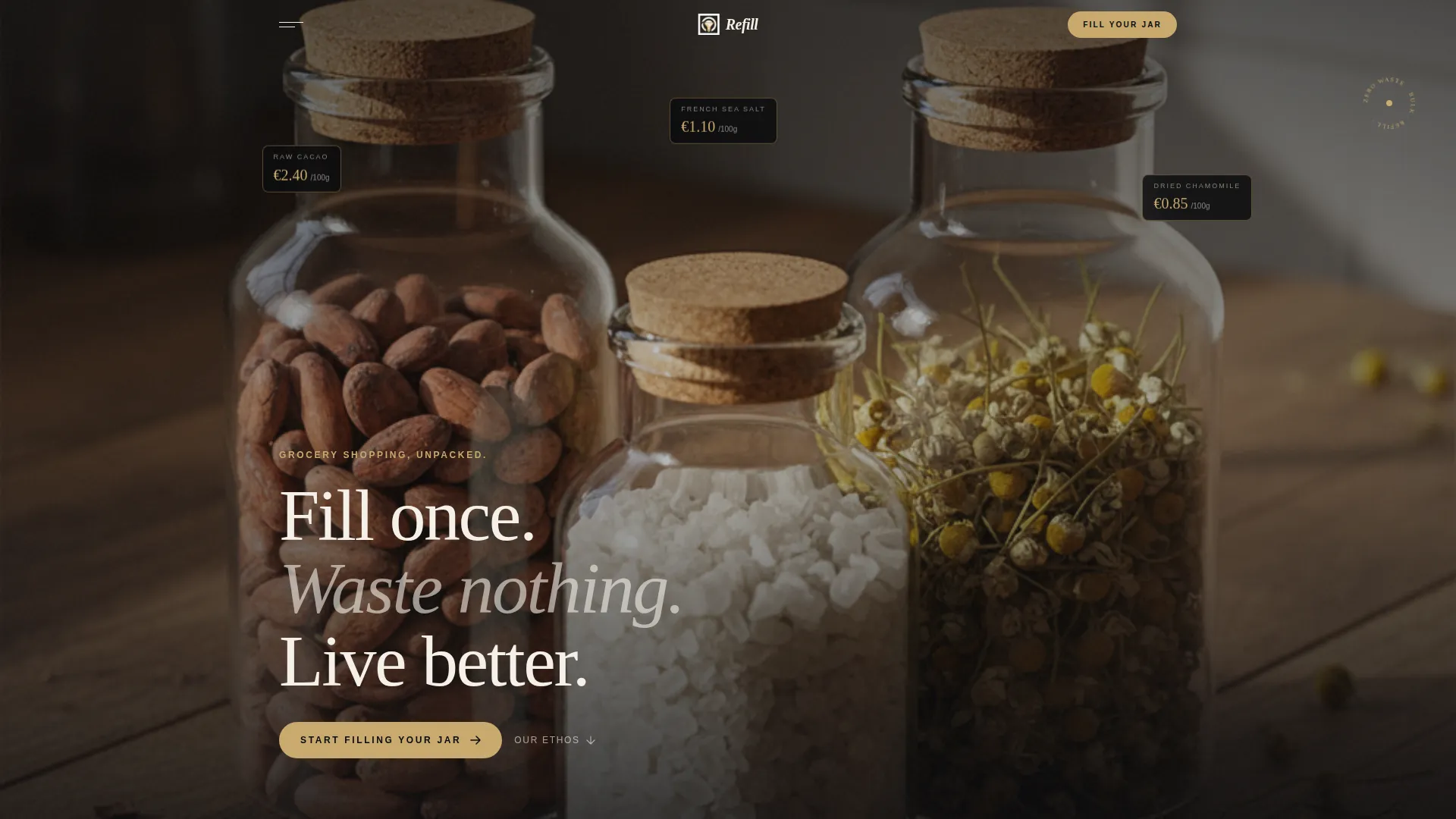
- A full-width, price-anchored hero section with a lifestyle photograph composition and tracked uppercase headline
- A curated masonry product grid with clickable cards, manifesto tiles, and a smooth category flow from pantry to body care
- A sticky mobile bottom bar repeating the primary call-to-action and a value comparison strip showing a sample weekly basket total
Feature list
This template is built around a focused set of purposefully chosen layout features. Each one comes directly from the design brief and serves a specific job on the page.
Price-Anchored Hero Section
The header opens with a full-width overhead lifestyle photograph showing three glass jars with floating gold price tags. A single tracked-out uppercase headline sits beneath: "Grocery shopping, unpacked." The price tags do the persuading before any copy begins.
Curated Masonry Product Grid
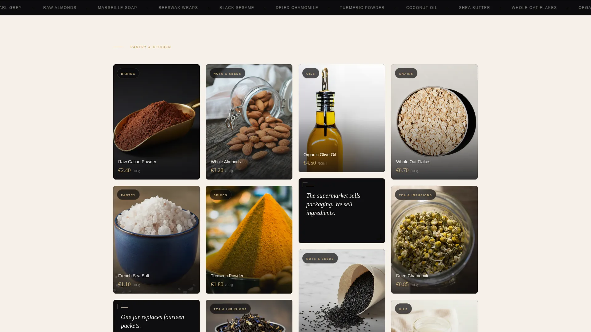
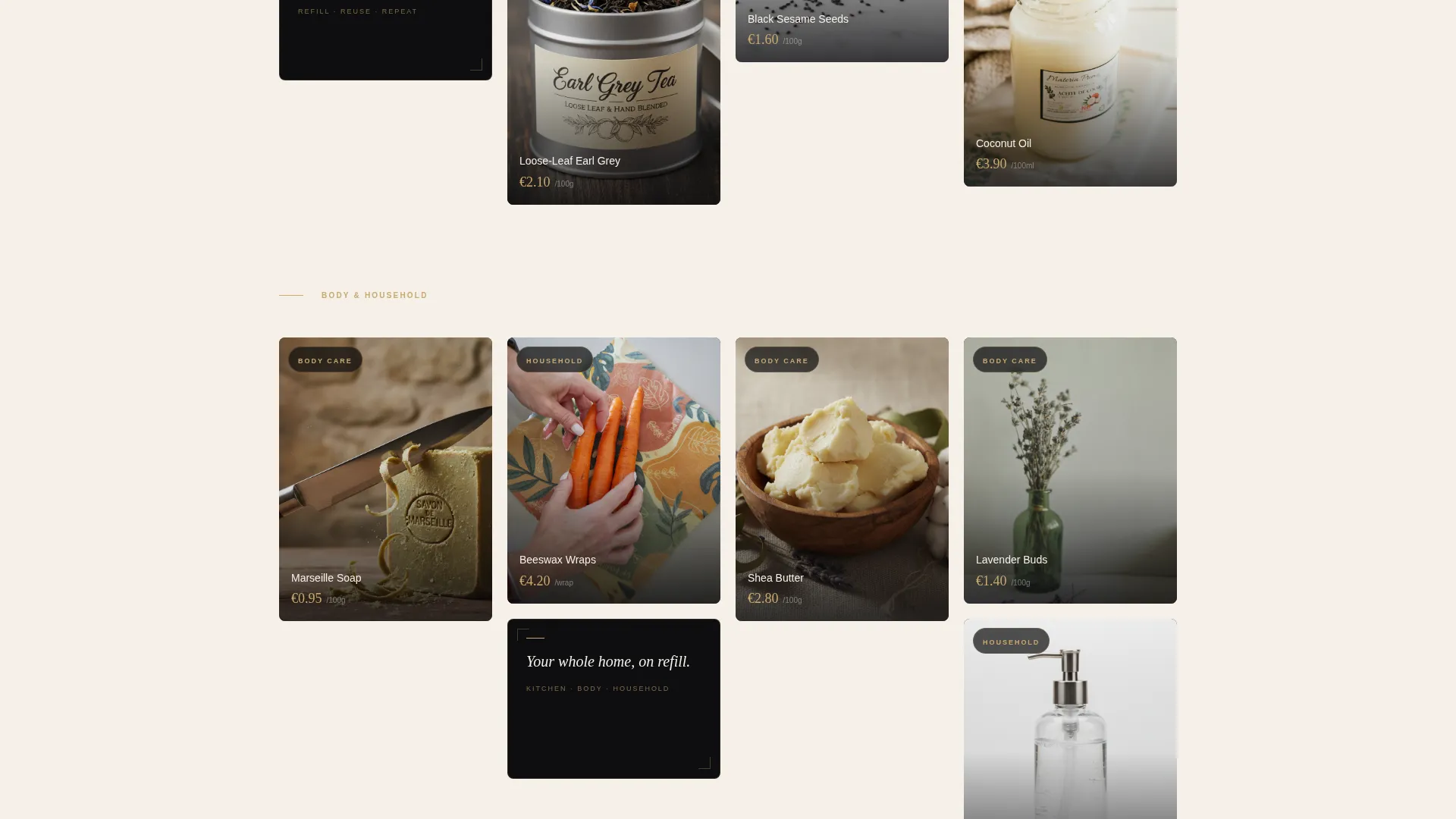
Products are arranged in a variable-height masonry grid rather than uniform rows. Each card holds a tight, editorial crop of a single ingredient or product. Scrolling feels like moving through a food photographer's portfolio, not a supermarket shelf.
Manifesto Interrupt Tiles
Every third tile in the masonry grid breaks the product rhythm with a short text statement set in gold on obsidian. Lines like "One jar replaces fourteen packets" reinforce the store's ethos without interrupting the shopping flow.
Visible Per-Tile Pricing
Every product card displays its price directly on the tile. No clicking through to discover cost. Transparency is built into the layout itself, which builds trust before the visitor has read a single word of copy.
Weekly Basket Comparison Strip
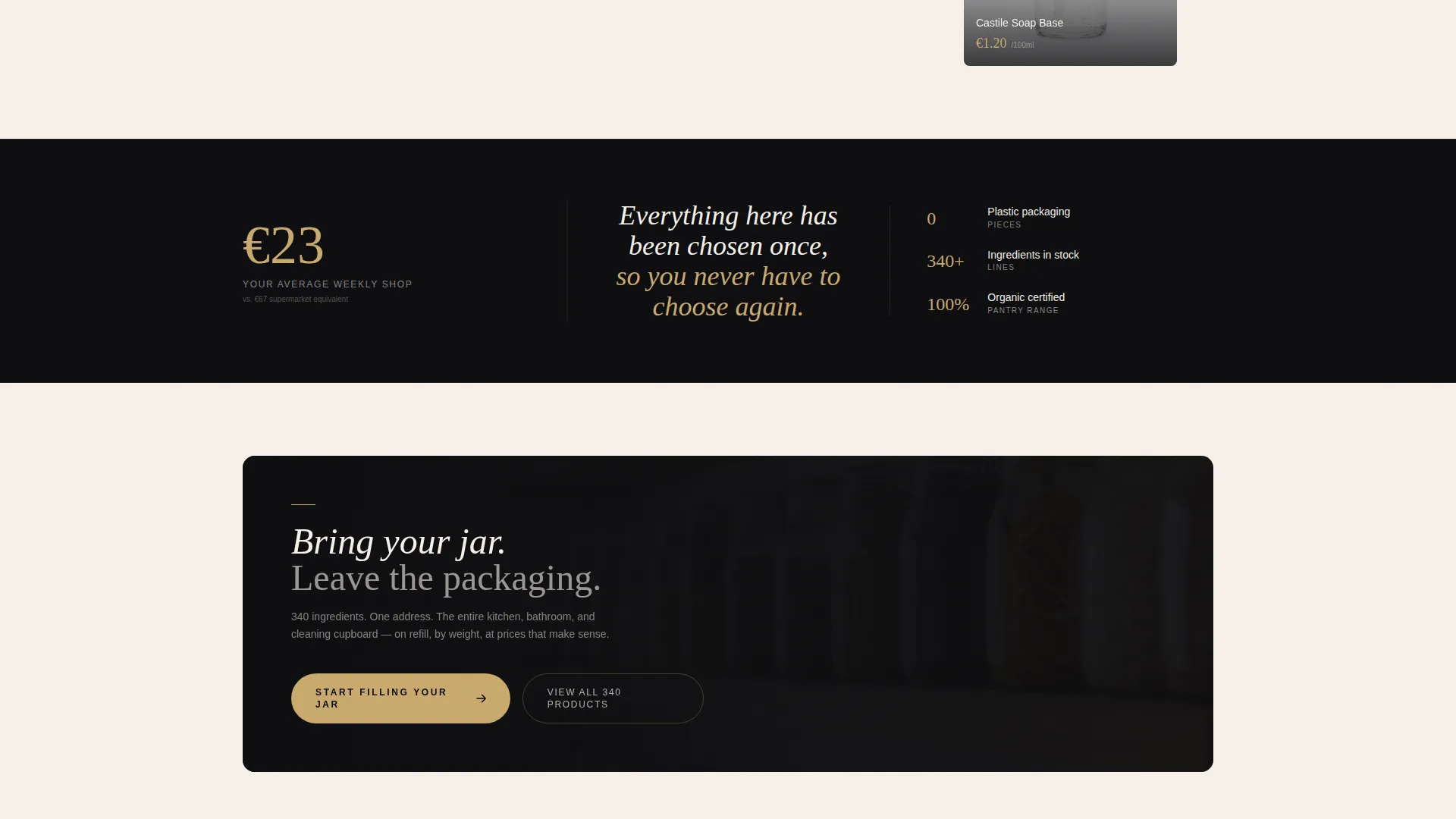
A dedicated strip shows a running "Your average weekly shop: €23" figure. It anchors the value proposition against the assumed cost of conventional grocery shopping and keeps price confidence high as the visitor scrolls.
Click-Through Call-to-Action System
The primary call-to-action button, "Start Filling Your Jar," appears after the first collection row in brushed gold on obsidian. On mobile, it repeats as a sticky bottom bar so the invitation to act is always visible.
Page sections overview
| Section | Purpose |
|---|---|
| Full-width hero | Opens with lifestyle photography and floating gold price tags |
| Tracked headline strip | Sets the brand tone in a single uppercase line |
| First masonry row | Introduces pantry staple products with visible pricing |
| Primary call to action block | Places the main call-to-action button after the first grid row |
| Value comparison strip | Anchors weekly basket cost against supermarket expectations |
| Expanded masonry grid | Continues product flow into household and body care |
| Manifesto interrupt tiles | Breaks the grid rhythm with short brand ethos statements |
| Sticky mobile bar | Repeats the call-to-action as a persistent bottom element on mobile |
Design & branding system
The visual identity is built on an Obsidian and Gold color system. The palette references a Marais perfumery: matte black labels, gold foil type, and deliberate negative space. Every product is treated as a single object, not part of a crowd.
- Core colors: deep obsidian black (#0B0B0D), warm parchment (#F5F0E8), muted charcoal (#2C2C2E), and brushed gold (#C9A96E) used for prices, hover states, and accent lines
- Typography is tracked out in uppercase for headlines, keeping the tone whisper-quiet and editorial
- Photography direction uses overhead compositions with shallow depth of field and morning light, referencing food and lifestyle editorial work rather than commercial product shots
Mobile & speed optimization
The template is designed with mobile behavior in mind. The sticky bottom bar ensures the call-to-action is always within reach on smaller screens, even mid-scroll through a long masonry grid.
- The sticky mobile call to action bar persists as the visitor scrolls, removing the need to scroll back to act
- The masonry grid adapts to narrower viewports without losing the editorial card-height variation that gives the layout its character
How this template helps you convert
Refill earns the click through price transparency, visual credibility, and a frictionless path to action. No forms. No account creation. Just a clear invitation and the confidence to take it.
- Visible pricing on every tile removes the most common reason a visitor hesitates: not knowing what something costs before committing to explore further
- The weekly basket comparison strip reframes the store as a money-conscious choice, not a premium indulgence, so value-minded visitors stay engaged instead of bouncing
- The sticky mobile call to action bar and the mid-page button placement mean the primary action is never more than a glance away, regardless of how far the visitor has scrolled
Other information about this template
Refill sits at the intersection of Luxe Minimal design and practical retail conversion. It is part of the Retail and E-Commerce category, within the Grocery and Food Store subcategory, and is specifically matched to the Bulk and Zero Waste Store niche. The template style is Masonry and Pinterest-inspired, with a Click-Through landing-page direction and a Price-Anchored header concept, all working together under the Curated Collection creative direction.
- Template category: Retail and E-Commerce, Grocery and Food Store, Bulk and Zero Waste Store niche
- The Obsidian and Gold color system is a deliberate identity choice, not a default palette swap
- The template is a single-page layout, so no multi-page navigation or sidebar structure is included
- Clickable masonry cards route to product detail or bundle pages, making the grid functional as well as editorial
- The manifesto tiles are editable text blocks, allowing store owners to set their own ethos statements in gold on obsidian
Theme
Luxe Minimal
Creative direction
Curated Collection
Color system
Obsidian & Gold
Style
Masonry/Pinterest
Direction
Click-Through
Page Sections
Price-anchored Hero Section
Curated Masonry Product Grid
Manifesto Interrupt Tiles
Visible Per-tile Pricing
Weekly Basket Comparison Strip
Click-through Call-to-action System
Related questions
Is this template suitable for a small refill shop with a limited product range?
Can I change the prices shown on the hero image and product tiles?
Does this template include a checkout or cart feature?
Can I add my own product photography?
Is the sticky mobile call-to-action bar easy to customize?



