Interior Design Studio Maintenance & Project Archive Website Template
This brutalist frosted glass interior design studio maintenance landing page template transforms a temporary offline page into a browsable project archive. Built on a dark concrete base with glassmorphic card modules, it lets visitors explore past work, feel invested, and follow through to the studio's Instagram portfolio. Bold brutalist design meets frosted-glass aesthetics in one striking, purposeful landing page.
by Rocket studio
Quick summary
This landing page turns a studio's downtime into an opportunity. Visitors land on a raw, industrial-feeling page and immediately begin exploring a frosted-glass project archive. Each card reveals finished work, building genuine interest before any ask is made. The design makes a bold statement from the first scroll, and the single conversion goal stays clear throughout.
Who this template is for
This template is crafted for design-forward studios and creative professionals who refuse to let a maintenance window feel like a dead end. It suits studios that want their website to keep delivering value even while offline.
- Interior design studios and boutique creative agency teams going through a site relaunch
- Property developers and boutique hoteliers who want to evaluate a studio's portfolio before committing
- Design-forward homeowners searching for a studio that treats space as art and function equally
What problem this template solves
Most maintenance pages are blank walls. They tell visitors nothing, earn no trust, and lose the audience a studio spent months building. This landing page solves that problem by making the wait feel like a curated preview rather than a closed door.
- Visitors leave typical maintenance pages immediately because there is nothing to read, explore, or feel connected to
- Studios lose potential clients during downtime because their website design offers no sense of capability or craft
- A standard coming-soon page gives users no reason to return, share the link, or follow the studio
What you get with this template
You get a fully structured, modular landing page built around a nine-card frosted-glass project archive. Every element is set up to guide visitors from curiosity to commitment without ever navigating away from the page.
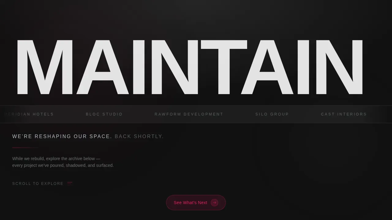
- A hero section with an oversized clipped wordmark, a drifting client logo marquee, and a single maintenance status line
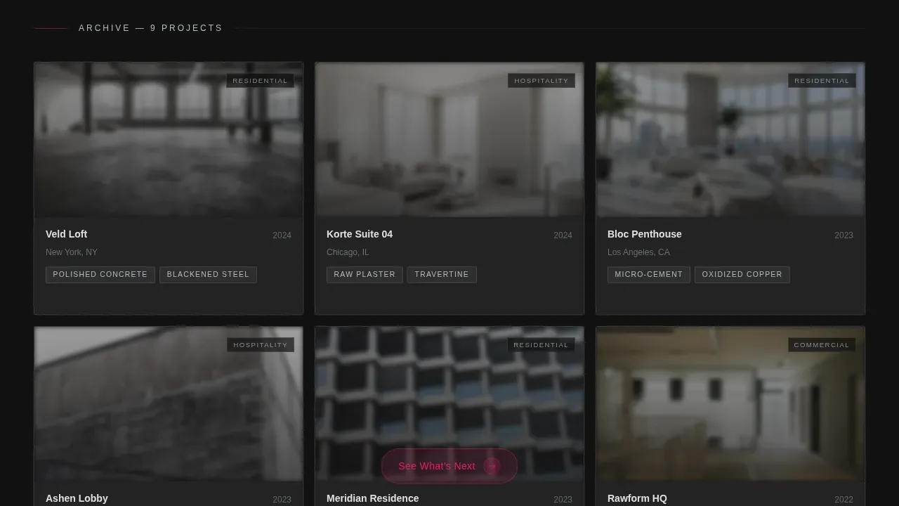
- A nine-card interactive grid where each card expands in place to reveal photographs and a project narrative
- A sticky "See What's Next" call-to-action pill and a triggered email capture toast that appears after three card interactions
Feature list
This landing page is packed with purposeful, prompt-backed functionality. Every feature serves the core goal: making visitors feel at home in the studio's world before the studio reopens.
Frosted Glass Card Archive Grid
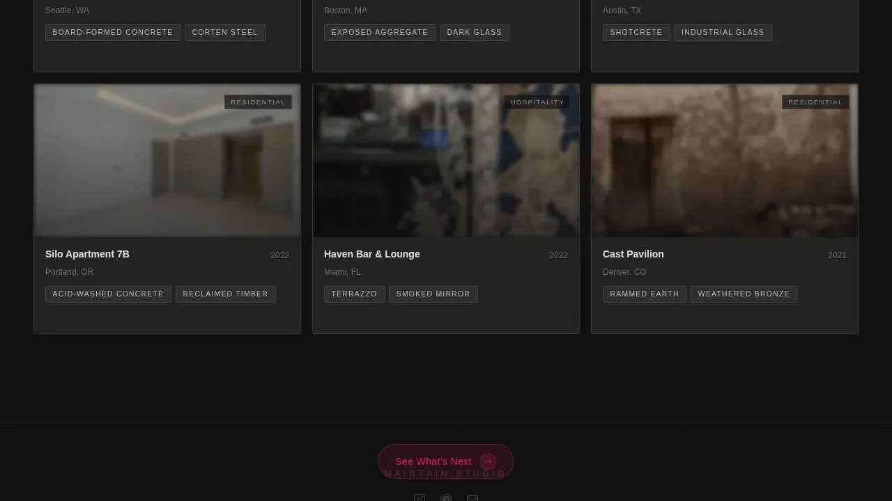
Nine modular cards sit on a charcoal concrete base. Each card shows a cropped interior photograph behind a frosted glass layer, a project name, and a material tag such as polished concrete, blackened steel, or raw plaster. Hovering a card sharpens the image and bleeds a magenta accent along the bottom edge. Clicking expands the card in place, pushing neighbors aside and revealing three additional photographs plus a single paragraph of project narrative.
Oversized Clipped Wordmark Hero
The studio's wordmark renders in oversized grotesque type, partially clipped by the viewport edge. It becomes architecture rather than typography. Below it, a horizontal client logo marquee drifts slowly left, etched in monochrome against a frosted glass band. A single line in etched glass gray reads the maintenance status.
Sticky Viewport-Pinned Call to Action
A frosted pill button reading "See What's Next" stays pinned to the bottom of the viewport throughout every scroll. The magenta text on frosted glass makes it visible without being aggressive. It travels with the user so the conversion moment is never more than one tap away.
Email Capture Toast Notification
After three card interactions, a subtle toast notification slides into view. It reads "Want first access when we reopen?" and presents a single email input field plus a "Notify Me" button. The form appears only when visitors have already shown genuine interest, making the ask feel earned rather than forced.
High-Fidelity Glassmorphic Visual System
The entire landing page runs on a glassmorphic color system. Poured concrete charcoal forms the base, frosted translucent white sits on every card surface, and sharp structural magenta marks hover states and active indicators. Etched glass gray handles secondary type. This combination of raw, unpolished brutalism and sleek frosted glass creates an Industrial Luxe aesthetic that stands apart from conventional web design.
Scroll-Reveal and Interaction Animations
Cards animate in using IntersectionObserver-powered scroll reveals. Hover states trigger blur-to-sharp transitions using CSS transforms and GPU-accelerated rendering. The marquee scrolls continuously. The expand-in-place card behavior and toast entrance animation complete a fully animated browsing experience without sacrificing load performance.
Page sections overview
| Section | Purpose |
|---|---|
| Wordmark Hero | Establishes studio identity with clipped oversized type and maintenance status line |
| Client Logo Marquee | Builds social proof through drifting monochrome client logos on a frosted band |
| Project Archive Grid | Nine frosted-glass cards form a browsable portfolio with expand-in-place detail views |
| Sticky call to action Pill | Keeps the Instagram conversion goal visible throughout the full scroll journey |
| Email Capture Toast | Collects relaunch notification emails after three card interactions |
| Minimal Footer | Delivers social icons and copyright with no visual clutter |
Design & branding system
The visual identity follows a Bold Brutalist theme executed through a glassmorphic palette. The result feels industrial and precise, not decorative. Brutalist design here is a deliberate reaction against soft, overproduced web aesthetics, emphasizing honest materials and bold geometric forms throughout every element.
- Base color is poured concrete charcoal (#1A1A1A), card surfaces use frosted translucent white at roughly 12% opacity, structural magenta (#E91E63) marks all hover and active states, and etched glass gray (#B0BEC5) handles secondary type
- Typography pairs DM Sans for body and interface text with Fraunces for display accents, creating a brutalist web typographic contrast between grotesque utility and editorial weight
- Cards float with subtle 1-pixel luminous borders that brighten on interaction, with blur stacking behind overlapping modules to mimic layered glass panes in a brutalist atrium
Mobile & speed optimization
The landing page is designed desktop-first to preserve the gallery-browsing experience. A mobile-responsive fallback ensures the page remains functional across devices. The technical approach keeps performance lean while delivering a high-animation design experience.
- Animations run entirely on CSS transforms, keeping them GPU-accelerated and off the main thread
- Brutalist designs typically use a minimal CSS structure, which contributes to faster load times compared to high-gloss, complex design systems
- IntersectionObserver powers all scroll-reveal triggers, so off-screen elements do not block rendering or consume unnecessary resources
How this template helps you convert
This landing page is built around a single, clear conversion goal: driving visitors to the studio's Instagram portfolio while capturing relaunch emails from the most interested users. Every design decision supports that goal.
- The project archive grid builds genuine investment before any ask is made. By the time visitors have opened three or four cards, they have already spent meaningful time with the studio's work and are naturally ready to follow the thread to the next destination.
- The sticky "See What's Next" pill stays visible throughout every scroll, so the conversion moment is always within reach without interrupting the browsing experience. The email toast appears only after real engagement, making both conversion paths feel like natural next steps rather than forced interruptions.
Other information about this template
This template is a strong match for any creative agency or design studio that wants its website to keep making a statement even during a relaunch. It suits teams who want to save time by starting with a fully structured, ready-to-customize page rather than building from a blank canvas.
- Brutalist web templates can be customized without requiring any custom code, and this template follows that same principle: all visual blocks are modular and independently editable
- Using a modular template design allows independent content blocks for easy updates without redesigning the full page, so you can swap project cards, update logos, or change the maintenance message in minutes
- No-code tools allow users to create websites without traditional programming skills, and this template is built to support that workflow from the first edit to launch
- The ui design follows brutalist web principles: raw, straightforward presentation without unnecessary elements, making it suitable for a design studio that wants to stand out and communicate a strong message
- Brutalist design creates pieces that age beautifully, developing patina and character over time, which is a quality this landing page reflects through its material-honest visual language
- The graphic design language draws from a monochromatic foundation with occasional magenta warmth, emphasizing texture over hue in the way brutalist interior design principles highlight the interaction between frosted glass and raw concrete
- This template can support studios relaunching after a period as short as 1 year or as long as a multi-phase renovation, keeping the audience warm and the brand visible throughout
- Brutalist furniture prioritizes function over ornament, and this template applies the same logic to every web design element: nothing is decorative unless it also delivers a purpose
- The design web approach here is a reaction against the lightness and frivolity of contemporary web design, delivering a bold, honest landing page that earns attention through craft rather than polish
Theme
Bold Brutalist
Creative direction
Interactive Explorer
Color system
Glassmorphic
Style
Card Grid (Modular)
Direction
Click-Through
Page Sections
Frosted Glass Project Archive Grid
Oversized Clipped Wordmark Hero
Sticky Viewport-pinned Call to Action
Triggered Email Capture Toast
Glassmorphic Industrial Luxe Visual System
Gpu-accelerated Scroll and Hover Animations
Related questions
Can I update the project cards without rebuilding the full landing page?
Does the email capture form appear automatically?
Is this landing page suitable for mobile users?
Can a creative agency outside interior design use this template?
What makes this different from a standard coming-soon page?



