Specialized Wellness Programs Reviews Website Template
Unwrite is a nature-inspired, single-column lead generation landing page template built for guided journaling therapy practices. It features a three-question embedded quiz, answer-reactive copy, a torn-paper sample prompt display, first-name social proof testimonials, and a minimal two-field lead capture form. The design uses a soft mist palette and gentle serif typography to feel warm, organic, and immediately trustworthy.
by Rocket studio
Quick summary
Unwrite is a lead generation landing page template designed for guided journaling therapy practices. It opens with a half-page hero photograph, flows through a personalized three-question quiz, and closes with a frictionless two-field sign-up form. The page earns the click before asking for anything. Every section is built to feel quiet, grounded, and genuinely useful to a visitor who is tired of being sold to.
Who this template is for
This template speaks directly to wellness practitioners and solo creators who need a high-quality lead generation landing page without starting from scratch. It is especially well-suited for people working in the journaling therapy space who want to capture leads through a meaningful, low-pressure experience rather than a generic sign-up wall.
The target audience for this template includes:
- Therapists who want to recommend a structured journaling practice as between-session homework and need a landing page to introduce it to clients
- Women in their thirties who journal sporadically and are ready to offer a framework-driven guide to others like themselves
- Burnt-out professionals and wellness creators who serve an audience that has already bounced off meditation apps and wants something quieter and more personal
What problem this template solves
Many wellness practitioners lose potential customers at the very moment those visitors are most open to help. A generic home page or a cold sign-up form does not meet people where they are emotionally. Sending traffic to a home page instead of a focused lead generation landing page means losing visitors before they ever understand the value of what you offer. This template solves that gap directly.
The core problems this template addresses:
- Visitors arrive anxious, burnt out, or grieving and immediately feel like they are being processed by a form rather than heard by a person
- Practitioners have no structured conversion funnel to move a curious visitor toward a committed lead without pressure or confusion
- The blank page problem that journaling itself tries to solve also shows up on the sign-up page, where generic copy fails to speak to anyone specifically
What you get with this template
This template delivers a complete, single-column lead generation landing page built specifically for a journaling therapy guide audience. Every section is purpose-built. Nothing is filler. The page is structured so that visitors experience the value of the guide before they are ever asked to sign up, which is one of the most effective ways to generate qualified leads in wellness markets.
What is included in this template:
- A full-page layout with seven distinct sections: hero, three-question quiz, sample prompt display, expressive writing neuroscience paragraph, first-name testimonials, guide preview with lead capture form, and a minimal footer
- A Soft Mist color system using fog-white, lichen green, river stone, and dried lavender, with Fraunces serif headlines and DM Sans body text
- Two primary calls to action in lichen green, a minimal two-field lead capture form asking only for a first name and email address, and a secondary free downloadable prompt PDF conversion path
Feature list
This template is packed with thoughtful, prompt-backed features that work together to guide visitors toward a single desired action without overwhelming users or cluttering the experience.
Quiz-Driven Personalized Flow
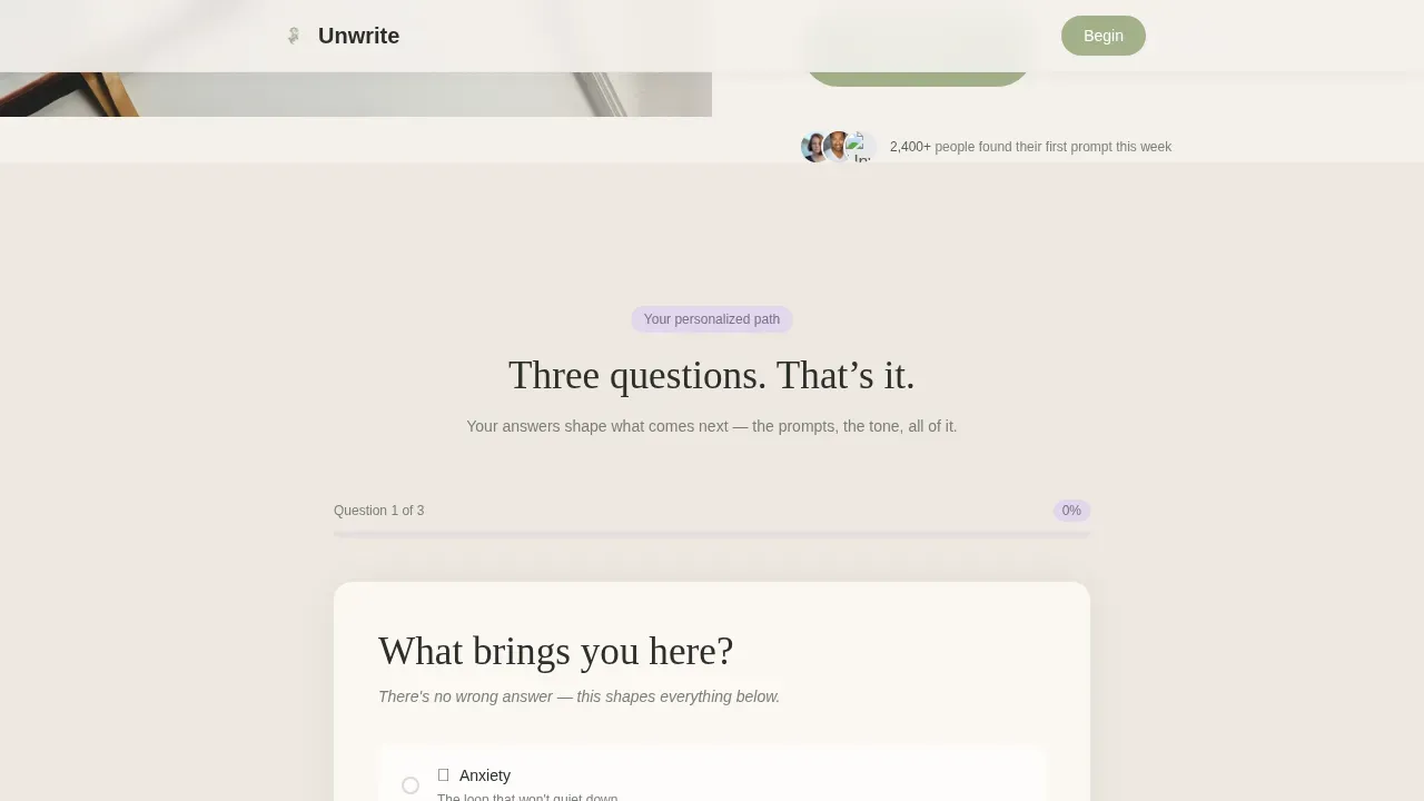
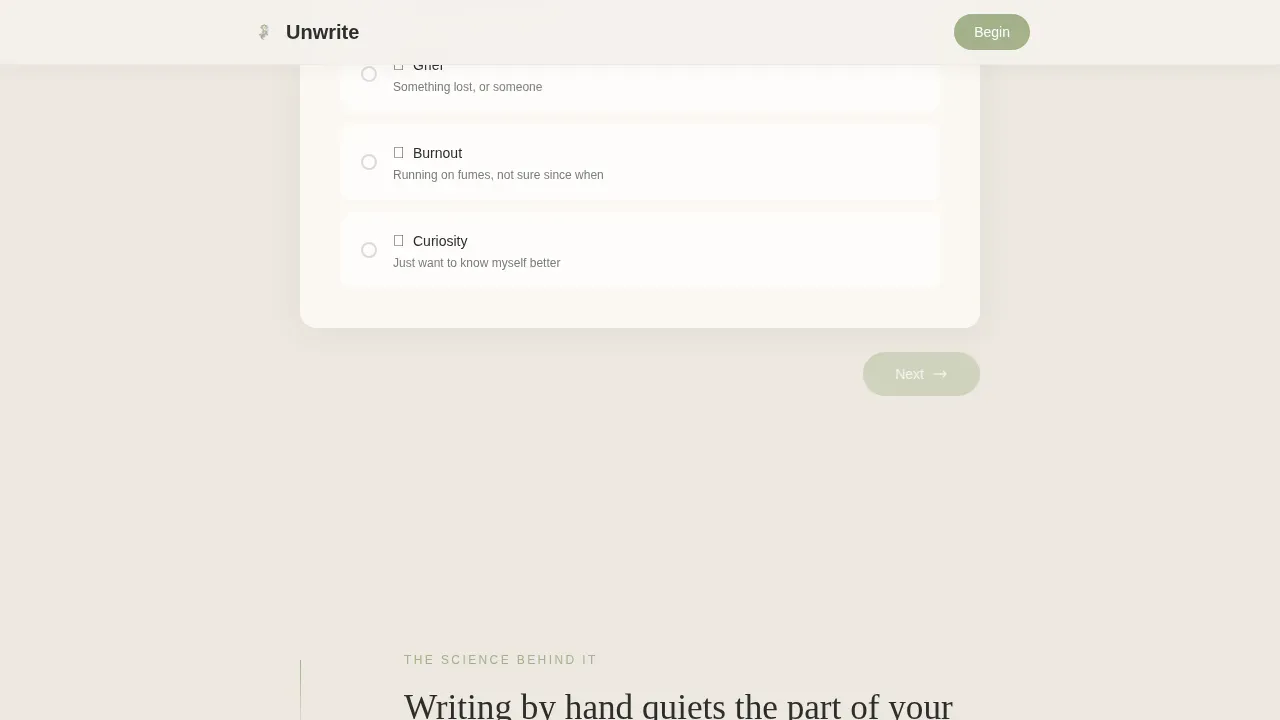
A three-question embedded quiz sits at the heart of this lead gen landing page. Visitors choose their reason for arriving, their journaling habit, and what stops them from writing consistently. Their answers subtly shift the language in the testimonials, sample prompt, and calls to action below. This approach makes the landing page feel like it is listening rather than broadcasting, which builds trust fast and keeps visitors moving through the conversion funnel naturally.
Half-Page Hero with Serif Headline
The hero section uses a split composition: a close-up photograph of a hand mid-sentence in a journal, natural light, and a warm background object just out of focus. Beside it, a strong headline set in Fraunces serif immediately communicates the core value proposition. The headline reads: "You don't need to know what to write. You just need the right question." This is outcome-driven copy that addresses the visitor's core pain point at first glance. A single lichen-green call-to-action button sits beneath it. No navigation links, no clutter, no distractions.
Torn-Paper Sample Prompt Display
Below the quiz, a genuinely usable journaling prompt appears on a torn-paper texture. This section is not decorative. It is functional social proof that the guide delivers real value. Visitors read the prompt, feel its usefulness, and understand what they will receive if they sign up. This is the template doing the selling through experience rather than assertion, which is one of the most effective techniques in any lead generation strategy.
Expressive Writing Science Section
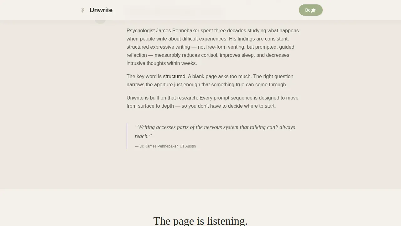
A short, conversational paragraph on the neuroscience of expressive writing follows the sample prompt. It gives the practice credibility without feeling clinical. The section is brief by design: minimal copy, maximum confidence. Visitors who need a logical reason to trust the guide find it here. Visitors who are already emotionally ready simply move past it without friction.
First-Name Testimonials in Handwritten Style
Three testimonials from real journalers appear in a handwritten-style font. Each is formatted as a first name followed by a single sentence. This format is intentional: it mirrors the intimacy of journaling itself and acts as quiet social proof without feeling like a marketing brochure. Trust signals do not need to be loud to be effective. These three voices do the work of establishing credibility precisely because they are understated.
Two-Field Lead Capture Form with Dual Conversion Path
The lead capture form asks only for a first name and email address, in that order. The placeholder text reads: "Just a name, this is your journal, not a mailing list." This copy is one of the most important trust elements on the page. It directly addresses the hesitation that stops potential customers from completing a form. Beneath the primary "Send Me My First Prompt" button, a quieter secondary text link offers a free guide: a downloadable PDF of five starter prompts for visitors who are not yet ready to commit. This low barrier secondary path captures leads who would otherwise leave without converting.
Page sections overview
| Section | Purpose |
|---|---|
| Hero split layout | Opens with a photograph and strong headline to set emotional tone and present the core value proposition |
| Embedded three-question quiz | Personalizes the page experience by capturing visitor intent and shifting reactive copy below |
| Sample prompt display | Shows a real journaling prompt on a torn-paper texture to demonstrate immediate, tangible value |
| Expressive writing science | Provides a brief, credible paragraph on the neuroscience behind journaling to build trust |
| First-name testimonials | Delivers quiet social proof through three single-sentence journaler voices in handwritten style |
| Guide preview and form | Previews what the personalized guide contains and presents the two-field lead capture form |
| Minimal footer | Closes the page with a clean horizontal footer pattern, no distracting links or navigation |
Design & branding system
The visual identity of this template is built around a nature-inspired Soft Mist palette that feels organic, warm, and never clinical. Typography pairs Fraunces, a gentle serif, for all headlines with DM Sans, a clean humanist sans-serif, for body copy. The result is a page that feels like a field journal left open on a windowsill during a rain shower: soft-edged, breathing, and honest.
Key design elements include:
- Fog-white (#F4F1EC) as the dominant background, shifting subtly to warm linen (#EDE8E0) between sections to create breathing room without hard dividers, with lichen green (#A3B18A) for button fills and section accents, river stone (#585C56) for body text, and dried lavender (#C9B8D9) as a secondary highlight on quiz elements and progress indicators
- Generous white space and minimal copy throughout, so the visual appeal of each section lands without crowding the visitor, and the page immediately communicates calm rather than urgency
- GSAP ScrollTrigger animations with staggered fades and smooth quiz state transitions that unfold one section at a time, keeping the scroll feeling deliberate and unhurried
Mobile & speed optimization
This template is built mobile-first, which matters significantly for this audience. Journaling happens on phones, in bed, on a lunch break, in a parked car. The people most likely to sign up are browsing on a small screen, often in a quiet personal moment. The template is structured so the landing page experience is just as considered and unhurried on mobile as it is on desktop.
Mobile and speed features include:
- Server Components handle all static sections of the landing page for fast rendering, while Client Components manage only the interactive quiz and its reactive state, keeping the page lean and responsive without sacrificing interactivity
- Large, tap-friendly calls to action, generous spacing between form fields, and a single-column layout that removes the need to reformat content for smaller screens, making mobile optimization a structural feature rather than an afterthought
How this template helps you convert
A lead generation landing page works when it gives before it asks. This template is built around that principle. Every section earns the next one. The quiz earns the sample prompt. The sample prompt earns the testimonials. The testimonials earn the form. By the time a visitor reaches the calls to action, they have already experienced what the guide delivers. That is what separates high converting pages from ones that simply look good.
- The embedded quiz acts as the first conversion step: it is therapeutic in itself, encourages visitors to reflect on their own needs, and creates a personalized experience that makes the lead capture form feel like a natural next step rather than an interruption
- The primary call to action, "Send Me My First Prompt," appears once below the quiz results and once at the page close, placed at the two highest-intent moments in the scroll without overwhelming users with repetition, while the secondary free guide download path offers an alternative desired action for visitors who need more time before committing
Other information about this template
This template is a strong fit for practitioners who want to launch pages quickly without writing from scratch or hiring a designer. The single-column flow keeps essential info easy to follow on any device. A dedicated lead generation landing page like this one consistently outperforms directing traffic to a home page, because it removes every distraction and focuses the visitor on one specific offer. Using a dedicated landing page for lead generation is more effective precisely because it avoids the noise that other pages introduce.
Landing pages are webpages that users land on after clicking on a social media post, a digital advertising campaign, or a Google Ads link. When the message on the landing page matches what brought the visitor there, conversion rates improve significantly. This template is structured with that message-match principle built in: the quiz reactive copy ensures that visitors from different sources, whether anxiety-focused, grief-focused, or burnout-focused, see language that reflects their own intent.
Additional considerations for buyers and practitioners using this template:
- This template is relevant regardless of company size: solo practitioners, small group practices, and independent wellness creators can all use it effectively as a lead gen landing page without customizing the structure
- The free guide download path, a secondary conversion option offering five starter prompts as a white paper-style PDF, captures leads who are not ready for the primary offer, broadening the reach of the lead generation strategy without adding form complexity
- The form asks only for a first name and email, which is intentional: to minimize form fields is to respect the visitor's time and reduce hesitation, which is one of the most reliable ways to capture leads and generate more leads from the same traffic
- Effective lead capture landing pages like this one include trust elements that reduce hesitation, and this template handles that through conversational copy in the form placeholder, understated testimonials, and a secondary path that lets visitors take the lead capture form at their own pace
- The template is built as a single-column flow, which naturally guides visitors downward without branching off to other pages, keeping the conversion funnel clean and the visitor focused on one clear desired action
- All calls to action use lichen green, creating a consistent visual signal that lets visitors immediately identify interactive elements at every scroll depth
- Buyers can fine tune the quiz questions, testimonial copy, sample prompt, and guide preview content to match their specific practice or audience without restructuring the layout
- The best examples of lead gen landing pages give before asking, and this template encodes that principle into its section order: value first, form last, with trust elements woven throughout
- This template includes all the good stuff a wellness lead gen landing page needs: a strong headline, persuasive content, social proof, minimal form fields, clear calls to action, and a secondary conversion path that captures visitors who are almost ready but not quite
- Capture landing pages in the wellness space perform best when they feel personal rather than promotional, and this template achieves that through handwritten testimonial styling, torn-paper textures, and quiz-reactive language that mirrors the visitor's own words back to them
- The page avoids security badges and formal compliance language by design: the trust signals here are tonal and copy-driven rather than legal, which fits the emotional register of a journaling therapy audience
- Prospective customers and therapists recommending this guide can use the landing page as a standalone destination or as the end point of a lead gen landing sequence driven from content or paid traffic

Theme
Nature-Inspired
Creative direction
Quiz & Personalize
Color system
Soft Mist
Style
Single Column Flow
Direction
Lead Generation
Page Sections
Quiz-driven Personalized Content Flow
Half-page Hero with Outcome-driven Headline
Torn-paper Sample Prompt Display
First-name Social Proof Testimonials
Two-field Lead Capture Form with Dual Conversion Path
Nature-inspired Soft Mist Design System
Related questions
Can I edit the quiz questions and copy to match my journaling practice?
Does this template work for therapists recommending journaling as structured homework?
What does the two-field form ask for, and why only two fields?
Is this template suitable for running paid traffic, such as Google Ads campaigns?
What is the secondary conversion path for visitors who are not ready to sign up?