Retail Technology Consultant Landing Page Template
Reframe is a single-page landing page template built for retail technology consultants who need to command instant credibility. It pairs a cinematic manifesto header, mosaic testimonial tiles, and side-by-side comparison tables into one authoritative editorial flow. The result is a page that builds a case like a closing argument and drives a single decisive click.
by Rocket studio
Quick summary
Reframe is a comparison table landing page template designed for retail technology consultancies. It opens with a full-viewport manifesto header, moves through a testimonial mosaic, and resolves into hard-data comparison tables. The entire page is engineered around one outcome: earning enough trust that "See What's Costing You" feels like the obvious next step.
Who this template is for
This template is built for consultants who already have the expertise. What they need is a page that communicates that expertise at a glance. Reframe speaks directly to retail operations advisors who work with mid-market chains, direct-to-consumer brands stepping into physical retail, and legacy department store groups overdue for a technology overhaul.
- Retail technology consultants and advisory firms targeting VP-level operators
- Independent consultants pitching point-of-sale migrations or omnichannel strategy engagements
- Boutique consultancies whose past results deserve a stronger stage than a generic agency template
What problem this template solves
Most professional services landing pages look like brochures. They list capabilities, show a logo wall, and ask for a meeting. That approach fails when your buyer is a skeptical senior operator who has already been burned by a bad vendor. Reframe replaces the brochure model with an editorial authority model, using client voices and comparative evidence to do the persuading.
- Consultants struggle to turn real results into compelling proof on a single page
- Generic templates dilute credibility for high-stakes B2B engagements
- Prospects abandon pages that lead with services before they lead with understanding
What you get with this template
Reframe delivers a fully structured single-page layout with distinct visual zones, each serving a specific persuasion role. Every section transitions from voice to data to voice again, keeping the reader both engaged and informed. Nothing floats without a human anchor.
- A full-viewport manifesto header with typewriter animation and signal-red pull quote treatment
- A scrolling testimonial mosaic that transitions into structured comparison tables
- A multi-placement click-through call-to-action system with sticky bottom bar behavior
Feature list
Reframe includes a focused set of structural and visual components drawn directly from the brief. Each one serves a specific role in the editorial authority model.
Full-Viewport Manifesto Header
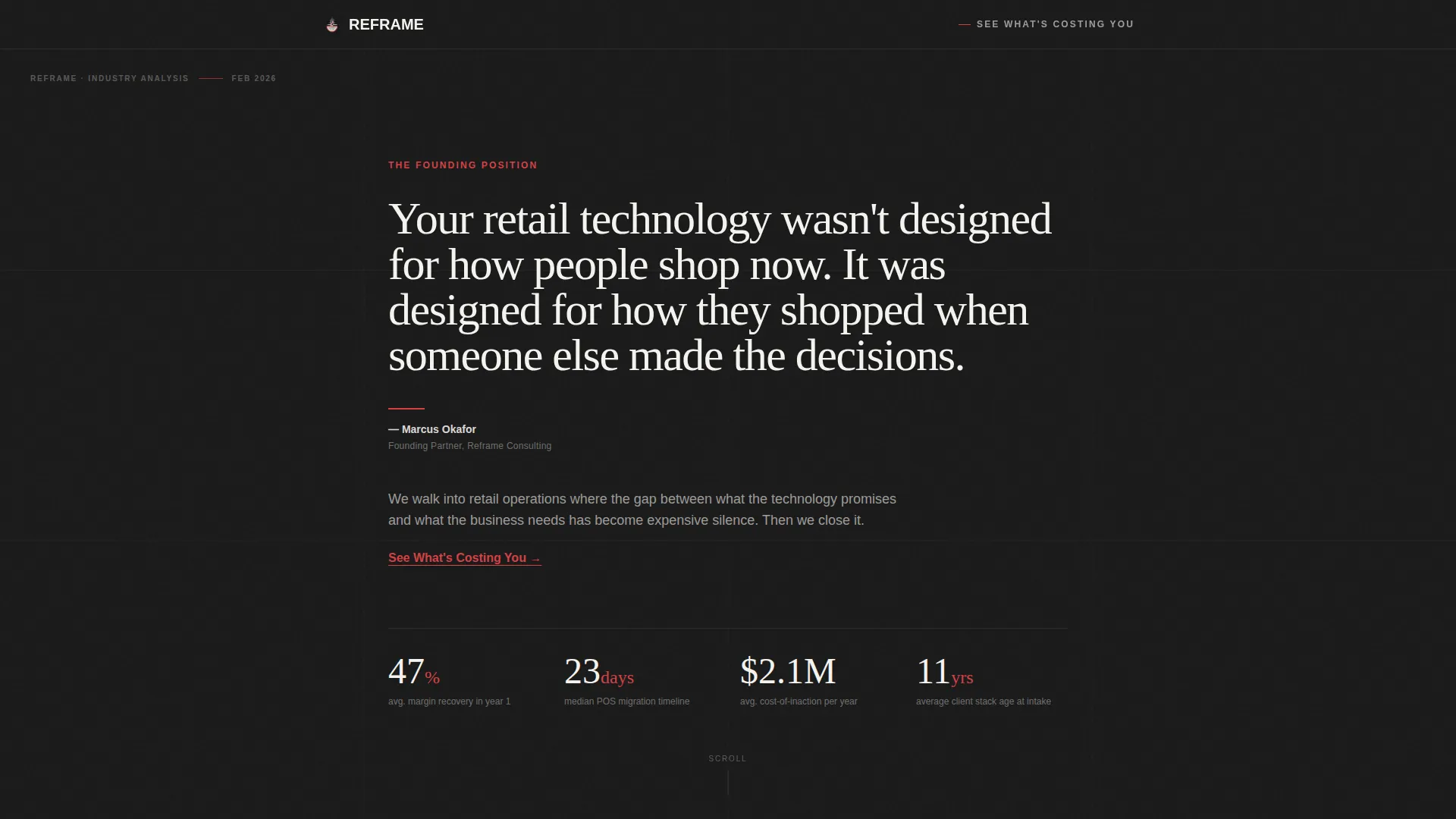
The header occupies the entire first screen. It uses oversized serif typography on a stark black background with warm white text. A typewriter animation runs for two seconds, then the full quote snaps into place. A thin signal-red rule sits beneath the attribution line crediting the founding partner.
Testimonial Mosaic Grid
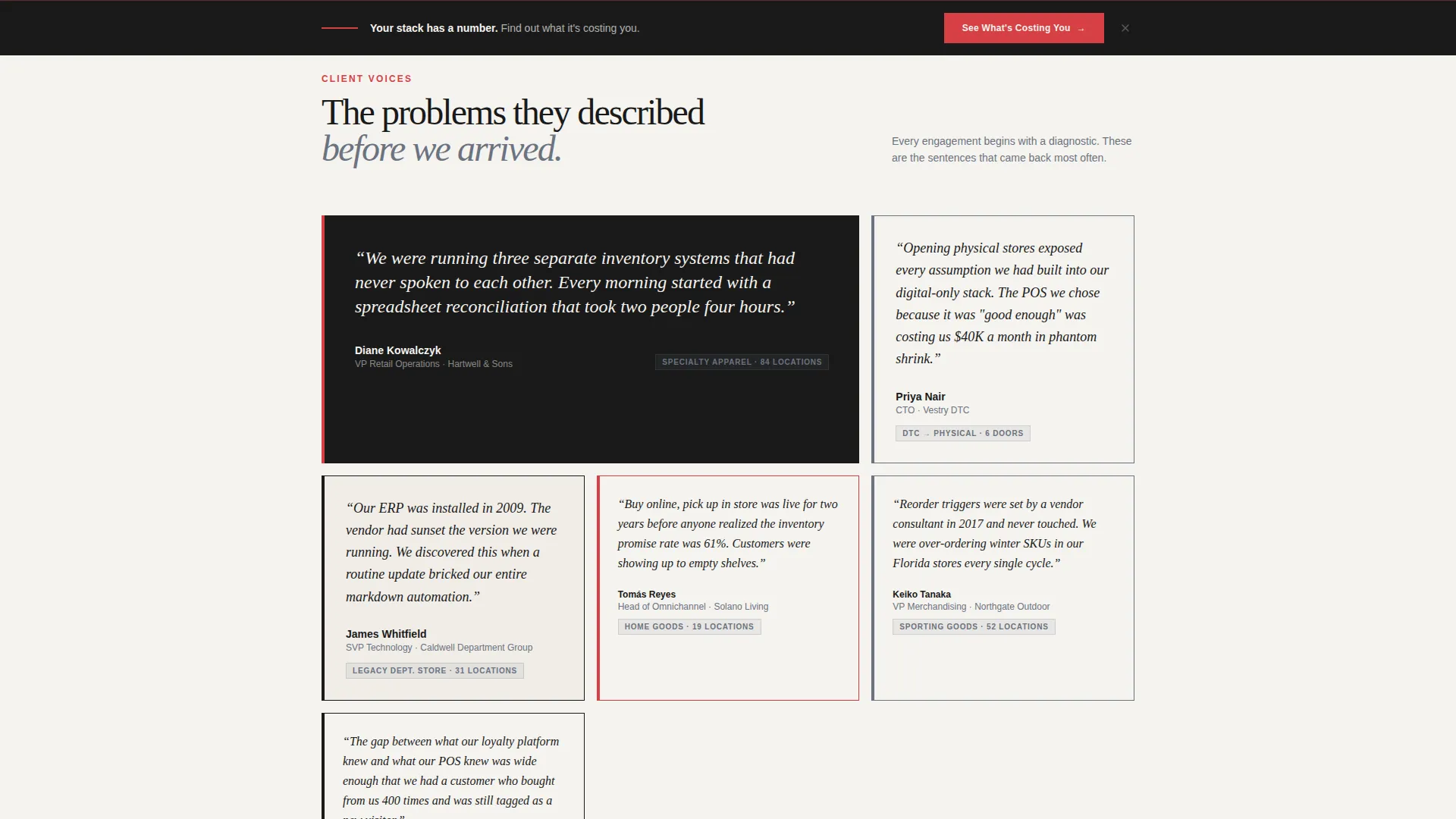
Client voices appear as individual tiles, each containing a named retail leader, their company, and a single focused sentence describing the problem they faced before the engagement. The tiles rearrange as the user scrolls, then resolve into the comparison table sections below.
Side-by-Side Comparison Tables
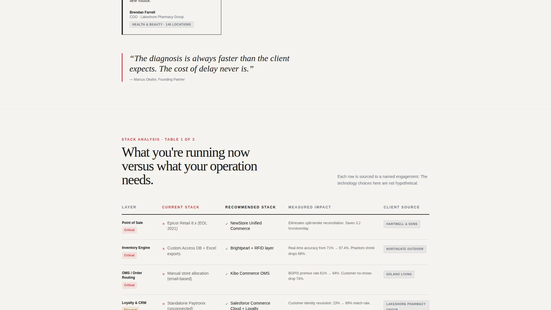
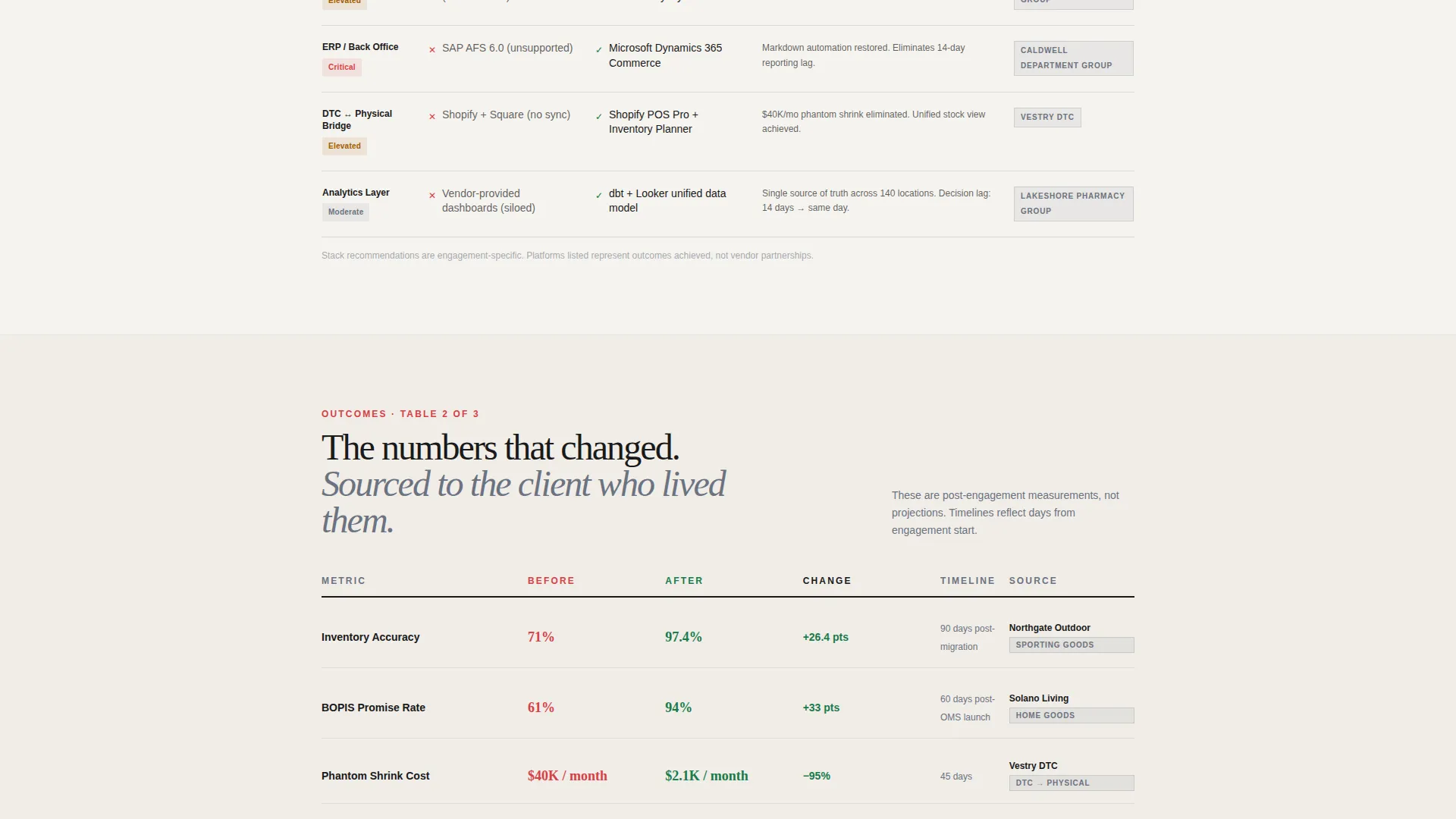
The comparison tables present legacy stack versus recommended stack, before-metrics versus after-metrics, and cost-of-inaction versus cost-of-engagement. Each table row is anchored to a specific client story, so the data always carries a human source.
Multi-Placement Call-to-Action System
The primary call-to-action, "See What's Costing You," appears three times in a deliberate sequence. First as a red-underlined text link inside the manifesto. Then as a full-width button after the second comparison table. Then locked into a sticky bottom bar after the third scroll depth is reached.
Editorial Monochrome Steel Design System
The visual identity uses four values only: editorial black, brushed steel mid-gray, warm newsprint white, and signal red reserved for interactive elements and pull quotes. Typography carries the page. Whitespace acts as punctuation.
Diagnostic Click-Through Routing
Clicking the call-to-action routes the prospect to a separate diagnostic landing page. There, they select their retail vertical, current point-of-sale platform, and number of locations. The main page carries no form, keeping the conversion goal singular and unambiguous.
Page sections overview
| Section | Purpose |
|---|---|
| Manifesto Header | Opens with authority using a full-viewport cinematic quote and typewriter animation |
| Testimonial Mosaic | Surfaces named client voices and problem statements as scrollable tiles |
| Comparison Table One | Contrasts legacy technology stack with the recommended modern stack |
| Comparison Table Two | Shows before-metrics versus after-metrics anchored to real client stories |
| Comparison Table Three | Presents cost-of-inaction versus cost-of-engagement data |
| Sticky call to action Bar | Locks the primary call-to-action into view after the third scroll depth |
Design & branding system
Reframe uses a Monochrome Steel color system that feels like a freshly printed business quarterly. The design prioritizes typographic weight and editorial restraint over decorative elements. Signal red appears sparingly, which makes every instance of it carry full visual impact.
- Color palette: editorial black (#1A1A1A), brushed steel mid-gray (#6B7280), warm newsprint white (#F5F3EF), signal red (#D64045) for interactive elements and pull quotes only
- Typography: oversized serif faces for headlines and pull quotes; whitespace used as deliberate structural punctuation throughout the layout
- Visual tone: ink-heavy, restrained, zero illustration or photography in the header section
Mobile & speed optimization
The single-column editorial flow adapts naturally to smaller screens. The sticky bottom bar call-to-action keeps the conversion path accessible regardless of scroll depth on any device. The typewriter animation and tile rearrangement behavior are contained within the page structure without relying on external dependencies.
- Sticky bottom bar keeps the primary call-to-action reachable on mobile throughout the full scroll
- Comparison tables are structured for horizontal readability and can be adapted for narrower viewports
- Single-page layout reduces navigation complexity and keeps mobile visitors focused on the core message
How this template helps you convert
Reframe is built around a single click, not a form submission. The entire page structure is a deliberate argument, not a catalog. Every design and copy decision pushes toward one moment: the prospect clicking through to the diagnostic page.
- The manifesto header stops the scroll immediately and frames the consultancy's authority before a single capability is mentioned, creating curiosity before credibility is even claimed.
- The alternating rhythm of client voice and comparison data builds a layered case, so by the time the full-width call-to-action button appears, the reader has already been persuaded across multiple evidence types.
- The sticky bottom bar ensures the call-to-action is never more than a glance away, removing friction at the exact moment a prospect decides they have seen enough to act.
Other information about this template
Reframe was designed with a specific buyer archetype in mind: the VP-level retail operator who reads critically, moves carefully, and does not respond to pressure tactics. The template earns the click through editorial authority rather than urgency copy. It is well suited to consultancies offering point-of-sale migrations, inventory intelligence reviews, and omnichannel orchestration engagements. The no-form approach on the main page is intentional. It reduces perceived commitment and increases the likelihood of a first click, while the diagnostic routing page handles qualification downstream. This template fits a partnership and business-to-business landing page direction, making it appropriate for high-consideration professional services engagements where trust must be established before any ask is made.
- Suitable for retail technology consultancies, omnichannel strategy advisors, and inventory operations specialists
- The diagnostic routing flow separates awareness from qualification, keeping the main page clean
- The editorial magazine visual theme positions the firm as a thought leader rather than a vendor
Theme
Educational Guide
Creative direction
Logo Wall Authority
Color system
Slate & Sky
Style
Single Column Flow
Direction
Partnership/B2B
Page Sections
Full-viewport Manifesto Header
Scrolling Testimonial Mosaic
Side-by-side Comparison Tables
Multi-placement Call to Action System
Diagnostic Click-through Routing
Monochrome Steel Editorial Design
Related questions
Does this template include a contact form?
Can I replace the comparison table data with my own client results?
Is this template suitable for a consultancy focused on one retail vertical?
How does the typewriter animation in the header work?
What happens after a visitor clicks the call-to-action button?



