Trauma-Informed PTSD Exercise Program Landing Page
Regulate is a single-column landing page template built for a trauma-informed fitness program targeting combat veterans, first responders, and survivors of sexual assault. It pairs clinical movement protocols with nervous system regulation techniques, then guides visitors through a low-pressure five-question readiness assessment. The design feels calm, authoritative, and safe before it ever asks for a commitment.
by Rocket studio
Quick summary
Regulate is a trauma-informed PTSD exercise program landing page template. It opens with stark, typographically dominant hero copy, guides visitors through a scrolling expert panel, presents program pillars backed by peer-reviewed citations, and closes with a gentle nervous system readiness quiz. Every design and layout decision is made to lower psychological threat signals, not raise them.
Who this template is for
This template is built for programs that serve people whose relationship with their own body has been disrupted by trauma. It works best when trust-building is the entire sales strategy, not just a section of it.
- Trauma-informed fitness coaches and clinical wellness programs serving veterans, first responders, or survivors
- Trauma psychologists and kinesiologists who want a co-branded program presence that reflects their clinical credibility
- Program founders who need a landing page that earns deep trust before asking for enrollment
What problem this template solves
Standard fitness landing pages are designed for motivated buyers already excited to start. This audience is different. Crowded gym photography, countdown timers, and aggressive calls to action can trigger avoidance responses in people carrying post-traumatic stress disorder. The template removes every common conversion tactic that could read as a threat.
- Survivors often abandon pages that feel pushy, loud, or visually chaotic before reading a single word
- Clinicians and coaches lose credibility when their program page looks identical to a generic fitness sales funnel
- A high-pressure quiz or visible progress bar can cause visitors to disengage before they reach the offer
What you get with this template
The template delivers a complete single-column landing page flow, from a zero-image hero section to a footer, without requiring any custom development. Each section is purpose-built for a specific trust-building role in the visitor journey.
- A full hero, expert panel, program pillars bento grid, peer-reviewed proof section, assessment call to action, and single-row footer
- A five-question nervous system readiness assessment with one question visible at a time and no visible progress pressure
- Scroll-triggered reveal animations with reduced-motion support so the page never startles or overwhelms
Feature list
A paragraph introduces the feature set: every element in this template has a documented reason tied to the clinical and emotional goals of the brief. Nothing is decorative without purpose.
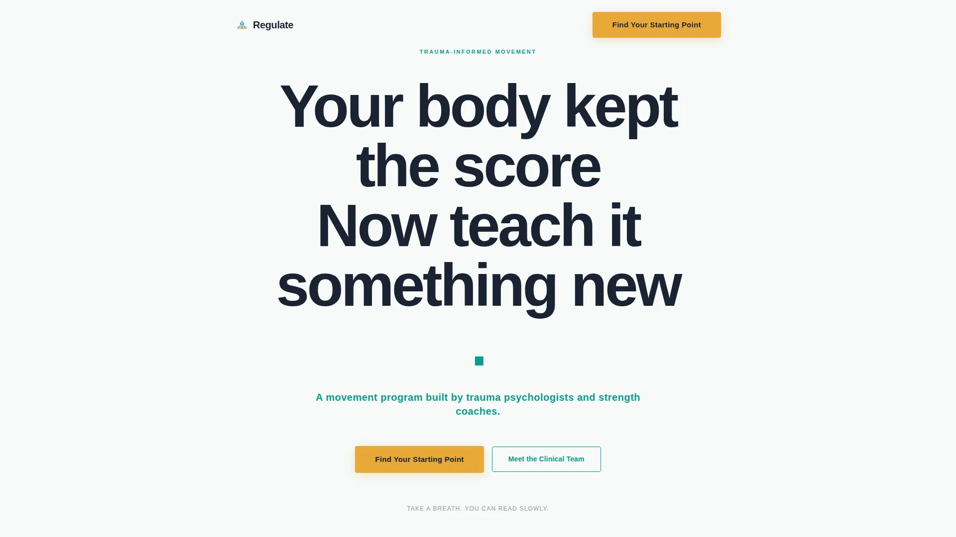
Giant Headline Hero Section
The hero uses maximum-scale centered typography on a stark white background with zero imagery. The headline "Your body kept the score. Now teach it something new." is set in Plus Jakarta Sans at viewport-dominating weight. A single teal subheadline provides clinical grounding. The emptiness of the layout is intentional: the nervous system has nothing to scan for threats.
Scrolling Expert Panel
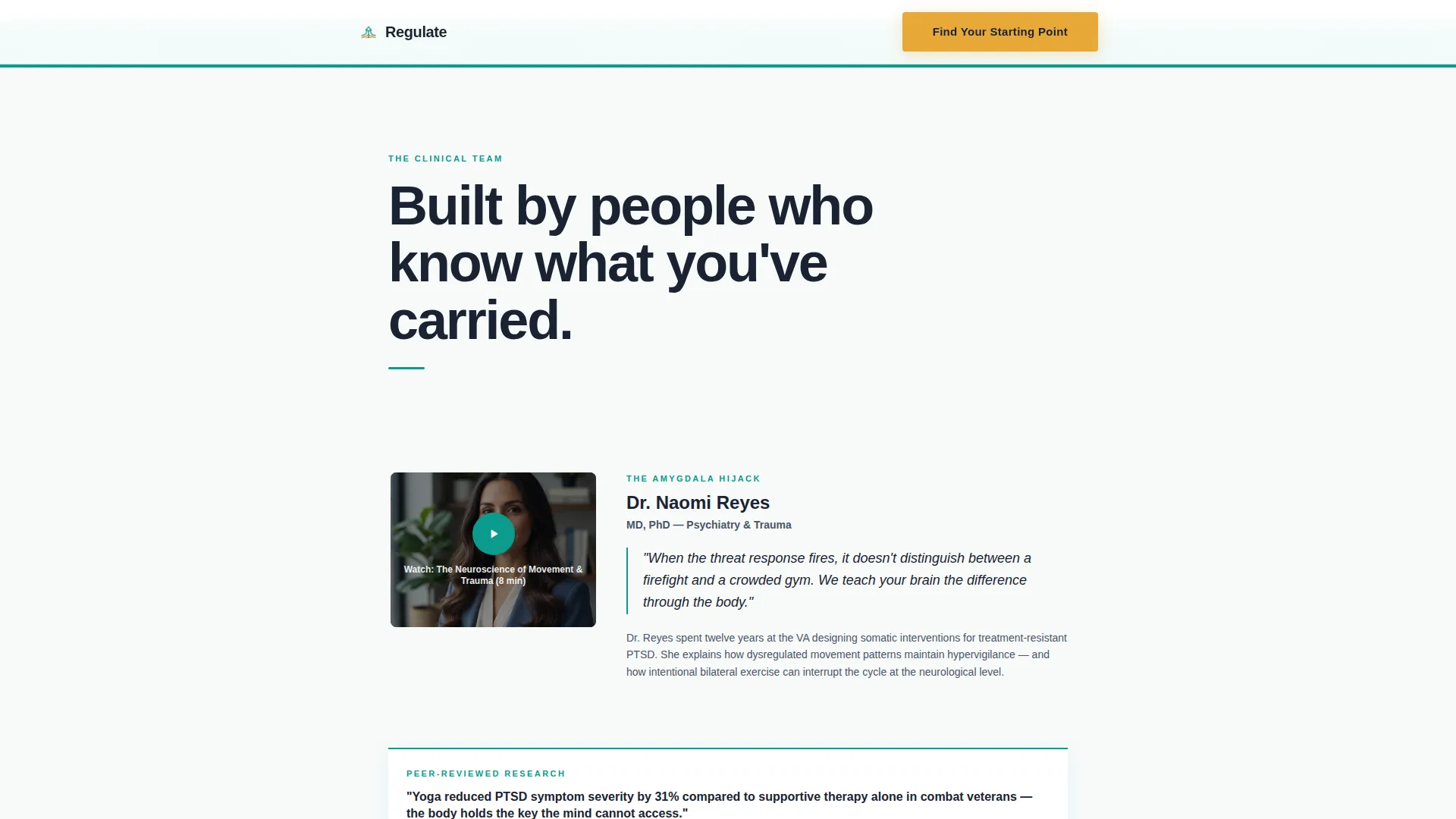
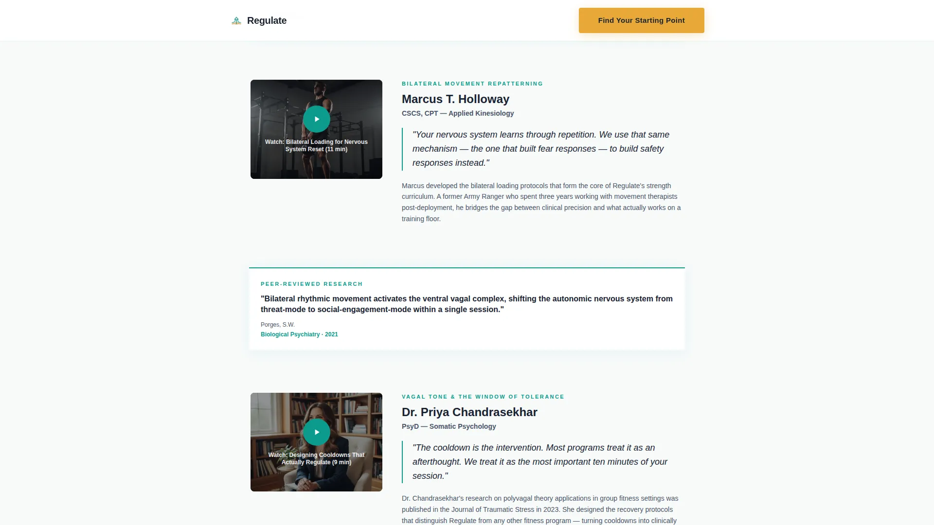
Each clinical team member is introduced one at a time as the visitor scrolls. Short video segments shot in a consistent, calm studio environment reveal a psychiatrist, a kinesiologist, and a veteran-turned-coach. Between expert sections, peer-reviewed citation cards slide into view. The effect builds authority in layers rather than front-loading credentials.
Program Pillars Bento Grid
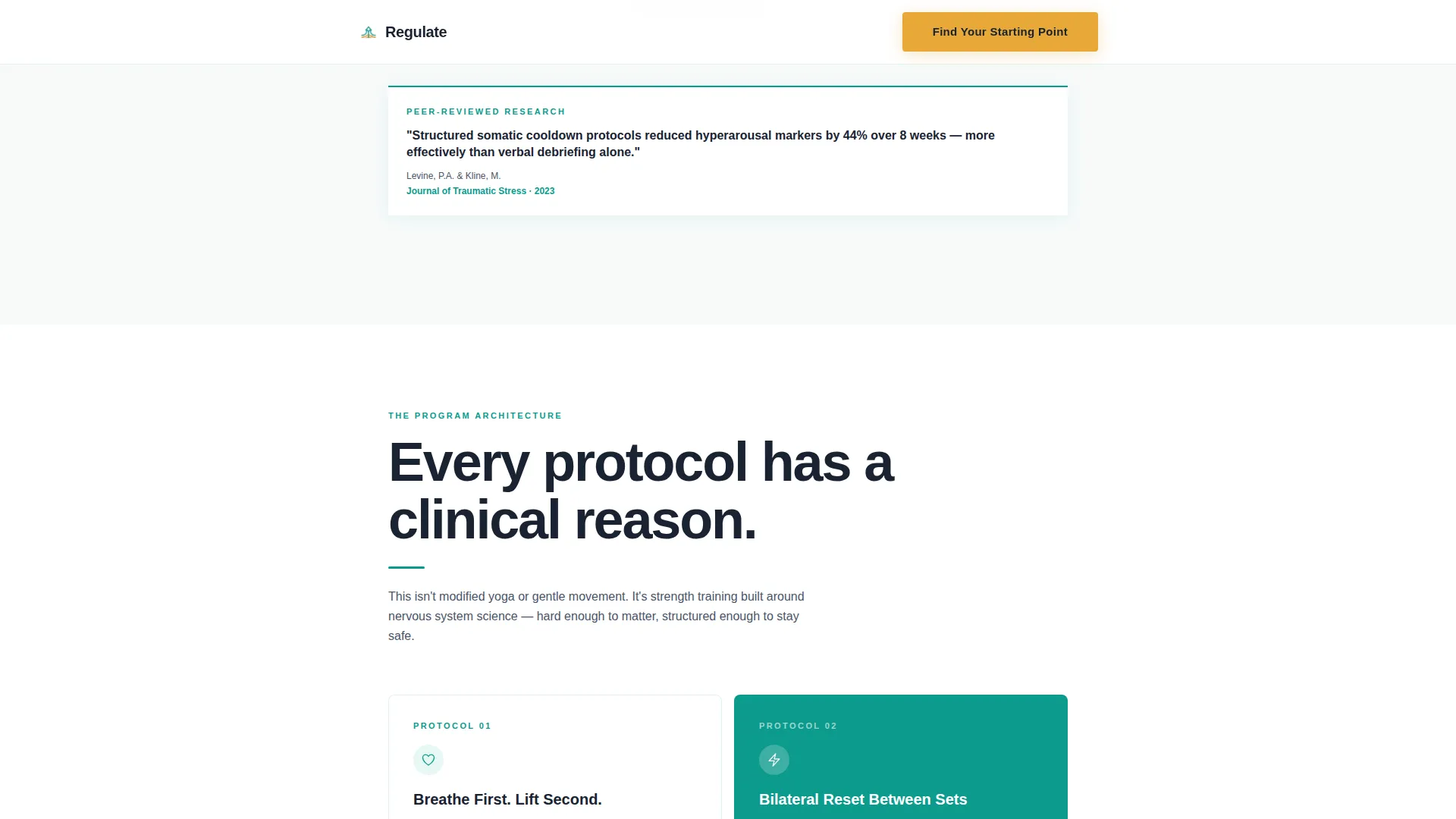
The template includes a bento-style grid section that pairs specific clinical movement protocols with their nervous system counterpart. Pairings such as box breathing into kettlebell carries, bilateral tapping between sets, and vagal tone work framed as cooldowns are each presented as individual tiles. The grid is scannable and specific, not vague.
Five-Question Readiness Assessment
The primary call to action leads into a five-question quiz designed to feel conversational and safe. Questions cover exercise frequency, primary trauma category (optional and skippable), biggest movement barrier, arousal tendency, and current therapist status. Each question appears alone on screen with no visible countdown or progress bar. Results recommend a personalized program tier.
Peer-Reviewed Citation Cards
Separate from the expert panel, a dedicated section presents research-backed citation cards. These appear as visual proof elements, not as decorative design. They signal that the program is grounded in clinical evidence, not wellness marketing trends.
Dual Call-to-Action Path
The assessment results offer two exits: a direct program tier recommendation and a secondary path labeled "Talk to Our Clinical Team First." This dual-path design respects visitors who are not yet ready to start independently. Neither path feels like a fallback; both feel like valid next steps.
Page sections overview
| Section | Purpose |
|---|---|
| Hero Headline | Anchors emotional context with zero imagery |
| Expert Panel Scroll | Builds clinical credibility through layered reveals |
| Program Pillars Grid | Shows specific protocol pairings in scannable tiles |
| Peer-Reviewed Proof | Validates program with research citation cards |
| Assessment Call to Action | Guides visitors into low-pressure quiz entry |
| Single-Row Footer | Closes page with minimal, non-distracting links |
Design & branding system
The visual identity follows a Medical Clarity theme. The palette is built to feel like a therapist's office that happens to have a squat rack: clinical enough to trust, warm enough to stay.
- Colors: clinical teal (#0D9B8C) as the primary action color, deep charcoal (#1A2332) for body text, soft antiseptic white (#F7FAFA) for backgrounds, and warm signal amber (#E8A838) reserved exclusively for call-to-action buttons and progress indicators
- Typography: Plus Jakarta Sans is used throughout at weighted, authoritative scales that read confidently without feeling aggressive
- Animation: scroll-triggered stagger reveals and medium-weight transitions are used throughout, with reduced-motion preferences respected so the page never introduces sudden visual changes
Mobile & speed optimization
This template is built mobile-first. People in this audience often access health information privately, on a phone, outside of work hours. The layout is a single-column flow precisely because it performs predictably across screen sizes without breakpoint complexity.
- Lazy image loading is built into the template so the initial page load stays fast even when expert video thumbnails are present
- Single-column flow means every section stacks cleanly on small screens with no horizontal overflow or cramped grid behavior
How this template helps you convert
This template converts by removing friction at every psychological touchpoint. It does not use urgency, scarcity, or pressure. It uses earned trust, clinical proof, and a low-stakes entry point.
- The scroll narrative builds credibility before the first call to action appears, so visitors arrive at the quiz already informed and partially convinced
- The five-question assessment replaces a hard enrollment ask with a personalized recommendation, making "start" feel like discovery rather than commitment
Other information about this template
This template sits at the intersection of clinical wellness and conversion design. It is categorized under Health and Medical, with a specific focus on PTSD care and exercise program delivery for trauma-affected populations.
- The template is built in a single-column flow format, making it straightforward to customize section by section without disrupting the overall layout logic
- The Teal Catalyst color system is a named design system within the template, and the amber call-to-action color is strictly reserved to avoid visual noise
- The template's Expert Panel creative direction and Quiz/Assessment landing-page direction are paired intentionally: trust is built first, then the low-stakes entry point appears
Theme
Medical Clarity
Creative direction
Expert Panel
Color system
Teal Catalyst
Style
Single Column Flow
Direction
Quiz/Assessment
Page Sections
Zero-image Hero with Dominant Typography
Layered Scrolling Expert Panel
Protocol Pairings Bento Grid
Low-pressure Five-question Quiz
Dual Call-to-action Exit Paths
Scroll-triggered Reveal Animations
Related questions
Is this template suitable for a therapist referring clients to a movement program?
Does the template include expert video content or stock footage?
Can the five-question assessment be customized or made partially optional?
What audience is this landing page template designed for?
Can I update the color system and typography to match my own brand?



