Endocrinologist Advanced Booking Website Template
Regulate is a single-column landing page built for virtual endocrinology practices. It guides frustrated patients through an interactive symptom checklist, builds trust with credentials and protocol details, and funnels every visitor toward one clear action: booking a video consultation. The design blends warm clinical tones with unhurried whitespace, making patients feel understood before they ever click schedule.
by Rocket studio
Quick summary
Regulate is a click-through landing page for a virtual endocrinology practice. It opens with a bold centered serif headline, walks visitors through a self-assessment symptom checklist, and builds trust through credentials, a first-visit timeline, and patient testimonials. Every section channels toward one amber button: "Check My Availability." No forms, no friction, just clarity and momentum.
Who this template is for
This template is built for board-certified endocrinologists running virtual or telehealth practices. It speaks directly to patients who have been dismissed, delayed, or overwhelmed by the traditional care system.
- Solo or small-group endocrinologists offering video consultations for thyroid disorders, diabetes management, and hormonal imbalance
- Telehealth practices targeting patients frustrated by long referral wait times or vague diagnoses
- Clinicians who want a high-trust landing page that converts without relying on forms or complex intake flows
What problem this template solves
Patients dealing with thyroid disorders, unmanaged hormonal imbalance, or a new diabetes diagnosis often arrive at a practice page feeling skeptical. They have heard "it's probably stress" too many times. They need to feel seen before they will act.
- Most medical landing pages lead with credentials but skip the emotional validation that hesitant patients need
- Visitors leave before booking because no single page connects their symptoms to a clear next step
- Long referral delays and conflicting advice create distrust that generic healthcare pages do not address
What you get with this template
You get a fully structured, single-column landing page ready to represent a virtual endocrinology consultation practice. Every section has a clear role, and the visual hierarchy guides the visitor from recognition to action without detours.
- A hero section with a large serif headline, floating symptom validation cards, and a prominent amber call-to-action button
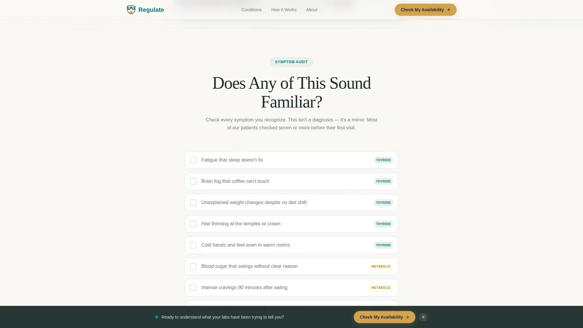
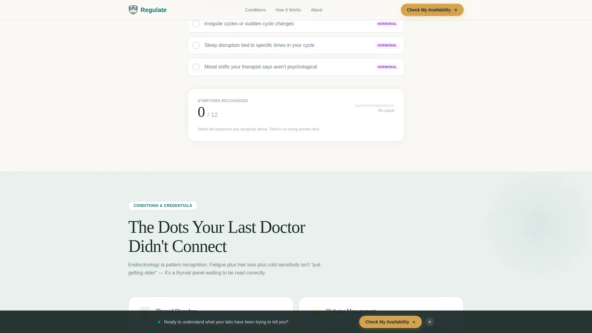
- An interactive symptom checklist with a live running tally and a conditional prompt that appears after the visitor checks three or more items
- A credentials and trust section, a first-visit timeline walkthrough, patient testimonial cards, and a sticky bottom bar that keeps the booking button visible throughout the scroll
Feature list
This template includes the following built-in capabilities, each serving a specific role in the patient conversion journey.
Giant Centered Serif Hero
The hero opens with a large Fraunces serif headline set against a warm linen white canvas. A single subline names the three primary conditions patients search for. One amber button sits below, and generous whitespace does the rest of the persuading.
Interactive Symptom Checklist
Visitors scroll through symptom clusters presented as checkable items. A quiet running counter tallies selections in real time. After three or more checks, a targeted call-to-action line appears: "If you checked three or more, it's time." The page validates without diagnosing.
First-Visit Timeline Section
A visual walkthrough explains exactly what happens during a consultation. It covers the pre-visit lab review, the 40-minute video consultation, and the follow-up plan. Patients arrive knowing what to expect, which reduces hesitation at the booking step.
Credentials and Conditions Section
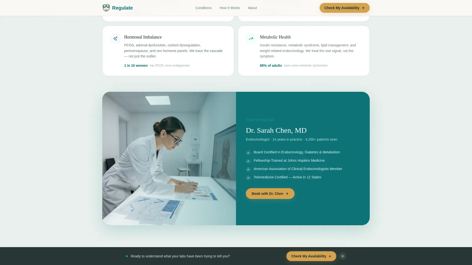
Board certifications and treated conditions are presented with specific protocol descriptions. This section answers the implicit question every hesitant patient carries: "Is this doctor actually qualified to help me?"
Patient Testimonial Cards
Voice cards feature patient-specific outcomes tied to real conditions. Testimonials are laid out as scroll-revealed cards, giving the social proof section a natural, unhurried feel rather than a wall of text.
Sticky Amber Call-to-Action Bar
After the page midpoint, a persistent bottom bar keeps the "Check My Availability" button visible at all times. The bar appears without interrupting reading flow, ensuring the conversion path is always one tap away.
Page sections overview
| Section | Purpose |
|---|---|
| Hero Headline | Anchor attention and name the three core conditions |
| Symptom Checklist | Self-assessment that validates the visitor's experience |
| Credentials and Trust | Board certs and condition-specific protocol details |
| First Visit Timeline | Step-by-step walkthrough of the consultation experience |
| Patient Testimonials | Specific outcome stories that reinforce clinical trust |
| Sticky Action Bar | Persistent booking button visible from the midpoint onward |
| Footer | Linear single-row with essential practice links |
Design & branding system
The visual identity follows a Healing Space theme. It sits precisely at the intersection of medical credibility and human warmth, using a restrained palette and a serif-led typographic system.
- Colors: deep clinical teal (#0D7377) as the primary anchor, soft sage mist (#E8F0ED) for section backgrounds, warm linen white (#FAF8F5) as the main canvas, and quiet amber (#D4A24E) reserved for buttons and interactive highlights
- Typography: Fraunces serif for all headlines, giving them an unhurried, authoritative presence; DM Sans for body copy, keeping clinical information easy to read
- Whitespace is treated as a design element, signaling that this practice gives each patient room and attention rather than rushing them through a crowded page
Mobile & speed optimization
The template is built desktop-first with a deliberate mobile experience layered in. Interactive elements scale cleanly, and the sticky call-to-action bar is particularly effective on smaller screens where the scroll distance is longer.
- Static sections use server-rendered components for fast initial load; the interactive checklist runs as a client component to keep interactivity snappy without slowing the page
- Scroll-reveal animations are set to medium intensity, appearing naturally as the visitor moves down the page without creating performance drag
- The sticky bottom bar remains accessible on mobile viewports, ensuring the booking path is never more than one tap away regardless of where the visitor pauses
How this template helps you convert
Every design and content decision in this template points toward a single conversion: clicking through to the external scheduling platform. The page earns that click by making the visitor feel understood first.
- The symptom checklist creates a moment of self-recognition early in the scroll. Once a visitor sees their own experience reflected back at them, they are already emotionally invested in the next step.
- The first-visit timeline removes the unknown. Patients who understand exactly what a consultation involves are far less likely to abandon the page at the booking prompt.
- The amber call-to-action button appears three times: beneath the hero, after the checklist with a conditional line, and in the sticky bottom bar. Repetition without pressure keeps the action visible at every decision point.
Other information about this template
This template is part of the Regulate design system, built under the Teal Catalyst color framework. It is categorized under Health and Medical, specifically within the Endocrinologist Website subcategory, targeting the virtual consultation niche.
- The template is built as a single-column flow, making it straightforward to customize section by section without disrupting the overall page hierarchy
- English (United States) copy, USD pricing references, and standard US date formats are used throughout, making it ready for a domestic telehealth audience
- Animation intensity is set to medium: scroll reveals, checklist interactions, and floating card effects are included without overwhelming the clinical tone
- The footer uses a linear single-row pattern, keeping the bottom of the page clean and uncluttered

Theme
Healing Space
Creative direction
Checklist & Audit
Color system
Teal Catalyst
Style
Single Column Flow
Direction
Click-Through
Page Sections
Interactive Symptom Checklist with Live Counter
Giant Centered Serif Hero Section
First Visit Timeline Walkthrough
Credentials and Protocol Details Section
Patient Testimonial Cards
Persistent Sticky Action Bar
Related questions
Does this template include an appointment booking form?
Can I update the symptom checklist items to match my practice's focus areas?
Is this template suitable for a practice that treats only one condition?
How does the sticky call-to-action bar behave on mobile devices?
Can the testimonial section be updated with my own patient quotes?



