Urology Billing Service Landing Page Template
Reimburse is a single-column landing page template built for urology billing and revenue cycle services. It opens with hard-hitting denial and revenue statistics, walks visitors through the three core billing pain points specific to urology practices, and guides them toward a consultation booking. The design uses a calm, clinical Soft Mist palette to match the audience's professional context.
by Rocket studio
Quick summary
Reimburse is a click-through landing page template for urology-specific billing and insurance services. It leads with oversized financial metrics, guides visitors through a pressure-building Problem-to-Solution arc covering prior authorizations, CPT modifier complexity, and payer denial patterns, then resolves into a clear consultation call to action. The design is clinical, quiet, and built to earn trust fast.
Who this template is for
This template is designed for companies or consultants offering billing, coding, or revenue cycle management services to urology practices. It speaks directly to the people inside those practices who feel the daily weight of denied claims and stalled reimbursements.
- Office managers and billing coordinators handling electronic remittance advice queues, modifier rules, and payer-specific denial patterns at urology practices
- Solo urologists and small group practice owners who personally review billing workflows between patient appointments
- Revenue cycle management firms positioning a urology-specialized service to practice decision-makers
What problem this template solves
Generic service pages fail urology billing professionals because they don't speak the language of urodynamic studies, cystoscopy authorizations, or bundled Current Procedural Terminology code disputes. This template solves the credibility gap by naming the exact pain points that urology billers live with every day.
- Prior authorization bottlenecks that delay advanced imaging and surgical procedures, costing time and cash flow
- Modifier and coding confusion on urology-specific bundled procedure codes, leading to underpayments and write-offs
- Payer-specific denial patterns from Medicare Advantage and commercial insurers that generic billing services consistently miss
What you get with this template
You get a fully structured single-column landing page that takes a visitor from financial shock to consultation intent in one continuous scroll. Every section is purposefully sequenced and visually distinct.
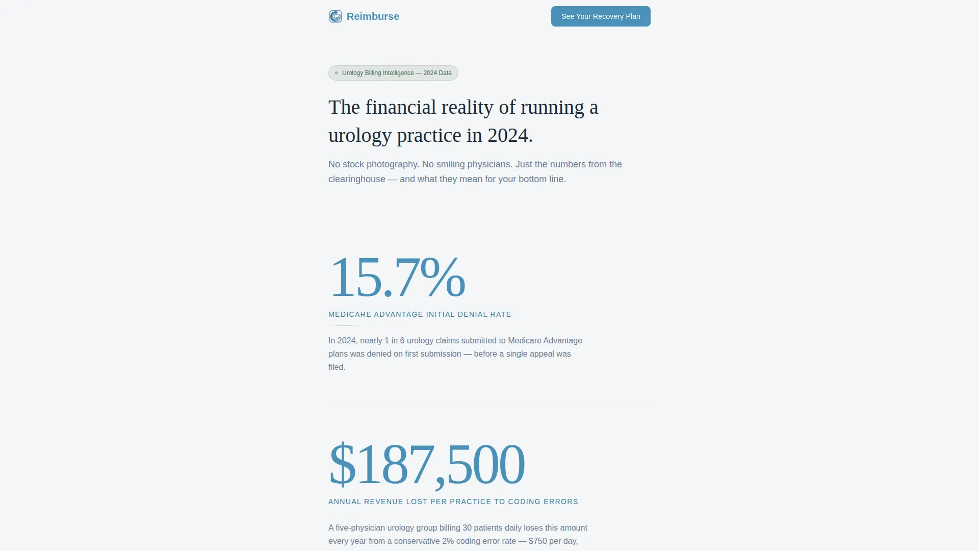
- A stats-driven hero section with three oversized urology billing metrics rendered in cerulean on fog white, each paired with a single explanatory line
- A three-part Problem arc with scroll-linked background tone darkening that builds pressure before resolving into a bright solution section
- A click-through call to action button ("See Your Revenue Recovery Plan"), two before-and-after case study snapshots, and a secondary email capture for a billing audit checklist
Feature list
This template includes a focused set of components built specifically for a high-stakes, B2B healthcare service page.
Oversized Stats Hero Block
Three typographically dominant financial metrics open the page. Each figure is rendered in large cerulean numerals against a fog white background, with a single-line contextual sentence beneath it. No photography, no illustrations, just the numbers that define the problem.
Scroll-Triggered Problem Arc
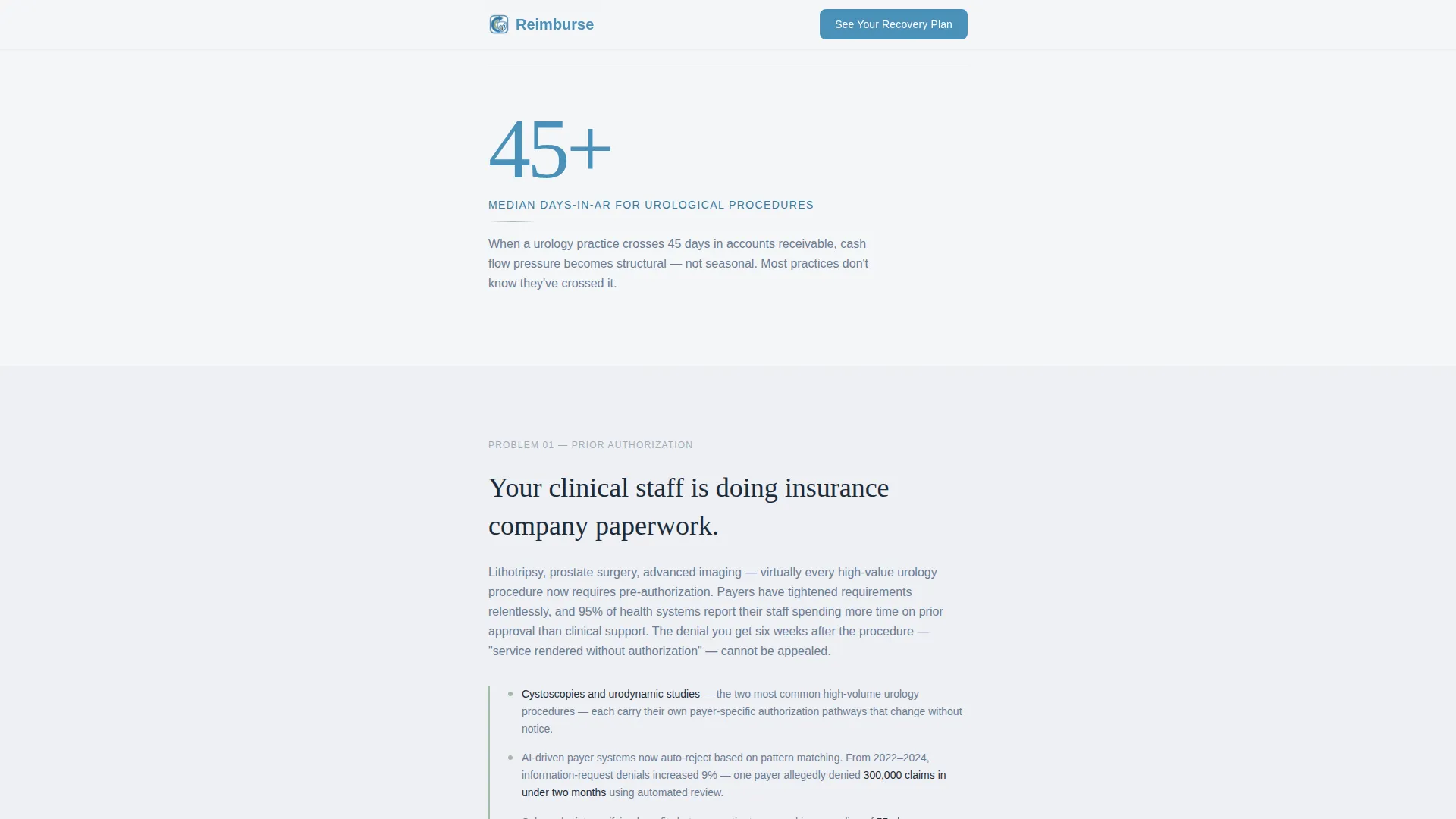
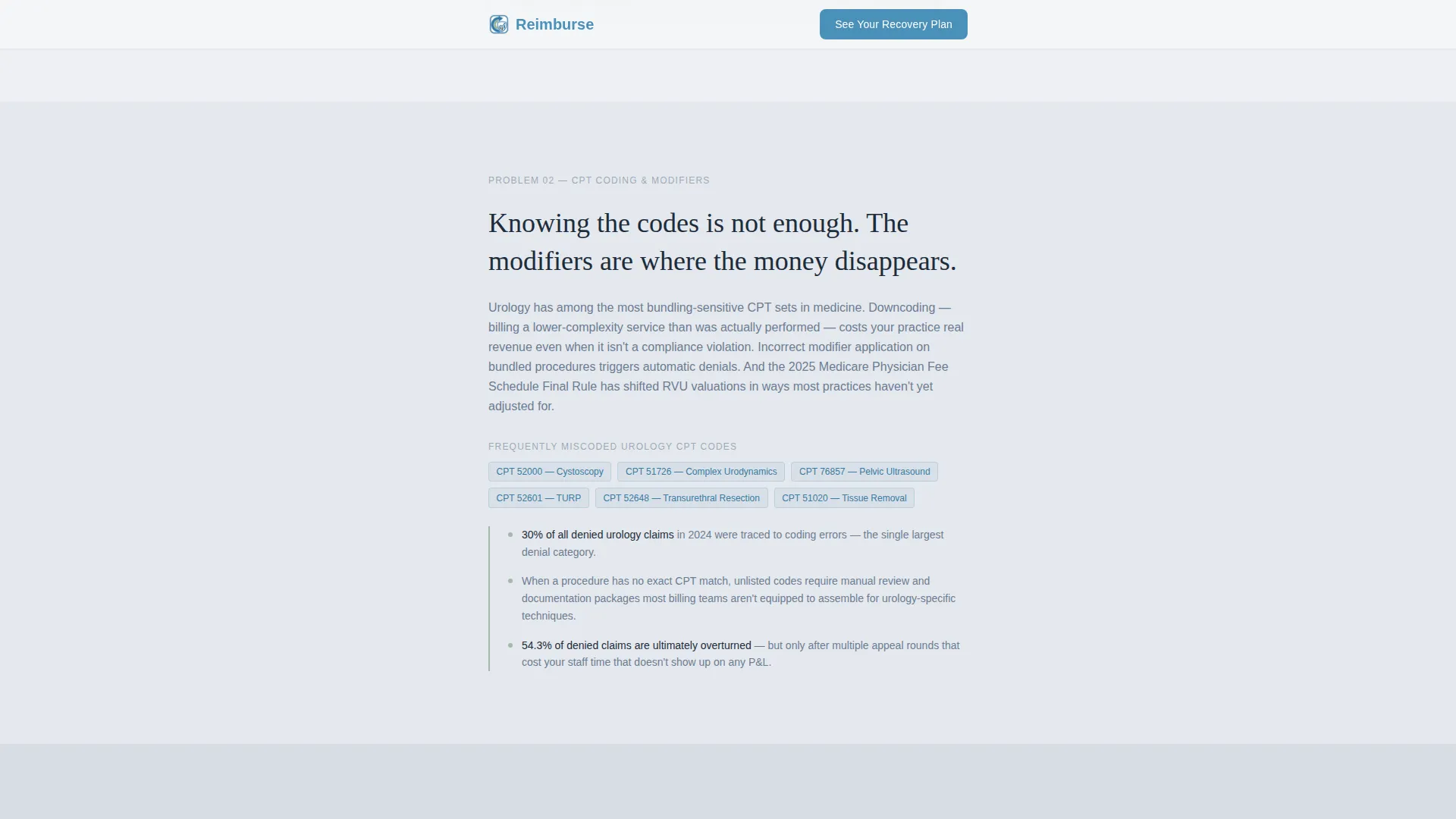
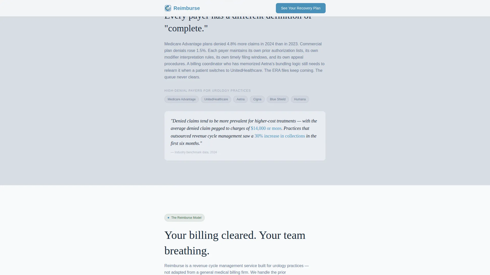
Three consecutive problem sections descend with progressively darkening background tones. Each zone isolates a distinct billing pain point: prior authorization delays, CPT modifier complexity, and payer denial patterns. Scroll-triggered reveals guide the reader downward with a sense of building pressure.
Solution Section with Primary Call to Action
After the problem arc resolves, the layout opens into a bright, breathable solution section. This is where the service model, urology-trained billing team, and technology approach are presented. The primary call to action button, "See Your Revenue Recovery Plan", appears here and anchors the bottom of the page.
Case Study Snapshot Pair
Two before-and-after collection rate snapshots provide social proof without lengthy testimonials. They sit between the solution section and the bottom call to action, giving hesitant visitors a concrete reason to move forward.
Secondary Email Capture Component
A single email input field paired with a text link allows not-yet-ready visitors to download a urology billing audit checklist. This keeps them in the funnel without requiring a full consultation commitment. It appears below the case study snapshots.
Typographic Hierarchy System
The template uses Fraunces for oversized statistics and section headers, paired with DM Sans for body text and interface elements. This combination projects both clinical authority and approachable readability across the full page.
Page sections overview
| Section | Purpose |
|---|---|
| Stats hero block | Opens with three urology billing metrics to establish financial stakes immediately |
| Problem arc: prior authorizations | Shows the cost of authorization bottlenecks for surgical and imaging procedures |
| Problem arc: modifier complexity | Addresses CPT bundling confusion and undercoding on urology-specific codes |
| Problem arc: payer denials | Details Medicare Advantage and commercial payer denial patterns |
| Solution and primary call to action | Presents the service model and team, with the "See Your Revenue Recovery Plan" button |
| Case study snapshots | Before-and-after collection rate comparisons to validate the service |
| Secondary capture and call to action | Email field for the audit checklist and a final consultation call to action |
| Footer | Single-row linear footer pattern |
Design & branding system
The Soft Mist color system drives every visual decision in this template. The palette avoids clinical sterility while staying firmly professional, it feels like a practice that has invested in its environment.
- Colors: fog white (#F4F6F8) backgrounds, calm slate (#6B7C93) body text, muted sage (#A3B9A8) for dividers and trust indicators, and cerulean (#4A90B8) for buttons and interactive highlights
- Typography: Fraunces for large statistics and section headlines, DM Sans for all body and interface text, a pairing that balances authority with readability
- Visual tone: no stock photography, no decorative imagery; the layout relies entirely on typographic scale, whitespace, and color contrast to communicate trust and expertise
Mobile & speed optimization
The template is built desktop-first to match the primary audience of office managers working at workstations, but the single-column layout translates cleanly to smaller screens for physicians checking between patient visits.
- Single-column flow eliminates complex reflow issues on mobile; the reading order stays identical across screen sizes
- Scroll-triggered animations use a medium intensity level and are implemented with minimal JavaScript to keep interaction lightweight
- Server Components power the static content sections, reducing the amount of client-side code needed for the core page structure
How this template helps you convert
Every structural decision in this template is designed to move a skeptical billing professional toward booking a consultation.
- The stats-first hero creates immediate recognition, visitors see their own financial reality reflected back at them before reading a single sentence of marketing copy, which builds credibility faster than any headline claim.
- The Problem-to-Solution arc mirrors the emotional arc of the audience: descending into the familiar mess of denials and undercoding, then climbing out into a clear, expert-led solution, so the call to action feels earned rather than pushed.
- The dual conversion path captures two audience segments at once, the ready buyer goes straight to the consultation via the primary button, while the hesitant visitor gets the audit checklist and stays in the funnel.
Other information about this template
This template is categorized under Health and Medical, with a subcategory focus on urologist websites and a niche alignment with urologist insurance and billing service pages. It is built for the United States healthcare billing context, using USD pricing references and US payer terminology throughout.
- The Healing Space theme and Soft Mist palette are intentional differentiators; most healthcare service pages default to aggressive blues or urgent reds, while this template chooses calm authority
- The footer follows a Pattern 1 Linear Single-Row layout, keeping the bottom of the page clean and uncluttered
- The template is scoped as a click-through landing page; it does not include an embedded scheduling form, relying instead on the primary call to action button to carry visitors to a separate consultation booking page
- The intersection match score for this template's niche alignment is 13, reflecting a precise fit between the Urologist Insurance and Billing Page niche and the Health and Medical category
Theme
Healing Space
Creative direction
Problem→Solution Arc
Color system
Soft Mist
Style
Single Column Flow
Direction
Click-Through
Page Sections
Oversized Stats Hero Block
Scroll-triggered Problem Arc
Solution Section with Primary Call to Action
Before-and-after Case Study Snapshots
Secondary Email Capture Component
Dual Typography System
Related questions
Who is this landing page template built for?
Does this template include a contact form or scheduling widget?
Can I update the statistics shown in the hero section?
What makes this different from a general medical service page template?
Is the audit checklist download included in the template?



