Locksmith Marketing Reviews Website Template
Rekey is a single-column Google Ads landing page template built for mobile locksmiths who need to convert urgent traffic fast. It leads with a testimonial card, stacks proof through stats, and drives calls with a fixed click-to-call button. The Arctic White color system and emergency amber accents make every trust signal and call-to-action impossible to miss.
by Rocket studio
Quick summary
Rekey is a Stats-First, single-column landing page template designed for mobile locksmith services running Google Ads campaigns. It opens with social proof, builds credibility through stacked numbers, and ends with a clear call to action. The layout is clean, urgent, and built to convert visitors who are already in a stressful situation.
Who this template is for
This template is built for mobile locksmiths who get their clients from paid search. It suits operators who want their page to do the convincing before the phone ever rings.
- Mobile locksmiths running Google Ads for emergency and rekey jobs
- Locksmith business owners who serve property managers, homeowners, and commercial clients
- Service providers who want a ready-to-launch landing page without building from scratch
What problem this template solves
Most locksmith landing pages bury the trust signals. A visitor arriving at 2 a.m. needs to feel confident in three seconds or they call someone else. This template solves the credibility gap by putting proof before pitch.
- Visitors see a real testimonial and a live response-time stat before any service list
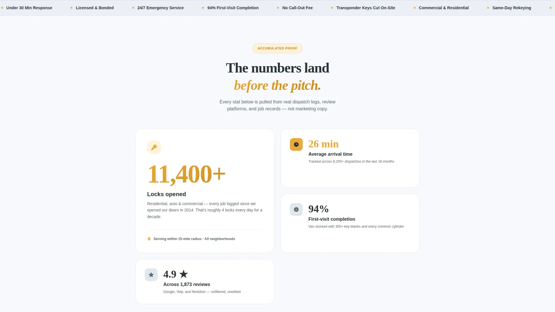
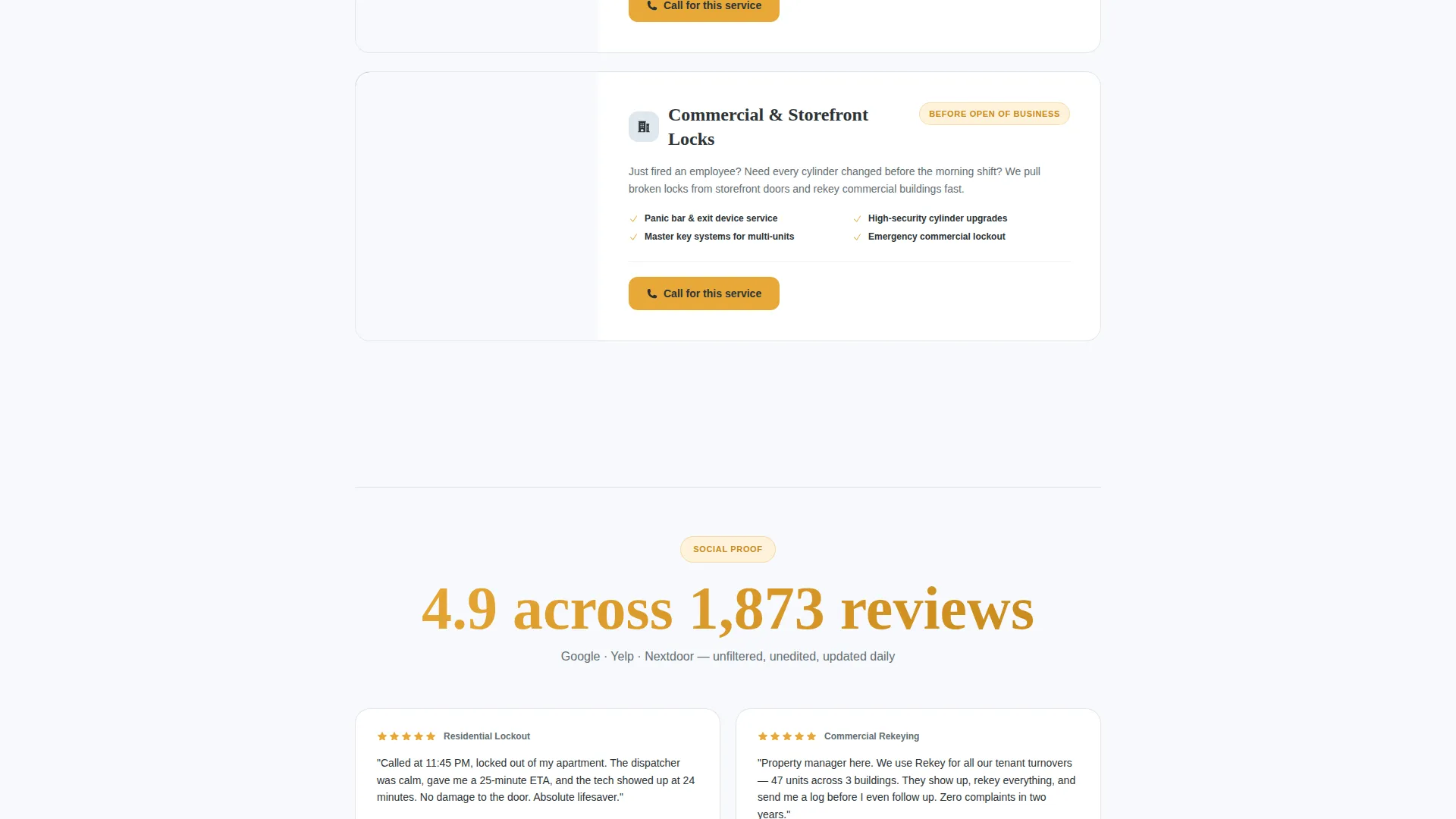
- Stats like "11,400+ locks opened" and "4.9 across 1,873 reviews" answer doubt before it forms
- The fixed mobile call button removes friction at the exact moment someone is ready to act
What you get with this template
You get a complete, single-column landing page layout with every section already designed and sequenced. The structure follows a deliberate proof-first narrative that is ready to customize with your own numbers and copy.
- A testimonial card header, stat-led content sections, a service breakdown, and a process overview
- A primary click-to-call call to action and a secondary email capture for a free lockout prevention guide
- An Arctic White and emergency amber visual system with consistent type hierarchy throughout
Feature list
This template includes purpose-built components that work together to reduce hesitation and drive action.
Stats-First Content Architecture
Every major section opens with a headline number before the explanation. "11,400+ locks opened" appears before the service list. "94% of jobs completed in a single visit" appears before the process breakdown. This sequencing makes credibility feel earned, not claimed.
Testimonial Card Header
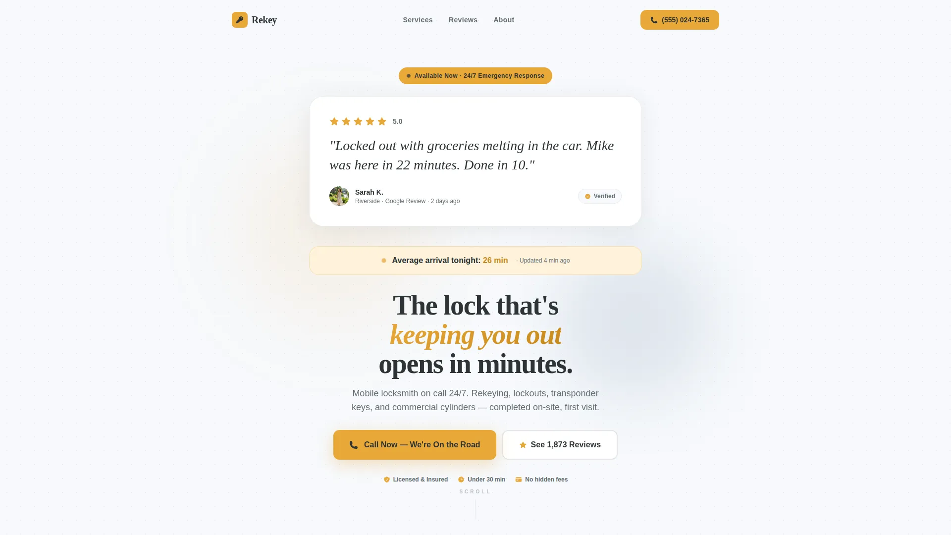
The page opens with a single oversized testimonial card on a clean white background. It shows a five-star rating, a first name and neighborhood, and a quote written in plain, conversational language. A pulsing response-time stat below the card grounds the social proof in the present moment.
Fixed Mobile Click-to-Call Button
A call button is fixed to the bottom of the viewport on mobile screens. It stays visible as the visitor scrolls. This removes the need to hunt for contact details during an emergency.
Secondary Email Capture Path
Visitors who are not in an emergency today can download a free lockout prevention guide by entering their email address. This secondary path captures future intent without disrupting the primary call flow.
Emergency Amber call to action System
The emergency amber color (#E8A838) is used exclusively on calls to action and response-time badges. This focused use of color trains the eye to find urgency signals instantly without visual clutter elsewhere on the page.
Single-Column Section Flow
The layout follows a strict single-column flow from top to bottom. Each section reveals a new layer of proof as the visitor scrolls. The sequence is deliberate: testimonial, stats, services, process, trust badges, and final call to action.
Page sections overview
| Section | Purpose |
|---|---|
| Testimonial Card Header | Opens with social proof and a pulsing live response-time stat |
| Response Time Stat | Anchors trust in the present moment before any service detail |
| Stats Impact Block | Stacks credibility numbers before the service list appears |
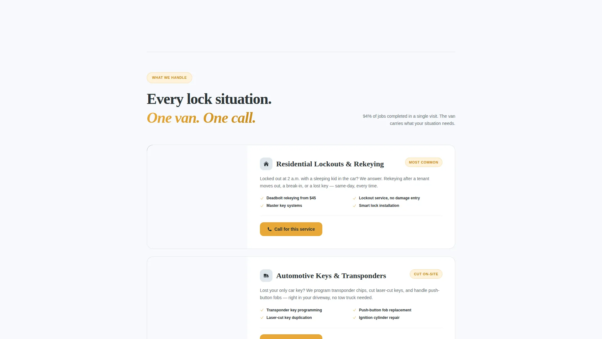
| Service List | Describes rekey, lockout, transponder, and commercial services |
| Trust Badge Row | Displays review count and rating after the key stats |
| Process Breakdown | Shows the single-visit job flow after the 94% completion stat |
| Secondary Lead Capture | Offers a free lockout prevention guide in exchange for an email |
| Primary call to action Section | Drives the final call action with the main click-to-call button |
Design & branding system
The Arctic White color system is clinical, trustworthy, and directional. Every color has a single role, which means visitors always know what to look at next.
- Clinical white (#F7F9FC) as the dominant background, gunmetal gray (#2D3436) for body text, and ice blue (#DFE6ED) for section dividers and card backgrounds
- Emergency amber (#E8A838) used exclusively on calls to action and response-time badges to concentrate urgency in one visual signal
- The overall palette reads like a well-lit, sterile environment: clean enough to feel professional and sharp enough to feel fast
Mobile & speed optimization
The template is structured for mobile-first browsing, which is where most emergency locksmith searches happen. The layout keeps critical actions visible without extra taps.
- The click-to-call button is fixed to the bottom of the mobile viewport so it is always one tap away
- Single-column flow eliminates horizontal scrolling and keeps the reading path uninterrupted on small screens
- Section spacing and card sizing are calibrated for touch interaction, not just desktop viewing
How this template helps you convert
The conversion logic follows accumulated proof. Each scroll adds a new reason to call until the decision feels obvious rather than risky.
- The testimonial card and live response-time stat establish trust in the first viewport, before the visitor has read a single service description.
- The stats-first content architecture answers the three most common objections (reliability, speed, and quality) with numbers before explanations.
- The fixed call button on mobile and the secondary email capture give every visitor a clear next step, whether they are in an emergency right now or planning ahead.
Other information about this template
This template is part of the Service Utility theme family, built for high-intent, single-service paid search landing pages. It is designed to pair with Google Ads campaigns targeting local locksmith keywords.
- The Content/Resource landing page direction means it earns trust through information density before asking for the call
- The template style is Single Column Flow, which keeps the visitor focused on one message at a time with no sidebars or competing paths
- The header concept is Testimonial Card, chosen specifically because social proof is the fastest trust signal for emergency service searches
- Template customization requires replacing the placeholder stats, testimonial text, and contact details with your own verified business information
Theme
Service Utility
Creative direction
Stats-First Impact
Color system
Arctic White
Style
Single Column Flow
Direction
Content/Resource
Page Sections
Stats-first Content Architecture
Testimonial Card Header
Fixed Mobile Click-to-call Button
Secondary Email Lead Capture
Emergency Amber Call to Action Highlight System
Single-column Proof Flow
Related questions
Who is this landing page template designed for?
What makes this template different from a standard service page?
Can I use this template for multiple locksmith service pages?
Do I need design experience to customize this template?
What is the secondary email capture for?



