Subscription Box Services Professional Website Template
Relic is a bento grid landing page template built for heritage and history subscription box brands. It pairs a Neo-Retro visual identity with a tactile unboxing experience, guiding visitors through artifact categories, a scrollable timeline, and subscriber photos before delivering a near-zero-friction call to action that routes directly to checkout.
by Rocket studio
Quick summary
Relic is a single-page bento grid landing page template designed for history and heritage subscription boxes. The layout layers artifact previews, provenance details, a full-width timeline strip, and real subscriber photos into a cohesive scroll experience. A fixed call-to-action bar and a pre-applied bundle deal keep the path to purchase short and clear.
Who this template is for
This template is built for brands that sell curated, story-driven subscription boxes to an audience that genuinely loves history. It suits founders and marketers who want a visually distinctive page that communicates depth before asking for a commitment.
- Subscription box brands in the history, heritage, or collectibles space
- Independent creators and educators selling monthly curated artifact parcels
- E-commerce operators who need a high-impact landing page without a complex multi-page build
What problem this template solves
Most subscription box landing pages rely on a simple hero and a bullet list of perks. That approach falls flat when the product itself is tactile, layered, and story-rich. Potential subscribers need to feel what they are getting before they decide to buy.
- Visitors leave without understanding what the box actually contains or why it matters
- Generic layouts fail to communicate the craft, curation, and narrative behind each monthly shipment
- Low-trust pages force visitors through a signup form before they have felt any excitement
What you get with this template
The template delivers a complete single-page layout structured around the unboxing journey. Every section is purpose-built to move a curious visitor toward a confident purchase.
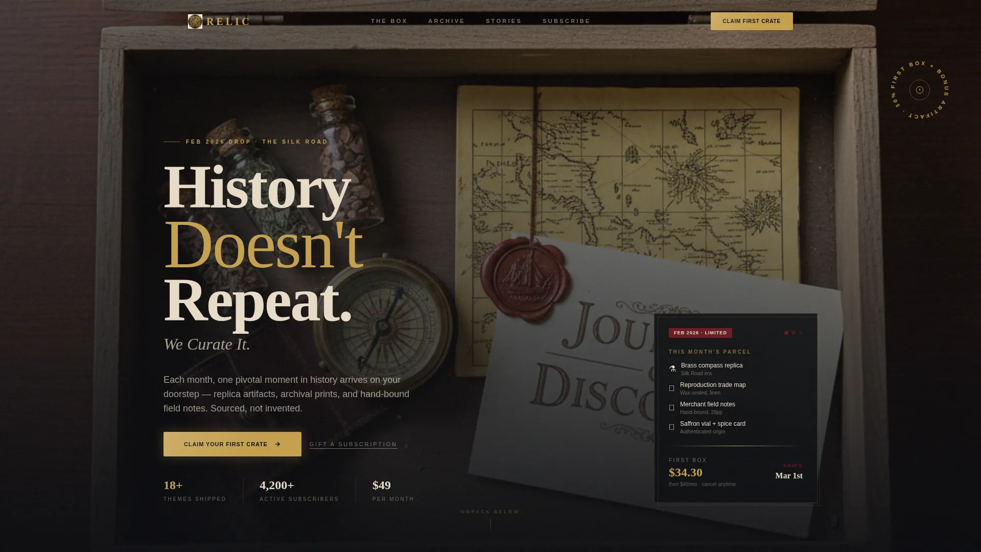
- A hero header with a top-down product photograph, a diagonal promotional banner, and a condensed serif headline
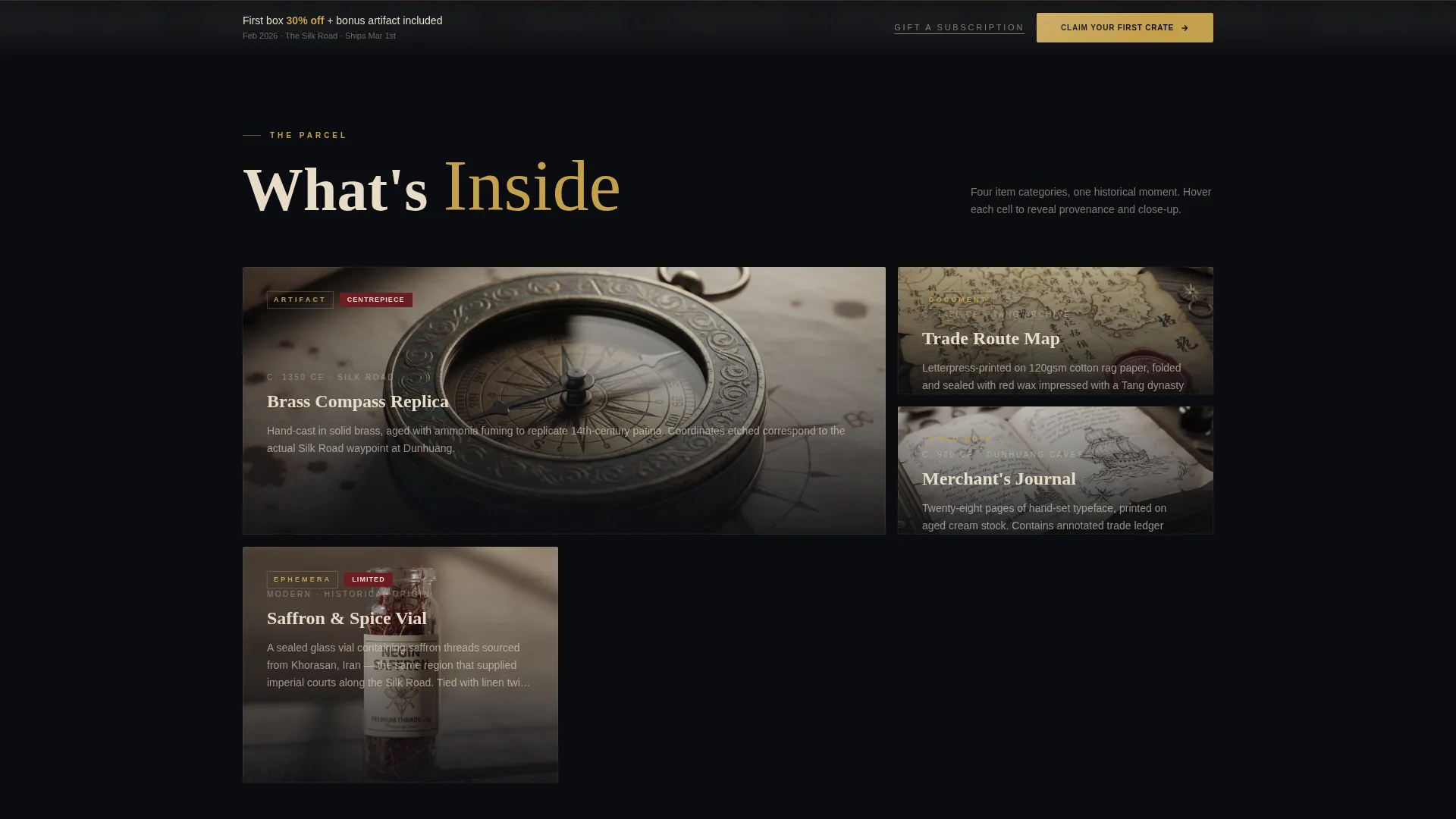
- A bento grid that organizes artifact categories with hover-expand cells revealing provenance details and close-up photography
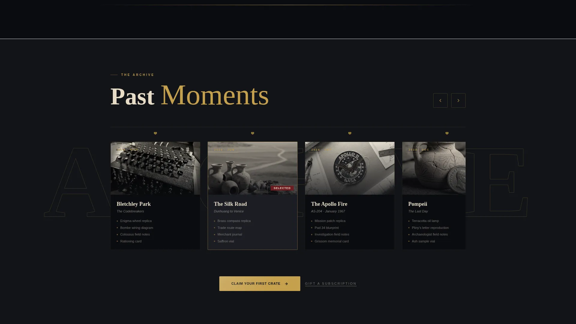
- A full-width interactive timeline strip plotting past box themes as clickable nodes
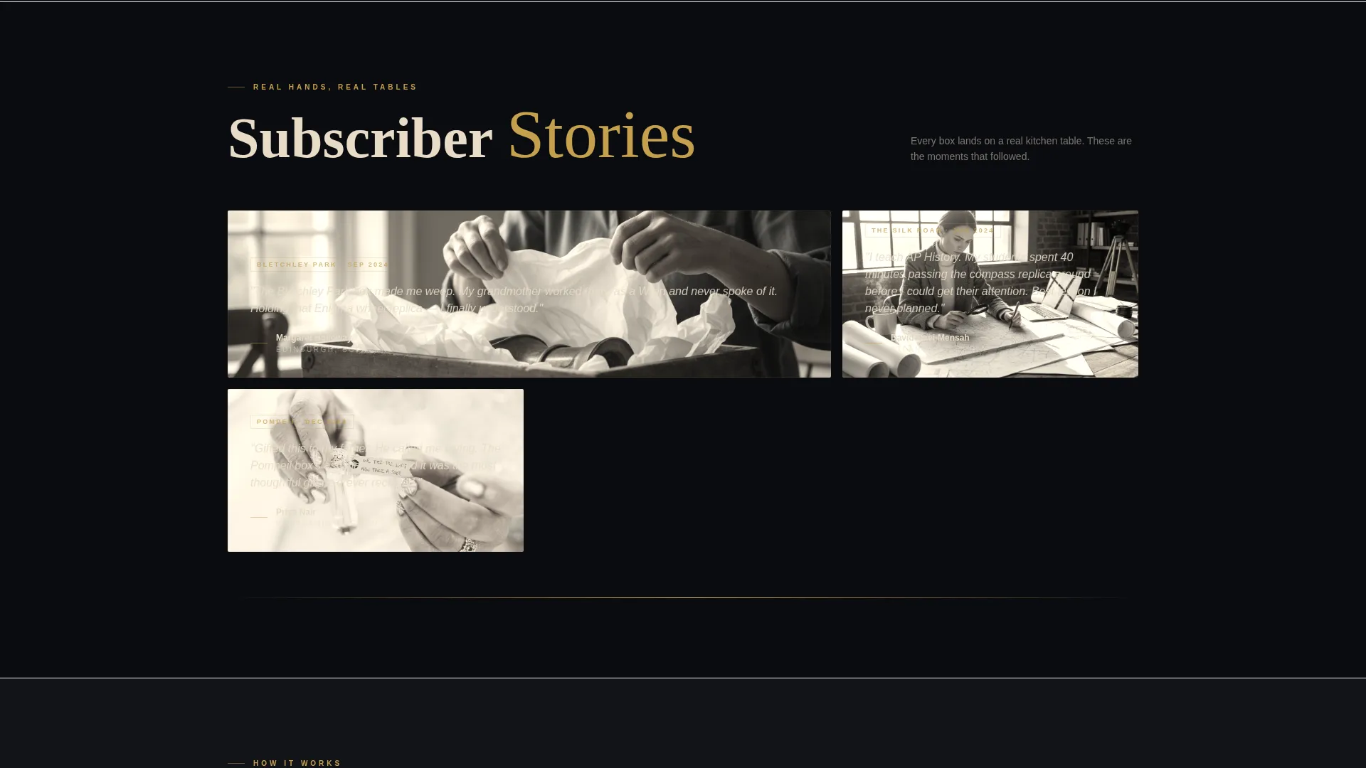
- A subscriber unboxing photo section with three real-hands product shots
- A fixed call-to-action bar after the hero and a second anchored call to action at the base of the timeline
Feature list
Every component in this template is drawn from the source brief and serves a specific role in the purchase journey.
Bento Grid Artifact Showcase
The core grid organizes box contents into four distinct cells: Artifact, Document, Field Note, and Ephemera. Each cell expands on hover to reveal a provenance description and a close-up photograph, letting visitors virtually unbox the product before committing.
Scrollable Interactive Timeline
A full-width timeline strip breaks the grid midway down the page. Past box themes such as The Silk Road, Bletchley Park, and The Apollo Fire appear as clickable nodes. This section proves catalog depth and builds confidence in the brand's research and curation standards.
Fixed Call-to-Action Bar
A persistent gold-bordered bar appears after the hero section and remains accessible as visitors scroll. The primary action, "Claim Your First Crate," routes directly to the checkout page with the bundle deal pre-applied, removing the need for any on-page form.
Diagonal Hero Promotion Banner
A translucent gold banner cuts diagonally across the hero photograph, surfacing the current introductory offer. The design draws the eye immediately without obscuring the product photography beneath it.
Subscriber Unboxing Photo Grid
Three real subscriber photos occupy the final grid section. Showing genuine hands and kitchen tables grounds the experience in everyday delight and adds social proof without manufactured testimonials.
Oxblood Urgency Cues
Limited-edition flags, countdown pips, and sold-out stamps appear in a dedicated oxblood accent color. These elements stand apart from the gold-and-parchment palette and signal scarcity or time sensitivity at a glance.
Page sections overview
| Section | Purpose |
|---|---|
| Hero Header | Showcases the open box with a promotional banner and headline |
| Bento Artifact Grid | Reveals each box category with hover-expand provenance detail |
| Timeline Strip | Plots past box themes as clickable historical nodes |
| Subscriber Photo Grid | Grounds the experience with real unboxing moments |
| Fixed call to action Bar | Keeps the primary action visible throughout the scroll |
| Secondary Gift Link | Surfaces the gift-a-subscription intent beneath each call to action |
Design & branding system
The visual identity follows a Neo-Retro theme built around a four-color Obsidian and Gold palette. The overall feeling is a Victorian collector's cabinet: lacquered dark wood, gilt-edge labels, and velvet visible through a half-open drawer.
- Obsidian black (#0B0C10) dominates the background; antiqued parchment (#E8DCC8) carries all body text for legible contrast
- Tarnished gold leaf (#C5A04E) traces every border, divider, and interactive element, while oxblood (#6B1C23) is reserved exclusively for urgency badges and hover states
- Typography uses a condensed serif headline set in parchment white, reinforcing the archival, press-printed character of the brand
Mobile & speed optimization
The bento grid layout is structured to remain clear and navigable on smaller screens. Hover-expand behavior and grid reordering are designed to translate into a touch-friendly scroll experience.
- Grid cells are sized and spaced to remain tappable and readable on mobile viewports
- The fixed call-to-action bar is positioned to stay accessible without obstructing content on narrow screens
- Lightweight image framing in the hero and subscriber sections keeps the visual hierarchy intact across device sizes
How this template helps you convert
The page is engineered to earn the click before it asks for one. Visitors are taken through a sensory preview of the product, shown proof of catalog history, and then presented with a clear, pre-loaded offer.
- The hover-expand bento grid lets visitors explore artifact categories in detail, building a sense of ownership before the call to action appears
- The fixed "Claim Your First Crate" bar keeps the bundle deal visible at every scroll depth, so the decision point is always one tap away
- The secondary "Gift a Subscription" link placed beneath each call to action captures the second-most-common buyer intent without adding a separate page or flow
Other information about this template
This template is categorized under Retail and E-Commerce, specifically within the Subscription Box Services subcategory. It is built as a single-page landing page, not a multi-page website, making it fast to launch and straightforward to customize.
- The Overlap and Layered template style creates depth through stacked grid cells and the diagonal hero banner, reinforcing the archival unboxing narrative
- The Neo-Retro theme and Curated Collection creative direction are reflected consistently across typography, color, and grid behavior
- No on-page signup form is included by design; the checkout link carries the bundle deal pre-applied to reduce friction at the point of purchase
- The template is suitable for seasonal relaunches, limited-edition box drops, and gift-giving campaign periods where urgency cues and promotional banners are especially effective
Theme
Neo-Retro
Creative direction
Curated Collection
Color system
Lavender Dream
Style
Overlap/Layered
Direction
Marketplace/Multi
Page Sections
Bento Grid Artifact Showcase
Scrollable Interactive Timeline
Fixed Call-to-action Bar
Diagonal Hero Promotion Banner
Subscriber Unboxing Photo Section
Oxblood Urgency Badge System
Related questions
Does this template include a signup or lead-capture form?
Can I update the timeline nodes to reflect my own box history?
Is the bento grid layout suitable for a product with fewer than four item categories?
How does the urgency badge system work?
Can this template support a gift subscription offer alongside a personal subscription?



