Headache & Migraine Clinic Comparison Table Landing Page
Relief is a single-page booking landing page built for headache and migraine clinics. It leads with oversized outcome statistics, walks visitors through a specialist-versus-generalist comparison table, and closes with a three-step appointment form. The design uses a clinical Slate and Sky palette to earn patient trust before the first click.
by Rocket studio
Quick summary
Relief is a comparison table landing page designed for dedicated headache and migraine clinics. It opens with a data-driven hero, moves through rolling outcome counters and an eight-row specialist comparison table, then converts visitors through a guided three-step booking form. Every section is built to replace patient doubt with clinical evidence.
Who this template is for
This template is built for neurologists and headache specialists who need a patient-facing landing page that does more than list services. It speaks directly to people who have cycled through general practitioners without a real diagnosis, and it positions specialist care as a measurably different category.
- Headache and migraine clinic owners launching or refreshing their patient acquisition page
- Neurologists and headache specialists who want to distinguish their practice from urgent care and general neurology
- Healthcare marketers building a booking-focused page for a chronic pain specialty clinic
What problem this template solves
Most migraine patients arrive at a specialist's page after years of ineffective general care. They are skeptical, exhausted, and not easily converted by a standard "book an appointment" button. The template addresses that skepticism head-on with outcome data, clinical methodology, and direct comparisons that explain why specialist care produces different results.
- Patients do not understand what separates a headache specialist from a general practitioner, so they delay booking
- Generic clinic pages fail to communicate diagnostic depth, leaving chronic sufferers unconvinced
- Earlier-stage visitors who are not ready to book need a softer entry point before they commit to scheduling
What you get with this template
The template delivers a complete, section-led landing page structured around a clear conversion path. It moves from an emotionally resonant hero through evidence layers and ends at a frictionless booking experience. Every section has a defined job, and nothing is decorative without purpose.
- A typographic hero section, an animated stats counter, an eight-row comparison table, three patient story cards, a clinical methodology explainer, and a three-step booking form
- A secondary quiz path that captures visitors who are not ready to book and routes them to the scheduler after a personalized recommendation
- A sticky mobile call-to-action bar and a linear single-row footer
Feature list
This template is built around a handful of purpose-driven components. Each one does specific work in the conversion sequence.
Giant Centered Hero Headline
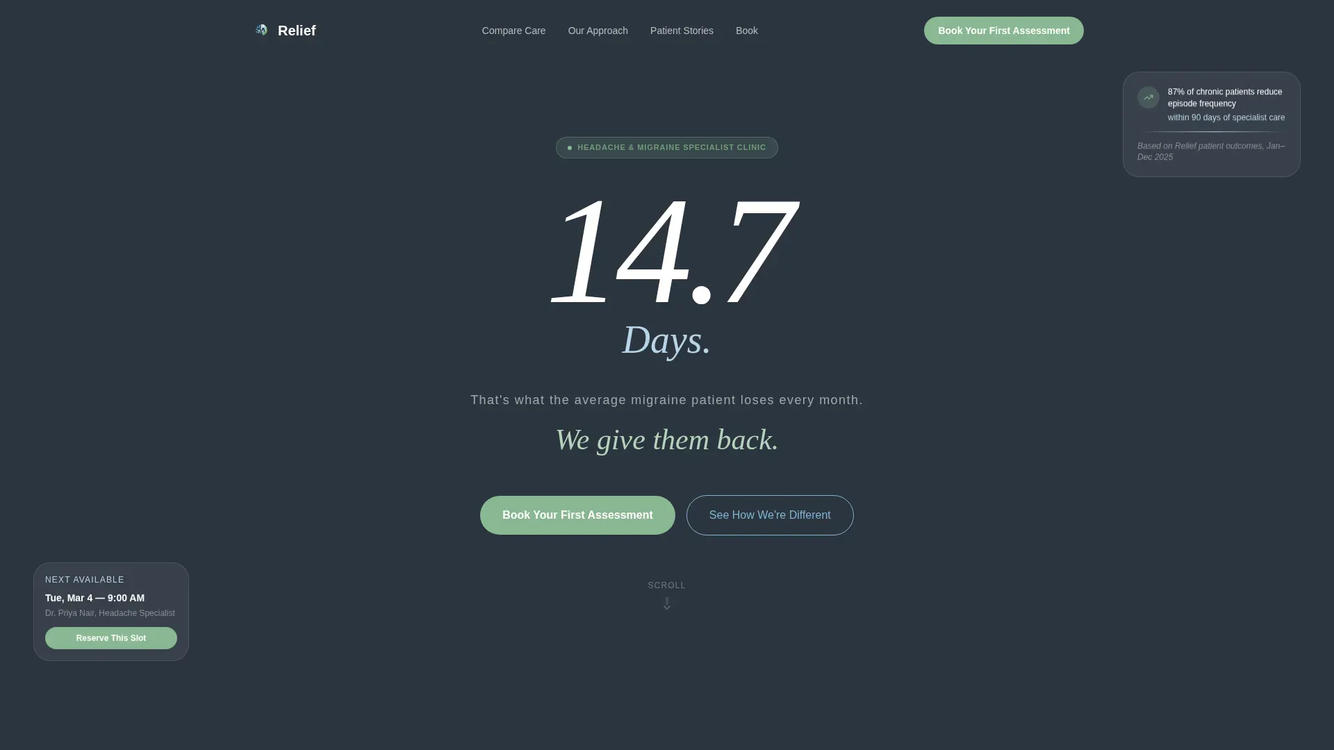
The hero opens with "14.7 Days" set in an oversized, light-weight variable sans-serif against a deep slate background. White text on a dark field creates immediate contrast. The single subline "We give them back" completes the message without clutter. Emptiness in the layout mirrors the stillness patients are seeking.
Animated Statistics Counter
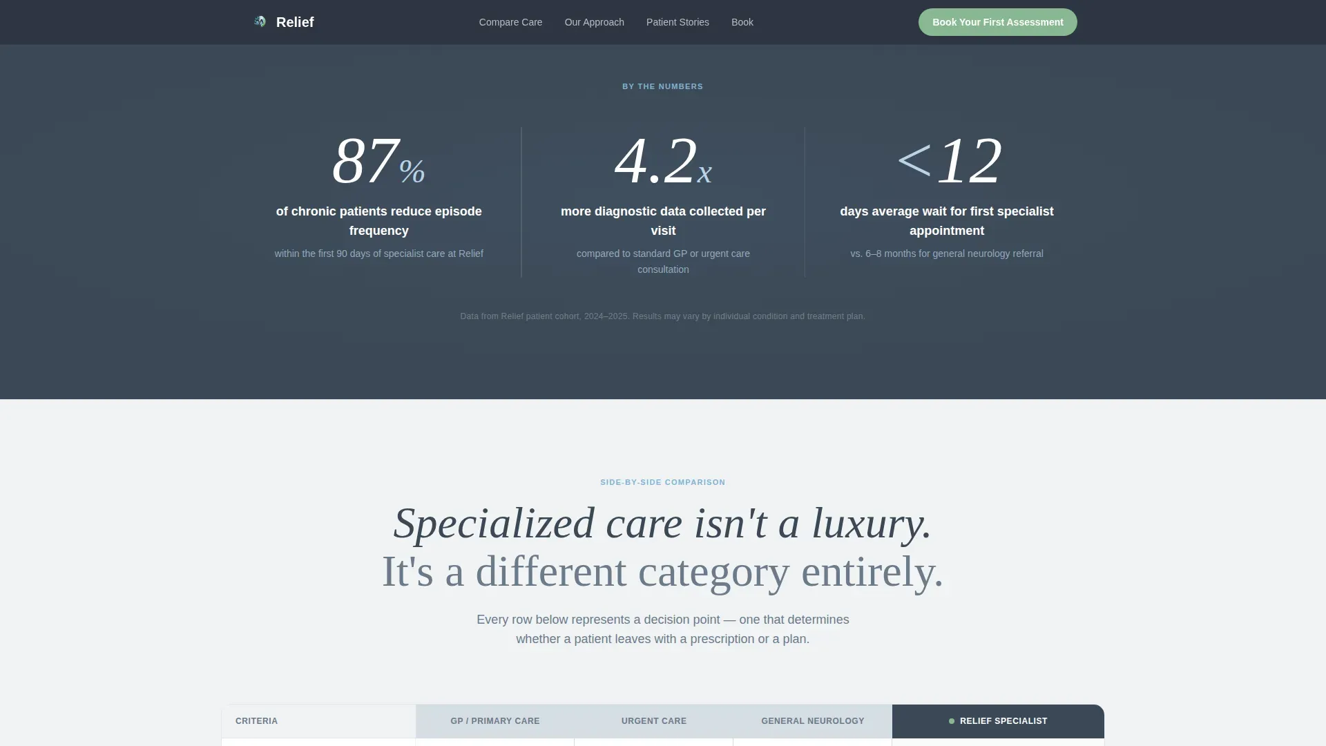
A full-width counter section reveals outcome numbers before any methodology copy appears. Scroll-triggered GSAP counter animations let statistics land with weight before the explanation follows. The first number a visitor sees is "87% of our chronic patients reduce episode frequency within 90 days."
Eight-Row Specialist Comparison Table
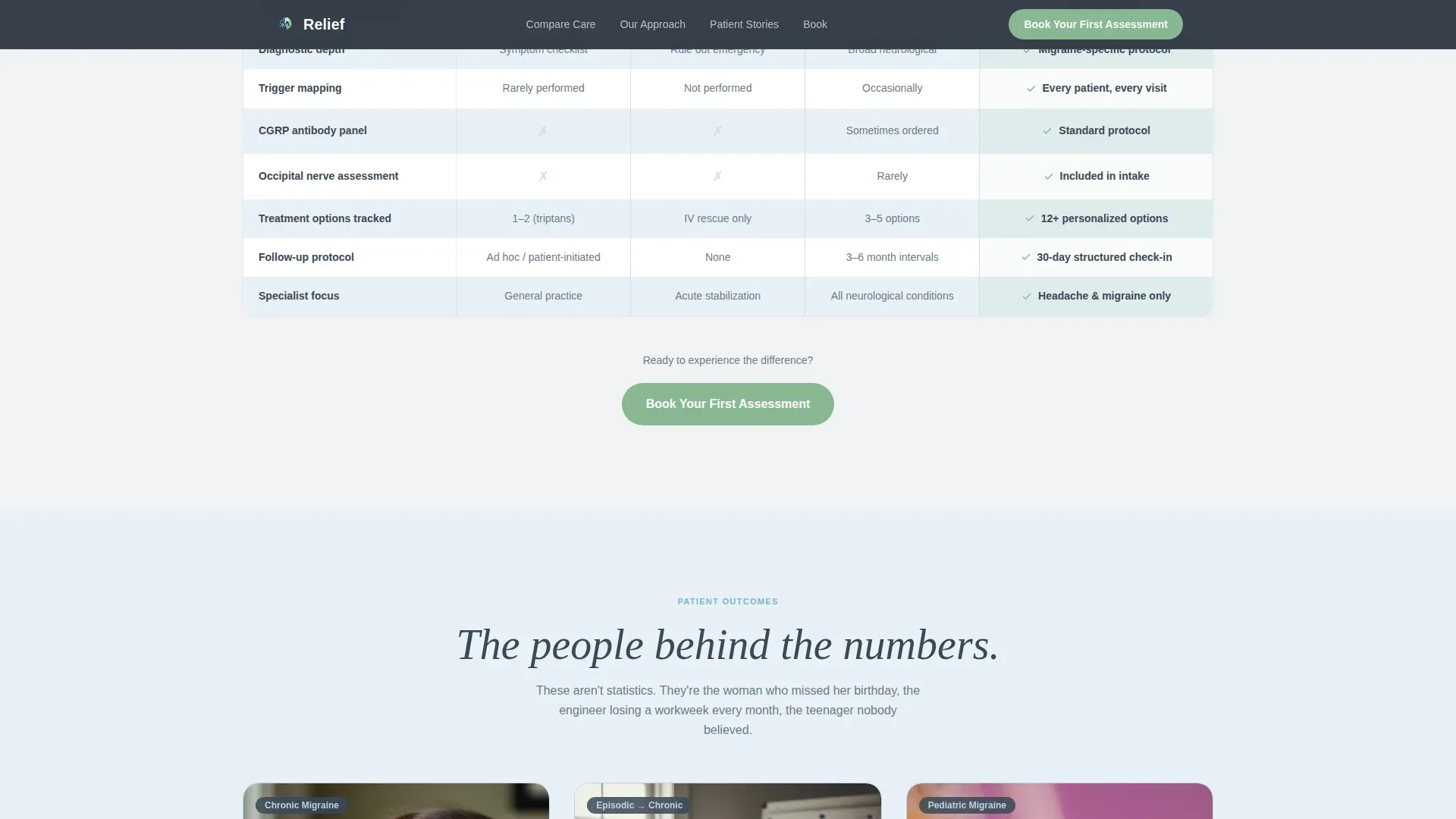
The comparison table is the structural centerpiece of the page. It contrasts "GP / Urgent Care / General Neuro" against "Dedicated Headache Specialist" across eight rows covering wait time, diagnostic depth, treatment options tracked, and follow-up protocol. Rows are staggered on scroll to build the case incrementally.
Three-Step Booking Form
The booking form is a guided three-step wizard. Step one is a migraine frequency selector with episodic, chronic, and daily options. Step two is an insurance provider dropdown. Step three is a preferred appointment window picker. The form reduces friction by breaking a potentially intimidating process into small, clear decisions.
Headache Pattern Quiz Path
A secondary call-to-action invites visitors who are not yet ready to book: "Not Sure Yet? Take Our 2-Minute Headache Pattern Quiz." The quiz ends with a personalized recommendation that still routes the visitor to the scheduler, capturing earlier-stage consideration traffic without losing them.
Patient Persona Story Cards
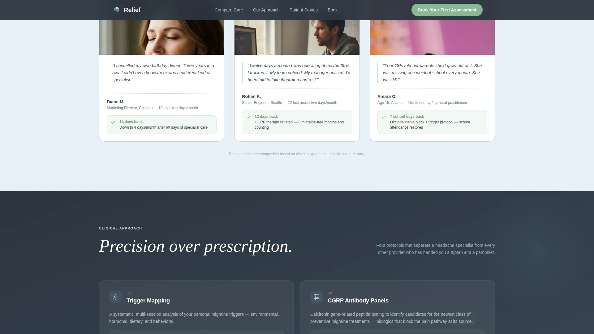
Three patient story cards reflect the real demographics the clinic serves: a woman who has cancelled social events due to migraines, a software engineer losing twelve productive days a month, and a teenager whose symptoms have been repeatedly dismissed. Each card pairs a lived experience with a clinical outcome.
Page sections overview
| Section | Purpose |
|---|---|
| Hero Headline | Anchor visitor attention with a single oversized stat and subline |
| Stats Counter | Deliver outcome numbers before any methodology copy loads |
| Comparison Table | Contrast generalist care against specialist care across eight clinical rows |
| Patient Story Cards | Build trust through three relatable persona outcomes |
| Methodology Explainer | Visualize trigger mapping, CGRP panels, and nerve assessments |
| Booking Form | Convert visitors through a three-step guided appointment wizard |
| Quiz Secondary Path | Capture undecided visitors and route them to the scheduler |
| Footer | Close the page with a clean linear single-row layout |
Design & branding system
The Organic Flow theme pairs clinical authority with atmospheric calm. The Slate and Sky color system uses four precisely assigned roles, so every color carries meaning rather than decoration. Typography reinforces the same duality: a variable sans-serif for body and interface text, and a display typeface reserved for numbers and headings.
- Deep clinical slate (#3B4856) anchors headers and body text with medical weight; soft atmospheric gray (#D6DDE3) fills section backgrounds; open-sky blue (#7FB3D3) floats across divider lines and section fields
- Living green (#88B892) appears only on call-to-action buttons and positive outcome indicators, making every interactive element feel like a deliberate signal of healing
- DM Sans handles all body copy and form interface text; Fraunces handles display numbers and hero headlines with weightless precision
Mobile & speed optimization
The template is built mobile-first. The hero is a typographic centerpiece on desktop but reflows cleanly for smaller screens. The most critical conversion element on mobile is the sticky bottom call-to-action bar, which keeps "Book Your First Assessment" within reach at all times without interrupting the scroll.
- Sticky mobile call-to-action bar keeps the primary booking prompt visible throughout the entire page scroll
- Server Components handle static sections such as the hero, stats, and comparison table; Client Components manage the interactive form wizard, quiz flow, and scroll-triggered animations
- The three-step form wizard and quiz path are built for touch-first interaction, with large tap targets and a single decision per screen
How this template helps you convert
The page is structured as a logical argument. Each scroll reveals the next layer of evidence, tightening the case until booking feels like the obvious next step rather than a leap of faith.
- The hero and stats counter establish the cost of inaction first, before any service description appears, so visitors understand what is at stake before they are asked to do anything.
- The comparison table builds a factual, row-by-row case that specialist care is a different category entirely, removing the common objection that a GP visit is "good enough."
- The three-step form and quiz path offer two entry points matched to visitor readiness, so both decided and undecided patients have a clear next action that suits where they are in their decision.
Other information about this template
This template is classified under the Health and Medical category with a Pain Management subcategory, specifically targeting the headache and migraine clinic niche. It is built for the US market with English copy, USD pricing references, US date formatting, and US insurance terminology baked into the form design.
- The template style is Comparison Table, the theme is Organic Flow, and the creative direction is Stats-First Impact
- The header concept is Giant Headline Centered, and the landing page direction is Booking and Scheduling
- The color system is Slate and Sky; the intersection match score for this niche and template combination is 13 out of a possible range, indicating strong alignment
- Animation complexity is high: GSAP counter animations, scroll-triggered section reveals, and staggered comparison table row entries are all part of the built interaction layer
Theme
Organic Flow
Creative direction
Stats-First Impact
Color system
Slate & Sky
Style
Comparison Table
Direction
Booking/Scheduling
Page Sections
Giant Centered Hero Headline
Animated Statistics Counter
Eight-row Comparison Table
Three-step Booking Form Wizard
Headache Pattern Quiz Path
Patient Persona Story Cards
Related questions
Can I edit the comparison table rows to match my clinic's specific services?
Does the quiz path connect directly to the booking form?
Is the sticky mobile call-to-action bar included out of the box?
Can I replace the patient story cards with outcomes from my own practice?
What design style does this template follow?



